by ChunLin Wu
How to Build A Debuggable Styled Component

Styled-components is a CSS-In-JavaScript library. It allows you to write CSS code inside your React JSX files. Life is good when your component’s CSS properties can be dynamically changed with styled-components.
However, there are some drawbacks when you try to debug your styled components. In this article, I’ll introduce to you the pros and cons of building components with traditional CSS and styled-components. Then, I’ll show you an easy method to overcome the flaws of building a styled component. Stay tuned!
Getting started
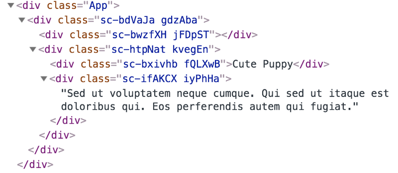
At first, let’s make a component with a conventional CSS file.
For now, the component looks like the image below.

Pretty Cute huh!?
Make the title “Cute Puppy” another color
Let’s give the Content.jsx a prop. To make it simple, give it a prop called skyblue.
Now, we can change Content.jsx CSS properties based on skyblue. I want to introduce you to two methods to add new CSS properties via general CSS.
Inline Style
As you can see, we take skyblue as the condition to add CSS properties to the style object. We then inject the style object as an inline style. Now the result will look like this…

The color of the title is now sky blue! Now let’s move on to the second method.
Add New CSS Classes
As you know, we made a CSS class called content--skyblue. This is straightforward to make the color sky blue. We want to add this class to the title “Cute Puppy”. What we are doing is making an array to store CSS classes, then using the join method to split classes with space. So now, the className would be like<div className="content__title content--skyblue">Cute Puppy</div> . The result will also look the same as the inline-style method.
You can see that it’s not convenient to modify the styles with both of the methods above, especially for those complex UI components. You don’t want to write many condition statements to style your components, right?
So, what are the pros and cons of both inline-style and adding new CSS classes?
Pros
- It’s general CSS and vanilla JS — you don’t need to learn new syntax and API.
- Easy to debug using browsers’ devtools.
Cons
- It’s not flexible to modify inline-style because of CSS specificity. You cannot simply just add a class to override inline-style because inline-style has higher specificity.
- It’s not clear to see what classes are included in
classNamevia the adding new CSS classes method. When you see this kind of code<div className={titleStyles.join(' ')}>Cute Puppy</div> , you have to look back at the logic that you added to the classes. That will be a major drawback when you have lotsof className to modify.
That’s why I want to introduce you to styled-components.
Styled-components
Use the best bits of ES6 and CSS to style your apps without stress ?
Styled-components is a library which makes it easy to modify CSS properties. You can just install it via npm install styled-components --save or yarn add styled-components. Then you can use styled-components to style your components. Let’s take the Cute Puppy as the example.
At first, we need to import styled-components to our component. We import it as a name called styled. Then we can define what HTML element should be used for each styled-component. For example,
const Button = styled.button` /* CSS Properties */ `
means this Button component stands for the styled-component render a <button />. Then we can simply move the CSS properties to each styled-component. That’s it! Just that simple! Now you can see the original version of Cute Puppy.
How about changing the title’s color using styled-components? Styled-components take advantage of JavaScript ES6 template literals. You can pass a function to template literals. That will be helpful when you want to modify CSS properties based on props. Let’s dive deeper into the topic via Cute Puppy.
We pass the prop skyblue to the Title component which was built with styled-components. Then we can simply pass a function to the CSS properties we want to modify via template literals. As you can see, we pass an arrow function props => (props.skyblue ? 'skyblue' : 'black')to determine under what condition should Title’s color be sky blue, and we just finish changing Title’s color!
How About Debugging
Let’s open Chrome Devtools to see what happens when we build a component with styled-components.
Styled-components have a built-in CSS module system. This is great for solving the problem of classnames conflict. However, we definitely don’t know what classes are we using when we try to debug on Chrome Devtools. Besides, when we check the render function in Content.jsx:
Do you know what HTML element we are using? absolutely not, right? You have to look back at each styled-component to check what HTML element is it using. That is annoying actually. Also, when you build styled-components in this way, basically you just abandon the powerful features of CSS selectors.
Considering the problems above, I want to introduce a simple method to build a debuggable styled-component, which combines general CSS with styled-components.
Combine CSS selectors with Styled-components
At the beginning of this part, I want you to know how to style existing components with styled-components.
The styled method works perfectly on all of your own or any third-party components as well. As long as they pass the className prop to their rendered sub-components, which should pass it too, and so on. Ultimately, the className must be passed down the line to an actual DOM node for the styling to take any effect.
We need to add className to general components and we can style them easily with styled-components. Let’s see how to take advantage of it to build a debuggable styled-component.
We need to wrap Content.jsx via the className prop and we can style it with this pattern:
const StyledContent = styled(Content)` /* CSS Properties */ `
Then we can wrap any component into the styled-component. In addition, we can also use the power of CSS selectors inside the styled-component. Even more, SCSS syntax is available in styled-components! Let’s see how it happens when we open the console in Chrome Devtools.
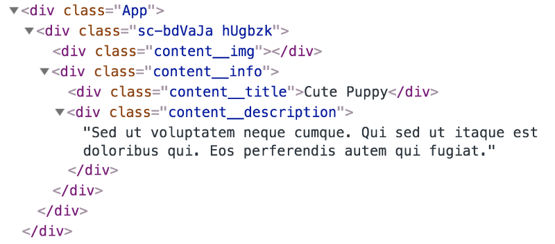
Now the classes are meaningful, right? And we still benefit from the built-in CSS module system because of the className prop. To put it simply, you just need to take care of CSS classnames inside the component, then you will be fine ?. Remember how we modify CSS properties via passing a function to styled-components? It still works with this method! Of course, the result will still look like…
Life has never been so beautiful!
Wrap up
We have gone through two methods to style component via traditional CSS. Then we learned how to style components easily with styled-components. In the end, we combined CSS selectors with styled-components. Now components can be easily styled and are also debuggable.
If you want to try out styled-components to style your components, but feel the pain when debugging, I would recommend that you give this method a try.
DEMO
Source Code
You can check the source code of every method on my Github repo
1. Inline-Style
4. Combine CSS Selectors with styled-components
Thank you for reading my article. I hope it didn’t waste your time. If you like this article, please feel free to give me a clap ???. Your claps will motivate me to write more high-quality articles ✍️.
Follow me on Twitter
Follow me on Github
Connect me on LinkedIn