by Maciej Nowakowski
A Guide to Responsive Images with Ready-to-Use Templates

Why generate 12 versions of the same image when just 2 media-queries do the job? The users won’t notice.
But Google will.
Responsive images that are in the wrong format, images that are not compressed properly, and images that are too big will all decrease the page speed and impact your SEO.
According to Google, anything above 2 seconds of download time will put off your users and discourage the crawlers from indexing your website.
I learned that the hard way when I was rebuilding my website. My goal was to create a simple website that downloads in the blink of an eye. To do so, I went for Gatsby.js — it’s fast and I know it.
After a few days of coding, the website was up and running. But, to my disappointment, it scored a modest 78/100 on mobile and a disastrous 57/100 on the desktop on PageSpeed Insights. Not good at all.
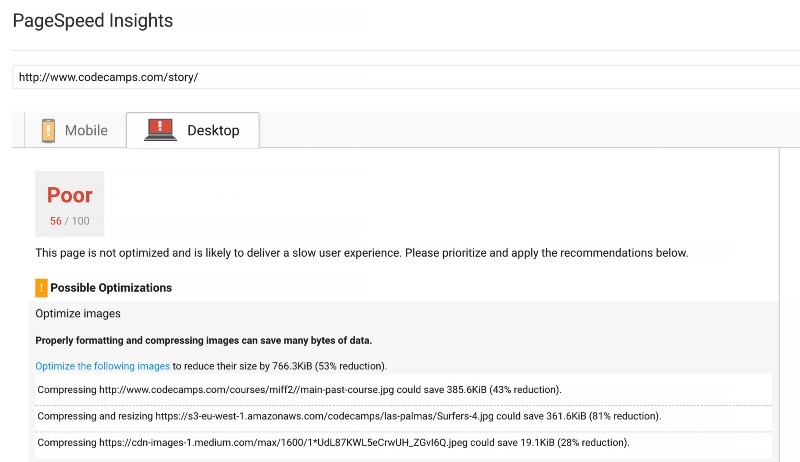
PageSpeed Insights suggested an easy fix to the problem. Just download the compressed images the tool has created, and you’ll be fine.
That sparked my curiosity. And the more I thought about sizes, formats, and compression levels, the more I felt overwhelmed with the abundance of choices. PNGs, JPGs, SVGs, inline base64 encoded strings… or maybe WebPs?
To wrap my head around it, I dived into the world of pixels, waded through the muddy waters of random tips on the subject, and came up with a systematic approach.
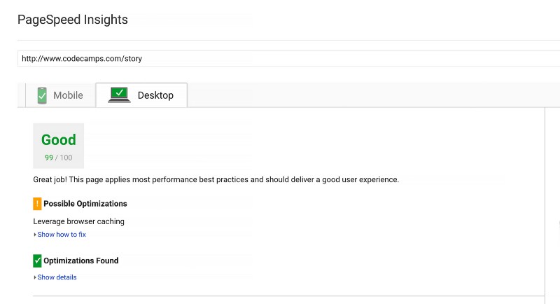
And once I applied what I learned, my PageSpeed rating increased from 78 to 91 on mobile and from 57 to 99 on desktop!
In this post, I will show you how to quickly generate responsive images that work in all browsers and massively reduce your download speeds.
Before you start
If you want to optimize an image, you have to start with a high-quality image that has the right format and the right size:
- Use JPGs for photos and PNGs for graphics or other images that require transparency
- Use smaller PNG-8 instead of PNG-24 for graphics with a limited number of colors. To decrease the size even further, you can also reduce the number of colors, from 256 to 16
- Use SVGs (vector graphic images) for icons and logos. They will scale nicely without increasing the size of your file
- Use inline images below 10KB as 64base encoded strings (sparingly)
- The actual width of an image shouldn’t exceed the width of the largest container it will be displayed in, multiplied by two (for retina displays)
Hardware and software pixels
The image that takes the full width of the 15" Macbook Pro screen is 1440 pixels wide but the actual resolution of the retina display is double that, at 2880x1800. Why? Because of its pixel density factor of 2.
Old monitors have a pixel density of 1. But since screen resolutions have increased in recent years, the hardware pixel is no longer equal to the software or CSS pixel.
The relationship between hardware and CSS pixels is described by the following formula:
CSS Pixels = Hardware Pixels / Pixel density
Therefore, hardware resolution of 2880 pixels translates to1440 CSS pixels on the retina display. This also explains why, when you inspect the full-width image in Developer Tools, you will see it as only 1440 pixels wide instead of the original 2880 pixels.
The retina display was a major breakthrough a few years ago. Today, mobile devices have even "denser" displays of 3 and even 4 for Samsung Galaxy S8+!
For the purpose of my experiment, I decided that to be razor-sharp, the full-width image should have the maximum width of 2880 pixels.
With the image height set to 600px and the quality to 75%, Photoshop produced a massive 939KB file. That’s hardly acceptable.
After a few experiments with compression levels, it became clear that compressing JPGs below 60% quality resulted in a visible loss of quality. I set the quality to 60% as a starting point and the image size dropped to 681KB. Still, far from decent.
WebP format
"WebP is a modern image format that provides superior lossless and lossy compression for images on the web," according to Google.
After conversion to the WebP format, my image was not only smaller but also
sharper! WebP shaved another 34% of the compressed JPEG size. "I’m on the right path", I thought!
Unfortunately, the WebP format is supported by Chrome and Opera, just about 60% of all browsers, according to Can I use. So I knew I’d have to think of fallback options.
At last, the limits were set:
- 60% compression level
- WebP format where possible
I also chose to support three breakpoints: 600px and 900px
(here is why) and 2-pixel densities — 1x and 2x for retina displays. That meant 6 different images instead of just two. Supporting the WebP format doubled the number.
There are two primary ways to put an image on a website, either by using HTML’s img element or a background-image in CSS.
Responsive images in HTML
The basic HTML img element has the src attribute that points to the image URL:
<img src="image.jpg" alt="image description"/>But you can go a step further and decide which image to serve depending on the screen’s pixel density with the srcset attribute:
<img srcset="image_1x.jpg 1x, image_2x.jpg 2x" src="image_1x.jpg"/>Here, I’ve used two different screen densities: 1x and 2x. Depending on the actual display density, the browser will choose the right one. The src attribute points to the fallback option.
At the moment, most browsers except IE, Edge, and Opera Mini have the srcset attribute implemented.
This solution seems like a step in the right direction. Unfortunately, your browser will always select the same image, with the same pixel density, regardless of the display size. And the same image will end up on both the desktop and the mobile device.
We need more control. And we can have it. Apart from pixel densities, the scrset attribute accepts width units w, an equivalent of CSS pixels.
The width unit enables the browser to choose the right image size for the given display capabilities.
With two breakpoints (600px and 900px), we can go with three different image sizes:
<img
  srcset="image-sm.jpg 600w,
          image-md.jpg 900w,
          image-lg.jpg 1440w"
  src="image_1x.jpg"
/>
There is a caveat here. When the browser decides which image to fetch, it has no knowledge of our CSS! The CSS file hasn’t been fetched at this point. And it assumes that the image will be displayed at the full width of the window.
If a full-width image is what you want, then fine. But what if you want to place an image in a container that is only 50vw wide? Here comes the sizes attribute into play. Let’s take a look:
<img
  srcset="image-sm.jpg 600w,
          image-md.jpg 900w,
          image-lg.jpg 1440w"
  sizes="50vw"
  src="image_1x.jpg"
/>
By adding the sizes="50vw" attribute, you are telling the browser that the image will be displayed at 50vw, and based on this information, the browser will decide which image to display.
But what if you want to display your image at 50vw on a big screen and at the full width of 100vw on a mobile device? The sizes attribute accepts also media queries!
You can specify that below the mobile breakpoint of 600px you want the browser to display your image at a full-screen width. And for the width higher than the mobile breakpoint you want the browser to display your image at 50vw.
You can do this by adding the media query:
<img
  srcset="image-sm.jpg 600w,
          image-md.jpg 900w,
          image-lg.jpg 1440w"
  sizes="(max-width: 600px) 100vw, 50vw"
  src="image_1x.jpg"
/>
Remember that in the above line of code you are instructing the browser which image to choose because the browser doesn’t know the corresponding CSS. You still have to add the breakpoints in CSS explicitly.
This solution works really well but we are missing pixel densities here! If we stopped here, we would be sending the same image both to the displays with 1x pixel density and to the retina screens. Luckily, there is an easy fix to it.
Picture element
Meet the HTML5 picture element. It accepts the source and img elements as its children. We can use the source element to list additional image formats that we want to serve to the browser.
But before we fix pixel densities, let’s introduce smaller and sharper images in WebP format.
Let’s add the source element as the first option inside the picture element with your image in the WebP format followed by the img pointing at the regular JPG image. Now, when the browser is not WebP-ready, it will gracefully fall back on to the img element (e.g. Safari).
<picture>
  <source
    srcset="image.webp"
    type="image/webp"
  />
  <img
    src="image.jpg"
    type="image/jpeg"
    alt="image description"
  />
</picture>
The source element opens up a whole new world of possibilities. It accepts media queries!
First, in the media attribute, we use the media query and then, in the srcsetattribute, we place the appropriate image. And we can use as many sourceelements as we wish:
<picture>
  <source
    media="(min-width: 900px)"
    srcset="image-lg.webp"
    type="image/webp"
  />
  <source
    media="(min-width: 600px)"
    srcset="image-md.webp"
    type="image/webp"
  />
  <source
    srcset="image-sm.webp"
    type="image/webp"
  />
  <img
    src="image-lg.jpg"
    type="image/jpeg"
    alt="image description"
  />
</picture>
Above, we have prepared three images in the WebP format, depending on the size of the display, and one JPG image as a fallback option.
The last secret of the srcset attribute is that it also accepts pixel densities. We can decide which image we want to serve on which screen and at which pixel density. The trick is to list image files in the scrset followed by a space and the pixel density factor, for example: 1x, 2x, 3x, or even 4x.
<picture>
  <source
    media="(min-width: 900px)"
    srcset="image-lg_1x.webp 1x, image-lg_2x.webp 2x"
    type="image/webp" />
  <source
    media="(min-width: 601px)"
    srcset="image-md_1x.webp 1x, image-md_2x.webp 2x"
    type="image/webp" />
  <source srcset="image-sm_1x.webp 1x, image-sm_2x.webp 2x" type="image/webp" />
  <img
    srcset="image-sm_1x.jpg 600w, image-md_1x.jpg 900w, image-lg_1x.jpg 1440w"
    src="image_lg_1x.jpg"
    type="image/jpeg"
    alt="image description"
  />
</picture>
...
Since we sorted out the screen sizes and pixel densities for the WebP format, let’s have a closer look at the fallback option. In the end, some browsers don’t support the WebP format.
Here, we have to decide if we want to use the 1 or 2-pixel-dense images. Below, I went for the first option:
<picture>
  <source
    media="(min-width: 900px)"
    srcset="image-lg_1x.webp 1x, image-lg_2x.webp 2x"
    type="image/webp"
  />
  <source
    media="(min-width: 601px)"
    srcset="image-md_1x.webp 1x, image-md_2x.webp 2x"
    type="image/webp"
  />
  <source srcset="image-sm_1x.webp 1x, image-sm_2x.webp 2x" type="image/webp" />
  <img
    srcset="image-sm_1x.jpg 600w, image-md_1x.jpg 900w, image-lg_1x.jpg 1440w"
    src="image_lg_1x.jpg"
    type="image/jpeg"
    alt="image description"
  />
</picture>
We have replaced the img element with the picture element. Where possible, we want to deliver images in the WebP format in three different sizes, depending on the display size, and 2 different pixel densities. If the browser doesn’t support the picture element or the WebP format, it will fall back on to the standard img element with three different sizes of JPGs.
Important: Notice that in the img element the srcset attribute should be placed before the src attribute. Otherwise, the browser will download the src image first and then, if it finds a better image in the srcset, it will download this one as well. This way we would end up with two images.
We could go one step further and create another 3 source elements for browsers that don’t support the WebP format and deliver JPG files instead.
Although it works great for Firefox, I’ve noticed that Safari will download both files: the JPG listed in the source and the JPG from the img element. Again, we would end up with two images instead of one.
Responsive images in CSS
If we don’t know the exact height and width of the container we want to cover with an image, we can use generic elements like div with the background-imageproperty pointing to the image URL:
background-image: url("/images/image.jpg");CSS, similarly to HTML, enables image size optimization.
The image-set in CSS is the equivalent of the srcset in HTML . At the moment, it is implemented in Chrome, Chrome for Android, Safari, iOS Safari, and a few other browsers. You can add polyfills to make the image-setwork on other browsers, but given that Chrome and Safari combined are the browsers of choice for 70% of users today, there is a good chance that most browsers will implement the attribute in the near future.
But worry not, the regular background-image as a fallback option will do the trick.
The structure is very similar to what we’ve just used in a srcset attribute.
To create a full-width image element with a height of 500px, we have to start with the fallback option — the first background-image in the code example below. Then, using the -webkit-image-set, we need to list the WebP images for different pixel densities. And we have to repeat the process for different breakpoints using media queries.
One important thing to remember is that both Chrome and Safari use the WebKit layout engine but Safari doesn’t support the WebP format. That’s why we have to add the last set of image-set attributes with JPG images (it will be used by Safari even though it doesn’t start with -webkit).
.bg-image {
  width: 100vw;
  height: 500px;

  background-size: cover;
  background-position: center;

  background-image: url(/images/image-lg_1x.jpg);
  background-image: -webkit-image-set(
    url(/images/image-lg_1x.webp) 1x,
    url(/images/image-lg_2x.webp) 2x
  );
  background-image: image-set(
    url(/images/image-lg_1x.jpg) 1x,
    url(/images/image-lg_2x.jpg) 2x
  );

  @media (max-width: 900px) {
    background-image: url(/images/image-md_2x.jpg);
    background-image: -webkit-image-set(
      url(/images/image-md_1x.webp) 1x,
      url(/images/image-md_2x.webp) 2x
    );
    background-image: image-set(
      url(/images/image-md_1x.jpg) 1x,
      url(/images/image-md_2x.jpg) 2x
    );
  }

  @media (max-width: 600px) {
    background-image: url(/images/image-sm_2x.jpg);
    background-image: -webkit-image-set(
      url(/images/image-sm_1x.webp) 1x,
      url(/images/image-sm_2x.webp) 2x
    );
    background-image: image-set(
      url(/images/image-sm_1x.jpg) 1x,
      url(/images/image-sm_2x.jpg) 2x
    );
  }
}
Here, the background image is centered in the div element and covers its whole area. Using the image-set attribute, we are assigning two different images to two different pixel densities.
The fallback option with a standard url takes care of the browsers that don’t support the image-set attribute.
It’s very important to place the fallback option before the background-imageswith the image-set attribute. If you place it after the image-setattribute, for example, Safari would download both, the image from image-set and the image from the fallback option if it found an image with a different file name.
The rest of the code follows the same pattern. Above, I have added media queries for 600px and 900px breakpoints and a set of corresponding images in smaller sizes.
The fallback option always has to use the JPG format to avoid the situation where an image cannot be shown at all, that is when the browser doesn’t support the image-set attribute or the WebP format.
How to inline small images
To improve user experience, we should not only compress and serve the smallest possible images, but we should also decrease the number of requests we send to the server.
The browser has to send a separate request for every single image. When sent to the server, the request has to first wait in a queue, which takes time. The more calls the browser makes, the longer the user has to wait.
That’s especially true when you have to download many small images. If possible, logos and icons should be saved as vector graphics (SVG). Small images can be embedded either in HTML or in CSS directly as base64 encoded strings.
Instead of passing a regular URL to the src attribute in the img element, we can pass the image as a string:
<img
  src="data:image/png;base64,encoded string"
  alt="img description"
/>
and in CSS:
.small-image {
  background-image: url(data:image/png;base64,encoded string);
}
In most cases, the generated string will be around 30% bigger than the original image, but you will save time on another round trip to the server.
The most common argument against using base64 encoded images in CSS files is that images are non-blocking resources whereas CSS files are. It means that if you embed too many small images into your CSS, it will increase the size of the CSS file and lengthen the time to the first paint of the website. That, in turn, will make the user wait longer before he or she can see any content.
Here is a great article on why you may consider dropping the idea of using encoded strings for images entirely.
The truth lays probably somewhere in the middle, and injecting one or two small files as base64 strings into CSS or HTML shouldn’t do any harm.
At the end of this article, you will learn how to generate them. It can feel strange at first because these strings are thousands of characters long. Your .logo class may look like this, but longer:
.logo {
  background-image: url(data:image/png;base64,iVBORw0KGgoAAAA NSUhEUgAABqIAAAFvCAMAAAAWmCq0AAAAGXRFWHRTb2Z0d2FyZQBBZG9iZS BJbWFnZVJlYWR5ccllPAAAA3hpVFh0WE1MOmNvbS5hZG9iZS54bXAAAAAAA Dw/eHBhY2tldCBiZWdpbj0i77u/IiBpZD0iVzVNME1wQ2VoaUh6cmVTek5U Y3prYzlkIj8+IDx4OnhtcG1ldGEgeG1sbnM6eD0iYWRvYmU6bnM6bWV0…);
}
How to generate responsive images
Let’s assume that you’ve just saved a perfect image and you’d like to create all the variations so you can use it on your website.
There are many tools that can help. Simple tools include compressjpeg.com, compresspng.com, and tinyjpg.com. More advanced tools include ImageOptim for JPEG, PNGs, and GIFs and ImageAlpha for PNGs.
On my quest to take full control of compression levels, formats, and scaling, I needed a tool that would help me automate the whole process. And I didn’t fancy drag-and-dropping dozens of images.
Both ImageMagic and GraphicsMagick are free and powerful pieces of software that painlessly pair with Grunt, the JavaScript task runner.
Even better, there are Grunt plugins that simplify the task further. Several quick tests showed that GraphicsMagick generates 20% smaller JPG images than ImageMagic at the same compression level. So the choice was clear.
Before we start to cut our way through the jungle of pixels, we have to prepare our tools and sharpen our axe. Download GraphicsMagick from here or use Homebrew to install it.
brew install graphicsmagickNext, install Grunt’s CLI globally:
npm install -g grunt-cliCreate a separate folder responsive-images and init the project:
mkdir responsive-images
cd responsive-images
npm init
And finally, install the local version of Grunt:
npm install grunt --save-devCreate two folders: src/ for original images and dest/ for the responsive images that Grunt and GraphicsMagick will generate:
mkdir srcmk
dir dest
The original image should be saved at the resolution equal to or greater than the largest image you want to generate in the src/ folder. I saved mine as JPG at 100% quality and 2880 pixels wide. It was around 2.5MB.
First, let’s generate responsive images using the grunt-responsive-imagesplugin. Install it:
npm install grunt-responsive-images --save-devNow, in the root directory of the project, create an additional file Gruntfile.js:
touch Gruntfile.jsThis is where we have to configure the plugin.
Copy and paste the code to the Gruntfile.js and let me walk you through the code:
module.exports = function (grunt) {
  grunt.initConfig({
    responsive_images: {
      dev: {
        options: {
          engine: "gm",
          sizes: [
            { name: "sm", suffix: "_1x", quality: 60, width: 600 },
            { name: "sm", suffix: "_2x", quality: 60, width: 1200 },
            { name: "md", suffix: "_1x", quality: 60, width: 900 },
            { name: "md", suffix: "_2x", quality: 60, width: 1800 },
            { name: "lg", suffix: "_1x", quality: 60, width: 1440 },
            { name: "lg", suffix: "_2x", quality: 60, width: 2880 },
          ],
        },
        files: [
          {
            expand: true,
            src: ["**/*.{jpg,png}"],
            cwd: "src/",
            dest: "dest/",
          },
        ],
      },
    },
  });
  grunt.loadNpmTasks("grunt-responsive-images");
  grunt.registerTask("default", ["responsive_images"]);
};
In options, we set GraphicsMagick as our engine of choice: engine: "gm". You can also test ImageMagick by changing it to engine: "im".
Next, in the sizes array, we have to specify the parameters of the images we want to produce, such as a name that will be appended to the original name, a suffix that will be added to the name as well, a quality and a width.
The resulting images will have the following naming structure:
original-[name]_[suffix}.jpgFor example, using the first sizes object, Grunt will generate from the original my-image.jpg the my-image-sm_1x.jpg image at 60% compression level and 600 pixels wide.
Below the options, we need to list source and destination folders as well as patterns of file names that we want to process.
To enable the dynamic build of file objects, let’s set the expand attribute to true and define:
cwd— source foldersrc— an array of patterns to match. In our case, we want to match any folder (**) inside the source folder and all files with extensionsjpgorpngdest— destination folder
The above Grunt task will generate a set of JPG and/or PNG files, depending on the source image file extensions.
We also want to produce a corresponding set of WebP images.
We need another plugin to do the job: grunt-cwebp. Let’s install it:
npm install grunt-cwebp --save-devAppend the Gruntfile.js with the following configuration:
module.exports = function (grunt) {
  grunt.initConfig({
    responsive_images: {
      ...
    },
    cwebp: {
      dynamic: {
        options: {
          q: 60,
        },
        files: [
          {
            expand: true,
            cwd: "dest/",
            src: ["**/*.{jpg,png}"],
            dest: "dest/",
          },
        ],
      },
    },
  });
  grunt.loadNpmTasks("grunt-responsive-images");
  grunt.loadNpmTasks("grunt-cwebp");
  grunt.registerTask("default", ["responsive_images", "cwebp"]);
};
The grunt-cwebp plugin uses the dest/ folder as the source of images. We want all the newly produced JPGs to have their WebP siblings and we should place them in the same folder.
Now, we can process the images:
gruntFor every image in the src/ folder, Grunt will generate 12 images in all the necessary sizes, pixel densities and in both JPG and WebP format!
How to generate base64 strings
If you want to generate base64 strings for inlining your images, here is how to do.
This time, let’s use the Grunt plugin: grunt-base64.
Create a new project in a separate folder base64-images. Init it with npm and install the local version of Grunt:
mkdir base64-images
cd base64-images
npm init
npm install grunt --save-dev
Install the grunt-base64 plugin:
npm install grunt-base64 --save-devIn the root directory, create a new images/ folder and the Gruntfile.js:
mkdir images
touch Gruntfile.js
and copy and paste the code into the Gruntfile.js:
module.exports = function (grunt) {
  grunt.initConfig({
    base64: {
      dev: {
        files: {
          "images/output.b64": ["images/*.{jpg,png}"],
        },
      },
    },
  });
  grunt.loadNpmTasks("grunt-base64");
  grunt.registerTask("default", ["base64"]);
};
Place the small original image in the images/ folder and run Grunt:
gruntAfter the task is finished, copy the whole content from the output.b64 file — that’s the base64 string that you can paste into the url of the background-image or into the src attribute of the img element.
There is also an easier way (on Mac OS X or Linux):
uuencode -m image-file-name remotenameThe remotename is not used and you can place even xyz to get base64 string printed into the standard output — in most cases into the terminal window.
You have to use -m option to get the base64 encoding.
Conclusion
Responsive images might feel overwhelming at first, but with Grunt and image processing engines on your side, you can create a smooth process and automate most of the repetitive tasks. And I promise it’s worth it. You will not only shine in PageSpeed Insights, but you will also slash the time to the first paint of your website.
In my case, the original 939KB image shrank by 60% to 380KB (JPG) and by 77% to 218KB in the WebP format.
In the end, my pixel-crusade paid off — the PageSpeed Insight rating for my website turned green.
If you liked this article, 👏 even 50 times — I would really appreciate it and it makes a huge difference to me.
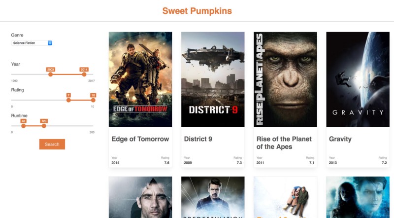
I published recently a free React tutorial for beginners. If you want to learn how to build a web application from scratch it’s a great starting point. You will learn how to build an app to help you find the best movie to watch 👉 Sweet Pumpkins