by Sushrut Shivaswamy
A new way of building dynamic visualisations

The Flux architecture gained popularity after Facebook adopted it. It’s a way of managing the state of React components so that the flow of the data through the app is unidirectional.
The advantages of this approach are that the app is comprised of few stateful components that passes state down to nested child components. A feature of React that really complements this approach to state management is that React allows us to write UI as a function of state. This means that, as state percolates down the app’s component hierarchy, components automatically change the view to reflect the changes in state.
JSX, a templating system used by React, allows for the creation of reusable single file components.
It also lends itself really well to creating a demarcation between the structure of the DOM and the behaviours associated with it.
- JSX gives a clean view of the DOM structure that is more intuitive than the several lines of JavaScript required to create the same DOM structure.
- The behaviours associated with the DOM structure — eventHandlers like onClick, onHover — are handled as member functions of the component.
- Any changes to the DOM structure require the user to call setState to change the state of the component instead of directly mutating the DOM. This makes it easier to debug the application, and it also ensures that the application is always in a defined state.
As the complexity of the app grew, however, the Flux approach also began to show its limitations.
Few stateful components passing state down to child components seem fine for small apps. But, as the complexity of the component hierarchy increases, stateful components have to share state with each other.
While it is possible to share state across different components/classes in JavaScript through common variables or, preferably, the Observer pattern, as the number of components increases it becomes harder to maintain the application.
The simplicity of components reacting to changes in state is muddled with the complexities of object-oriented design.
Charts — why are they hard to make?
The advances that web apps have benefited from have not changed the way that charting libraries are made. A chart is also a presentational component, and can technically be termed as UI. A chart is also composed of DOM elements that control its visual appearance.
However, charts differ in one key aspect: developers don’t treat SVG as DOM. Technically, the <svg> tag is not even an HTMLElement like other DOM elements, and sits in a separate namespace. SVG is only known for its ability to scale to any viewport size and maintain the resolution of the image at a constant level. That’s the extent to which most developers know about it.
Also the tags used to create an SVG image like <point>, <rect />, and <polyline /> sound very “math like.” This makes developers shy away from how SVG structures actually work.
Even those involved with applications that make heavy use of SVG are usually unaware of its inner workings. They utilise other libraries like snap or d3 to avoid the hassle of understanding what goes on under the hood.
Having avoided the underlying complexity of the SVG tag, it feels easy to model complex SVG constructs.
Geometry
Consider a bar chart, for example.
We traditionally adopt a cookie cutter approach and split a chart into parts:
- x-axis
- y-axis
- bars
A seasoned developer would notice that the word axis was written twice in the above list. So lets create an abstraction layer called Axis that subclasses can inherit from.
To render the bars, we can create a separate class called Bar that utilises the scale provided by the axis class. As charts come in various shapes, it makes more sense to have an abstraction layer called Geometry that other classes can inherit from, namely Bar, Point, Line, and Area. As more complex charts are made, several new geometry types can be added to render different kinds of charts.
Following the above methodology, a chart comprises three or more stateful components that utilise each others’ properties to render a meaningful chart.
To update or enhance the chart, a developer is expected to know the state to mutate in each of these components. Since state is scattered across various components, even simple changes take a lot of time for new developers. The ordering of the state changes also becomes relevant.
In the above example, the geometry utilises the scale of the axes. For the chart to be resized, the range of each axis has to be updated before updating the Geometry.
Not following this ordering will lead to visual artefacts — because the geometry would be distorted due to an invalid scale. At worst, failure to carry out this ordered sequence of operations could leave the chart in an undefined state.
Having cross-connectivity between charts further compounds this problem. The orchestration of state changes spans multiple charts/interacting components.
Having so many interacting components with directed relationships can also lead to cyclic dependencies between components.
This was a problem that plagued UI development frameworks as well until developing web applications with a single source of truth became the standard. The most influential library in directing the shift to single source of truth webapps was Redux.
Note: The next section explains how using Redux makes web app development easier. Feel free to skip it if you already know about Redux.
Redux
Redux is a library developed by Dan Abhramov. It helps ease the burden of developers by providing an easy way to maintain the state of an application.
Redux introduced the concept of a state store that acted as the single source of truth for the entire application. Instead of components directly mutating the state, each component would dispatch an action that would commit a change to the unified state store.
Each action was identified by a unique enum that would be logged every time a change was committed to the state store. This made it easy to track how the state store was being mutated.
Once a change was committed to the state store, the new state would percolate down the component hierarchy. Components would re-render or ignore the change depending on whether the part of the state that changed was relevant to them. Components could no longer mutate the state in isolation. It had to be at a global level.
The main purpose is to isolate state management from side effects like rendering and fetching data from the server. Always leave the application in a defined state.
This lays the foundation for a deterministic view render. Given a sequence of state changes, you will always end up with the same rendered view.
This level of deterministic view rendering is especially helpful for offline applications. Here, the sequence of state mutations that happen while user is offline can be stored and replayed when connectivity is re-established to get back the same view.
The success of of the React-Redux model spawned a number of other libraries like Vue and Cycle, as well as several other implementations of the state store like MobX and Vuex.
A closer look at SVG
SVG stands for scalable vector graphics. The svg tag can optionally house various kinds of geometry, which expose a number of DOM attributes.
Circle: <circle />
Attributes:
- cx: x offset of circle in viewport
- cy: y offset of circle in viewport
- r : radius of circle
Polyline: <polyline />
Attributes:
- points: array of points (x, y) through which a line is drawn.
Polygon: <polygon />
Attributes:
- points: array of points (x, y) to construct a polygon.
Text: <text />
Attributes:
- x: x offset of text in viewport
- y: y offset of text in viewport
- innerText: The text to show.
Many more geometry types are available in the SVG standard, but for the purposes of charts, the above will suffice. These geometric elements can also be styled with normal CSS.
Finding a bridge
These are the guiding principles behind modern web application development and development of charting libraries. Let’s try to isolate where developing charting libraries differs from web applications:
- web apps are composed of DOM nodes. Charts are composed of SVG geometries.
- web apps can be broken down into reusable sections of DOM that can be modelled as components. Charts aren’t modelled as reusable set of geometries.
- web app frameworks are always coupled with a templating engine so that DOM structure can be modelled in markup and the behaviours can be separated from it and written in JavaScript. Charts have no such framework available.
- web app frameworks allow for a state store to be incorporated through the use of a plugin. Charts are usually modelled as stateful components.
Remodelling chart complexity
A chart is a visual tool that showcases variation across fields in the data using geometry.
So how does that work?
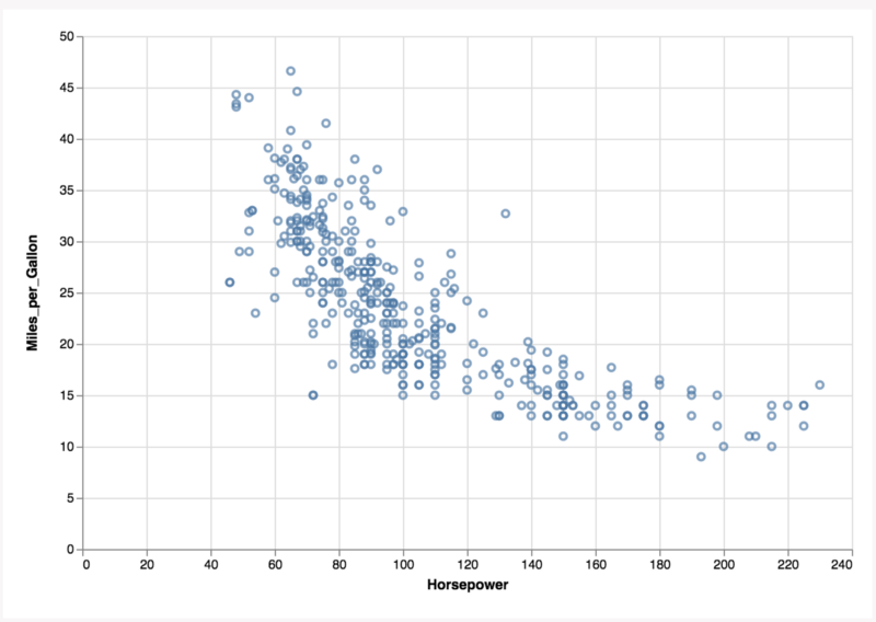
Looking at the chart above, what do we see? Circles offset in the viewport based on fields present in the data.
What else?
- Ticks offset along the bottom based on a field in the data.
- Text labels offset along the bottom based on a field in the data.
- Same as above along the left side of the chart.
Let’s break it down to the level of geometries.
How do we render the circles in the scatterplot?
<circle cx=”horsepowerScale()” cy=”milesPerGallonScale()” cr=”const” />
What about the axes? X-Axes: Text + Ticks
<text x=”horsepowerScale()” y=”0”>{{ text value }}</text>
<tick x=”horsepwerScale()” y=”0” />
There is a similar SVG structure for the y-axis, except that the scale function changes and the x, y fields are inverted.
The common theme above is that the chart is viewed as a meaningful arrangement of geometry:
- each geometry in the SVG namespace exposes visual attributes
- the value of these attributes is bound to a calculated value
- the calculated value depends on the scale
- the scale depends on a field in the data and the range
What is a scale?
A scale is a function that maps data to a position in the viewport.
What is the input to scale?
- the domain of the field
- the length of the viewport to map to
Let R be the length of viewport and D be the domain of the data.
- Then we can define a scaling function S as:
- S = f(D, R) + b
where b is a constant.
How many scales does a chart need to have?
If you’re thinking two, then you’re wrong.
Scale doesn’t exist only along x- and y-axes. The axes themselves are only present in a chart as visual anchors so that users can line up data variations along multiple dimensions.
The axis is just geometry that is rendered using a scale.
How many dimensions are there?
It’s not two. The viewport is two-dimensional but that has nothing to do with the dimensionality of the chart. The dimensionality of a chart is defined by the number of scaling functions used.
The overarching concept comprises of two simple terms: Geometry and Scale.
Each geometry exposes visual attributes that control its appearance.
The value of these attributes can be hooked up to scaling functions. The scaling function is tied to a particular field in the data.
This lends itself to the idea that every visual attribute in a chart can only be tied to one field in the data table.
Given this decomposition of charts we can model the scatter plot above as follows:
The field Horsepower is used to create a scaling function called horsepowerScale().
The field Acceleration is used to create a scaling function called accelerationScale().
Since we are not varying the size of the circles, only two scaling functions are required.
Any circle i in the scatterplot can be represented as
<circle cx="horsepowerScale(ti)" cy="accelerationScale(ti)" cr="5" />
where ti is the ith tuple in the Datatable.
Given that only two scaling functions were used, the dimensionality of the above chart becomes two.
If we also modulated the size of each circle, using a scaling function tied to another field, then the dimensionality would be three.
Doing so would result in what is known as a “bubble chart”.
Grammar of Graphics
This is similar to the Grammar of Graphics (GOG) approach, where every chart is defined by a mark (geometry) and the visual encodings used by the mark.
In a GOG approach the scatterplot would be represented as:
{ mark: 'circle', encoding: { x: 'horsepower', y: 'acceleration' }}Notice that there is a one-to-one mapping between the encoding of a GOG geometry and the visual attributes exposed by the geometry in SVG.
The axis can also be rendered similarly:
- The x-axis is a tick geometry with its x-offset attribute tied to
horsepowerScale()and its y-offset set to 0. - The y-axis is a tick geometry with its y-offset attribute tied to
accelerationScale()and its x-offset set to 0.
To render the scatterplot with all its elements, the following snippet of code would suffice:
Decomposition of charts into an association between visual attributes and a scaling function allows us to view a chart as a web app.
Web Application frameworks model UI as a function of state.
Charts Frameworks should model geometry as a function of scale.
So the idea that makes web applications easy to develop can easily be extended to creating charts:
- Initially, tabular data is supplied as input.
- For every field in the Data array, a scaling function is created. The scaling function selectively recomputes values when a field in the column is tied to changes. The same scaling function is percolated throughout the application.
- Every geometry is modelled as a component that exposes visual attributes.
- The value of these visual attributes is tied to a scaling function that reacts to changes in data.
- The collections of geometry can be represented in markup using a templating engine of choice like hyperHTML, mustache, or handlebars. Ideally, the templating engine should be introduced as a plugin so that we can avoid writing bindings for different libraries like React and Angular.
- The state store that selectively computes scales should also be introduced as a plugin.
Let’s see what putting a chart together using the above principles would look like:
We are using React as a templating engine and Redux as the state store in the above example.
The above approach is just a rough implementation of what a framework that can model charts as webapps would would like like.
Notice the separation of the templating engine and state store from the actual rendering logic.
Final points
Ideally, geometries/charts that we create should be available as components in the framework of the user’s choice along with their state store. If it seems unthinkable that something like this could even be done, stay calm. It’s been done before.
SkateJS is a compiler that creates web components but allows user to switch internal rendering engines.
Users can choose between React, Preact, lit-html or extend the Renderer interface to write their own. The default renderer just mutates the DOM directly.
We can be even more ambitious with what we choose once we have synchronous rendering coupled with state management.
Imagine a TickProvider component that allows for rendering only small clusters of geometry in a given animation frame as well as allowing us to identify bottlenecks in our rendering pipeline.
Given that a chart is meaningful arrangement of geometry, it follows that meaningful clusters of geometry should render together.
In the scatter plot example, for every group of circles that render, the corresponding sections of the x/y axis geometry should also render simultaneously.
If we break the rendering into chunks, where each chunk consists of one meaningful cluster of geometry as modelled above, we can support beautiful transitions that add to the visual appeal of the chart.
Another advantage of a TickProvider is that we can profile and ensure that each cluster of geometry renders completely in the time allotted per tick. This will help avoid freezing of the UI when the geometry count to be rendered is very large. Instead of running a render loop over the entire geometry collection, we could batch the render calls in sync with the animation frames.
We can also break down the calculation of visual attribute values.
Consider a data table that has N fields being used to render dashboards with the above approach.
Since we are using a centralised state store, we can calculate the values of the N scaling function and memorize them. They only need to be re-calculated when the associated data table field changes.
Also, consider the equation below that computes the value of m visual attributes based on the scaling functions.
The 0th value for a visual attribute V, that is bound to field 0 of N, can be calculated as follows:
V(0) = S(d0, R) + b0
- where d0 is the 0th data tuple from the data table
- R is the range supplied as a prop to the component
- b0 is constant
If we write a series of such equations together we see this:
V(0) = S(d0, R) + b0
V(1) = S(d1, R) + b1
V(2) = S(d2, R) + b2
..
V(m) = S(dm, R) + bm
The scaling function itself can be expressed as a linear equation. We have a set of linear equations that can be batch computed to calculate the value for visual attributes.
How so?
The above arrangement looks suspiciously like a matrix.
Computations in the browser are slow, but matrix computations can be sped up by leveraging GPU acceleration.
Modelling the chart as geometry as a function of scale could therefore help us render charts much faster, as well handle larger volumes of data with a fast first render.
Data Visualisation is something that help us glean insights from large quantities of data. The impact that it has on decision making is slowly going up with multiple organisations looking to make data driven decisions.
Safe to say, we need a more robust, accessible and maintainable way of developing visualisations.
What do you think?