by Irene Kuo
Guerrilla Usability Testing the New Experiences Feature on Airbnb’s iOS App

Airbnb recently came out with Experiences, which are activities designed and led by hosts. I encountered some problems when using the newly redesigned app, so I conducted a usability test to:
- See if other users were experiencing similar issues
- Identify user pain points / priorities and
- Make the user experience more frictionless and intuitive.
The current layout is great for when a user first heads to a new city — the variety of options are all laid out. But it’s not as great for when users want to search for something more specific.
Note that I conducted this usability test in early January of 2017, so it doesn’t reflect changes introduced after that.
Objective
To run a guerrilla usability test to answer the question: Can users easily search for and book a specific experience (non-random browsing) through Airbnb’s mobile app?
Target Users
I interviewed both high-frequency and low-frequency travelers to get a sense of the behavioral differences between each group. How would a traveler who is more familiar with a range of spontaneous, exploratory experiences act compared to a low-frequency traveler whose idea of experiences might consist of booking traditional tour guides for mainstream sightseeing? I also made sure interviewees had a range of technical experience, from basic to advanced proficiency.
Although travelers aged 25 to 34 are the largest demographic of Airbnb’s users, senior women are Airbnb’s largest growing segment of hosts. Including those that can be considered extreme users into the usability test helped me design for their amplified needs, which often include the needs of average users.
I tested 7 users that I approached in coffee shops and public parks. The focused scope of the study allowed me to iterate through the design cycle with a small sample size.
Tasks
I gave the users contextual scenarios and asked them to think-aloud* while they completed four tasks:
- Scenario: Let’s say you just landed in Los Angeles for the week and you wanted to book a yoga class for tomorrow. What would you do now?
- Scenario: You’re planning a trip to Tokyo the 2nd week of October. How would you book a cooking class experience over a couple of days?
- Task: Look for reviews.
- Task: Book an experience.
* I demonstrated a quick think-aloud session to show participants what was expected of them. I tried to incorporate instances in which I would be confused while using my chosen app to encourage users to share their unfiltered thought process.
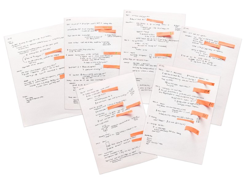
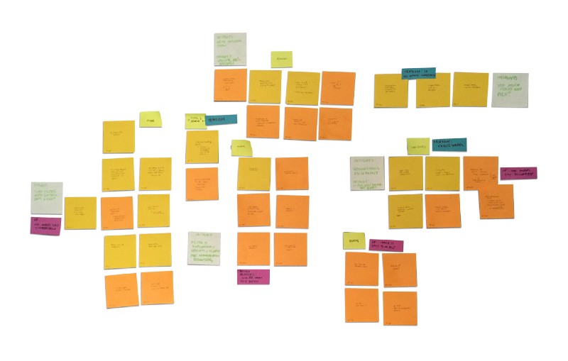
Synthesizing Notes
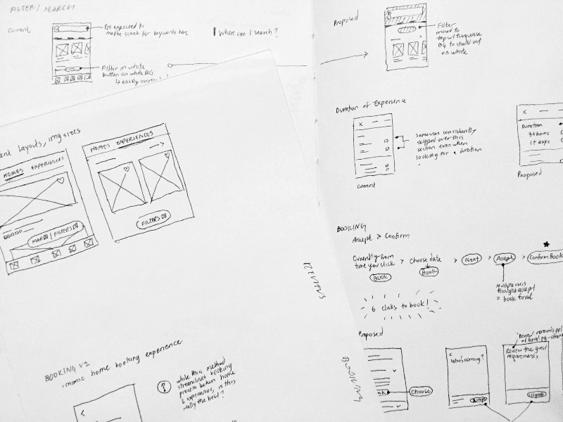
To synthesize my research, I wrote the key points from the interviews onto post-its and grouped them together by themes. Using Stanford d.school’s sense-making framework, I noted tensions and relevant design principles, then derived insights using the “I noticed, I wonder” structure to brainstorm ideas to combat these pain points.
Key Findings
My research revealed 3 key findings:
1. Search bar confusion & overlooked filter button
“Where do I search?”
All the users I interviewed attempted to use the top search bar to look for a specific experience.
“Am I just going to have to scroll through everything?”
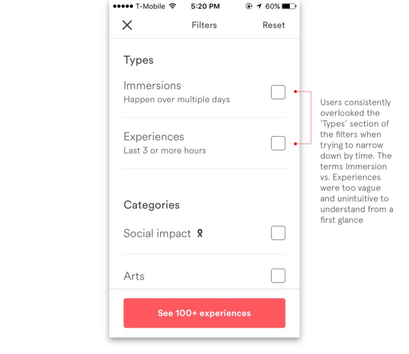
After users tried to search for an experience by typing a specific word or phrase into the search bar where the location & date are usually inputted, they wouldn’t know how to narrow down the results further because they often overlooked the filter button. Even users who had prior experience with Airbnb’s app didn’t see it when they were directly looking for a filter option.
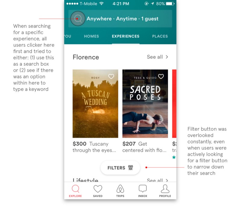
When I asked users to filter down according to how long an experience would last, the majority scrolled past the time filter in the filter options.
2. Reviews
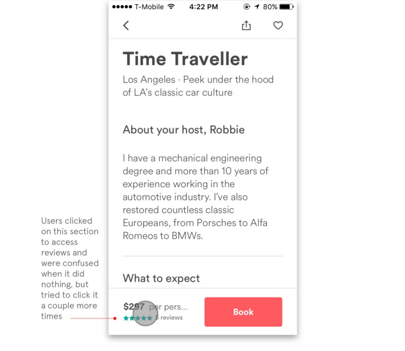
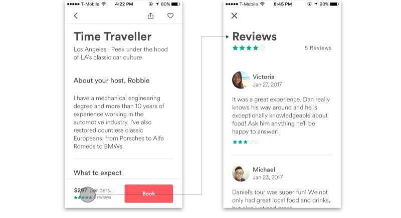
“Is clicking this supposed to work?”
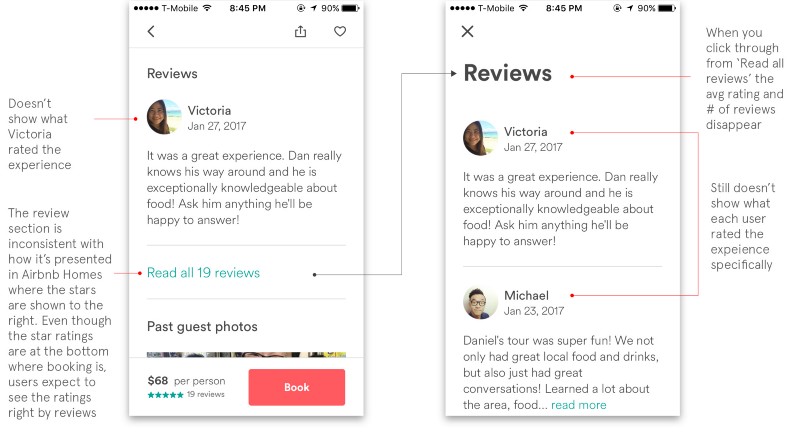
Users intuitively tried to click the bottom bar where the stars are to access reviews.
“What did each person rate?”
3. Booking
“Oh no!!! Did I book it?”
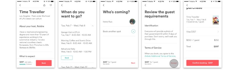
From the time users click ‘Book,’ users must click a minimum of 5 times to finalize booking. Users thought that clicking ACCEPT meant that they booked the experience.
Ideate & Prototype Solutions
After highlighting the primary pain points, I began brainstorming possible solutions through sketching before I moved on to wireframing and creating high-res mockups.
1. Search and filter
Upon reviewing my findings, the lack of a search bar was the most common friction point that also induced the most negative emotional feedback. 100% of users looking for a specific experience in a new city intuitively looked for a search bar to type into.
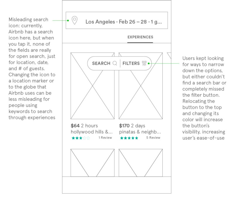
Instead of creating an independent search bar, the search + filter button was modeled after the Airbnb Home’s filter + map button to keep the two-function consistency.
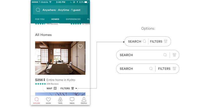
Although the second and third options would minimize user clicks by letting them automatically type in the search bar, I wanted the button to be secondary to the input bar at the top to prioritize the entry for location, date, and the number of guests.
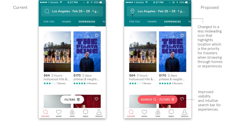
After creating a mock-up based on the wireframe, which has the search+filter button at the top, I realized that placing the search + filter at the top blocked the add-to-wishlist heart icon for the first experience. The proposed solution below moves the button back down to where it originally was but still emphasizes it through color. My suggestions can be expanded across the mobile app for a consistent experience.
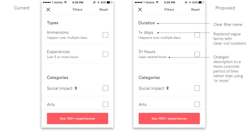
1b. Filter for duration
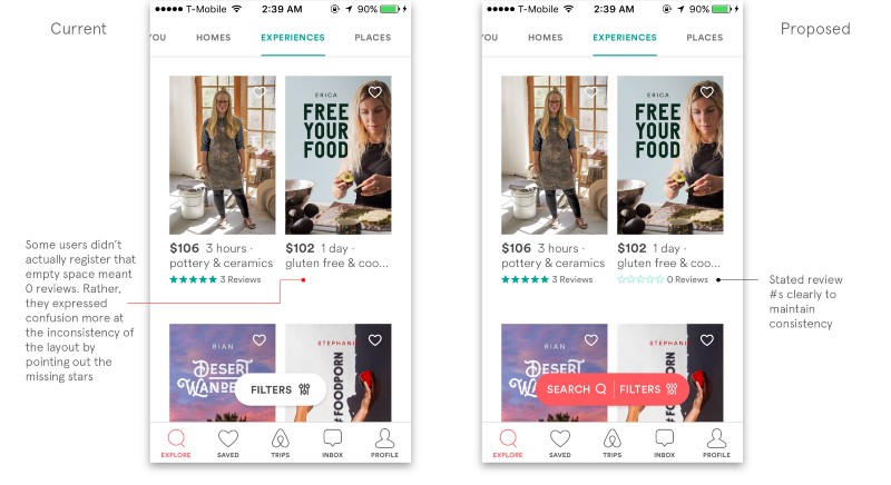
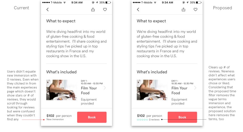
The time filters were often overlooked. The whole host-guided experiences are all categorized under the tab “Experiences.” Understandably, users did not immediately discern that there was another category of guided tours (Immersions). To combat the ambiguity of the first terms that users see in the filters (Immersion vs. Experience), the proposed solution:
- …forgoes the vague terms altogether for clearer distinctions between experiences that span hours vs. days.
- …replaces the word “Types” with “Duration” to clarify that this filter is about time / how long the experience will last.
2. Reviews
Users wanted to know what each specific person rated the experience.
Users have both ratings as a guest and host (if they are a host). Given that there has been confusion in the Airbnb community about the separation of guest / host ratings in Homes, I wanted to make sure that the confusion didn’t carry over to the experience / host / guest ratings. In my design, I had to be careful to clarify that the rating left by each guest who went through the experience was for the experience and NOT the overall rating of the guests themselves.
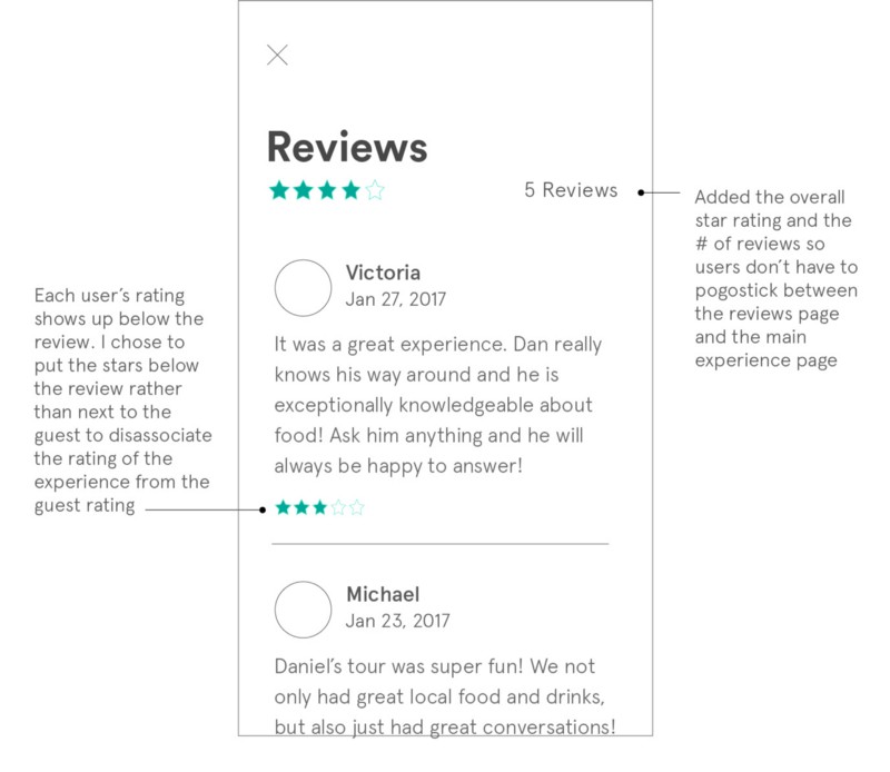
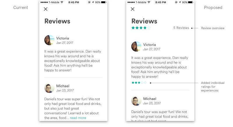
All users tested expected to click the stars on the bottom to read reviews so the flow should meet user expectations:
Users were also confused when looking at new experiences because it wasn’t explicitly mentioned that there were 0 reviews. However, they would still try to look for a review section.
3. Booking
I noticed that the booking process for experiences vs. homes are different. Compared to the 5 step minimum booking process for experiences, home booking shows all the steps on one page, as seen below:
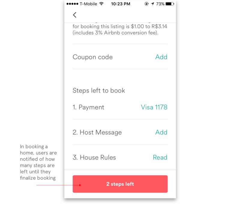
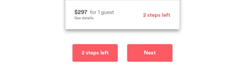
To clarify the current experience booking process, I took a page from the ‘steps left’ indicator in homes. Because the experience booking isn’t all on one page, users don’t really know when it stops. The words ‘next’ or ‘accept’ led users to believe that they had falsely confirmed the booking.
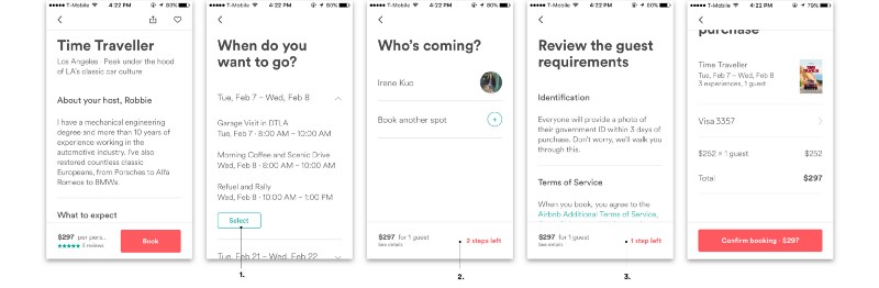
- Changed the word from “book” to “select” because the word “book” makes people think of the last step
- Changed “next” to “2 steps left” so users know where they are in the process
- Originally, the word “accept” made users think that clicking it would finalize their booking. It was changed to ‘1 step left’ to remove user apprehension of clicking to the next page
Edit: A suggestion in the comments makes a very valid point: the 2 steps left doesn’t look like a clickable button, so users might get confused about what to do next. My improvement would be to use a button to indicate the next action item, either with the words ‘2 steps left’ or ‘next,’ although 2 steps left would give users a better marker for where they are in the booking process.
Validating Solutions
To validate my solutions, I printed out paper prototypes and asked 7 users (4 from initial study) to complete the tasks again, this time with much less friction. Although I couldn’t actually see how a search bar would actually work within Airbnb’s system, users experienced much less confusion.
A comment below from Bac Le suggested that my solution in the booking process could create confusion because the ‘2 steps left’ doesn’t look like a clickable button. This just goes to show that I need to validate with more users.
However, during my validation process, I noticed that there was an unconscious friction point while navigating through the whole app. By that, I mean that users experienced difficulty but remained neutral and disregarded the pain point. First, the app uses both left-right and up-down scrolling. For example, when browsing homes, users scroll by up-down but in Experiences, if users don’t input a location, the scrolling is both right-left AND up-down which turns into ONLY up-down once a location is inputted. Second, the image sizes for homes, experiences, and places are all different, making the experience inconsistent. This issue was also present in my original study, but was outside the scope of non-random browsing in Experiences. This could be another study in the future.
Conclusion
Thanks for reading! This is a self-initiated UX Research and Design project and I am in no way affiliated with Airbnb. I wanted to solve problems that I was running in to when I browsed their new Experiences section. I would LOVE x 10000 to hear your feedback!
I’m currently studying Design Leadership MA/MBA at Johns Hopkins University and the Maryland Institute College of Art. Find me at irenekuo.com