by Scott Domes
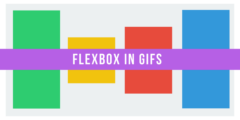
How Flexbox works — explained with big, colorful, animated gifs

Flexbox promises to save us from the evils of plain CSS (like vertical alignment).
Well, Flexbox does deliver on that goal. But mastering its new mental model can be challenging.
So let’s take an animated look at how Flexbox works, so we can use it to build better layouts.
Flexbox’s underlying principle is to make layouts flexible and intuitive.
To accomplish this, it lets containers decide for themselves how to evenly distribute their children — including their size and the space between them.
This all sounds good in principle. But let’s see what it looks like in practice.
In this article, we’ll dive into the 5 most common Flexbox properties. We’ll explore what they do, how you can use them, and what their results will actually look like.
Property #1: Display: Flex
Here’s our example webpage:
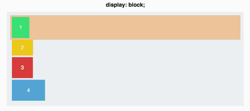
You have four colored divs of various sizes, held within a grey container div. As of now, each div has defaulted to display: block. Each square thus takes up the full width of its line.
In order to get started with Flexbox, you need to make your container into a flex container. This is as easy as:
#container { display: flex;}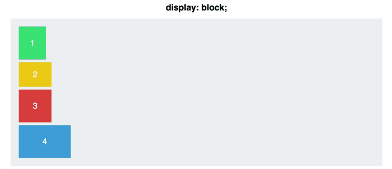
Not a lot has changed — your divs are displayed inline now, but that’s about it. But behind the scenes, you’ve done something powerful. You gave your squares something called a flex context.
You can now start to position them within that context, with far less difficulty than traditional CSS.
Property #2: Flex Direction
A Flexbox container has two axes: a main axis and a cross axis, which default to looking like this:
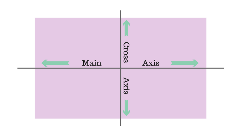
By default, items are arranged along the main axis, from left to right. This is why your squares defaulted to a horizontal line once you applied display: flex.
Flex-direction, however, let’s you rotate the main axis.
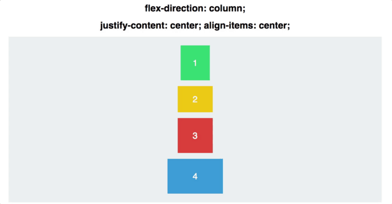
#container { display: flex; flex-direction: column;}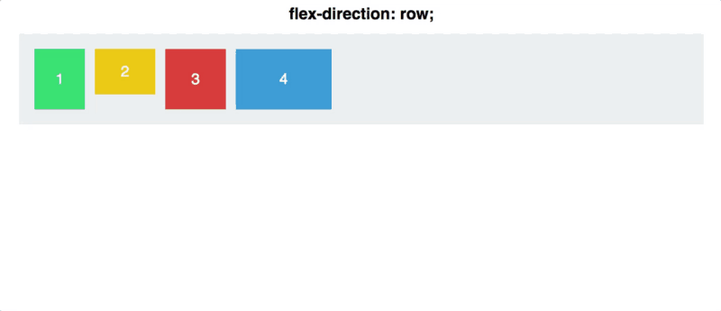
There’s an important distinction to make here: flex-direction: column doesn’t align the squares on the cross axis instead of the main axis. It makes the main axis itself go from horizontal to vertical.
There are a couple of other options for flex-direction, as well: row-reverse and column-reverse.

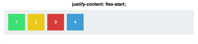
Property #3: Justify Content
Justify-content controls how you align items on the main axis.
Here, you’ll dive a bit deeper into the main/cross axis distinction. First, let’s go back to flex-direction: row.
#container { display: flex; flex-direction: row; justify-content: flex-start;}You have five commands at your disposal to use justify-content:
- Flex-start
- Flex-end
- Center
- Space-between
- Space-around
Space-around and space-between are the least intuitive. Space-between gives equal space between each square, but not between it and the container.
Space-around puts an equal cushion of space on either side of the square — which means the space between the outermost squares and the container is half as much as the space between two squares (each square contributing a non-overlapping equal amount of margin, thus doubling the space).
A final note: remember that justify-content works along the main-axis, and flex-direction switches the main-axis. This will be important as you move to…
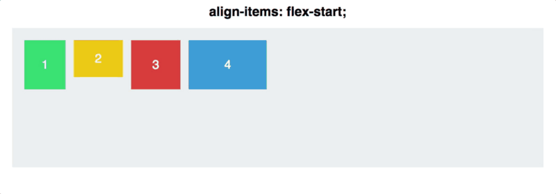
Property #4: Align Items
If you ‘get’ justify-content, align-items will be a breeze.
As justify-content works along the main axis, align-items applies to the cross axis.

Let’s reset our flex-direction to row, so our axes look the same as the above image.
Then, let’s dive into the align-items commands.
- flex-start
- flex-end
- center
- stretch
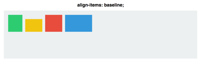
- baseline
The first three are exactly the same as justify-content, so nothing too fancy here.
The next two are a bit different, however.
You have stretch, in which the items take up the entirety of the cross-axis, and baseline, in which the bottom of the paragraph tags are aligned.
(Note that for align-items: stretch, I had to set the height of the squares to auto. Otherwise the height property would override the stretch.)
For baseline, be aware that if you take away the paragraph tags, it aligns the bottom of the squares instead, like so:
To demonstrate the main and cross axes better, let’s combine justify-content and align-items and see how centering works different for the two flex-direction commands:
With row, the squares are set up along a horizontal main axis. With column, they fall along a vertical main axis.
Even if the squares are centered both vertically and horizontally in both cases, the two are not interchangeable!
Property #5: Align Self
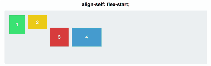
Align-self allows you to manually manipulate the alignment of one particular element.
It’s basically overriding align-items for one square. All the properties are the same, though it defaults to auto, in which it follows the align-items of the container.
#container { align-items: flex-start;}.square#one { align-self: center;}// Only this square will be centered.Let’s see what this looks like. You’ll apply align-self to two squares, and for the rest apply align-items: center and flex-direction: row.
Conclusion
Even though we’ve just scratched the surface of Flexbox, these commands should be enough for you to handle most basic alignments — and to vertically align to your heart’s content.
If you want to see more GIF Flexbox tutorials, or if this tutorial was helpful to you, hit the green heart below or leave a comment.
Thanks for reading!