
by Praveen Dubey
An introduction to plotly.js — an open source graphing library

Plotly.js is a library ideally suited for JavaScript applications which make use of graphs and charts. There are a few reasons to consider using it for your next data visualization project:
- Plotly.js uses both D3.js (SVG) and WebGL for graphics rendering
- Plotly.js is an “all-in-one bundle” with d3.js and stack.gl modules
- It works with JSON schema
- Plotly.js supports basic, statistical, scientific, financial and map charts.
Also, more than 9000 stars on its open source Github is a strong indicator for its community growth.
Usage and Examples
Let’s looks at setup and few examples for better and practical understanding.
First, include the file from its CDN.
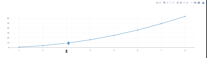
<head><!-- Include Plotly.js --><script src="https://cdn.plot.ly/plotly-latest.min.js"></script></head>Next, let’s plot a small graph which shows the numbers and their squares:
The code to generate this graph is below:
<head> <!-- Include Plotly.js --> <script src="https://cdn.plot.ly/plotly-latest.min.js"></script></head><body> <div id="myDiv"> <!-- Plotly chart will be drawn inside this DIV --> </div><script> var trace = { x: [1, 2, 3, 4, 5, 6, 7, 8], y: [1, 4, 9, 16, 25, 36, 49, 64], mode: 'line' };var data = [ trace ]; Plotly.newPlot('myDiv', data);</script></body>Basic setup can be done with a file inclusion, a DOM element, and a script for plotting.
After the inclusion of the Plotly.js library in <head>, we have defined an empty <div> to plot the graph.
Plotly.new() draws a new plot in the<div> element, overwriting any existing plot and in this case we used myDiv. The input will be a <div> element and some data.
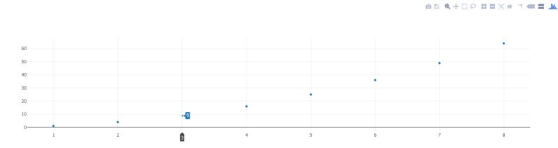
Notice the inclusion of mode in the trace variable. It can be any combination of "lines", "markers", "text" joined with a "+" OR "none".
Examples include "lines", "markers", "lines+markers", "lines+markers+text", "none".
Here we have used markers. Notice that you only get points marked in the graph coordinates and do not see the connected line across all points.
Plot multiple lines now just by adding values to the data variable:
<head> <!-- Include Plotly.js --> <script src="https://cdn.plot.ly/plotly-latest.min.js"></script></head><body> <div id="myDiv"> <!-- Plotly chart will be drawn inside this DIV --></div> <script> var trace1 = { x: [1, 2, 3, 4], y: [10, 15, 13, 17], mode: 'lines', type: 'scatter' };var trace2 = { x: [2, 3, 4, 5], y: [16, 5, 11, 9], mode: 'marker', type: 'scatter' };var trace3 = { x: [1, 2, 3, 4], y: [12, 9, 15, 12], mode: 'lines+markers', type: 'scatter' };var data = [trace1, trace2, trace3];Plotly.newPlot('myDiv', data); </script></body>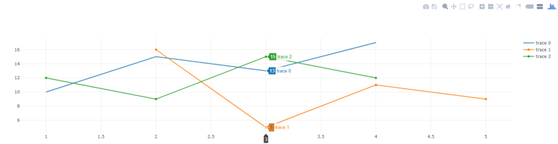
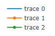
The legend in a graph is linked to the data being graphically displayed in the plot area of the chart.
As of now we don’t have any labels, and the legend looks like:
Let’s update them by using options such as text,textfont ,textpostion for customization of our data labels. These should be passed with individual data sets.
<head> <!-- Include Plotly.js --> <script src="https://cdn.plot.ly/plotly-latest.min.js"></script></head><body> <div id="myDiv"><!-- Plotly chart will be drawn inside this DIV --></div> <script> var trace1 = { x: [1, 2, 3, 4, 5], y: [100, 60, 30, 60, 10], mode: 'lines+markers+text', type: 'scatter', name: 'Beta', text: ['Mobile A', 'Mobile B', 'Mobile C', 'Mobile D', 'Mobile E'], textposition: 'top center', textfont: { family: 'Raleway, sans-serif' }, marker: { size: 12 } };var trace2 = { x: [1.5, 2.5, 3.5, 4.5, 5.5], y: [100, 10, 70, 150, 40], mode: 'lines+markers+text', type: 'scatter', name: 'Alpha', text: ['Product A', 'Product B', 'Product C', 'Product D', 'Product E'], textfont : { family:'Times New Roman' }, textposition: 'bottom center', marker: { size: 12 } };var data = [ trace1, trace2 ];var layout = { xaxis: { range: [ 0.75, 5.25 ] }, yaxis: { range: [0, 200] }, legend: { y: 0.5, yref: 'paper', font: { family: 'Arial, sans-serif', size: 20, color: 'black', } }, title:'Data Labels on the Plot' };Plotly.newPlot('myDiv', data, layout); </script></body>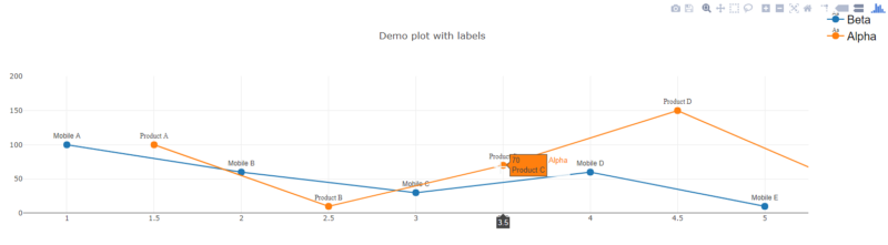
The layout of other visual attributes such as the title and annotations will be defined in an object usually called layout.
By now we have seen some examples of line, let’s quickly plot a bar chart using 'bar' as type.
var data = [{ x: ['Company X', 'Company Y', 'Company Z'], y: [200, 140, 230], type: 'bar'}];Plotly.newPlot('myDiv', data);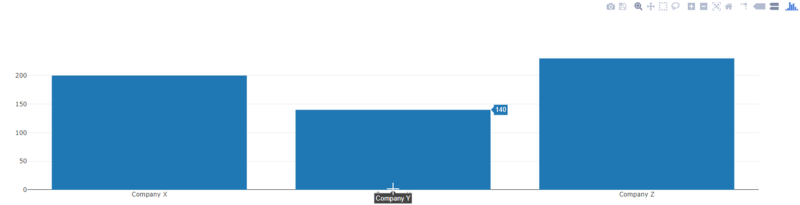
You can also change the type in the above data shown for products and mobile by changing scatter to bar.
var trace = { x: [1.5, 2.5, 3.5, 4.5, 5.5], y: [100, 10, 70, 150, 40], mode: 'lines+markers+text', type: 'bar', name: 'Alpha', text: ['Product A', 'Product B', 'Product C', 'Product D', 'Product E'], textfont : { family:'Times New Roman' }, textposition: 'top', marker: { size: 12 } };Here is one example which changes the opacity of bar:
var trace2 = { x: ['Alpha', 'Beta', 'Gamma'], y: [100, 200, 500], type: 'bar', name: 'Opacity Example', marker: { color: 'rgb(204,204,204)', opacity: 0.5 }};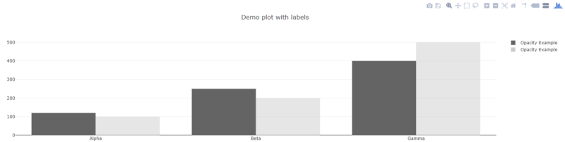
We have created some basic scatter charts and talked about few options which can be easily tweaked to get different variations of the same chart.
Let’s continue by plotting a meteor dataset using only few lines of code.
I am using dataset from bcdunbar’s github and will try to break down entire process into multiple steps.
Let’s get started.
Step 1. Initial Setup
Add plotly.js in your HTML file. This includes the JavaScript file, empty div element and placeholder for scripts.
<html><head> <!-- Include Plotly.js file from CDN --> <script src="https://cdn.plot.ly/plotly-latest.min.js"></script></head><body><!-- DIV will be used for charts --><div id="mapDiv"></div> <script> // JS code for plot </script></div></body></html>Step 2. Dataset
Since our dataset is in CSV format, we can use Plotly.d3.csv. It internally reads the CSV data from an AJAX call.
Wrapper code for plotting:
Plotly.d3.csv('https://raw.githubusercontent.com/bcdunbar/datasets/master/meteorites_subset.csv', function(err, rows){Plotly.plot('mapDiv', data, layout);});Step 3. Access Token
Get the Mapbox access token we would be using from here.
Plotly.plot needs two main things: data and layout which defines what type of data will be used and how it should be plotted on screen.
Step 4. Map Layout
var layout = { title: 'Demonstration of Meteorite Landing using Plotly.js', font: { color: 'white' }, dragmode: 'zoom', mapbox: { center: { lat: 38.03697222, lon: -90.70916722 }, style: 'light', zoom: 2 }, paper_bgcolor: '#191A1A', plot_bgcolor: '#191A1A', showlegend: true, annotations: [{ x: 0, y: 0, text: 'NASA', showarrow: false }]};Notice that we are using mapbox to define all map configs including center, zoom level, color and legends.
Next add the token we created in Step 3 by using:
Plotly.setPlotConfig({ mapboxAccessToken: 'your token here'});Step 5. Process Data
Last thing we need is to add our data object from the source CSV:
var classArray = unpack(rows, 'class'); var classes = [...new Set(classArray)];function unpack(rows, key) { return rows.map(function(row) { return row[key]; }); }var data = classes.map(function(classes) { var rowsFiltered = rows.filter(function(row) { return (row.class === classes); }); return { type: 'scattermapbox', name: classes, lat: unpack(rowsFiltered, 'reclat'), lon: unpack(rowsFiltered, 'reclong') }; });Now we have data, layout, token and map… Here’s the end result:
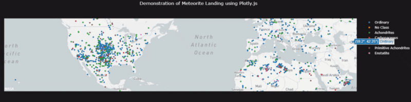
This was a plotting demonstration with step by step approach on plotting a map dataset using plotly.js. You can find a lot of examples on the Plotly documentation to get started with.
Hope this gave you a good introduction to Plotly js.
Make sure to drop your feedback below, and code for this can be found on my Github.