
by Sibylle Sehl
An introduction to Web Performance and the Critical Rendering Path

Most of us work with the web every day. It’s become normal for us to get all the information we need delivered to us almost instantly. But how that web page is actually put together and delivered to us is a bit of a mystery.
Sometimes web pages are amazingly fast, and sometimes we need to wait a long time to see the content — often resulting in us being rather frustrated and abandoning the page. In the following article, I’ll try to clear things up a bit.
Disclaimer: All the information I’m sharing in this post is what I’ve learned through the free courses mentioned at the bottom and summarised here for anyone interested.
The Critical Rendering Path
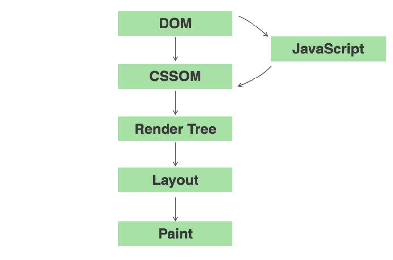
First of all, it would be useful to understand the steps the browser is actually going through. It starts with plain HTML, CSS, and JavaScript files goes through rendering and painting a page, and arrives in the end to become what the user sees.
These steps from your different HTML, CSS, and JS files to a painted page are commonly referred to as the Critical Rendering Path (or CRP for short).
The Critical Rendering Path consists of five different steps, which are best explained in a graphic.
Building up the DOM and the CSSOM
Most web pages consist of HTML, CSS, and JavaScript, which all form a critical part in the CRP. In order to read and process your HTML, the browser will construct the Document Object Model (DOM). The browser is looking at the HTML tags (<p>, </p>, <h1> and </h1> etc) in your markup and converts them into tokens which in turn are created into nodes in parallel. By processing these StartTag tokens and EndTag tokes in order, and seeing which come first, the browser can establish their hierarchy and establish parents and children.
Don’t let this terminology scare you, though. Imagine the DOM as a big tree with branches which represent parent nodes, and that in turn contain leaves, the child nodes. This tree will represent the dependencies of nodes in our HTML and looks somewhat similar to this:
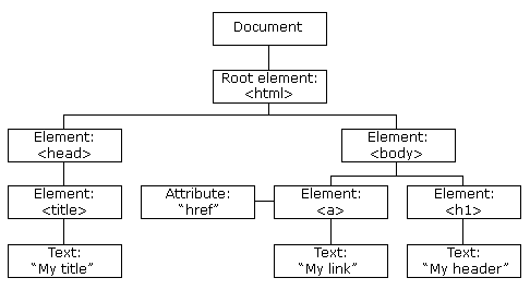
In the image above, we can see the root element that encompasses all its children which in turn are parents that contain children as well. Put that upside down and it will look almost like a tree!
The DOM thus represents our complete HTML markup. As you saw, it is built up incrementally by processing the tokens and converting them into nodes. In fact, we can use that to our advantage by returning partial HTML and giving our user the indication that something is happening and rendering on the page.
After constructing the DOM, your browser will process the CSS and build the CSS Object Model (CSSOM). This process is very similar to building the DOM. But in this process, as opposed to before, the child nodes inherit their parent nodes’ styling rules — hence the name Cascading Style Sheets (CSS).
Unfortunately, we can’t incrementally process partial CSS like we could with the DOM, as it could easily lead to applying the wrong styles if an overriding style comes later in the process. This is the reason why CSS is render blocking, as the browser needs to stop rendering until it receives and processes all the CSS.
Our DOM tree and CSSOM tree will contain all the nodes and dependencies that we have in our page.
Collating all the visible content — The Render Tree
The browser needs to know which nodes to actually visually represent on the page. The Render Tree achieves exactly that, and is a representation of the visible content of the DOM and CSSOM.
We start constructing the Render Tree by identifying the root node and then copying all the visible information from the DOM and CSSOM. For this we also check that we search for tags that have the same selector. Meta data, links, and so on are not copied into the render tree. The same applies for CSS that contains “display: none;” as it is also a non-visible item.
Once we complete this process, we get something similar to the below (notice how ‘web performance’ is not copied over).
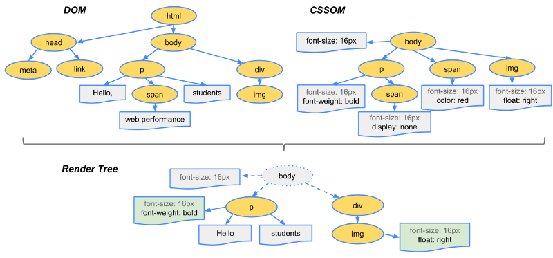
The Render Tree is a pretty accurate description of what’s actually being displayed to you on the screen, capturing both content and associated styles. Of course, this would look a lot more complex in real life examples.
Making it fit right — Layout
While we now know what we need to display and render to the page, it is important to know how it is rendered. For the layout to look correct, we need to know the size of the browser. Our layout depends on it to calculate the correct positions and dimensions for all our elements on the page.
All of this happens during the Layout step. Taking the Layout step into account is especially important for mobile, where our viewpoint can change when we switch between landscape and portrait when we rotate our phones. This means that the browser would need to rerun the layout step every time we turned our phone which could be quite a performance bottleneck.
Paint the Pixels
This step involves actually painting the pixels to the screen, specified by what (Render Tree) and how (Layout). The painting step includes the actual painting of pixels (for example, when resizing an image) as opposed to just positioning it. It’s what you ultimately see on your screen afterwards.

Let’s summarise
Now let’s put all this information together again so that we can see that we grasped all the steps we must go through in the Critical Rendering Path (CRP).
- The browser starts off by constructing the DOM by parsing all the relevant HTML.
- It then proceeds to look at the CSS and JavaScript resources and requests them, which is happening usually in the head where we commonly put our external links.
- The browser then parses the CSS and constructs the CSSOM followed by running the JavaScript.
- Then the DOM and CSSOM are being merged together into the Render Tree.
- We then run the Layout and Painting step to present the page to the user.
Okay, that’s good to know — but why does it matter?
Now this is all neat to know, and we have gained a better understanding of what the browser is actually doing in the background. But why does it matter exactly? Do we all need to know what happens under the hood?
Yes, we do!
If we keep increasing the size of our files and do not pay attention to what we’re asking the browser to render and paint to the page, the browser will need longer to process all the resources. This usually results in a slower and less enjoyable user experience, meaning that pages won’t be usable and rendered correctly leading to frustration on the user’s side.
This is especially true if you request a page from a rural area where fast broadband isn’t necessarily the best.
But luckily, there’s a few ways around this and we can make our pages faster!

Optimising performance
There are a number of strategies we can leverage to make our pages faster and better to use for our users. This is especially important for users that might be in more remote locations where faster internet is not the norm or where pages are commonly accessed through mobile internet.
When we speak of optimisation strategies, we roughly have three techniques at our disposal.
Minifying, Compressing, and Caching
These techniques can all be applied to our HTML, CSS, and JS. Then, through their smaller size, they will reduce the amount of data that we send back and forth between the client and the server. The fewer bytes we have to send, the faster the browser will get the data and start processing and rendering the page.
Minimise the use of render-blocking resources (CSS)
CSS itself is render blocking as we discussed above, meaning that the browser will stop rendering the page until the CSS has completely loaded and is processed.
We can mitigate for large CSS files, though, by unblocking the rendering for certain styles and viewports. We do this by using print rules in our media queries, analytics, and device orientation (if you want to know how, I suggest you check out the resources below). We can furthermore reduce the number of resources needing to be loaded by inlining some our CSS in certain circumstances.
Minimise the use of parser-blocking resources (JS document parser)
We can also defer the execution of our JavaScript and use async attributes on our script to achieve this. This means that the rest of the page can process, and in the meantime the user sees an indication that something is happening on the page. It also means that we don’t need to wait for the JavaScript to load.
So broadly speaking, that leaves us with 3 optimisation patterns:
- Minimise the number of bytes you send
- Reduce the number of critical resources in the critical rendering path (analytics might not have to be loaded at the very start when the page is built)
- Shorten the critical rendering path length (meaning reducing the amount of roundtrips between your browser and the server that we need to render the page)
Try it yourself
If you’re keen to give this a try and start optimising, you can measure the performance of your website or others with a number of tools. The easiest are probably Google Products like PageSpeedInsights or Google Lighthouse, a handy little Google Chrome extension you can easily install through the Chrome App Store.
Just click the extension and then generate report and you get a report that includes the following:
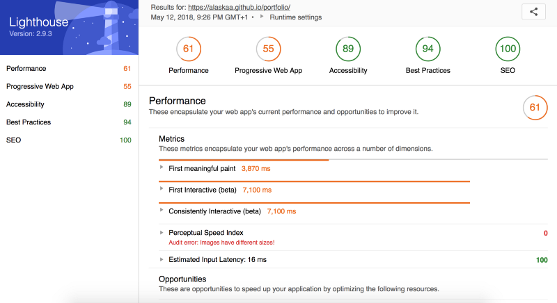
You can then compare your performance against a number of metrics, such as First Pixel Painted to the Screen, First Interactive, Visual Completeness of your site, and many others.
Your favourite browser’s Dev Tools are also a great place to look in terms of figuring out load times and performance bottlenecks. Keeping overall load times low will most definitely increase the overall speed at which your site is served to your end users.
Conclusion
Hopefully this has shed some light into the inner workings of how your browser displays a page to you and the heavy work it needs to complete in the background to make sure your HTML, CSS and JavaScript are being transformed correctly.
Being aware of these steps helps us make existing pages more performant. But it also enables us to be mindful of how we develop applications and websites and consider how our pages look for humans in other areas of the world.
Resources
Most of my knowledge that I have shared here I have acquired through the following:
- Website Performance Optimisation on Udacity
- Why Performance Matters on Google Developers
- High Performance Browser Networking by Ilya Grigorik (https://hpbn.co/)
- High Performance Websites: Essential Knowledge for Front-end Engineers by Steve Souders