

Hi, dev community!
Today I’d like to share my experience of analyzing developers’ preferences based on StackOverflow’s Developer Survey Results. Of course, there are plenty of ready analytical reports but it’s always much more exciting to create a personal project from scratch and improve our skills of data analysis. And that’s exactly what I’m going to do. :)
Challenges
Right from the start, I faced a challenge of finding a tool that could handle the processing of 100k text records. Since it’s an enormous dataset, the tool needs to be powerful and use as little of browser memory as possible. It should be simple-to-use at the same time. Luckily, I found a web pivot table component. It looked promising at first sight and helped me accomplish all my intentions related to reporting.
Beyond its reporting capabilities, I noticed that it supported integration with charting libraries. I chose FusionCharts. It also integrates with different JavaScript frameworks and provides sophisticated charts. Using a combination of a pivot table and chart, I managed to create a tiny pet project on data analysis and visualization.
Goals & objectives
My analytical purposes included creating a report and visualizing the survey results. I decided to focus on developers’ profiles, their employment statuses, the most loved technologies, languages, frameworks, and libraries and unite this information to gain new insights.
For example, it was interesting for me to discover the backgrounds of developers who love specific technologies. As the next step forward, I’d like to analyze relationships between choosing different technologies.
This article will be in the form of a step-by-step tutorial where I’ll try to cover the most important aspects of working with both tools.
I’m excited to share with you the process of creating an interactive dashboard featured with drill-through, drag-and-drop and charting functionality.
Let’s start!
Install the libraries into your project
As a first step, you need to add the library scripts, Flexmonster connector for FusionCharts, and containers where the components will be rendered.
<script src="https://cdn.flexmonster.com/flexmonster.js"></script>
<script src="https://cdn.flexmonster.com/lib/flexmonster.fusioncharts.js"></script>
<script src="https://static.fusioncharts.com/code/latest/fusioncharts.js"></script>

<div id="pivotContainer"></div>
<div id="fusionchartContainer"></div>
If you want to create multiple charts, add more containers for them.
Integrate a pivot table
Add a reporting tool to your project and set its basic configuration:
var pivot = new Flexmonster({
    container: "pivotContainer",
    toolbar: true
});
To find out how to extend the possibilities of the pivot table with various properties, you can check the article about init API call.
Prepare and import the data
As a dataset, I’ve chosen the Developer’s Survey Results. It contains 195 MB of raw text data.
One way to load the data into a pivot table is by defining the function that returns JSON data. But as I can’t show the whole data in a CodePen demo due to its limitations on code size. So as not to clutter my code, I’ve loaded a file on CDN and set a path to my data source:
dataSource: {
    filename: "surveyresults.csv"
}
Set a slice
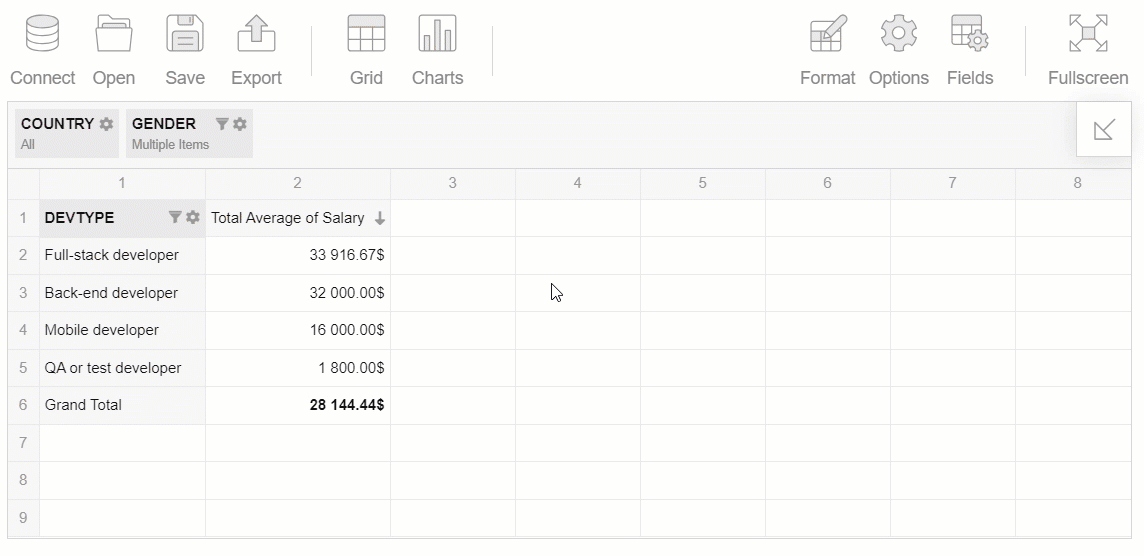
Arrange the hierarchies on the grid — put them into rows, columns, and measures. Also, you can add report filters to keep your grid neat and sort the data to see the most relevant records first.
"slice": {
    "reportFilters": [{
            "uniqueName": "Country"
        },
        {
            "uniqueName": "Gender"
        }
    ],
    "rows": [{
        "uniqueName": "DevType"
    }],
    "columns": [{
        "uniqueName": "[Measures]"
    }],
    "measures": [{
        "uniqueName": "Salary",
        "aggregation": "average"
    }],
    "sorting": {
        "column": {
            "type": "desc",
            "tuple": [],
            "measure": {
                "uniqueName": "Salary",
                "aggregation": "average"
            }
        }
    }
}
Later, you can change the slice in run time with the drag-and-drop feature — as soon as you need to take a look from a different perspective.
Bind charts and pivot grid together
Let’s make the charts display the data from the pivot table. For this, attach an event handler to the reportcomplete event of Flexmonster. It is fired as soon as the pivot grid is ready to act as a data provider.
The code looks as follows:
reportcomplete: function() {
    pivot.off("reportcomplete");
    createFusionChart();
}
Now let’s get to the part of a code which will make a dashboard interactive.
Define a function that is responsible for getting the data from the report, creating and drawing the chart.
In createFusionChart(), invoke the getData() method on the pivot table instance to get the data from the current report or the slice you need. This method pre-processes it to the given type of chart and passes the data to the callbackHandler and updateHandler. These handlers specify what happens once the report is displayed for the first time or when the data is updated (filtered, sorted, etc). In callbackHandler, you need to instantiate a chart and send the data to it. In updateHandler, simply set the updated data to the chart and render it again.
Hooray! The chart and pivot table are rendered on the same page. Now the chart shows the data from the grid and reacts to any changes applied to the report.
In a similar manner, you can add as many charts as you need.
For this data visualization, I’ve chosen a map, bar, and column charts.
What I’ve got
After following all these steps, I’ve got a totally interactive dashboard based on the reporting tool and charts. Let me share with you some of the insights I’ve gained from the survey results data.
Demographics
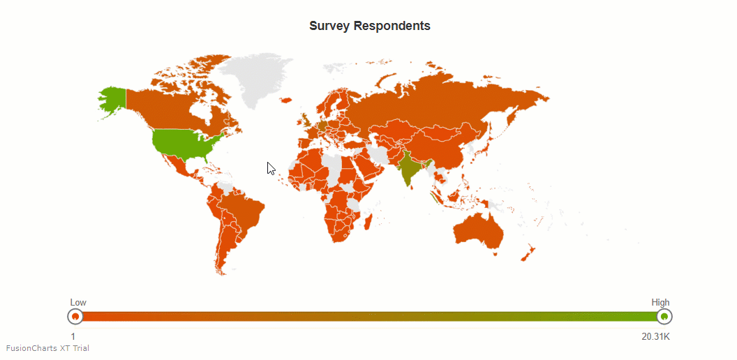
It can be easily seen from the graph that most developers who took the survey live in the United States, India, and Canada.
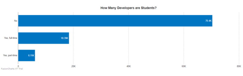
Occupation
More than 18k of respondents are full-time students:
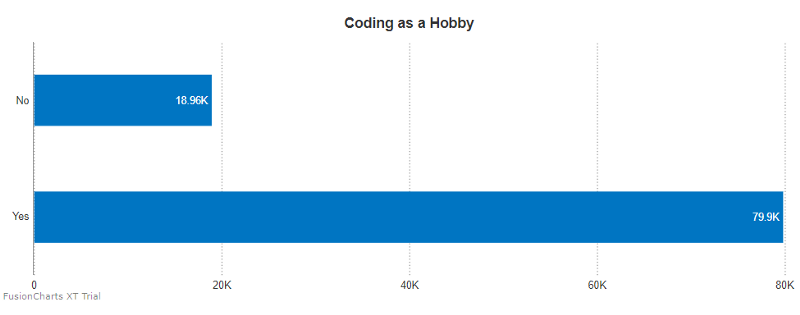
Besides, around 80k of developers say they code outside of work in free time:
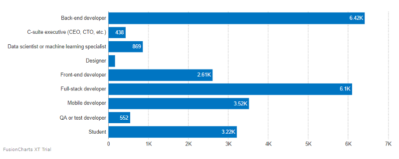
It was interesting to find out the most common types of developers. They are back-end, full-stack, and mobile developers:
Education
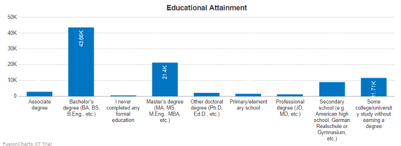
Most of the respondents have at least a bachelor’s degree:
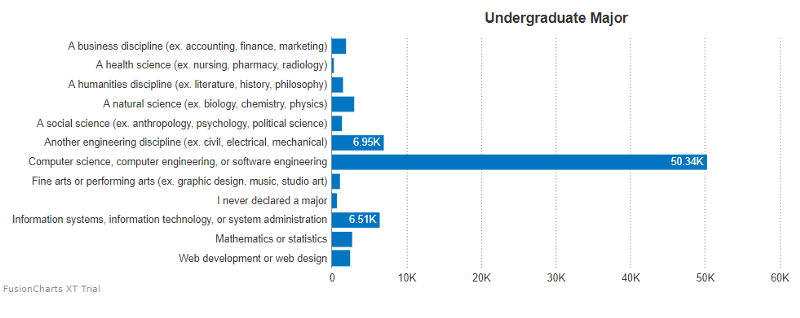
More than 50.34K of developers majored in computer science, computer and software engineering:
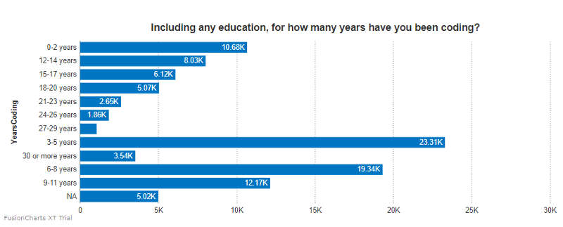
More than 23K of developers learned to code within the past five years:
Frameworks, libraries, and tools
Let’s get to the most desired frameworks, libraries, and tools with which developers want to work in the next year:
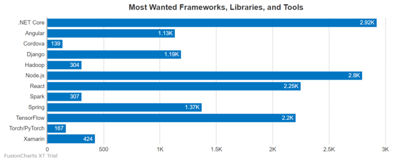
As you see, .NET Core, Node.js, React and TensorFlow got the most votes.
Bringing it all together
Using developer-friendly APIs and guides of the pivot table and a charting library, I’ve managed to get a big picture of the trends in the developer community. I encourage you to dive deeper into data and share unique insights with your friends and teammates.
I hope this tutorial will inspire you to create your visualization project.
Thank you for reading!
Useful links