by AMR
Build your first web app dashboard using Shiny and R

One of the beautiful gifts that R has (that Python missed,until dash) is Shiny. Shiny is an R package that makes it easy to build interactive web apps straight from R. Dashboards are popular since they are good in helping businesses make insights out of the existing data.
In this post, we will see how to leverage Shiny to build a simple sales revenue dashboard. You will need R installed.
Loading packages in R
The packages you need must be downloaded separately, and installed using R. All the packages listed below can be directly installed from CRAN, you can choose which CRAN mirror to use. Package dependencies will also be downloaded and installed by default.
Once the packages are installed, you need to load them into your R session. The library and require commands are used and, again, package dependencies are also loaded automatically by R.
# load the required packageslibrary(shiny)require(shinydashboard)library(ggplot2)library(dplyr)Sample input file
As a dashboard needs an input data to visualize, we will use recommendation.csv as an example of input data to our dashboard. As this is a .csv file, the read.csv command was used. The first row in the .csv is a title row, so header=T is used. There are two ways you can get the recommendation.csv file into your current R session:
- Open this link — recommendation.csv and save it (Ctrl+S) in your current working directory, where this R code is saved. Then the following code will work perfectly.
recommendation <- read.csv('recommendation.csv',stringsAsFactors = F,header=T)head(recommendation) Account Product Region Revenue1 Axis Bank FBB North 20002 HSBC FBB South 300003 SBI FBB East 10004 ICICI FBB West 10005 Bandhan Bank FBB West 2006 Axis Bank SIMO North 2002. Instead of reading the .csv from your local computer, you can also read it from a URL (web) using the same function read.csv. Since this .csv is already uploaded on my Github, we can use that link in our read.csv to read the file.
recommendation <- read.csv('https://raw.githubusercontent.com/amrrs/sample_revenue_dashboard_shiny/master/recommendation.csv',stringsAsFactors = F,header=T)head(recommendation) Account Product Region Revenue1 Axis Bank FBB North 20002 HSBC FBB South 300003 SBI FBB East 10004 ICICI FBB West 10005 Bandhan Bank FBB West 2006 Axis Bank SIMO North 200Overview of Shiny
Every Shiny application has two main sections: UI and Server. UI contains the code for front-end like buttons, plot visuals, tabs and so on. Server contains the code for back-end like data retrieval, manipulation, and wrangling.

Instead of simply using only Shiny, we couple it with shinydashboard. shinydashboard is an R package whose job is to make it easier, as the name suggests, to build dashboards with Shiny.
Creating a populated dashboard: UI
The UI part of a Shiny app built with shinydashboard has 3 basic elements wrapped in the dashboardPage() command. The simplest Shiny code with shinydashboard
## app.R ##library(shiny)library(shinydashboard)ui <- dashboardPage( dashboardHeader(), dashboardSidebar(), dashboardBody())server <- function(input, output) { }shinyApp(ui, server)gives this app
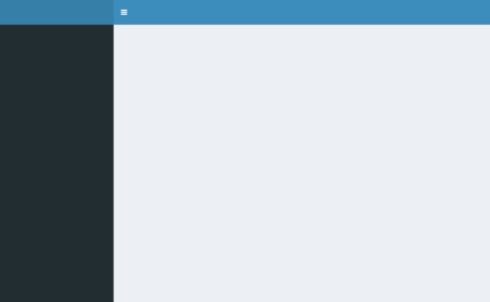
Let us populate dashboardHeader() and dashboardSidebar(). The code contains comments, prefixed with #.
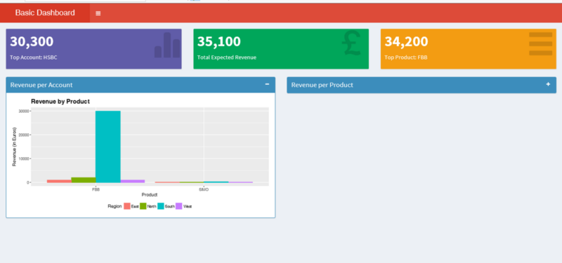
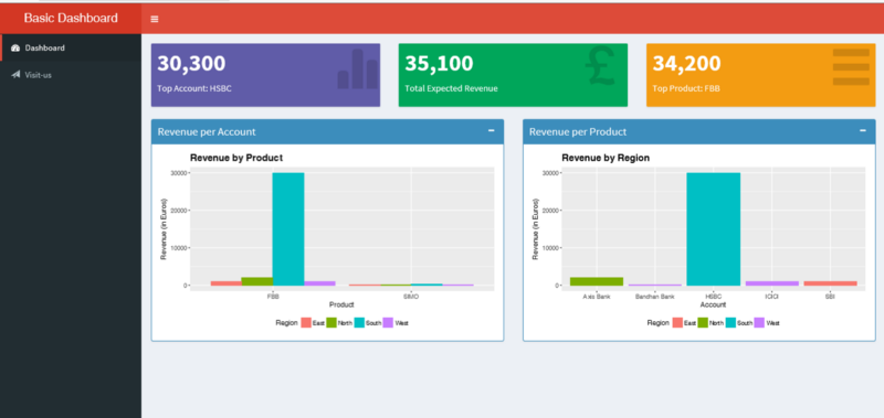
#Dashboard header carrying the title of the dashboardheader <- dashboardHeader(title = "Basic Dashboard") #Sidebar content of the dashboardsidebar <- dashboardSidebar( sidebarMenu( menuItem("Dashboard", tabName = "dashboard", icon = icon("dashboard")), menuItem("Visit-us", icon = icon("send",lib='glyphicon'), href = "https://www.salesforce.com") ))The UI elements that we would like to show in our dashboard populate dashboardPage() . Since the example is a sales revenue dashboard, let us show three Key Performance Indicator (KPI) boxes on the top that represent a quick summary, followed by two box plots for a detailed view.
To align these elements, one by one, we define them inside fluidRow().
frow1 <- fluidRow( valueBoxOutput("value1") ,valueBoxOutput("value2") ,valueBoxOutput("value3"))frow2 <- fluidRow( box( title = "Revenue per Account" ,status = "primary" ,solidHeader = TRUE ,collapsible = TRUE ,plotOutput("revenuebyPrd", height = "300px") ) ,box( title = "Revenue per Product" ,status = "primary" ,solidHeader = TRUE ,collapsible = TRUE ,plotOutput("revenuebyRegion", height = "300px") ) )# combine the two fluid rows to make the bodybody <- dashboardBody(frow1, frow2)In the above code, valueBoxOutput() is used to display the KPI information. valueBoxOutput() and plotOutput() are written in the Server part, which is used in the UI part to display a plot. box() is a function provided by shinydashboard to enclose the plot inside a box that has features like title, solidHeaderand collapsible. Having defined two fluidRow() functions individually for the sake of modularity, we combine both of them in dashbboardBody().
Thus we can complete the UI part, comprising header, sidebar, and page, with the code below:
#completing the ui part with dashboardPageui <- dashboardPage(title = 'This is my Page title', header, sidebar, body, skin='red')The value of title in dashboardPage() is the title of the browser page/tab, while the title defined in dashboardHeader() is visible as the dashboard title.
Creating a populated dashboard: Server
With the UI part over, we will create the Server part where the program and logic behind valueBoxOutput() and plotOutput() are added with renderValueBox() and renderPlot() respectively. These are enclosed inside a server function , with input and output as its parameters. Values inside inputare received from UI (like textBox value, Slider value). Values inside output are sent to UI (like plotOutput, valueBoxOutput).
Below is the complete Server code:
# create the server functions for the dashboard server <- function(input, output) { #some data manipulation to derive the values of KPI boxes total.revenue <- sum(recommendation$Revenue) sales.account <- recommendation %>% group_by(Account) %>% summarise(value = sum(Revenue)) %>% filter(value==max(value)) prof.prod <- recommendation %>% group_by(Product) %>% summarise(value = sum(Revenue)) %>% filter(value==max(value))#creating the valueBoxOutput content output$value1 <- renderValueBox({ valueBox( formatC(sales.account$value, format="d", big.mark=',') ,paste('Top Account:',sales.account$Account) ,icon = icon("stats",lib='glyphicon') ,color = "purple") }) output$value2 <- renderValueBox({ valueBox( formatC(total.revenue, format="d", big.mark=',') ,'Total Expected Revenue' ,icon = icon("gbp",lib='glyphicon') ,color = "green") })output$value3 <- renderValueBox({ valueBox( formatC(prof.prod$value, format="d", big.mark=',') ,paste('Top Product:',prof.prod$Product) ,icon = icon("menu-hamburger",lib='glyphicon') ,color = "yellow") })#creating the plotOutput content output$revenuebyPrd <- renderPlot({ ggplot(data = recommendation, aes(x=Product, y=Revenue, fill=factor(Region))) + geom_bar(position = "dodge", stat = "identity") + ylab("Revenue (in Euros)") + xlab("Product") + theme(legend.position="bottom" ,plot.title = element_text(size=15, face="bold")) + ggtitle("Revenue by Product") + labs(fill = "Region") })output$revenuebyRegion <- renderPlot({ ggplot(data = recommendation, aes(x=Account, y=Revenue, fill=factor(Region))) + geom_bar(position = "dodge", stat = "identity") + ylab("Revenue (in Euros)") + xlab("Account") + theme(legend.position="bottom" ,plot.title = element_text(size=15, face="bold")) + ggtitle("Revenue by Region") + labs(fill = "Region") })}So far, we have defined both essential parts of a Shiny app — UI and Server. Finally, we have to call/run the Shiny, with UI and Server as its parameters.
#run/call the shiny appshinyApp(ui, server)Listening on http://127.0.0.1:5101The entire R file has to be saved as app.R inside a folder before running the shiny app. Also remember to put the input data file (in our case, recommendation.csv) inside the same folder as app.R. While there is another valid way to structure the Shiny app with two files ui.R and server.R(optionally, global.R), it has been ignored in this article for the sake of brevity since this is aimed at beginners.
Upon running the file, the Shiny web app will open in your default browser and look similar to the screenshots below:

Hopefully, at this stage, you have this example Shiny web app up and running. The code and plots used here are available on my Github. If you are interested in Shiny, you can learn more from DataCamp’s Building Web Applications in R with Shiny Course.