by Matthew Choi
Building Tesla’s Battery Range Calculator with React (Part 3: CSS Animation)
This is the third part of Building Tesla’s Battery Range Calculator with React series.
In part 1, we’ve created the application with only the React core, and in part 2 we’ve transformed the application by introducing Redux, a state management solution.
Part 1, which focuses on React, is here:
Building Tesla’s Battery Range Calculator with React (Part 1)
In this series of articles, I will walk you through the process of building Tesla’s battery range calculator with React…medium.freecodecamp.com
Part 2, which focuses on Redux, is here:
Building Tesla’s Battery Range Calculator with React (Part 2: Redux version)
This tutorial is the second part of building Tesla’s battery range calculator with React.medium.freecodecamp.com
If you look at the application we’ve built so far, it’s a bit plain and boring. It would look cooler if we could give it dynamic car showroom feel.
When the app is loaded, it would be nice if our stunning Tesla car images were in motion. With a little Transformer feel. The Tesla header is also shown as a fade-in effect, and the rest of the components should look a little nicer.
Even when the user event occurs after loading, it will be more impactful to show a noticeable visual effect instead of just changing the numerical value.
Just like this:
You can check out live demo.
And here’s the full source code.
In Part 3, we’ll take a step-by-step look at the process of making our finished apps more stylish using CSS animation.
1. Warming up
Let’s start with the warming up before starting.
1–1. Basic example CSS animation
CSS animation lets an element gradually change from one style to another.
CSS animation consist of two components :
- A style describing the CSS animation
- A set of keyframes that indicate the start and end states of animation’s style
Here is a simple example. In this example, the background color of one element is gradually changed from red to yellow over 5 seconds.
To create a CSS animation, you need two steps :
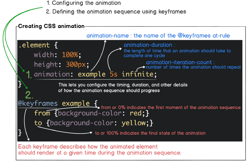
Check out Using CSS animations for more details
1–2. Another example CSS animation
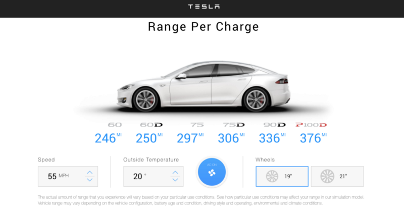
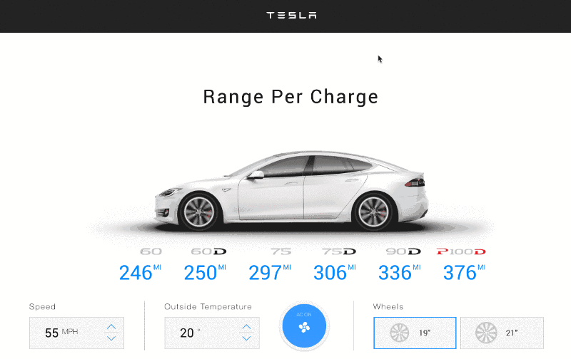
Here’s what we’re starting with. It’s got a Tesla header, some title and a nice Tesla car image.
1–3 Making it bounce
Here are three elements nicely placed. Let’s see these three elements slowly appear on a white screen, as one or two actors dancing on a stage with nothing on the white background.
First, define the animation sequence using keyframes. Then apply the animate-pop-in class with the animation property defined to the div and h1 elements.
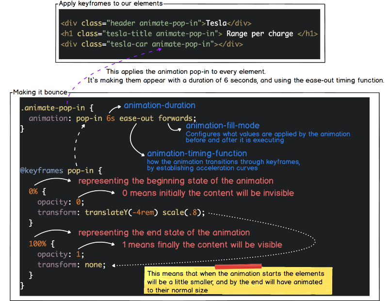
Now you can see that the three elements appear slowly increasing in size over 6 seconds.
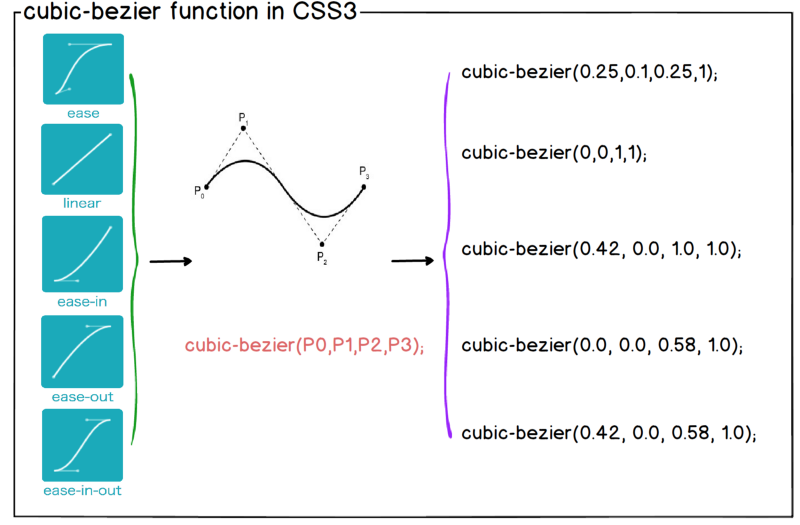
1–4 Cubic Bezier
In our example we used ease-out with an animation-timing-function. Easing functions specify the rate of change of a parameter over time. There are four predefined timing functions we can use, they are ease, ease-in, ease-out, ease-in-out and linear.
- ease — speeds up a little through the middle, and then slows down towards the end
- ease-in — starts of slowly, and accelerates through to the end
- ease-out — starts of quickly, and decelerates through to the end
- ease-in-out — starts slowly, accelerates through to the middle, then decelerates through to the end
- linear — constant animation speed throughout
It’s important that they are essentially based on the Bezier curve.
1–5 Creating Custom Speed
As in our real life, not all objects move at a constant speed, giving these variable speeds to the elements on the screen will give a more realistic movement. Using Cubic-bezier function, we are able to create custom speed.
However, defining the animation speed in the cubic-bezier function format is not intuitive.
Here is a fantastic tool to visualize how cubic-bezier works.
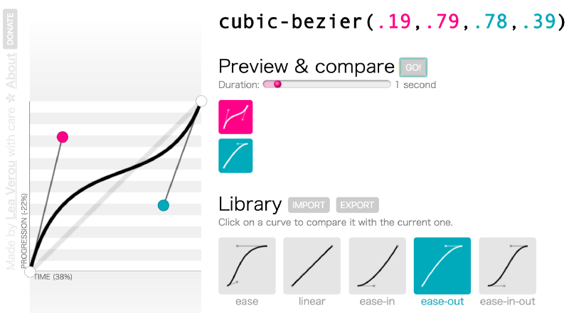
Here’s an example of applying custom speed instead of ease-out.
Now that the warm-up is over, let’s get started.
2. Excersize
As we saw in the demo, we’ll apply animation to two points in our application:
- when an application is loaded
- When a user action occurs
2.1 when an application is loaded
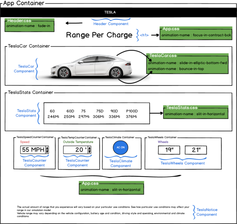
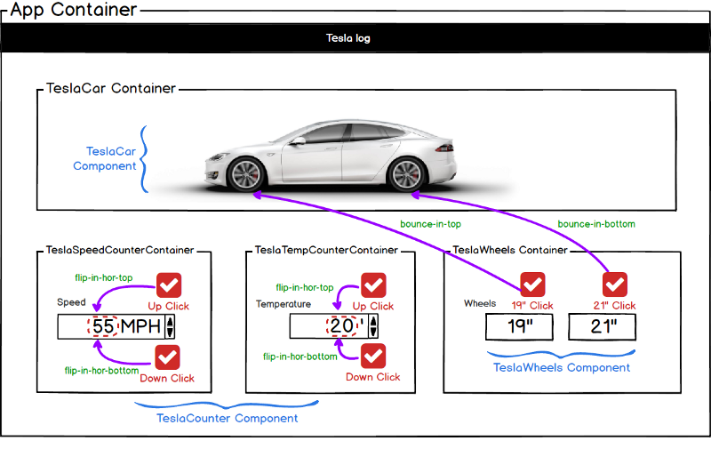
Let’s look at the entire layout of our app. The component structure of the app we created in Part 1, Part 2 does not change at all. Just it needs to define animation attribute and @keyframes in the corresponding CSS file. The CSS file to be modified is marked in green.
2.1.1 Introducing Animista
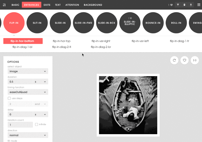
Wouldn’t it be nice to have a tool that lets us see what effect animations are possible before applying them? And how effects would look once you applied them? How you could combine multiple animation properties in a single place? There’s precisely a tool for that: Animista.
With this tool, we can touch and test animated effects at will. Once you find the animation you like, click on the Generate code button to copy the animation property value and apply it to the corresponding CSS in our app.
Don’t forget to click the Add to Favorites button and grab the keyframes code from the download page.
2.1.2 Set up part 2 project code base
If you want to go directly to part 3 without looking at part 2, you need to build the codebase first by cloning the part 2 code.
- git clone https://github.com/gyver98/redux-tesla-battery-range-calculator-tutorial
- npm install
- npm start
After the npm start, let’s make sure the application works.
2.1.3 Tesla Header
The Tesla Header component should have a fade-in effect that gradually displays the logo.
First, open the Header.css file and paste the animation properties and keyframes values copied from Animista. Then modify it to refer to this class in the Header.js file.
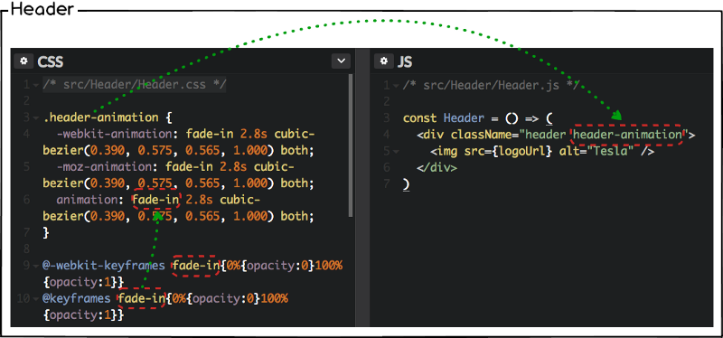
- Check out Header.css
- Check out Header.js
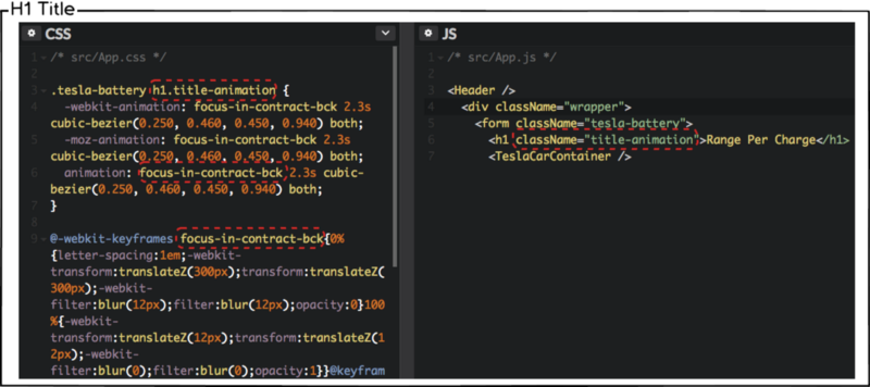
2.1.4 <h1> title
The focus-in-contract-bck effect is likely to work for Tesla title. Give the animation effect the same way you did in Tesla Header.
Note that the title <h1> element is defined in App.js / App.css.
2.1.5 TeslaCar
For the TeslaCar component, which has the most dynamic effects, let’s apply the following two effects.
- Tesla Car : slide-in-elliptic-bottom-fwd
- Tesla Wheels : bounce-in-top
/src/Components/TeslaCar/TeslaCar.css
.tesla-car-animation { -webkit-animation: slide-in-elliptic-bottom-fwd 0.7s cubic-bezier(0.250, 0.460, 0.450, 0.940) both; -moz-animation: slide-in-elliptic-bottom-fwd 0.7s cubic-bezier(0.250, 0.460, 0.450, 0.940) both; animation: slide-in-elliptic-bottom-fwd 0.7s cubic-bezier(0.250, 0.460, 0.450, 0.940) both; } .tesla-wheels-animation { -webkit-animation: bounce-in-top 2.3s both; -moz-animation: bounce-in-top 2.3s both; animation: bounce-in-top 2.3s both;}@-webkit-keyframes slide-in-elliptic-bottom-fwd{0%{-webkit-transform:translateY(600px) rotateX(30deg) scale(0);transform:translateY(600px) rotateX(30deg) scale(0);-webkit-transform-origin:50% 100%;transform-origin:50% 100%;opacity:0}100%{-webkit-transform:translateY(0) rotateX(0) scale(1);transform:translateY(0) rotateX(0) scale(1);-webkit-transform-origin:50% -1400px;transform-origin:50% -1400px;opacity:1}}@keyframes slide-in-elliptic-bottom-fwd{0%{-webkit-transform:translateY(600px) rotateX(30deg) scale(0);transform:translateY(600px) rotateX(30deg) scale(0);-webkit-transform-origin:50% 100%;transform-origin:50% 100%;opacity:0}100%{-webkit-transform:translateY(0) rotateX(0) scale(1);transform:translateY(0) rotateX(0) scale(1);-webkit-transform-origin:50% -1400px;transform-origin:50% -1400px;opacity:1}}@-webkit-keyframes bounce-in-top{0%{-webkit-transform:translateY(-500px);transform:translateY(-500px);-webkit-animation-timing-function:ease-in;animation-timing-function:ease-in;opacity:0}38%{-webkit-transform:translateY(0);transform:translateY(0);-webkit-animation-timing-function:ease-out;animation-timing-function:ease-out;opacity:1}55%{-webkit-transform:translateY(-65px);transform:translateY(-65px);-webkit-animation-timing-function:ease-in;animation-timing-function:ease-in}72%{-webkit-transform:translateY(0);transform:translateY(0);-webkit-animation-timing-function:ease-out;animation-timing-function:ease-out}81%{-webkit-transform:translateY(-28px);transform:translateY(-28px);-webkit-animation-timing-function:ease-in}90%{-webkit-transform:translateY(0);transform:translateY(0);-webkit-animation-timing-function:ease-out;animation-timing-function:ease-out}95%{-webkit-transform:translateY(-8px);transform:translateY(-8px);-webkit-animation-timing-function:ease-in;animation-timing-function:ease-in}100%{-webkit-transform:translateY(0);transform:translateY(0);-webkit-animation-timing-function:ease-out;animation-timing-function:ease-out}}@keyframes bounce-in-top{0%{-webkit-transform:translateY(-500px);transform:translateY(-500px);-webkit-animation-timing-function:ease-in;animation-timing-function:ease-in;opacity:0}38%{-webkit-transform:translateY(0);transform:translateY(0);-webkit-animation-timing-function:ease-out;animation-timing-function:ease-out;opacity:1}55%{-webkit-transform:translateY(-65px);transform:translateY(-65px);-webkit-animation-timing-function:ease-in;animation-timing-function:ease-in}72%{-webkit-transform:translateY(0);transform:translateY(0);-webkit-animation-timing-function:ease-out;animation-timing-function:ease-out}81%{-webkit-transform:translateY(-28px);transform:translateY(-28px);-webkit-animation-timing-function:ease-in}90%{-webkit-transform:translateY(0);transform:translateY(0);-webkit-animation-timing-function:ease-out;animation-timing-function:ease-out}95%{-webkit-transform:translateY(-8px);transform:translateY(-8px);-webkit-animation-timing-function:ease-in;animation-timing-function:ease-in}100%{-webkit-transform:translateY(0);transform:translateY(0);-webkit-animation-timing-function:ease-out;animation-timing-function:ease-out}}/src/Components/TeslaCar/TeslaCar.js
const TeslaCar = (props) => ( <div className="tesla-car tesla-car-animation"> <div className="tesla-wheels tesla-wheels-animation"> <;/div> </div>);- Check out TeslaCar.js
- Check out TeslaCar.css
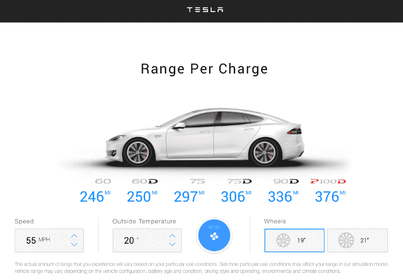
At this point, you should see this:
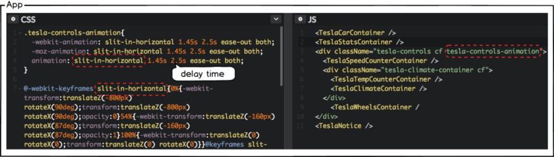
2.1.6 TeslaStats
This time, let’s give the TeslaStats component a slit-in-horizontal animation effect. Give the delay 2 seconds to start after the TeslaCar animation runs.
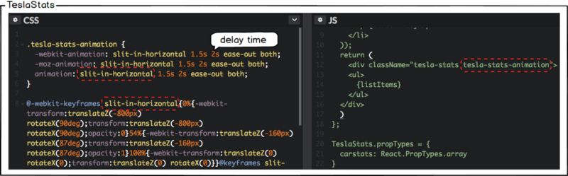
- Check out TeslaStats.css
- Check out TeslaStats.js
2.1.7 Tesla Controls
The Speed counter, the Temperature counter, and the Climate and Wheels components are wrapped in the tesla-controls class, so we can simply modify App.css and App.js as follows, without modifying the CSS of each component.
Provide the same animation effects as applied to the TeslaStats component. Give the delay 2.5 seconds to start after the TeslaStats animation runs.
Here’s what you should be seeing:

We have implemented all the animation at the time the application is loaded. Now let’s implement animation when user action occurs.
2.2 When a user action occurs
When user clicks the Speed, Temperature counters and Wheels, we are going to give the following animation effect.
2.2.1 Speed counter
First, consider what happens when you click Speed counter up.
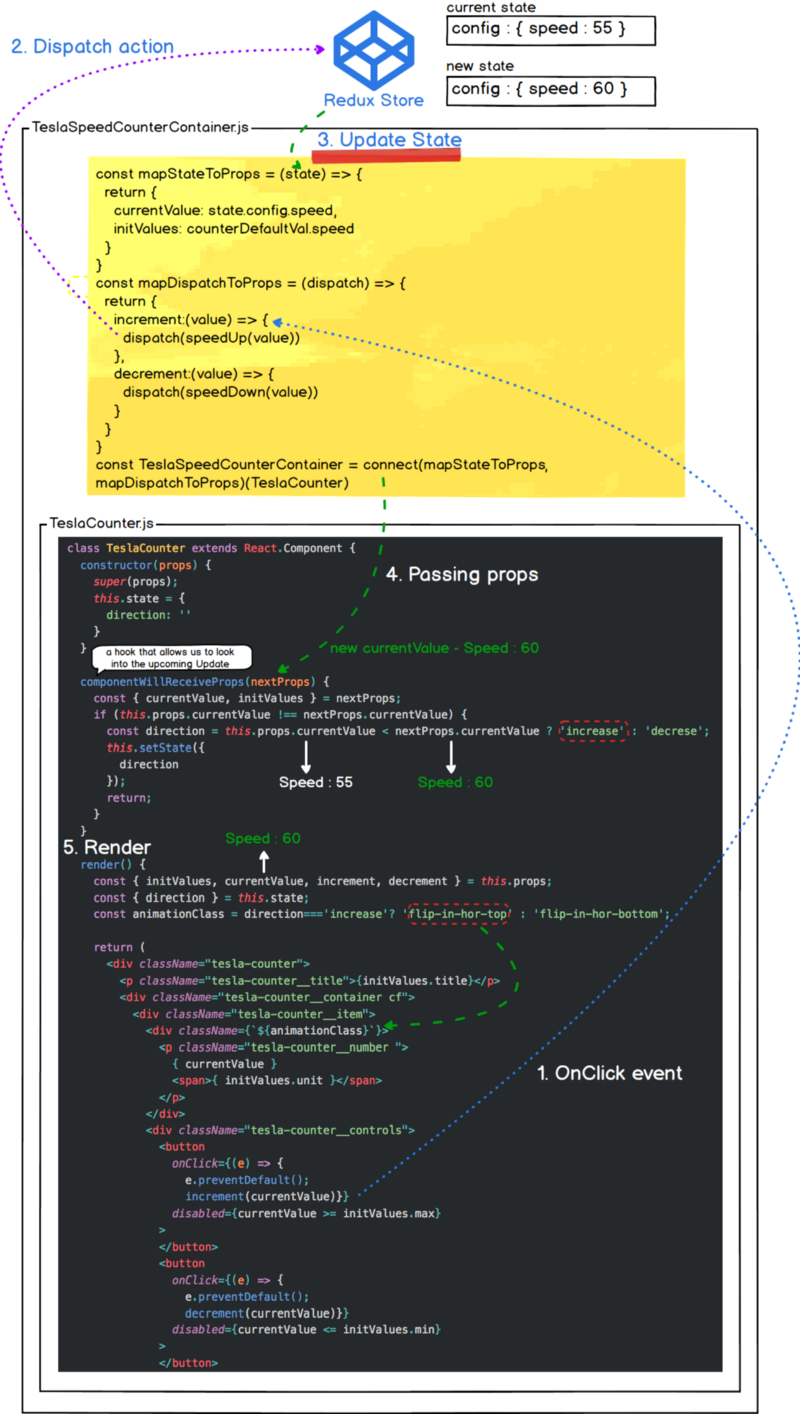
We defined mapStateToProps and mapDispatchToProps as a way to create a TeslaSpeedCounter container in part 2 and communicate with the Redux Store. Then, we refer to the state in the TeslaCounter component through connect and when the action occurs, we dispatch it to the Redux Store to update the new state and render the view.
The following figure shows this flow well.
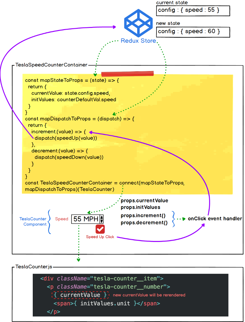
So how do you animate when a new state is rendered by a speed up click event? After defining the animation in TeslaCounter.css, would you like to add the flip-in-hor-top class that you want to apply as follows?
<div className="flip-in-hor-top"> <p className="tesla-counter__number "> { currentValue } <span>{ initValues.unit }<;/span> </p></div>This will have no effect. Because only the currentValue that is updated when the event occurs is re-rendered. In addition, we are trying to apply different orientations to the up and down events. If so, we need to know the direction of the animation along with the event, and then make sure that the corresponding class is applied and re-rendered.
2.2.2 TeslaCounter.css
First, let’s define the animation code that we want to apply through Animista to the CSS file after copying. Add the following animation class and keyframes.
- flip-in-hor-bottom
- flip-in-hor-top
- keyframes flip-in-hor-bottom
- keyframes flip-in-hor-top
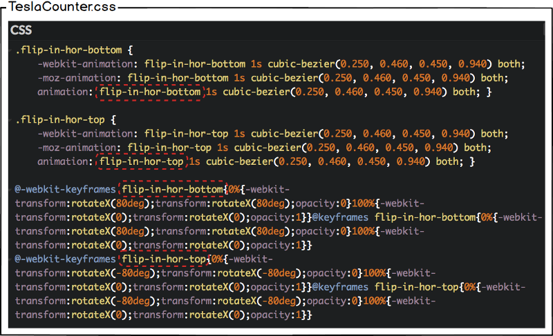
- Check out TeslaCounter.css
2.2.3 TeslaCounter.js
To apply different animation effects according to the speed up/down event, we need to know the type of the event, update it in the Redux store with reducer, and have the new state value passed to the TeslaCounter through props. Instead of adding this event type to the Redux store, let’s implement it in a way that manages to the local state of the TeslaCounter. Since the local state is required, modify the current functional component TeslaCounter as a class component.
We also need the update life cycle method componentWillReceiveProps() here. This method is called when props are passed to the TeslaCounter component. TeslaCounter component has two up/down button that allow the user to change counter value by clicking it. The button is bound to the onClick event and sets the state on the Redux store through dispatching an action. The new state value is then passed to the TeslaCounter component as a prop through connect() in TeslaCounter container.
Any time the user clicks the up/down button this begins an Update for the TeslaCounter component. The first method called on the Component is componentWillReceiveProps(nextProps) passing in the new prop value. This allows us to compare the incoming props against our current props and make logical decisions based on the value. We can get our current props by calling this.props and the new value is the nextProps argument passed to the method.
So why do we need componentWillReceiveProps? This is a hook that allows us to look into the upcoming Update. If we have a state that is a calculation of props, we can safely apply the logic here and store the result using this.setState().
Here we need a direction state, which is the animation direction, which can be obtained by comparing the current value with the updated value.
You can see the whole flow through the following image.
- Check out TeslaCoutner.js
Now click on the Speed and Temperature counters to confirm that the animation has been applied. But there is one problem. If you click the Up / Down button alternately, they work normally. If you click the same button continuously, the animation will not be applied. This is because the animation class changes only when the event type changes.
To solve this problem, add animationEffect to the local state and setTimeout to initialise the applied animation class after 0.5 seconds.
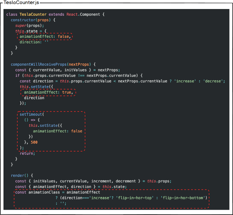
Now you can see that it works fine even if you click the same button continuously.
- Check out TeslaCounter.js
2.2.4 TeslaWheels animation
Finally, let’s apply animation effects when clicking on Wheels.
First, bounce-in-top is already defined in TeslaCar.css, so let’s define additional bounce-in-bottom animation. Then open the TeslaCar.js file and replace the tesla-car-animation that was already applied in the 2.1.5 TeslaCar section with tesla-wheel-animation-${props.wheelsize}.
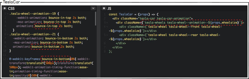
- Check out TeslaCar.css
- Check out TeslaCar.js
You should have a fully working Tesla range calculator with animation:
- Check out the full source code