A quick tutorial to get you up to speed with the latest version of Bootstrap.

In my opinion, the best way to learn a new technology is often to start building stuff from day one. This gives a sense of meaning to the learning process. Plus, it’s satisfying to see a product appear before you as you struggle your way through the material.
So in this article, I’ll walk you through building a simple website using Bootstrap 4.0 while highlighting the most important new features of the library.
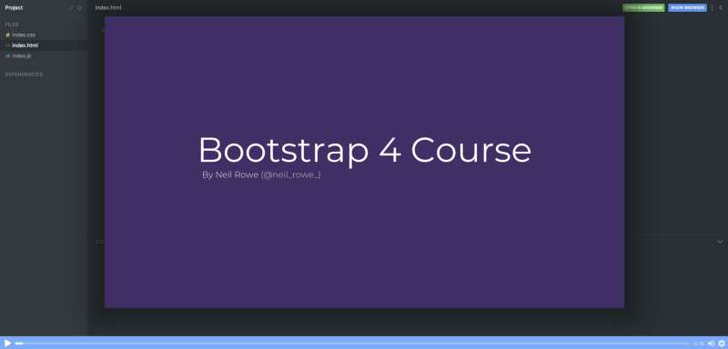
If you want to learn Bootstrap 4.0 properly, check out this free course on Scrimba!
Now let’s get started.
What we’ll build
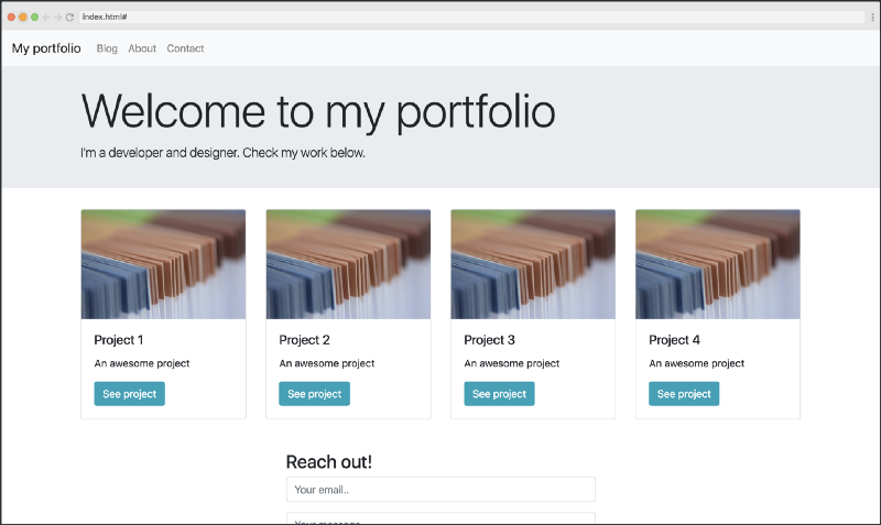
We’re going to build a basic portfolio website. Even though it’s simple, it contains several core concepts you’ll need to learn in order to use Bootstrap 4.0 properly.
If you want to play around with the code, check out this Scrimba playground. Feel free to use it as a reference if you don’t understand something in the article and need to experiment for yourself.
The navbar
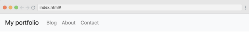
Let’s start with the navbar. In Bootstrap 4.0 they’ve made navbars easier, as they require a bit less markup now. Here’s what we need to create the simplest navbar possible:
Which results in the following:
The bg-light class makes the background light grey while the navbar-light class gives the text a dark colour. By default, the text colour in navbars is blue, however, I think it looks better with the navbar-light class.
Let’s add some content to our navbar, at the same level as the brand anchor tag:
<ul class="navbar-nav">
  <li class="navbar-item">
    <a href="#" class="nav-link">Homepage</a>
  </li>
  <li class="navbar-item">
    <a href="#" class="nav-link">Blog</a>
  </li>
  <li class="navbar-item">
    <a href="#" class="nav-link">About</a>
  </li>
  <li class="navbar-item">
    <a href="#" class="nav-link">Contact Us</a>
  </li>
</ul>
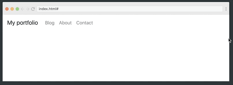
The three classes to take notice of here are the navbar-nav,navbar-link and navbar-item. Together they construct the navigation options the way you want them.
Here’s how that looks:
However, now we’ll need to make it responsive, as we want our navigation options to collapse into a hamburger icon on smaller screens. To achieve this, we need to do two things:
- Tell Bootstrap at which point the navigation options should break to collapse into a hamburger
- Create the markup for the hamburger
To make it collapse, we’ll add the navbar-expand-md class to the nav element itself:
<nav class="navbar navbar-light bg-light `**navbar-expand-md**`">
...
</nav
This tells Bootstrap that we want the navbar options to toggle between expanded and collapsed states at the md breakpoint, which is at768px.
We also need to wrap our navigation options in a div (with the two classes collapse and navbar-collapse) which tells Bootstrap that this is the part we want to collapse.
<div class="collapse navbar-collapse" id="navbarNav">
  <ul class="navbar-nav">
  ...
  </ul>
</div>
The id of navbarNav is to connect this item with the data-target attribute in the hamburger icon, which we’ll create like this:
<button class="navbar-toggler" type="button" data-toggle="collapse" data-target="#navbarNav">
<span class="navbar-toggler-icon"></span>
</button>
```html
We now have a great looking navbar, which collapses and expands at our chosen breakpoint:
### Jumbotron
The next step is to create something that welcomes our users to the website below the navbar. To do that, we’ll use the [jumbotron](https://getbootstrap.com/docs/4.0/components/jumbotron/) component. It’s super simple:
```html
<div class="jumbotron jumbotron-fluid">
<div class="container">
<h1 class="display-3">Welcome to my website</h1>
<p class="lead">I'm a developer and designer. Check my portfolio below</p>
</div>
Which results in the following:
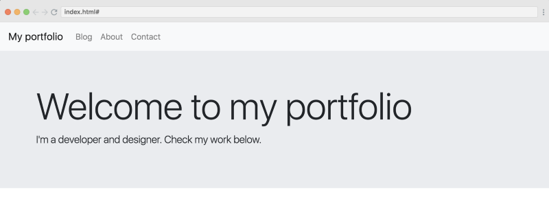
The display-3 and lead classes are typography classes, which make the text a bit more opinionated and better looking in my view. You can read more about typography in Bootstrap 4.0 here.
The Main Content — Grid and Cards
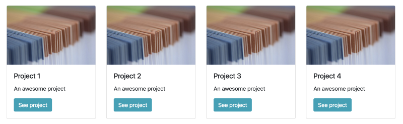
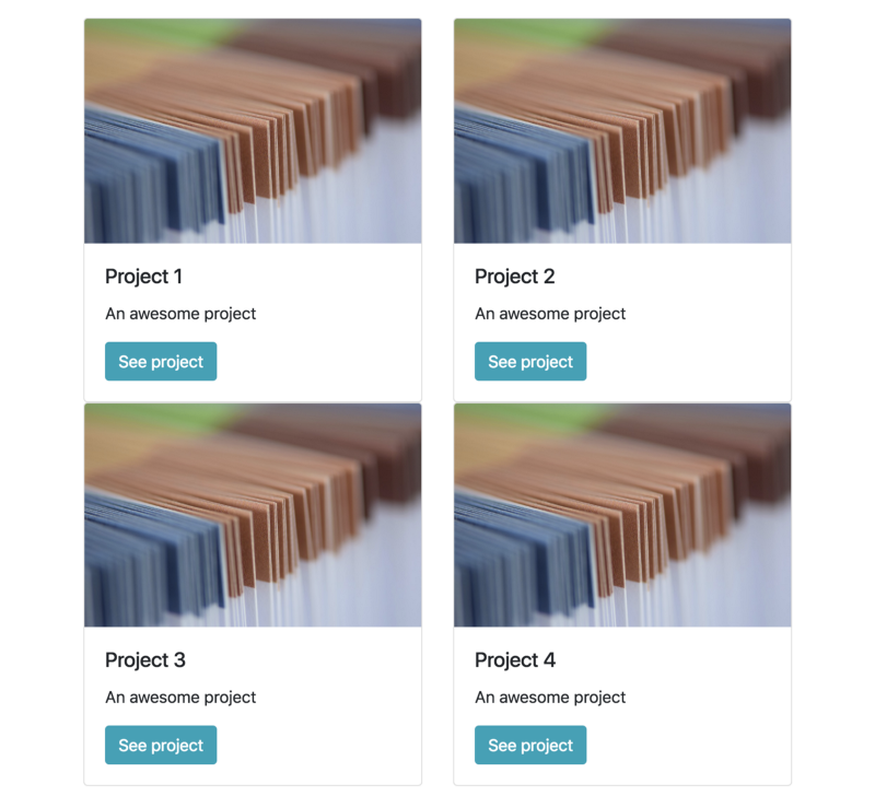
Below our jumbotron we’re going to add the main content of our website, which will consist of four cards. A card is a whole new component of Bootstrap 4.0, and it’s replacing panels, wells, and thumbnails from Bootstrap 3.0.
Let’s first have a look at what we want to build:
Creating the grid
In order to make them appear nicely like this, and to also make sure they work well responsively, we’ll need to wrap the cards in a grid. The grid is one of the core pieces of Bootstrap, and many developers use the library solely because of the grid.
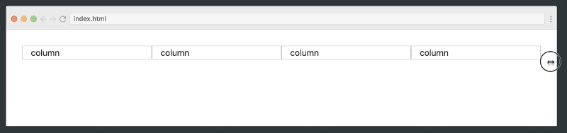
We’ll start off by creating a very simple grid with no content. In Bootstrap, you always create rows first and then wrap columns inside the rows. By default, the grid can be divided into 12 columns in the width.
Above the sm breakpoint, we want each of the cards to take up half the width, so we’ll give the columns a col-sm-6 class. When the screen reaches the lg breakpoint though, we want four cards in the width, so we’ll do col-lg-3.
<div class="container">
  <div class="row">
    <div class="col-sm-6 col-lg-3">column</div>
    <div class="col-sm-6 col-lg-3">column</div>
    <div class="col-sm-6 col-lg-3">column</div>
    <div class="col-sm-6 col-lg-3">column</div>
  </div>
</div>
This gives the following responsive layout:
Creating the cards
Now we simply need to replace the column text with a card component. Here’s the markup for our card:
<div class="card">
  <img class="card-img-top" alt="Card header image" src="img1.png">
  <div class="card-body">
    <h5 class="card-title">Project 1</h5>
    <p class="card-text">An awesome project</p>
    <a href="#" class="btn btn-info">See project</a>
  </div>
</div>
To turn a div into a card we’ll simply add the class card. If we want an image to appear in the header of the card, we’ll add the card-img-top. As for the rest of the content, we’ll use the classes card-body, card-title , and card-text.
One problem, though, is that this layout won’t look good when the grid gets multiple rows. As you can see, we’ll need to add some spacing in-between the rows.
This will introduce you to a new spacing concept in Bootstrap 4.0, where you can add classes to set the padding and margin. We’ll simply add the class mt-3 to the card divs.
<div class="card mt-3">
...
</div>
The mt stands for margin-top, and the 3 is a number on a scale from 1 to 5, where 5 is the most. You can also do for example pb-4, which would set thepadding-bootom to 4. You probably get the point by now. Once we’ve added this, we have a nice grid with cards on our website.
Contact form
Finally, let’s also add a contact form. It’ll simply be a new row in our grid. This time we’ll also use the offset class, as we don’t want it to be full-width, at least not above the md breakpoint.
So from md and upwards we’ll give it a width of six columns, and an offset of three:
<div class="row mt-5">
  <div class="col-sm-12 **col-md-6 offset-md-3**">
    <h3>Reach out!</h3>
    _...form goes here..._
  </div>
</div>
Now let’s look at the code for the form itself:
<form>
  <div class="form-group">
    <input type="text" class="form-control" id="email" placeholder="Your email..">
  </div>
  <div class="form-group">
    <textarea class="form-control" placeholder="Your message..">
    </textarea>
  </div>
  <button type="submit" class="btn btn-primary">Submit</button></form>
The controls — like the <input> and <textarea>—are styled with the form-control class. They make it look like a classical Boostrap form:

And that’s it! You’ve now created your very first Bootstrap 4.0 website. If you want to learn the library properly, be sure to check out our free course on Scrimba.
Thanks for reading! My name is Per Borgen, I'm the co-founder of Scrimba – the easiest way to learn to code. You should check out our responsive web design bootcamp if want to learn to build modern website on a professional level.