
by Henrik Ståhl
I recently decided to try out a CSS framework. As a journalist, I’ve been taught to work from the ground up, do things thoroughly, and never “borrow” stuff from others (in the news industry, that’s considered plagiarism). Therefore I’ve been kind of reluctant to use frameworks since starting my coding journey. Simply because I felt that it would be like cheating, if you know what I mean.
I couldn’t have been more wrong.
First things first. After experimenting a little bit on my own with video as fullscreen background — a very fun and interesting challenge, by the way — I wanted more actual content to work with before diving head first into Bulma, a modern framework based on Flexbox created by Jeremy Thomas.
That’s why I eventually decided not to experiment with Bulma on my May The Code website.
Instead, I chose to redesign a website I created for my now defunct Swedish rock band Evangeliet (we’ve been on a hiatus since 2014).
In this story, I will tell you why I felt bullied by PHP, how I failed and failed again despite reading through the documentation over and over, and what I finally learned by screwing everything up.
The New Front Page
I had already implemented a first iteration of a front page with fullscreen video as background and a simple nav bar, so the first thing I did was to replace my somewhat ugly navigation bar with a Bulma navigation.
Adding the nav wasn’t particularly hard. At least not after reading the documentation a bunch of times. But the fullscreen video as background was a bit trickier. After some fruitless experimentations with different Bulma layout elements, such as .hero and .container is-fluid, I created a custom CSS to handle the fullscreen background:
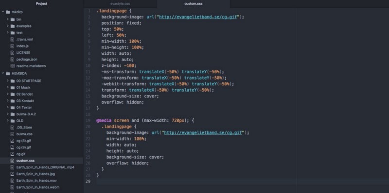
It worked! At least on desktop. As soon as I grabbed my phone to check it out on a smaller viewport, I quickly found out that I had been brutally punished by my outdated desktop-first approach:
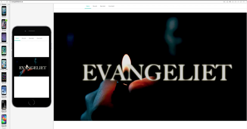
And as you can see, I accidentally put the nav bar and the fullscreen background video in separate sections in the HTML document, resulting in the former being detached from the latter.
I was nevertheless motivated to move forward, so I left it the way it was for the time being.
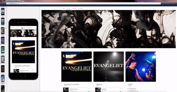
The Audio Page
Next, I wanted to create a neat audio page. The page itself is pretty straightforward: it’s composed of three album “blocks” with Spotify lists. First, I created a fluid container with an image:
<div class="container is-fluid"> <figure class="image"> <img src="/smoke.jpeg" alt="Evangeliet"> </figure></div>Then, I scanned the Bulma documentation in the hopes of finding a component that would fit my need. I eventually settled on a card:
<div class="card"> <div class="card-image"> <figure class="image is-square"> <img src="/Konturen.jpeg" alt="Konturen av en dröm"> </figure> </div> <div class="card-content"> <div class="media"> <div class="media-left"> </div> <div class="media-content"> <p class="title is-4">Konturen av en dröm</p> <p class="subtitle is-6">2013</p> </div> </div>I then nestled a .card-content class inside the card component:
<div class="content"> <iframe src="https://open.spotify.com/embed?uri=spotify:album:2bXUzHUmEZpXpTc6mNbQgH&theme=white" width="100%" height="380" frameborder="0" allowtransparency="true"></iframe> <br> <small><strong>UPC:</strong> 0885014300335</small> <small><strong>Catalog Number:</strong> RU 27130</small> <br> <small><strong>Release date:</strong> 18 Dec 2013</small> </div> </div> </div>To get a nice Spotify player, I fetched an embed code from the Spotify Developer docs. (I changed the width from 300px to 100%, and the theme from default black to white, which suits my design better.)
I created three cards, added some album info, and bundled them with column elements. The result was pleasing:

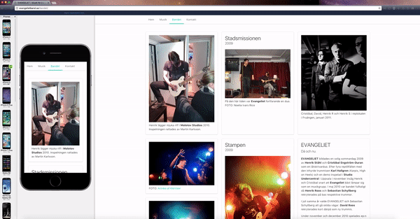
The Image Grid
After that, I wanted to create some sort of page containing pictures of the band. I wanted something more challenging than a standard “band member biographies” page, which wouldn’t have differed all that much from the audio page.
I scanned the documentation once again and decided to do something with the tiles element. This element is
“[a] single tile element to build 2-dimensional Metro-like, Pinterest-like, or whatever-you-like grids.”
I read and contemplated the docs over and over, and reached a conclusion: since I still consider myself a markup beginner, I needed to do some hands-on experimentation in order to wrap my head around the Bulma tiles. Because reading… well, it didn’t get me anywhere.
So I basically copy-pasted one of the examples from the docs and altered the content. I flipped stuff around, effectively breaking everything. Learning by screwing up, right? :)
After messing around with the different classes, I opted for a 3 column grid structure, composed of various tile elements. Here’s an example of the markup:
<div class="tile is-ancestor"> <div class="tile is-parent"> <article class="tile is-child box"> <figure> <img src="/bilder/molotov.jpg"> <figcaption> Henrik lägger mjuka riff i <strong>Molotov Studios</strong> 2010. Inspelningen rattades av Martin Karlsson. </figcaption> </figure> </article> </div> <div class="tile is-parent"> <article class="tile is-child box"> <p class="title">Stadsmissionen</p> <p class="subtitle">2009</p> <figure> <img src="/bilder/duo.jpg"> <figcaption> På den här tiden var <strong>Evangeliet</strong> fortfarande en duo. <br> FOTO: Noelia Ivars Rico </figcaption> </figure> </article> </div> <div class="tile is-parent"> <article class="tile is-child box"> <figure> <img src="/bilder/bandbild2.jpg"> <figcaption> Cristóbal, David, Henrik R och Henrik S i replokalen i Fruängen, januari 2011. </figcaption> </figure> </article> </div> </div>The example above is the three top images on the webpage. The structure of the tile boxes on the page are more or less the same as in the docs, except for the fact that I added images in all boxes except one. Also, I inserted column elements and added three images in one of the boxes.
Which required a bit of patience, given the fact that:
- I still get dizzy quite easily by all the tags and end tags when nesting stuff, and
- I wasn’t aware of the visual feature in Atom highlighting opening and closing HTML tags. ??
I could have gone for either of the different structures I tested during the experimental phase, but I considered the layout provided in the Bulma docs the best fit. Why fix something that isn’t broken?
And honestly, I like the fact that the mobile users see a few images before getting to the text chunk. That’s why I switched back to the current structure after initially mirroring the 2nd column and placing its five boxes in the top of the page, effectively positioning the tall vertical box in the top left corner on desktop.
The Contact Page
Last but not least, I wanted a contact page. With an email form and everything.
Again, the documentation provided everything I needed in terms of markup. A no-brainer. Fortunately, I had already tried to learn just a tiny bit of PHP with the sole purpose of creating an online form (for a different website though).
And I had failed. Hard.
I don’t know why other people seem to hate PHP, I guess it’s for various reasons. But I do know that personally, I dislike PHP because I felt bullied by it.
It felt like I’d tried everything. I read a bunch of blog posts and worked through the entire W3Schools tutorial. But I still didn’t grasp a fraction of PHP.
Anyway, during my short stint as a PHP marauder, I stumbled upon Formspree, an online form service created by Rohit Datta.
As I had previously used Formspree both on the May The Code website with great results, I knew that it would work for my band’s website as well.
I added the field and label classes needed, as well as the required form action=”https://formspree.io/xx@xx.se" method=”POST" class — and that was it!
After submitting the form and confirming my email, everything worked like a charm.
I fixed the size of the form on desktop with a few lines of CSS in my custom stylesheet, but not until way later. The form was up and running and I was happy.
What about the ??
Now I was left with just one challenge: how can I make the hamburger menu on mobile actually work? ?
The Bulma documentation provided markup only. The functionality itself was up to me to fix.
Since then, Jeremy has updated the docs and replaced the old nav component with the new navbar component. Here’s an example of the old one:
<!-- This "nav-toggle" hamburger menu is only visible on mobile --> <!-- You need JavaScript to toggle the "is-active" class on "nav-menu" --> <span class="nav-toggle"> <span></span> <span></span> <span></span> </span> <!-- This "nav-menu" is hidden on mobile --> <!-- Add the modifier "is-active" to display it on mobile --> <div class="nav-right nav-menu"> <a class="nav-item"> Home </a> <a class="nav-item"> Documentation </a> <a class="nav-item"> Blog </a>I’ve gained a lot of ground in the few months, but I’m not yet comfortable enough with HTML and CSS to make the leap to real programming, so I really wanted to make this work without diving into the vast sea of JavaScript.
I had no idea how.
That’s why I opted for a horizontal menu bar all the way down to the smallest viewports, after what felt like hours of investigations. All I needed to do was add the is-mobile modifier to the nav-item class:
<nav class="nav has-shadow"> <div class="container"> <div class="nav-left"> <a class="nav-item is-tab is-mobile" href="/">Hem</a> <a class="nav-item is-tab is-mobile" href="/musik">Musik</a> <a class="nav-item is-tab is-mobile" href="/bandet">Bandet</a> <a class="nav-item is-tab is-mobile is-active" href="/kontakt">Kontakt</a> </div> </nav>I could do this because my menu consisted of just four components: front page, audio page, band page, and contact page. Because of this, everything was visible — and accessible — even in smaller viewports.
A week or so later, I stumbled upon this great thread on GitHub. The user rudedogg had the exact same problem as I did. Many different solutions are provided in the thread, such as
Yeah you simply need a JS event to handle the click and “add” or “remove” the ‘.is-active’-class on ‘#nav-menu’.
and
React snippet (w/o jQuery) on an element with className="nav-toggle" onClick={() => { let toggle = document.querySelector(".nav-toggle"); let menu = document.querySelector(".nav-menu"); toggle.classList.toggle("is-active"); menu.classList.toggle("is-active"); }}Nothing seemed to completely fill my need. Until I scrolled down and found this incredibly humble, short, and brilliant comment by shaneturner:
A bit more succinct on the nav item itself: <span class="nav-toggle" onclick="document.querySelector('.nav-menu').classList.toggle('is-active');">I’m in no position to determine if this is the best solution, neither if it’s actually better than any other suggestion in the GitHub thread. But I tried it out and it worked immediately, right out of the box.

Iterations
I was done. Mission complete.
It felt so good! Not only had I been able to build an entire website using Bulma — I had also learned a great deal about HTML and CSS scanning through the documentation and experimenting with the different elements.
What had first felt like a mountain to climb turned into a medium-sized hill, and here I was standing at the top.
I wasn’t fully satisfied though. Now I knew how to use Bulma to build a website, but the website I’d built wasn’t anyway near perfect. Next, I wanted to climb the next hill, the higher one, and come just a little bit closer to perfection. In other words: using Bulma to build a website I’m actually proud of.
And I did.
But that’s another story.
Henrik Ståhl is a journalist with more than 15 years of experience, recently turned Product Owner at Bonnier News, working with the digital development of Dagens industri and Dagens Nyheter. In his spare time, he’s trying to learn programming.