
A new, more powerful interface for sharing Components across your organization
The Team Library in Figma is a set of shared Components across all files in a Team. Components in the Team Library are accessible across any file — existing and new — in any Team project. If a new file is created in our Team, before it has any content in it, it automatically has access to hundreds of existing Components we’ve published to our Team Library. Not only that, but when the master version of a Component is edited, Figma allows those changes to flow throughout every file that contains an Instance of that Component. And the best part is that it’s not a forced update, instead, a notification appears in each of those files, allowing the change(s) to the Instance of that Component to be viewed and accepted.

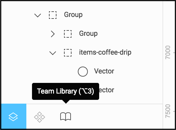
Today, a major update to the Team Library was released. The left-hand panel in Figma, formerly just the Layers List, has a new interface at the bottom. By default that panel allows you to see all your layers and objects in the file, just as you could before, and now has two new dedicated spaces: File Components and Team Library, which can be toggled at the bottom of the panel or with keyboard shortcuts: alt + 1 for Layers List, alt + 2 for File Components, and alt + 3 for Team Library (although, Chrome OS hijacks that keyboard shortcut currently).
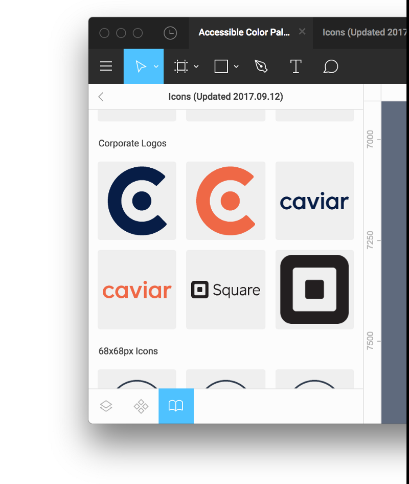
As a design system scales, maintaining consistency can become more challenging. At Square, we use Team Libraries to organize commonly shared assets between the Communications and Social teams. Assets like unified color palettes and icon sets created by the Marketing team, corporate logos, and devices by Facebook are all used frequently. After using several asset management solutions, having a unified, updating version of assets directly accessible inside the design application is incredibly powerful. So many issues related to building out design and asset library systems have been removed.
But don’t feel limited to just icon assets. In Figma’s own words, you can “create design systems with linked UI components the whole team can use.” A Component is any object or group of objects that you intend to use in multiple places, but want to reserve the ability to change properties across all versions of them (similar to Symbols in other applications). You could create complex screen layouts or webpages with hundreds of objects in a Frame and turn it into a Component to be shared across your team.
Using Components
Components can be a singular line or shape, or an extremely complex set of objects in a Frame, and everywhere in-between. Components are elements that can be re-used throughout a design file or Team. Take a simple button for example. I want all the buttons in my design to be the same basic design: rounded corners, red background, text size and style, etc. So I create my first button with all the properties set how I like them.
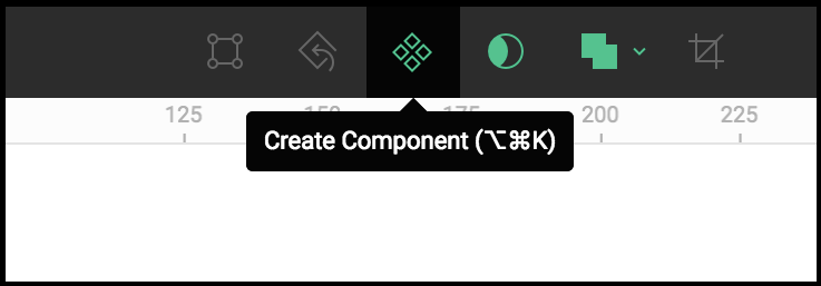
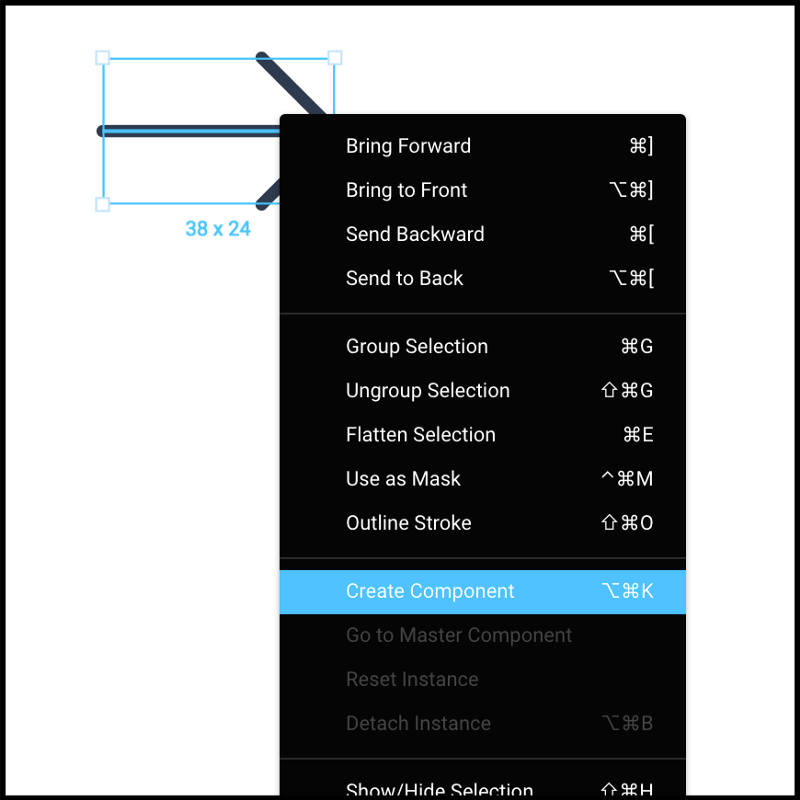
Then I make a Component out of my first button. You can select any object then click the Component button at the top of the Figma interface, use macOS keyboard shortcut: option + command + K, or right-click the object and select “Create Component.”
To create more buttons, I duplicate the new button Component or drag a new copy out of the File Components list in the left-hand panel. These new buttons are called Instances, and they all reference and retain the properties of the Component they were created from, as known as the Master Component. If I adjust the color or typeface in the Master Component button, all the Instances in my file will update to match, instantly.
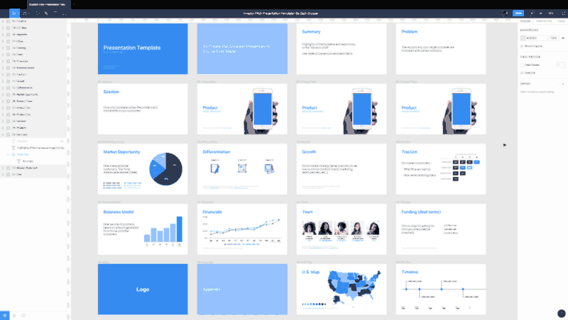
I used Components in an open-source presentation template, setting up the slide titles as a Component and Instances of that Component. Now, when I need to customize a new presentation with a different typeface and color palette, it takes seconds.
Anyone with access to the file can make changes to the Components too. Sharing a file with a copy editor, for example, allows them to update the text in a Master Component and have their copy changes flow through all the Instances.
Using Components within a file already felt like magic to me, and has always been a huge time saver as a file grows with more Frames and Instances. But the real magic lies in using Components across multiple files, thanks to the Team Library.
If I take a button Component, and publish it to the Team Library, then anyone on my team can access it and use it within their files, and any new files created in the Team have access to it as well. That means designers can immediately start building; using foundational Components from our design system.
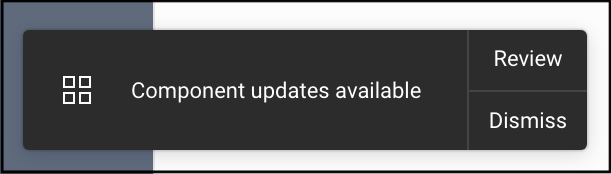
As time goes on, the button properties may need to be adjusted. Returning to the Master Component of that button, by right-clicking an Instance of it or the Component itself in the Team Library panel, and adjusting it’s color, for example, notifies every file containing an Instance that there is an update available. A blue notification dot appears on the File Components list icon at the base of the left-hand panel. A “Publish changes” button at the top of the Component List leads to a modal to confirm the changes. Once changes are published to the Team Library, any file that uses an Instance of that Component will receive a notification in the bottom right corner to review the update(s). Clicking “Review” allows you to see what was changed, by who, and when. Once accepted, the Instance(s) in your file will update immediately to conform to the master Component. And you can choose not to accept those changes and your file’s Instances will remain unchanged.
Selecting and publishing File Components to Team Library
- Select object, group, or frame
- Click the Component button at the top of the Figma interface, use macOS keyboard shortcut: option + command + K, or right-click object and select “Create Component”
- Switch to the Component tab by selecting the toggle at the base of the Layer List, or use macOS keyboard shortcut: alt + 2
- Right-click Components to add them to the Team Library, or use “Publish file to library” below your Component list to push all Components in this file to the Team Library
- Switch to the Team Library tab by selecting the toggle at the base of the panel, or use macOS keyboard shortcut: alt + 3
Now you can search or navigate to any Component that has been published in your Team, by any contributor.
To place an Instance of a Component into your file: Drag from the Team Library panel into any file. That Instance continues to be attached to the Master Component from whichever file in your Team it originates (And it could be from another member of your team), unless you right-click and select “Detach Instance” (macOS keyboard shortcut: option + command + B)
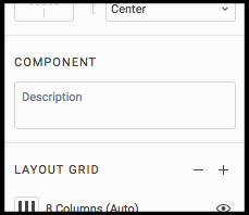
You can also add a description to your Components, visible in the Team Library to add additional context for your team. Select to the Master Component and add a description in the right-hand panel. The descriptions appear on hover in the Component List and in the Team Library.
Read even more about Components here:
Components in Figma
Today we are excited to release Components in Figma. By bringing concepts like composition, inheritance and unlimited…blog.figma.com
Pro tip
You can set the background of a Component tile in the Component List and Team Library by setting a Frame behind the component and changing its color. This is really handy with lighter Components, like white or grey icons.
Huge thanks to the team at Figma! Who keep building incredible features like this, and have the fastest release cycle I’ve ever seen.
There are already 464 Components in Square’s Team Library!
Disclaimer: You may have found this post through advertising on Twitter or Facebook. Figma didn’t sponsor the writing of this post, and are advertising with my permission as they also thought it was helpful for other designers.