by ZAYDEK
KAMEHAMEHAAAA ?
Free Course: Level Up ? With Bulma CSS
The best CSS framework since Bootstrap
Before I get to the article, I just want to share that I’m building a product, and I would love to collect some data about how to better serve web developers. I created a short questionnaire to check out before or after reading this article. Please check it out — thanks! And now, back to our regular scheduled programming.

Meet Bulma CSS! Free course ? here
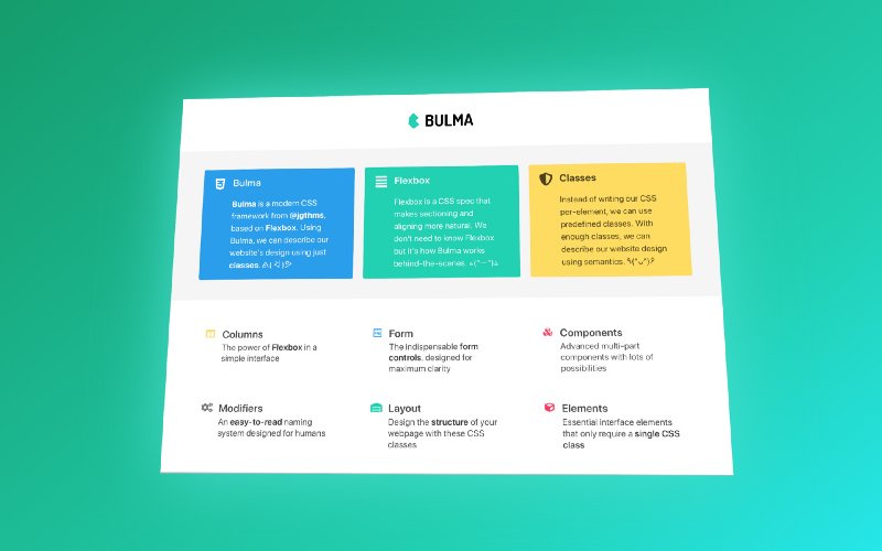
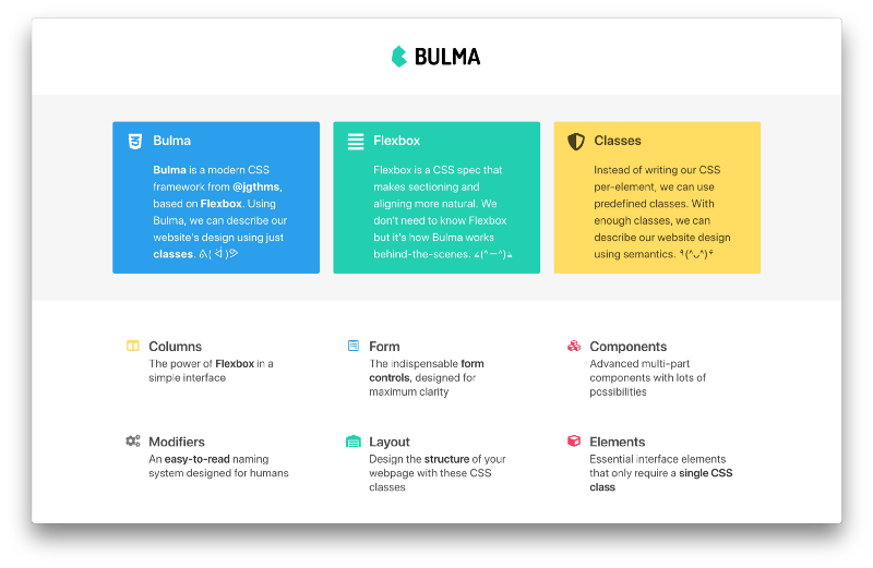
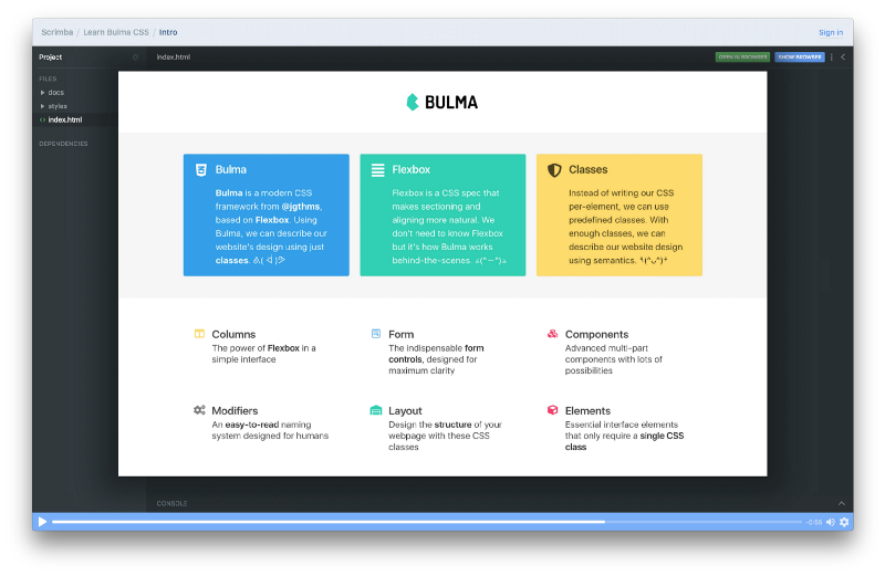
Apart from being the second longest-standing character in Dragon Ball Z, Bulma is a modern CSS framework based on Flexbox from Jeremy Thomas @jgthms. And Bulma is gaining adoption fast with 150K+ downloads a month and 26K+ stars on GitHub. OK…tell me more. ?
With Bulma, we can create beautiful and responsive websites with ease. Jeremy designed Bulma as a reusable set of Sass patterns to kickstart new projects. Don’t know Sass? Sass *compiles* to CSS. And once Flexbox became standardized, Jeremy used it to power what we now know as Bulma.
In this article, I detail *how* Bulma works and *what* we can build with it.

I also taught Bulma CSS on Scrimba, where we build these websites. It’s free — click here to enroll! ?
Scrimba.com is a platform for front-end development, where websites are recorded as events — not videos — and can be edited. ?
How does Bulma work?
Bulma is 4.5K lines of Sass and 9.5K lines when compiled to CSS. What in the heck is all this code doing?! Bulma addresses 90% of common website patterns, like columns, forms, components, modifiers, layouts, and elements. The code is *also* responsive and can be further themed and customized.
Bulma doesn’t solve all problems, but can be *far* more productive than hand-coding Sass or CSS. And because Bulma compiles to CSS, it’s adaptable to JavaScript frameworks and libraries like Angular, React, and Vue. In short, Bulma works *like* Bootstrap but without JavaScript.
Unlike Bootstrap, Bulma relies on CSS — not JavaScript. But like Bootstrap, ships with its own CSS Reset. Now, let’s walk through how Bulma works from first principles. I’m assuming you’re familiar with HTML/CSS but no more, thus this is what classic CSS looks like:
Note: While this isn’t Bulma, it does demonstrate *how* Bulma works.
<!DOCTYPE html><html> <head> … <style>p { line-height: 2;} </style> </head> <body> <p> A long time ago in a galaxy far far away… </p> </body></html>Here we defined a p in our HTML, and in our CSS defined all p’s as having double-spaced lines, for example line-height: 2. Wait — what if we don’t want all ps to be double-spaced? Or what if we want some but not *all* to be double-spaced? Then we can instead opt-in to CSS using classes:
<!DOCTYPE html><html> <head> … <style>.double-spaced { line-height: 2;} </style> </head> <body> <p class="double-spaced"> A long time ago in a galaxy far far away… </p> </body></html>So we defined a class named double-spaced that we opt into versus having elements inherit CSS, like in the first example. And this is more sensible because it makes it harder for us to later overwrite our CSS. Still, we can go even further to make it harder, and we can make our class conditional:
<!DOCTYPE html><html> <head> … <style>p.double-spaced { line-height: 2;} </style> </head> <body> <p class="double-spaced"> A long time ago in a galaxy far far away… </p> </body></html>And now double-spaced requires the presence of a p element. This is conditional CSS, and we can go even further! We can use just classes, for example class-1.class-2 to create conditional classes. This is one of the techniques Bulma uses to create HTML/CSS contracts.
*AHEM* Are we just writing CSS in our HTML now…?
(ง •̀_•́)ง
The difference here is that Bulma emphasizes common patterns using semantics — not one-to-one CSS rules. This means we use Bulma to describe relationships — not rules — and therefore is more powerful. Also, Bulma’s new documentation is amazing and takes a lot of the guesswork out of CSS.
In addition to conditional classes, Bulma defines plentiful HTML/CSS contracts, which leads to more flexible CSS and more idiomatic code. And this is great for sharing code across teams. These contracts detail the relationship of classes to one another. Here’s a simple example of an HTML/CSS contract:
<section class="section"> <div class="container"> ... </div></section>Given enough well-designed classes and contracts, we can create all kinds of beautiful and responsive websites backed with Bulma. Check out the expo! ⭐️ Now, before we get ahead of ourselves, let’s start with a “Hello World” and then the following slide — that’s no slide, it’s a website.

And in the near future, I’ll be releasing two ✌️ more articles detailing how we can build a beautiful blog and a Tesla launch page with Bulma! For updates, Follow me on Medium ✍️ and Twitter. ? I do, however, teach these in the free interactive Scrimba course. Click here to enroll for free! ?
And without further ado…
“Hello World”
Now that we understand how Bulma works, let’s learn how to “Hello World”:
<!DOCTYPE html><html> <head> <meta charset="utf-8"> <meta name="viewport" content="width=device-width, initial-scale=1"> <title>Hello Bulma!</title> <link rel="stylesheet" href="https://…/bulma.min.css"> <script defer src="https://…/all.js"></script> </head> <body> <section class="section"> <div class="container"> <h1 class="title"> Hello World </h1> <p class="subtitle"> My first website with <strong>Bulma</strong>! </p> </div> </section> </body></html>Come back — don’t be scared! ? All Bulma websites start from this template. Let’s focus on the head element first; the link pointing to bulma.min.css loads Bulma, and the script pointing to all.js loads Font Awesome icons. Note: Bulma supports all icon font libraries.
And Bulma prefers to use HTML5 elements, for example section versus div where appropriate. It’s more readable and idiomatic. Wait — what if the client’s browser is outdated and thus doesn’t acknowledge HTML5 elements? Bulma takes care of that, too!
/* bulma.css#L312 */article,aside,figure,footer,header,hgroup,section { display: block;}Thanks Bulma! ? This guarantees that HTML5 elements are rendered as block elements despite the client’s browser. OK — let’s review the body:
<section class="section"> <div class="container"> <h1 class="title"> Hello World </h1> <;p class="subtitle"> My first website with <strong>Bulma<;/strong>! </p> </div></section>When I first learned Bulma, I (╯°□°)╯︵ ┻━┻ because it’s so terse. But once I calmed down, I began to recognize an emergent pattern: the shape of our website’s tree. And it’s much simpler than I thought:
.section | .container / \.title .subtitle / \ ... ...Ahhhh. Where .section defines the start of new content, .container is a wrapper class for content (like text) and is used for responsive design. And .title and .subtitle are for aesthetics. Having done so, Bulma took care of dozens of details like best practices and responsive design. ??
Beyond “Hello World” ?
Think of Bulma as lego pieces with modifiers, like color variants. And so, composing this website requires just a few pieces and modifiers, such as .columns, .media, .icon — that’s it. Though the code *is* more complex, that’s because it’s code. The composition of the website is what’s simple:
.column | .media / \.media-left .media-content / \ .icon .content / \ ... ...The above is what one Bulma column looks like as a tree. And in code:
…<div class="column"> <article class="media notification is-info"> <figure class="media-left"> <span class="icon is-medium"> <i class="fab fa-2x fa-css3-alt"></i> </span> </figure> <div class="media-content"> <div class="content"> <h1 class="title is-size-4"> Bulma </h1> <p class="is-size-5"> <strong>Bulma</strong> is a modern CSS framework... </p> </div> </div> </article></div>…Note: Modifiers such as .notification, .is-info, .is-medium, and so on help personalize our website. Some modifiers are conditional and require another class, and some are general-use. You can learn more about them here. And for an interactive playground of the complete website, click here. ?
Bulma is fascinating! We can design beautiful and responsive websites using semantics — without writing CSS.
Final thoughts ?
The thing I love most about Bulma is that it’s a means to understand how its creator thinks without having to ask him. How do I do X? Look it up! This is a powerful idea — that we can look into a CSS guru’s mind for answers, rather than hack unideal solutions ourselves.
Thanks for reading! I was hesitant to learn Bulma at first, but then came to appreciate how powerful and idiomatic it can be. So I decided that Bulma shouldn’t go unnoticed, because designing and developing websites can often be *much* harder than anticipated. Again — thanks for reading! ???
Like this? There’s two more — click here and here!