The CSS Flexible Box Layout — Flexbox — provides a simple solution to the design and layout problems designers and developers have faced with CSS. Let me show you how to use it to generate some common layouts and challenges that you will face in designing a responsive website design.
I assume you already know the basis of Flexbox. If not there are many documents teaching you about Flexbox. I would recommend Understanding Flexbox: Everything you need to know.
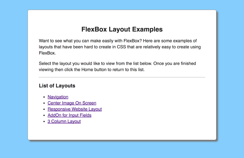
Here is What We Will Be Making
In this article, I am going to show you how to make 7 different layouts using FlexBox.
- Navigation
- Center image on screen
- Responsive website layout
- AddOn for input fields
- 3 column layout
Get The Code
All of the examples that I am going to show can be downloaded from my GitHub account. The code for every example is just html and css. I have created a master homepage that provides a link to every example that we are going to cover.
Navigation
Every website has a navigation. Using Flexbox you can create a navigation that has your company name on the left and menu items on the right.

To accomplish this layout in CSS, you would have to use floats to get some content to appear on the left and the rest of the content to appear on the right.
With FlexBox you have to specify a flex container that contains the navigation. The company name on the left is a flex item within this container.
The menu items on the right are their own flex container with a <ul> containing all the menu items.
Here is the html for the navigation:
Here is the CSS for the navigation:
Center Image on Screen
Many websites include a full size image. Usually this image contains text that is centered on the screen.
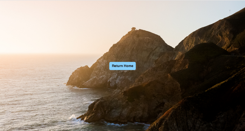
The challenge is styling the image so that it fits full page regardless of whether you are viewing this on a wide screen monitor, laptop, tablet or phone and have the CSS remain centered on the screen. Flexbox makes it easy to do this. To mimic text centered on the screen I have included a button
Here is the html to center an image on the screen:
Here is the css to center an image on the screen:
Responsive Website Layout
Almost every website has the same layout which contains a navigation across the top and a footer at the bottom. In between there are 3 columns consisting or a right and left sidebar and the main content area. Generally the main content area takes up 60% of the width of the screen and the two sidebars are allocated 20% of the screen each.
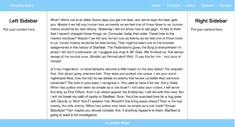
The challenge for creating a responsive website is having the footer stay at the bottom of the page regardless of how much content is displayed. The content area should scroll if there is more than can be displayed on the page.
Here is the html for the responsive website layout:
Here is the css code for the responsive website layout:
AddOn for Input Field
To improve your user experience, many designers prefer to put images or text in their input fields. This provides the user with directions on what should be included in the field.
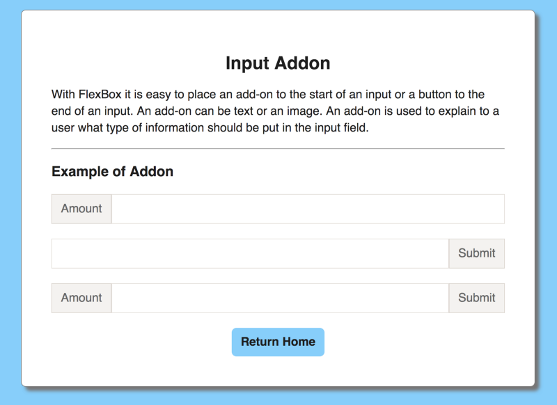
With traditional CSS that was very challenging and required you to use a table format to insert something before or after an input field. With Flexbox it is much easier.
Here is the html code for the addon for input fields:
Here is the css code for addon for input field:
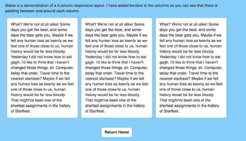
3 Column Layout
It is very common for websites to include a 3 column layout on the screen.
Here is the html for a 3 column layout:
Here is the css for the 3 column layout:
More Articles
Thanks for reading my article. If you like it, please click on clap icon below so that others will find the article. Here are some more of my articles that you might be interested in:
Think outside the box with CSS shape-outside
7 Things I learned in my journey from coding bootcamp to Senior Developer
Why Company Culture is Important to Your Career as a Software Engineer