by Fabrice Dubois
Homeless iPhone (Part 2)
Pause. Rewind. Deep dive in the design process.
Two weeks ago I posted about the possibility of an iPhone that has no Home button at all.
With iOS 11 on an iPad you enjoy a whole new app switcher. As a little design challenge, I study how this UI could work on the imminent ‘iPhone 8’, and whether it could cater for the absence of Home button.
Today I’ve paused the exploration, and I’m walking you through the design process. We’ll review my sketches in detail, see what they reveal about the train of thought (ouch!), and look at a couple of prototype variants that you’ll be able to download and try.
Being process-oriented, not product-driven, is the most important and difficult skill for a designer to develop.
Matthew Frederick
Sketches and prototypes below are provided as is, they haven’t been modified at all for the sake of this article. I include raw scans of my large sketch boards, so the post is probably best viewed on desktop or tablet.
Sketching
I always keep my sketches and notes. They’re useful to review in slow motion what has happened in the mind, assess the reasoning, and have a fresh look at germinating ideas that were forgotten on the road side.
For this project I used two A3 sheets. Let’s comment the key screens:
1. Trying to force-fit the iPad design. In that first attempt, everything is on a single horizontal scroll view. And there’s a Home button! False start.
2. Trying again. But stopping fast since clearly, it’s not going to work. My proportions are completely unrealistic. Lack of discipline.
3. A more realistic ratio. I finally acknowledge it’s a very long phone I’m dealing with (6/13 ratio). I’m going to need my imagination. The whole view now scrolls vertically, with apps on 2 columns. An accident happens here: my focus has now shifted to the iPhone’s Control Centre (that I’m probably examining on my iOS 11 phone, as a model for the sketch). I’m misled and add the little chevron at the top, meaning “swipe down to close”.
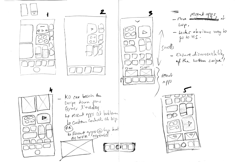
4. A potential conflict. Because I now wrongly assume the UI can be swiped down, I worry this is going to interfere with my vertical scroll. I capture this in a side note: “KO since swipe needed to close overlay”. I swap things, move apps to the top, as if it could help, but finally plant the seed of an alternative idea: “Recent apps @ top but as horiz. carousel”.
5. One last shot at the vertical scroll. Here, I guess I’m seeking confirmation that the vertical approach is flawed... But my mind forks again as I notice a new issue! Controls and recent apps compete for visibility: Scroll to view one and the other is pushed out of bounds. They’re part of the same strap. At that point I decide to try decoupling them.
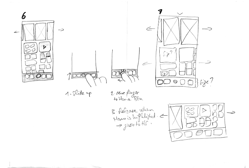
6. Recent apps as horizontal carousel. That looks more familiar for an app switcher. Controls still scroll vertically, though — so how does that work as a whole? Doesn’t feel right. I appear distracted again between 6 and 7 but let’s skip that.
7. Two parallel scroll views. The control group and the app carousel are now free to move without running into each other. Space is shared equally. I annotate some elements with “Size?”: Can I afford that layout on the real device? Only one way to know: Increase fidelity. But overall I sense I’ve got a candidate solution I can work with.
Observations
I don’t state my goal. That’s a pity because something as simple as “Adapt the new iPad switcher to the iPhone 8” (even if obvious) would have focused me sooner on the actual issues.
I don’t have a very clear logic in mind. Evidence of confusion: The fallacy that the UI is an overlay that can be swiped down, and the Home button that I remove then for some reason bring back (don’t ask!).
I seem mainly concerned by a layout problem. Apparently I don’t worry much about how to access the home screen. Yet that’s very key in my experiment! I do leave a shy trace at step 3: “Lacks obvious way to go to HS”, and then stick a Home button everywhere. This is embarrassing (given the experiment is all about button-less!) — I’m probably aware that at some point I need to find empty space so the background can be tapped, like on the iPad switcher, but I wouldn’t swear. The Home button looks more like a mechanically applied FIX-ME label, something I don’t want to deal with yet.
Being process-oriented means: [Long list that includes:] Working fluidly between concept-scale and detail-scale to see how each informs the other.
Matthew Frederick
My drawing and handwriting look awful. But somehow that’s positive. In the process of doing these sketches it never occurred to me that I would share them later; in the moment, the absence of aesthetic requirements actually did reinforce focus.
Side notes help inform my next steps. Sketch, evaluate, note issues, and try addressing them in a future iteration. Any change can bring new problems, and the sooner I capture them, the better. It’s just so easy to spot and forget. I’ll take side notes more systematically in the future.
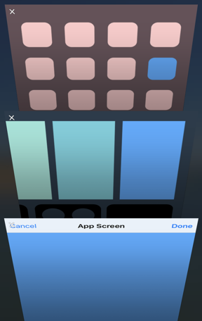
Prototyping
You can try the prototypes below if you use Principle, on a Mac or an iPhone directly. Click the movie captions to download the Principle .prd files. To learn more check Principle’s docs, and my tips at the end of the post.
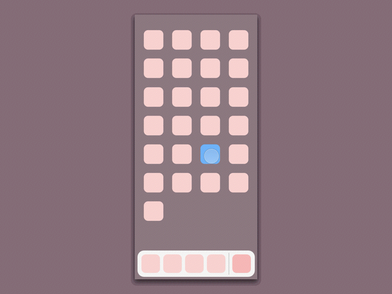
An early version (v8 above) features the chevron at the top and a discreet Home button at the bottom. Tapping the chevron re-opens the current app (what else could it do?) but so does a tap on the app miniature already.
So this chevron based interaction looks silly, in hindsight. Pay attention to the animation it triggers: While it does the right thing (zooming in the app correctly represents the action of bringing it to the foreground), it is disconnected from the chevron object itself. The chevron, on one hand, is doing what you want (dismiss switcher and return to app) but on the other hand it does not behave as you’d expect (slide down). Prototyping instantly trapped the contradiction here. I should have caught the flaw much earlier, but that’s ok — there are many things in my life that I should’ve done earlier.
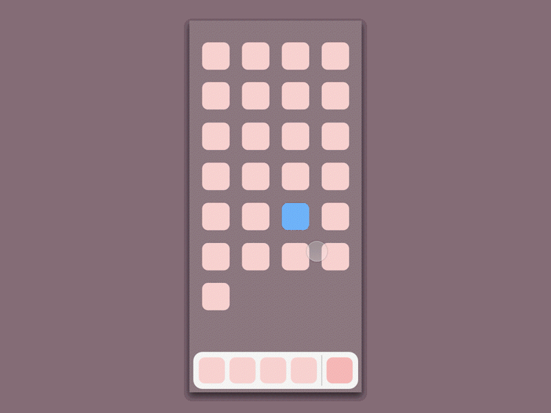
The chevron is gone (v11 above) but I now experiment with a home screen miniature (like in iOS 10's switcher). This is efficient for the home screen use case, but it pushes the previous app (green) too far left for a right-hander. And there’s duplication again: the Home button becomes redundant, but if I remove it then the user can only rely on the miniature to go to home screen, which is too far right for left-handers! They could scroll but in this particular case I certainly don’t want them to have to.
There’s another aspect: this model is inconsistent with my target one, whereby only a tap on the background should take you home. This is key for the coherence of the whole, and central to the beauty of the new iOS 11 switcher. Why? Because the blurred background behind the switcher is the home screen. Any specific affordance to access the home screen (such as a Home button or my miniature) is superfluous (not to say incoherent) when you can interact with the home screen directly. Depth is one of the core design principles in iOS — with Clarity and Deference — and Apple beautifully builds on it here.
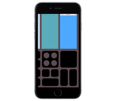
In the final v14 iteration above I clean up and more strictly align with the iPad switcher. That’s the version I present in part 1. A further improvement could be to enlarge the empty area at the bottom, for instance by limiting the Control Centre grid to 3 rows.
One last quote from Matthew Frederick’s excellent 101 Things I Learned in Architecture School:
Properly gaining control of the design process tends to feel like one is *losing* control of the design process […] Accept uncertainty. Recognize as normal the feeling of lostness that attends to much of the process.
On my journey I drifted away from my initial goal several times and accidentally glimpsed at different possibilities. Some may be worth revisiting later, some opened my eyes to new pitfalls. The wandering isn’t waste, it is the essence of exploration. At the same time one can’t keep opening boxes and adding todos forever; it’s also important to deliver reasonably stable and presentable solutions as you go along. The challenge is to strike a balance between breadth and depth.
Tips – if you try the prototypes
- Interactions are limited to: swipe up, scroll horizontally, tap the blue app miniature, tap the switcher’s background. In the home screen, tap the blue icon only.
- The intermediate Dock state that I describe in the previous post is not supported by the prototypes I share here. In order to create the Dock state movie I made a temporary modification.
- The prototypes are designed for the ‘iPhone 8’ itself, at 375 * 812 points (145 pt taller than an iPhone 6/7). So if your test device, like mine, is a 6/7 series, Principle scales down the UI a bit so that it fits your display: Everything looks a bit smaller than it should be. And positioned a bit higher too, due to the bottom area on the 6/7 (no such chin on the future edge to edge display).
- However, if you open this image on a 6/7 you get a much better idea of the expected ‘iPhone 8’ feel. Just imagine the phone is taller and that you can tap the bottom area anywhere. You may need to first save the image to your photo library. It’s supposed to fill the entire screen and look like this: