by Zhen Liu
How a Bubble Plot Reveals the Best Cities to Live in the US
In this article, I’ll show you some exciting facts about American cities, the value of bubble plots in deciding which city to live in, and how to create those plots.
Are you thinking about investing in real estate in 2018? Moving to a new city? When considering these decisions, you need to weigh in different factors like unemployment rate, housing price, the size of the city, safety and so on. Even with all that data and four corresponding bar charts, you’ll still be clueless staring at that table. You’ll try to find the best candidates, but those factors are telling different stories… Sounds like a complex problem.
So, is there a way we can visualize all these factors in 1 chart and compare them ALL? Yes, we can use a bubble plot!
What’s a bubble plot?
A bubble plot is a type of chart that displays more than two dimensions of data (compared to traditional scatter plots). In addition to plotting a dot on an X-Y plane, it uses the size, color, or shape of the point to display more dimensions.
We use unemployment rate as the X-axis, median home price as the Y-axis, and the population of the cities as the size of the dots. This makes a good third dimension. Color is randomly assigned to each city.
The best city in the US to live in is…(wait for it)
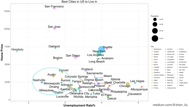
Winner: Nashville!
Other recommendations: Austin, Omaha, Milwaukee, Dallas, Minneapolis, Denver and Aurora.
They have low unemployment (and therefore there’s higher chance of finding a job), and low home price, because they are on the lower left side of the plot. What does that mean?
It means you can make your choices based on this plot.
For example, if you consider unemployment rate to be more important and don’t mind the higher home prices, then Honolulu, Oakland, Boston, and San Diego are strong candidates
What about adding safety as another factor?
Sure. Let’s add safety as a fourth factor (the other three factors are still home price, unemployment rate, and population). Instead of randomly assigning a color for a city, we use the color scale for crime (crime rate per 100,000 people). Red means more crime and blue means less.
Does the result change?
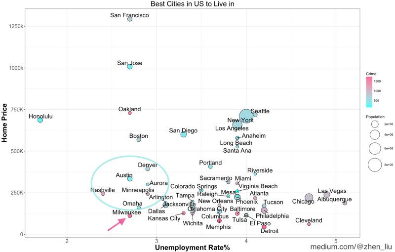
It did! If safety is very important for you, then Milwaukee might not be such a great choice among the previous recommendations (even though it’s at the lower left side of the graph).
Now you see the power of a bubble plot: the ability to demonstrate multiple factors in one 2-D plot. If you only have bar charts for those factors, it’s hard for you to identify the cities with an ideal combination of factors. The bubble plot basically created a “visual objective function” for you to optimize a multi-variable decision-making problem.
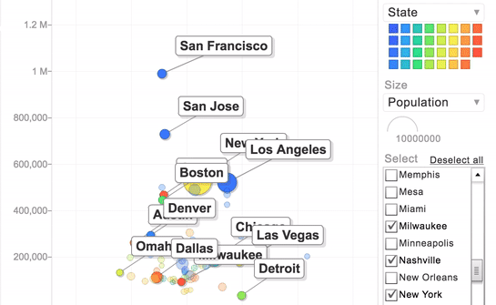
How do unemployment rate and home price change over time?
We can create an interactive motion chart to add time as a dimension (2013 to 2017) to see how the factors change for these cities over time.
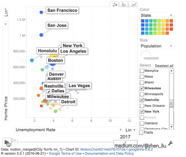
To avoid too much visual information, I didn’t use crime data and used the different colors to represent a few selected cities.
The good news is that the unemployment rate for almost all cities decreased significantly (moving from right to left). But the bad news is that the housing prices are going up pretty fast (especially for San Francisco, San Jose, Los Angles, New York, and Seattle).
Want to create the charts yourself? Here is my code for the bubble plots and the motion chart in R. Have fun playing with the plots :)
################ Bubble Plot ################library(data.table)library(ggplot2)library(ggrepel)bubble_data <-fread("https://raw.githubusercontent.com/zhendata/Medium_Posts/c007346db1575aca391a6623c87bb5a31a60b365/bubble_plot_merged_city_data.csv",sep=",")bubble_plot <- ggplot(bubble_data, aes(x = Unemployment_Rate, y = Home_Price/1000)) + geom_point(aes(size = Population, fill = Total_Crime),shape=21) +# Create 'Bubble' by assigning size a variable #scale_fill_continuous(low = "#33FFFF", high ="#FF6699" ) +scale_size_area(max_size = 20)+# Select bubble color scale and bubble maximum size #geom_text_repel( aes(label = City),nudge_x = 0,nudge_y = 0.75,size = 6) +# Use geom_text_repel to repel the labels away from each other #theme_bw()+# Use white background instead of the default grey one #ggtitle("Best Cities in US to Live in") +labs(x = "Unemployment Rate%", y = "Home Price", size = "Population",fill="Crime") +theme(plot.title = element_text(size=25, hjust = 0.5), axis.title=element_text(size=20, face = "bold"), axis.text=element_text(size=15)) +# Style title and axis #scale_y_continuous(name="Home Price", breaks = seq(0, 1500, by=250), labels=c("0", "250K", "500K", "750K", "1000k", "1250k", "1500K"))# Make y-axis more readable by replacing scientific number by "K" #print(bubble_plot)################# Motion Chart #################library(data.table)library(googleVis)motion_data <-fread("https://raw.githubusercontent.com/zhendata/Medium_Posts/c007346db1575aca391a6623c87bb5a31a60b365/motion_chart_merged_city_data.csv",sep=",")motion_chart <- gvisMotionChart(motion_data, idvar = "City", timevar = "Year",xvar = "Unemployment Rate",yvar= "Home Price",sizevar="Population")plot(motion_chart)# R automatically opens a tab in the browser for you# The flash player needs to be enabled in browser 
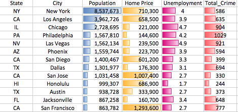
######### Data #########"""The datasets I used are from Zillow (medium housing), FBI’s UCR program, census.gov (population), Bureau of Labor (unemployment). I did some data cleaning and joining for the format I needed in this article, and you can click the links below to download."""bubble_plot_merged_city_data.csv, motion_chart_merged_city_data.csvFollow me and give me a few claps if you found this helpful!
You can also read my previous articles on data science, real estate, and decision making:
How to analyze seasonality and trends to save money on your apartment lease.
When I was looking for a new apartment to rent, I started to wonder: is there a data-driven decision making strategy…medium.freecodecamp.orgHow to Use Data to Predict Rent and Optimize Your Lease Duration So You Can Save Money
In my last post, we talked about how to pick the best month to sign the lease based on seasonality. Now, how long…medium.freecodecamp.org