
by Déborah Mesquita
How and why I used Plotly (instead of D3) to visualize my Lollapalooza data

D3.js is an awesome JavaScript library, but it has a very steep learning curve. This makes the task of building a valuable visualization something that can take a lot of effort. This extra effort is ok if your goal is to make new and creative data visualizations, but often that is not the case.
Often times, your goal might just be to build an interactive visualization with some well-known charts. And if you're not a front-end engineer, this can become a little tricky.
As data scientists, one of our main tasks is data manipulation. Today the main tool I use for that is Pandas (Python). What if I tell you that you can build some beautiful and interactive charts for the web right from your Pandas dataframes? Well, you can! We can use Plotly for that.
For the record, there are also Plotly API Libraries for Matlab, R and JavaScript, but we’ll stick with the Python library here.
To be fair, Plotly is built on top of d3.js (and stack.gl). The main difference between D3 and Plotly is that Plotly is specifically a charting library.
Let's build a bar chart to get to know how Plotly works.
Building a bar chart with plotly
There are 3 main concepts in Plotly’s philosophy:
- Data
- Layout
- Figure
Data
The Data object defines what we want to display in the chart (that is, the data). We define a collection of data and the specifications to display them as a trace. A Data object can have many traces. Think of a line chart with two lines representing two different categories: each line is a trace.
Layout
The Layout object defines features that are not related to data (like title, axis titles, and so on). We can also use the Layout to add annotations and shapes to the chart.
Figure
The Figure object creates the final object to be plotted. It's an object that contains both data and layout.
Plotly visualizations are built with plotly.js. This means that the Python API is just a package to interact with the plotly.js library. The plotly.graph_objs module contains the functions that will generate graph objects for us.
Ok, now we a ready to build a bar chart:
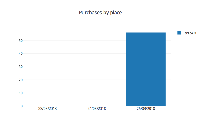
import plotly.graph_objs as goimport pandas as pdimport plotly.offline as offlinedf = pd.read_csv("data.csv")df_purchases_by_type = df.pivot_table( index = "place", columns = "date", values = "price", aggfunc = "sum" ).fillna(0)trace_microbar = go.Bar( x = df_purchases_by_type.columns, y = df_purchases_by_type.loc["MICROBAR"])data = [trace_microbar]layout = go.Layout(title = "Purchases by place", showlegend = True)figure = go.Figure(data = data, layout = layout)offline.plot(figure)Note: in this article we’ll not talk about what I’m doing with the dataframes. But if you would like a post about that, let me know in the comments ?
Okay, so first we want to show the bars of one category (a place called "MICROBAR"). So we create a data object (a list) with go.Bar() (a trace) specifying the data for the x and y axes. Trace is a dictionary and data is a list of dictionaries. Here is the trace_microbar contents (notice the type key):
{'type': 'bar', 'x': Index(['23/03/2018', '24/03/2018', '25/03/2018'], dtype='object', name='date'), 'y': date 23/03/2018 0.0 24/03/2018 0.0 25/03/2018 56.0 Name: MICROBAR, dtype: float64}In the Layout object, we set the title of the chart and the showlegend parameter. Then we wrap Data and Layout in a figure and call plotly.offline.plot() to display the chart. Plotly has different options for displaying the charts, but let’s stick with the offline option here. This will open a browser window with our chart.
I want to display everything in a stacked bar chart, so we’ll create a data list with all the traces (places) we want to display and set the barmode parameter to stack.
import plotly.graph_objs as goimport pandas as pdimport plotly.offline as offlinedf = pd.read_csv("data.csv")df_purchases_by_place = df.pivot_table(index="place",columns="date",values="price",aggfunc="sum").fillna(0)data = []for index,place in df_purchases_by_place.iterrows(): trace = go.Bar( x = df_purchases_by_place.columns, y = place, name=index ) data.append(trace)layout = go.Layout( title="Purchases by place", showlegend=True, barmode="stack" )figure = go.Figure(data=data, layout=layout)offline.plot(figure)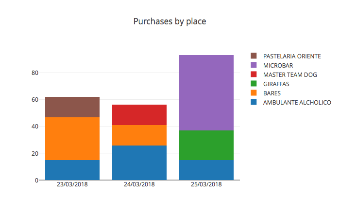
And that’s the basics of Plotly. To customize our charts, we set different parameters for traces and the layout. Now let’s go ahead and talk about the Lollapalooza visualization.
My Lollapalooza experience
For the 2018 edition of Lollapalooza Brazil, all purchases were made through an RFID-enabled wristband. They send the data to your email address, so I decided to take a look at it. What can we learn about me and my experience by analyzing the purchases I made at the festival?
This is how the data looks:
- purchase date
- purchase hour
- product
- quantity
- stage
- place where I did the purchase
Based on this data, let’s answer some questions.
Where did I go during the festival?
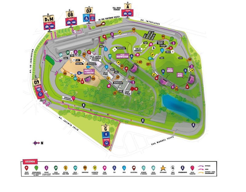
The data only tells us the name of the location where I made the purchase, and the festival took place at Autódromo de Interlagos. I took the map with the stages from here and used the georeferencer tool from georeference.com to get the latitude and longitude coordinates for the stages.
We need to display a map and the markers for each purchase, so we will use Mapbox and the scattermapbox trace. First let’s plot only the stages to see how this works:
import plotly.graph_objs as goimport plotly.offline as offlineimport pandas as pdmapbox_token = "" #https://www.mapbox.com/help/define-access-token/df = pd.read_csv("stages.csv")trace = go.Scattermapbox( lat = df["latitude"], lon = df["longitude"], text=df["stage"], marker=go.Marker(size=10), mode="markers+text", textposition="top" )data = [trace]layout = go.Layout( mapbox=dict( accesstoken=mapbox_token, center=dict( lat = -23.701057, lon = -46.6970635 ), zoom=14.5 ) )figure = go.Figure(data = data, layout = layout)offline.plot(figure)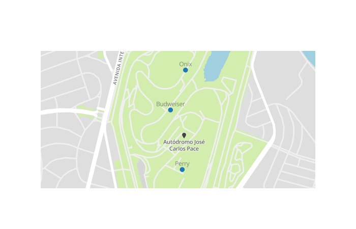
Let’s learn a new Layout parameter: updatemenus. We will use this to display the markers by date. There are four possible update methods:
"restyle": modify data or data attributes"relayout": modify layout attributes"update": modify data and layout attributes"animate": start or pause an animation)
To update the markers, we only need to modify the data, so we will use the "restyle" method. When restyling you can set the changes for each trace or for all traces. Here we set each trace to be visible only when the user changes the dropdown menu option:
import plotly.graph_objs as goimport plotly.offline as offlineimport pandas as pdimport numpy as npmapbox_token = ""df = pd.read_csv("data.csv")df_markers = df.groupby(["latitude","longitude","date"]).agg(dict(product = lambda x: "%s" % ", ".join(x), hour = lambda x: "%s" % ", ".join(x)))df_markers.reset_index(inplace=True)data = []update_buttons = []dates = np.unique(df_markers["date"])for i,date in enumerate(dates): df_markers_date = df_markers[df_markers["date"] == date] trace = go.Scattermapbox( lat = df_markers_date["latitude"], lon = df_markers_date["longitude"], name = date, text=df_markers_date["product"]+"<br>"+df_markers_date["hour"], visible=False ) data.append(trace) visible_traces = np.full(len(dates), False) visible_traces[i] = True button = dict( label=date, method="restyle", args=[dict(visible = visible_traces)] ) update_buttons.append(button)updatemenus = [dict(active=-1, buttons = update_buttons)]layout = go.Layout( mapbox=dict( accesstoken=mapbox_token, center=dict( lat = -23.701057, lon = -46.6970635), zoom=14.5), updatemenus=updatemenus )figure = go.Figure(data = data, layout = layout)offline.plot(figure)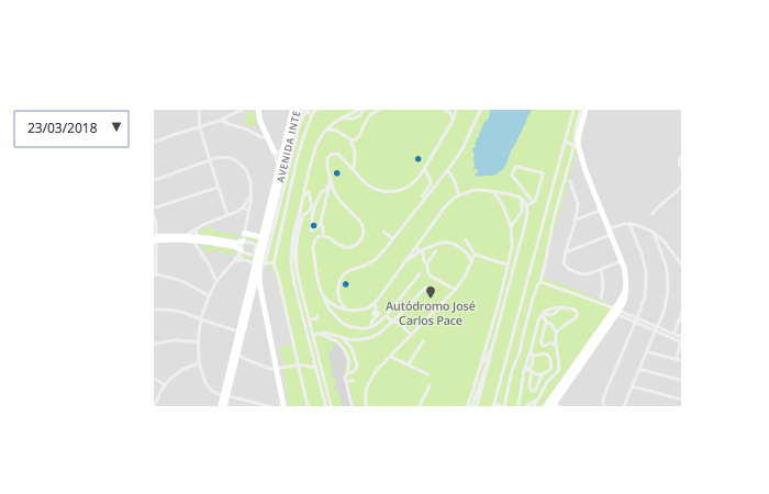
How did I spend my money?
To answer that, I created a bar chart with my spendings for food and beverage by each day and built a heatmap to show when I bought stuff. We already saw how to build a bar chart, so now let’s build a heatmap chart:
import plotly.graph_objs as goimport pandas as pdimport plotly.offline as offlinedf = pd.read_csv("data.csv")df_purchases_by_type = df.pivot_table(index="place",columns="date",values="price",aggfunc="sum").fillna(0)df["hour_int"] = pd.to_datetime(df["hour"], format="%H:%M", errors='coerce').apply(lambda x: int(x.hour))df_heatmap = df.pivot_table(index="date",values="price",columns="hour", aggfunc="sum").fillna(0)trace_heatmap = go.Heatmap( x = df_heatmap.columns, y = df_heatmap.index, z = [df_heatmap.iloc[0], df_heatmap.iloc[1], df_heatmap.iloc[2]] )data = [trace_heatmap]layout = go.Layout(title="Purchases by place", showlegend=True)figure = go.Figure(data=data, layout=layout)offline.plot(figure)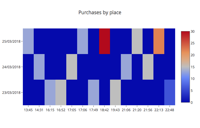
Which concerts did I watch?
Now let’s go to the coolest part: could I guess the concerts I attended based only on my purchases?
Ideally, when we are watching a show, we are watching the show (and not buying stuff), so the purchases should be made before or after each concert. I then made a list of each concert happening one hour before, one hour after, and according to the time the purchase was made.
To find out which one of these shows I attended, I calculated the distance from the location of the purchase to each stage. The shows I attended should be the ones with the shortest distance to the concessions.
As we want to show each data point, the best choice for a visualization is a table. Let’s build one:
import plotly.graph_objs as goimport plotly.offline as offlineimport pandas as pddf_table = pd.read_csv("concerts_I_attended.csv")def colorFont(x): if x == "Yes": return "rgb(0,0,9)" else: return "rgb(178,178,178)"df_table["color"] = df_table["correct"].apply(lambda x: colorFont(x))trace_table = go.Table( header=dict( values=["Concert","Date","Correct?"], fill=dict( color=("rgb(82,187,47)")) ), cells=dict( values= [df_table.concert,df_table.date,df_table.correct], font=dict(color=([df_table.color]))) )data = [trace_table]figure = go.Figure(data = data)offline.plot(figure)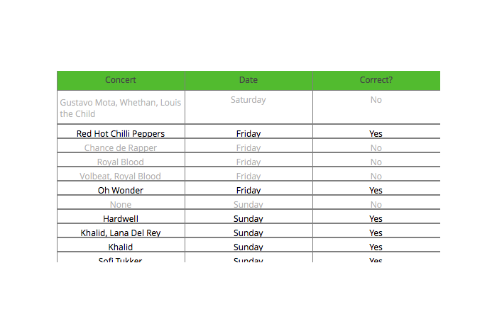
Three concerts were missing and four were incorrect, giving us a precision of 67% and recall of 72%.
Putting it all together: dash
We have all the charts, but the goal is to put them all together on a page. To do that we will use Dash (by Plotly).
“Dash is a Python framework for building analytical web applications. No JavaScript required. Dash is ideal for building data visualization apps with highly custom user interfaces in pure Python. It’s particularly suited for anyone who works with data in Python.” — Plotly’s site
Dash is written on top of Flask, Plotly.js, and React.js. It works in a very similar way to the way we create Plotly charts:
import dashimport dash_core_components as dccimport dash_html_components as htmlimport plotly.graph_objs as goimport pandas as pd app = dash.Dash()df_table = pd.read_csv("concerts_I_attended.csv").dropna(subset=["concert"])def colorFont(x): if x == "Yes": return "rgb(0,0,9)" else: return "rgb(178,178,178)"df_table["color"] = df_table["correct"].apply(lambda x: colorFont(x))trace_table = go.Table(header=dict(values=["Concert","Date","Correct?"],fill=dict(color=("rgb(82,187,47)"))),cells=dict(values=[df_table.concert,df_table.date,df_table.correct],font=dict(color=([df_table.color]))))data_table = [trace_table]app.layout = html.Div(children=[ html.Div( [ dcc.Markdown( """ ## My experience at Lollapalooza Brazil 2018 *** """.replace(' ', ''), className='eight columns offset-by-two' ) ], className='row', style=dict(textAlign="center",marginBottom="15px") ),html.Div([ html.Div([ html.H5('Which concerts did I attend?', style=dict(textAlign="center")), html.Div('People usually buy things before or after a concert, so I took the list of concerts, got the distances from the location of the purchases to the stages and tried to guess which concerts did I attend. 8 concerts were correct and 3 were missing from a total of 12 concerts.', style=dict(textAlign="center")), dcc.Graph(id='table', figure=go.Figure(data=data_table,layout=go.Layout(margin=dict(t=30)))), ], className="twelve columns"), ], className="row")])app.css.append_css({ 'external_url': 'https://codepen.io/chriddyp/pen/bWLwgP.css'})if __name__ == '__main__': app.run_server(debug=True)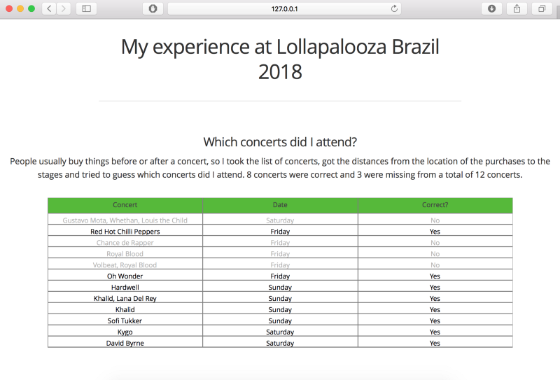
Cool right?
I hosted the final visualization here and the all the code is here.
There are some alternatives to hosting the visualizations: Dash has a public dash app hosting and Plotly also provides a web-service for hosting graphs.
Did you found this article helpful? I try my best to write a deep dive article each month, you can receive an email when I publish a new one.
I had a pretty good experience with Plotly, I’ll definitely use it for my next project. What are your thoughts about it after this overview? And what other tools do you use to build visualizations for the web? Share them in the comments! And thank you for reading! ?