by Gbolahan Taoheed Fawale
How I designed a famous building in isometric 3D using Figma

This article does not quite follow the conventional tutorial format. This is a blend of storytelling and broad explanations, a well-documented expression of my thoughts.
Since I designed my first 3D object in Figma, I’ve become more interested in recreating different complex objects and illustrations. This will ultimately help me better my design skills. I want make designs that make people go “Wow! Did you really use Figma to do that?” I want to hear them express their surprise, as they thought Figma was only a UI design tool.
That is how I personally want to position Figma within and beyond my immediate community. Just like developers say, “it’s not about the available tools but how well those tools can be put to good use.” Indeed, it’s about how these tools can be used for the desired results. Besides, the most important aspect of software development is what determines your level of proficiency in a particular programming language. I also do little front-end as well, though.
I have some design projects as well as accompanying posts that I will be preparing in an effort to document how I created them. I will be pushing these to the public as soon as I am done.
Though isometric designs are gradually getting popular, I want to push my designs beyond the conventional isometric 3D designs. I want them to head towards something more realistic while also keeping their originality.
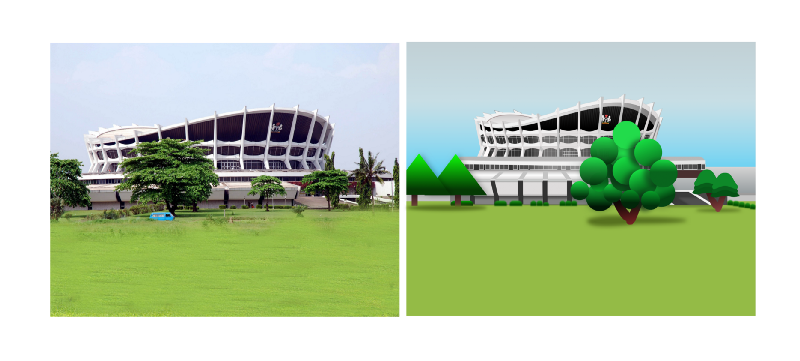
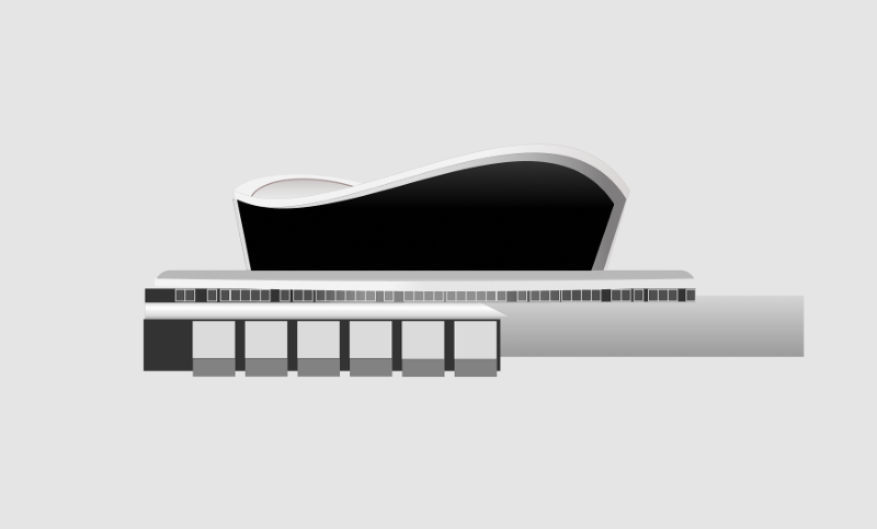
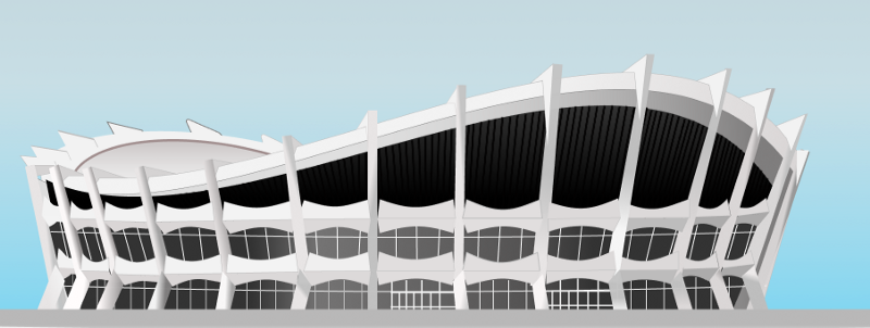
Now, let’s get back to business. I want to take it back to the roots (Africans, a-woo! I know some of us know that popular JJC song. Lol.) Well, this is the first design from my Isometric Nigeria 3D landmark project, and it’s also one of the most complex. I believed that if I could successfully design this building (the National Theater, in Lagos) I could easily design any other isometric 3D object.
Stage 1: Pre-design
I started out by spending some time studying the building. I used a picture I got off Google as a reference point by bringing the picture into my Figma workspace. While I worked on the design, I kept studying the reference image and continued to tweak the design until I got something nicely crafted.
I approach my designs like I want to draw or paint them on paper. I study the shadows, perspective, contrast, direction, and reflection of light. These are some of the most important elements and features to look out for when creating isometric 3D objects and realistic illustrations. Strategically applying gradient layers give objects that solid appearance.
Stage 2: Design proper (Creating upper seat-section of the theater)
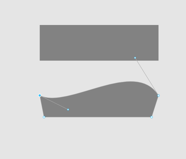
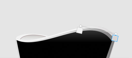
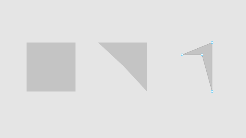
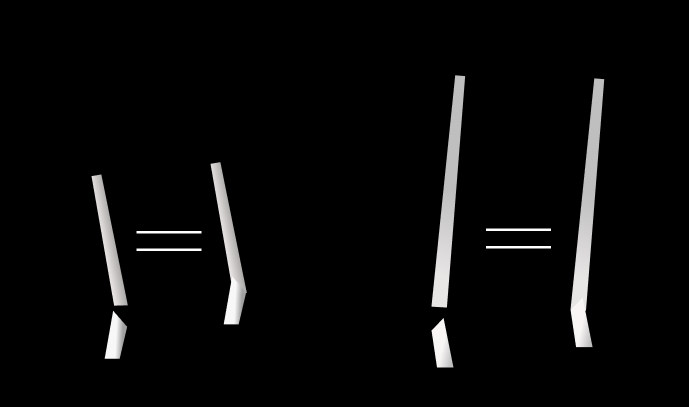
First, I created the body of the upper part of the building using a rectangle. I then modified the rectangle to give me a shape similar to what I have in the reference photo. After that, I did something similar for the other part (rectangle) of the building that looks like it’s behind the first, check the second image below.
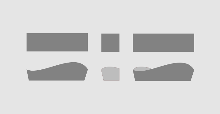
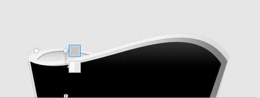
Now we need to replicate these two shapes, edit them to make them appear bigger and place them behind the initial/original layers. This lays a foundation for what will later look like a roof/top of a real building structure. This process is demonstrated in the images below.
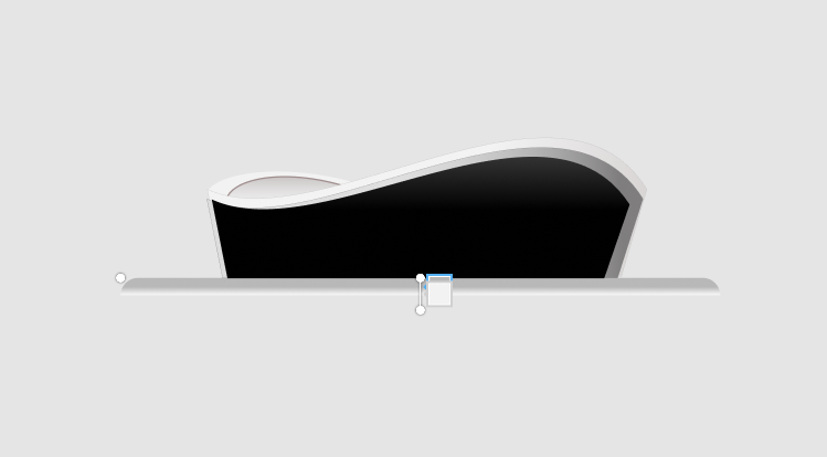
Once completed, the next stage was to create the lower part of the building.
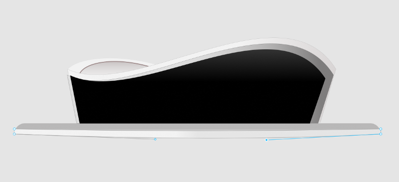
Stage 3: Designing the outer part of the stage of the theater
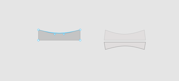
I created a rectangle, applied a corner radius of 100px to the upper left and right corners, and also applied a linear gradient fill. The corner radius and gradient are used to show that the structure is circular. The result is the image below.
Next, I added another rectangle with a gradient fill, and bent it outwardly towards the bottom. The two rectangles in this stage show that the concrete base of the first section we created above is also circular. The new rectangle has a wider circumference so it extends more outwardly than the section above it. This is also reflected in the width of the rectangles. The combined result is in the image below.
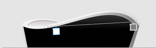
Things are getting more interesting. In the image below, I created another rectangle, then applied a linear gradient fill. You can see the center is brighter and has a kind of shiny effect. This was done to give the next layer a glassy effect, as seen in the reference photo.
The glassy layer is a complex shape (a single layer of many similar shapes). I use complex shapes to reduce the number of layers I have in my layers panel, when designing without grouping or flattening layers. You can read my post on it here. Right after this, I added another rectangle as seen in the next image. This part forms a wall used as a demarcation between the different openings and entrances of the building.
Stage 4: Ground floor design
Next, I added another rectangular layer, which I edited and modified to look like what is in the picture below. This layer forms the top for the next layers. It, and the other layers I will be adding afterwards, all play a role in the look of the structure and how it’s perceived by the viewer.
I added another rectangle that was blurred to form the shadow for the next layers I created in the next image.
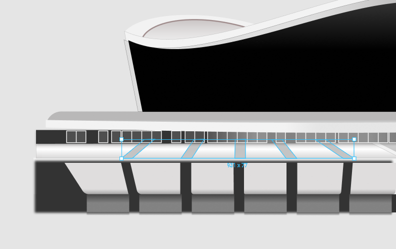
In the image above, I created 12 rectangles placed neatly on top of each other which I modified to have the picture below
Stage 5: Adding more effects
I applied a linear gradient fill and drop shadow to the six light grey rectangles above. The gradient gives it the realistic look of a block of walls with light bouncing off it. I added the drop shadow to buttress that look and effect. The darker rectangles below are just flat walls/the base of the building. The shadows of the six light grey rectangles outwardly extend to the curved walls/pillars above that it was casting on.
I also applied a gradient fill to the dark grey rectangles. These are darker because they are the lowest part of the building.
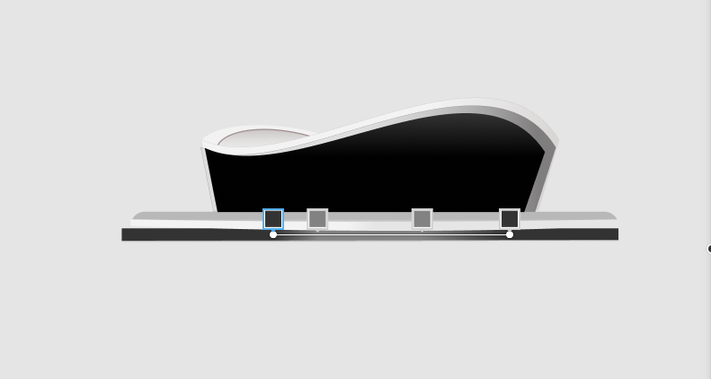
At this stage I needed to add some layers to perfect the look. I added another five narrow rectangles to fit the spaces between the 12 rectangles I created.
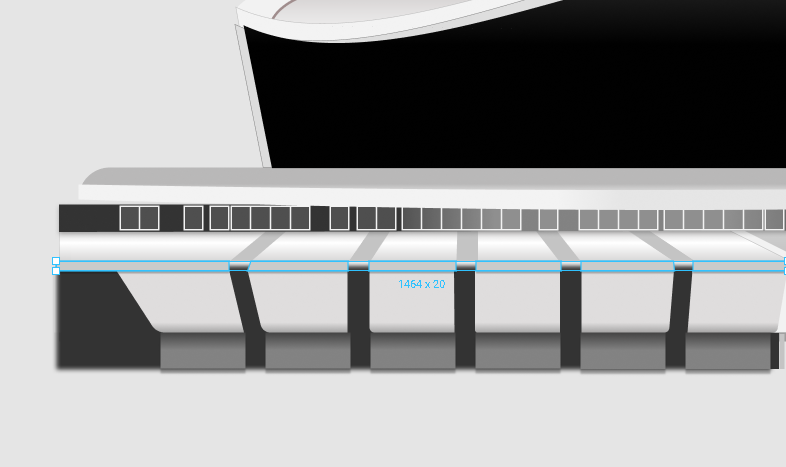
Then I added some narrow rectangles, and placed them vertically. This gives the thick block/pillar effect of a real building, at the point where the six grey rectangles meet with the flat layer above it. This is shown in the image below.
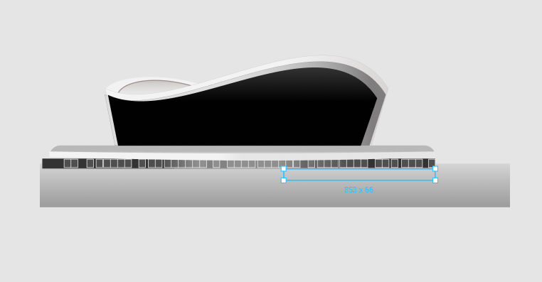
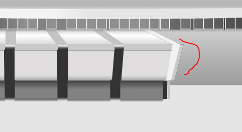
At this point there was something still missing. I added new rectangular layers and modified them to add that layer that looks like a wall at the far right of the 12 rectangles I created above. As captured in the reference photo, I modified the lightest rectangle and placed it behind the 12 rectangles. It now protrudes more towards the right. I modified the darker rectangles to look like the image below:
Stage 6: Working on the outer pillars
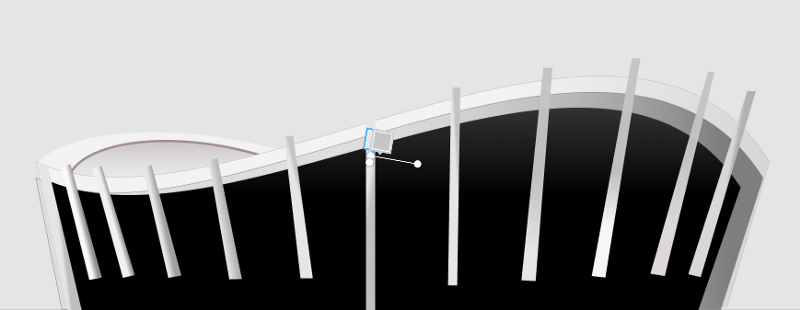
I went back to the upper part and put some things in place. As shown in the image below, I created narrow-sized rectangles to represent the vertical pillars.
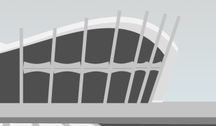
I then created another set of rectangles. These were modified, and one was flipped in the opposite direction. I grouped both shapes to form the horizontal inner pillars and replicated it to look like the picture below. Though they aren’t neatly arranged at this point, I worked on this later.
In the later parts of this post, you will observe that the upper part of each individual horizontal pillar is brighter than the lower parts. Also, the ones closer to the left side of the building are brighter than the ones on the right — remember the building is circular in structure ?
Stage 7: Designing the rooftop
I did some magic at the top-most part of the vertical pillars. I created a new rectangle, and used the ‘edit object’ option to modify it to look like what we have below. I modified it to suit the different parts of the circular structure of the rooftop. You can see they are different sizes and also reflect how much light is hitting them from the top.
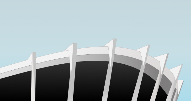
The rooftops in the image below are just rectangles I modified, and filled with color to blend with the surface of the roof itself. I created another copy, shifted it up a little to have a kind of stroke at the topmost edges, giving it a contrasting effect with the sky. If I didn’t do that, it would disappear into the sky at the background.
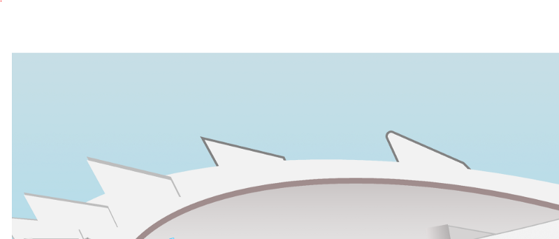
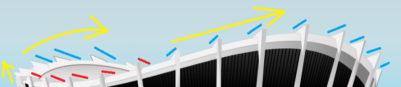
In the image below, the yellow arrows show the direction and curvature of the building. Light rays falling on the roof of the building reflect quite differently, making us see some parts of the building darker while others are lighter. The areas marked blue are brighter and sizes are bigger as the building curves towards the right. Towards the left side, they are darker and shorter until the building’s circular structure becomes more visible and higher behind, at the left.
It’s just like when you are driving on roads with sharp corners — you only see further ahead when you drive past the curve. It’s all these little things that make the eye perceive the building as a circular structure.
Stage 8: Adding effects to the pillars
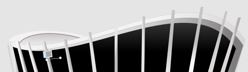
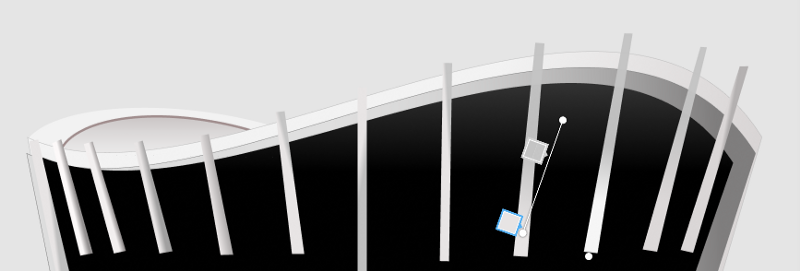
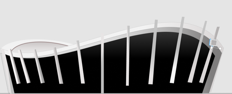
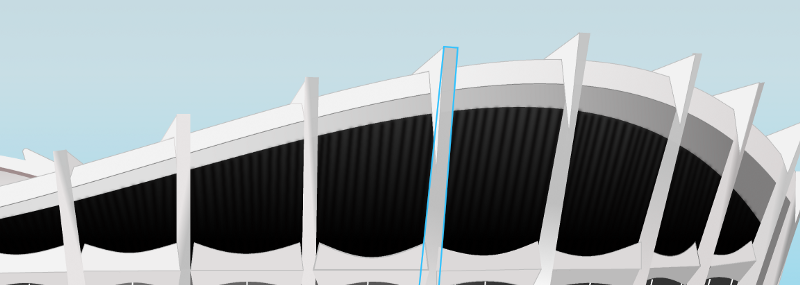
Here are images of the different ways I applied linear gradient fill to the vertical pillars. This gives them a solid look. You will also observe that the vertical pillars were tilted to follow the direction of the curvature of the building ?
Stage 9: Adding the windows and glass walls
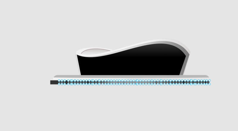
Just before adding the vertical pillars that spread around the building, I created complex shapes of lines. These represent what look like blocks of polished wood, neatly arranged side by side. I used this as a sort of padding layer on the outer walls of the upper section of the building, then blurred it. The result is shown in the image below.
I also did something similar to create the glass windows in the image below.
You will notice a black background behind the white lines in the image below. In this layer, I applied a gradient fill to give the shining bright effect of the glass walls/windows, and to give that circular structure of the building. That’s the reason why the right and left sides of the rectangle are darker that the bright center part. You will also notice that the white lines were bent and tilted parallel to the vertical pillars.
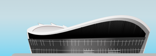
The final result is shown below.
The glass makes the center appear brighter because that’s the only part of the building our eyes can see. It’s reflecting the sky and surrounding environment, but gets a little darker moving towards the left and right due to the circular structure of the building. If this was a normal non-circular glass building or skyscraper, all the glass will be shining bright!
I kept on tweaking the design by applying gradients on the vertical pillars to give them a solid look. The lower portion of the vertical pillars are bent outwardly to support the structure. I thought of how I was going to achieve this for a while, considering the fact that the vertical pillars were rectangles and not a shape I created with a pen tool. Upon further review, I found it was necessary to add another rectangle, and blend them using gradient at the intersection of both rectangles.
Something from behind the scenes
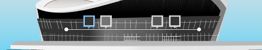
You will notice that I made some changes to the horizontal pillars to reflect the effect and direction of light in the pictures below. The upper part of each horizontal pillar is lighter than its lower part. The overall appearance of the horizontal pillar gets darker/duller towards the right part of the building.
At the lower portion of the building at the right, I added some rectangles to represent the entrance/driveway of the building. I did this by applying inner shadow to depict an entrance tunnel.
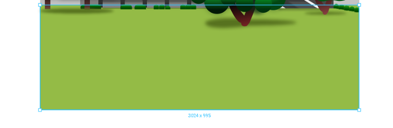
Then I worked on the sky image below and surrounding landscape. The green flat surface that represents the vegetation around the building is just a large rectangle with single color fill ( you can see the image of the grass layer in the second image).
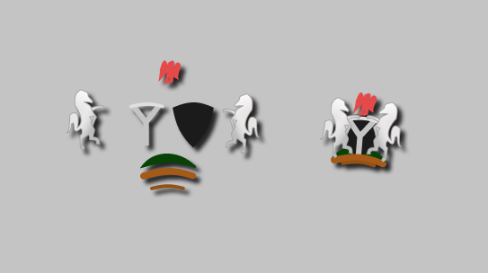
Stage 10: Nigerian Coat of Arms
At this stage, I was almost done with the design. Because I wasn’t satisfied, I tried to create the Nigerian Coat of Arms. It was a fast one, though, as I preferred to design something not perfect than not put anything there at all.
The horses and eagle were created using pen tool. For the the ‘Y’ part, the layers below the shield and the shield background were modified shapes. I also applied a drop shadow to the grouped Coat of Arms to make it “pop” out of the background.
Stage 11: Vegetation and geography
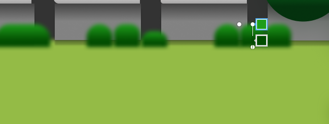
And the trees! The reason for using circles with shadows and gradient layers is to depict different hidden branches and leaves casting shadows on each other at different parts of the trees. I also made the tree with circles much bigger, closer, and strategically placed. The trees cast shadows underneath to give the building a distant effect in the eyes of the viewer.
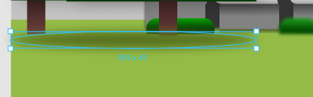
The shadows below the trees are just circles which were stretched to have a saucer look and flat appearance. These were then blurred to look like real shadows.
I also created some objects in the design to represent shrubs and green flowers. These were planted at different locations to look like the reference image. The shrubs and flowers are rectangles that I created, applied round corners at the upper parts, filled with a gradient layer, and blurred to give that distant effect. Objects get sharper and more distinct the closer you get, but the shrubs and flowers are far away. This is also the reason for their small sizes.
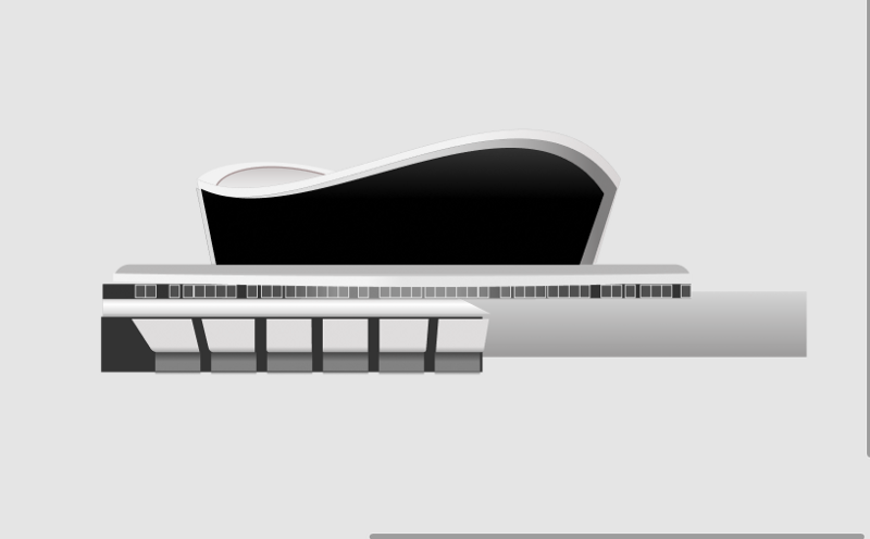
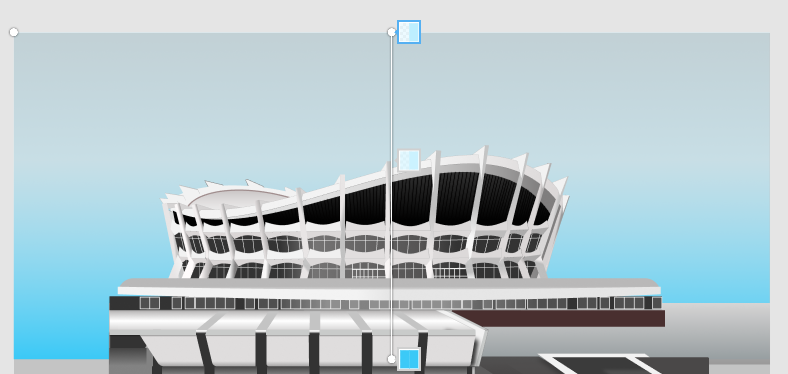
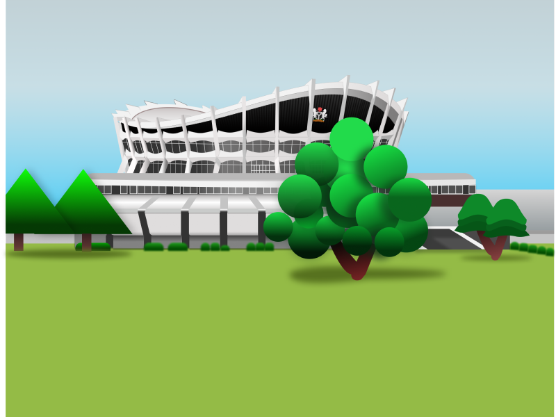
The final design is shown below.
The link to the design is here.
Thanks for reading
You can reach out to me on twitter here
Don’t forget to join Figma Africa Community on Slack here.