
by Cathy Ha
How to build a flexible image uploader component using Vue.js 2.0

I’ve been coding with Vue.js 2.0 for about half a year now, and it’s pretty awesome. It’s incredibly intuitive and simple. The partitioning between HTML/CSS/Javascript makes both learning and coding a breeze.
But the trouble (and the fun) of coding with a relatively new framework is the lack of tutorials for what you want to build. Especially when you have a specific thing in mind.
I ran into this issue when I was trying to build a profile photo uploader for Torneo. Sure, I could have used a fancy package, but where’s the fun in that?
So, by modifying and combining two great tutorials, I created my own reusable image uploader component.
Check out the git repository for all the code.
Desired Behaviour
I created the component with the following goals in mind:
- The component should be capable of being activated by any element in its parent component to upload images
- We should be able to see a preview of the image in the parent component
- The uploaded image should be saved in a FormData format to send to the back-end
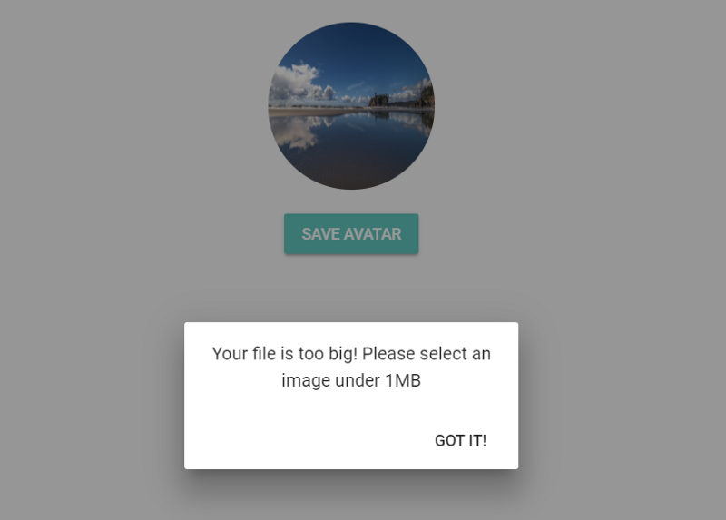
- The component should check for a size limit in the uploaded image (this can be done in the back-end as well, but it’s a bit faster in the front-end)
- One file at a time (note that this tutorial talks about how to handle multiple files — all you need are some loops)
Step 1: Setup
We’ll get started by installing the webpack-simple template. We’ll also be installing Vuetify to save some time on styling. Note that everything wrapped in <v-…> is from Vuetify. Since their tags are pretty self-explanatory, I won’t go too deep into it. I will leave you to read their documentation.
# install the vue-clinpm install vue-cli -g# initiate the webpack-simple, and follow instructionsvue init webpack-simple image-upload# install dependenciesnpm install# install Vuetifynpm install vuetify --save
Step 2: Create the Image Upload Template
Great! Now that we have the templates set up and installed, we can delete any placeholder content. Then we can create a new component file for the image uploader.
<template> <div> <!-- slot for parent component to activate the file changer --> <div @click="launchFilePicker()"> <slot name="activator"></slot> </div> <!-- image input: style is set to hidden and assigned a ref so that it can be triggered --> <input type="file" ref="file" :name="uploadFieldName" @change="onFileChange( $event.target.name, $event.target.files)" style="display:none"> <!-- error dialog displays any potential errors --> <v-dialog v-model="errorDialog" max-width="300"> <v-card> <v-card-text class="subheading">{{errorText}}</v-card-text> <v-card-actions> <v-spacer></v-spacer> <v-btn @click="errorDialog = false" flat>Got it!</v-btn> </v-card-actions> </v-card> </v-dialog> </div></template>- To make the image uploader component capable of being activated by any element in the parent component, we can take advantage of Vue’s “slot” functionality.
- Since we want the “trigger” for the input to be in the parent component, we want the functionality of the file input in the child component, without being able to see it. We can change the style of the input to “display:none” to hide it.
- The image input is assigned a “ref” so that when the slot is clicked on, we can activate the image input by its reference.
- To make the image uploader more user-friendly, we can use a dialog to display any potential errors.
Next, we can use some Vue.js magic in the JavaScript portion to massage some life into our component:
<script> export default { name: 'image-input', data: ()=> ({ errorDialog: null, errorText: '', uploadFieldName: 'file', maxSize: 1024 }), props: { // Use "value" here to enable compatibility with v-model value: Object, }, methods: { launchFilePicker(){ this.$refs.file.click(); }, onFileChange(fieldName, file) { const { maxSize } = this let imageFile = file[0] //check if user actually selected a file if (file.length>0) { let size = imageFile.size / maxSize / maxSize if (!imageFile.type.match('image.*')) { // check whether the upload is an image this.errorDialog = true this.errorText = 'Please choose an image file' } else if (size>1) { // check whether the size is greater than the size limit this.errorDialog = true this.errorText = 'Your file is too big! Please select an image under 1MB' } else { // Append file into FormData & turn file into image URL let formData = new FormData() let imageURL = URL.createObjectURL(imageFile) formData.append(fieldName, imageFile) // Emit FormData & image URL to the parent component this.$emit('input', { formData, imageURL }) } } } } }</script>5. To make the image uploader component v-model compatible, use “value” in the props. Whatever data that is emitted by the component will be captured in the “value” prop.
6. When the file input activator in the parent component is clicked, “this.$refs.file.click()” is used to activate the file selector.
7. Once the user picks something from the file selector / closes the file selector, we need to check:
- Whether the user has actually selected a file
- Whether the file is an image
- Whether the file is greater than the size limit (often a good idea when it comes to user uploads)
8. If the file that the user selected is fine, create a FormData element and append the file into the element using a name that your server would accept. Also, convert the image file into an object URL so that the parent component can read it for a preview.
9. Emit the data (FormData for uploading to the server, and imageURL for the preview) to the parent component.
Step 3: Create the Parent Component
In the parent component, we can visualize the child component’s functionality.
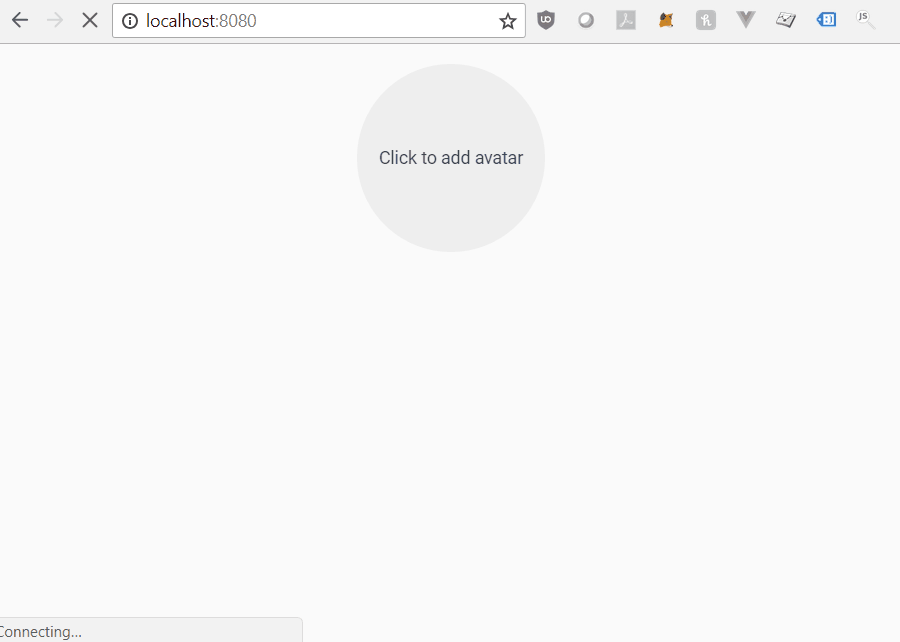
<template> <v-app id="app" class="mt-0"> <v-container grid-list-xl> <image-input v-model="avatar"> <div slot="activator"> <v-avatar size="150px" v-ripple v-if="!avatar" class="grey lighten-3 mb-3"> <span>Click to add avatar</span> </v-avatar> <v-avatar size="150px" v-ripple v-else class="mb-3"> <img :src="avatar.imageURL" alt="avatar"> </v-avatar> </div> </image-input> <v-slide-x-transition> <div v-if="avatar && saved == false"> <v-btn class="primary" @click="uploadImage" :loading="saving">Save Avatar</v-btn> </div> </v-slide-x-transition> </v-container> </v-app></template>- Wrap the activator element in a <div/> and let the child component know that it belongs in the slot that we named “activator”.
- Use Vue’s v-if and v-else to display a prompt to upload or the avatar preview depending on whether the user has selected a file.
- Conditionally display a button to save the user’s changes.
Almost done! Next, time to add in some Javascript to the parent component:
<script>import ImageInput from './components/ImageInput.vue'export default { name: 'app', data () { return { avatar: null, saving: false, saved: false } }, components: { ImageInput: ImageInput }, watch:{ avatar: { handler: function() { this.saved = false }, deep: true } }, methods: { uploadImage() { this.saving = true setTimeout(() => this.savedAvatar(), 1000) }, savedAvatar() { this.saving = false this.saved = true } }}</script>4. In the script portion, import the child component.
5. When the user clicks “save”, upload the avatar to the server (note that I am faking an upload in the code above. In reality, we use axios to upload the file to the server. The back-end then saves the file in a filesystem and passes the path to the file in the data).

That’s it! There’s much room to enhance this component — like passing props to resize the image being uploaded, handling multiple files, etc. If you see any potential points for improvement or spot a mistake in my code, please please leave a comment!
Again, feel free to check out the git repository for all the code.
Finally, a shameless plug here: if you happen to be interested in sports, check out Torneo — a sports-related startup that I’ve helped to develop.