
by Sarah Sweat
How to build a React development playground using Storybook

Lately, I have been wanting to try new things and test out new technologies or patterns in my React components. I needed a place where I could test these things out without launching a new app every time.
I recently started using React storybook at work in order to establish a new design system for future projects. I also used it to prototype several versions of a new content authoring tool our team is working on. Putting this tool together with my desire to create components and play around with new things in a low stakes way seemed perfect. A few examples of these new “things” are React Context, SlateJs, and React Hooks.
This could also be used as a portfolio and a great way to showcase your work. Since Storybook can be deployed as its own app, you can host a webpage where you have a variety of projects and components you can display to potential employers or clients. Once deployed, it’s as easy as sending them a link to your storybook!
This post will focus on creating the Storybook for React environment and I will aim to post in the future about what I create inside of it!
Sooo… What is Storybook?
Taken straight from the Storybook website because I couldn’t say it better myself:
“Storybook is a user interface development environment and playground for UI components. The tool enables developers to create components independently and showcase components interactively in an isolated development environment.
Storybook runs outside of the main app so users can develop UI components in isolation without worrying about app specific dependencies and requirements.”
That means… I can create and display/interact with components independently of actually running the React app! And since this project won’t be focused on a single app’s performance or DRYness, I can have multiple prototypes and versions of components so that I can perfect them, allow stakeholders to approve, etc. before bringing them into the app for which they were intended for. I can also use it to just practice making components and testing how to use the new tech I mentioned before.
Let’s get building now!
Create a base React app
npx create-react-app my-playground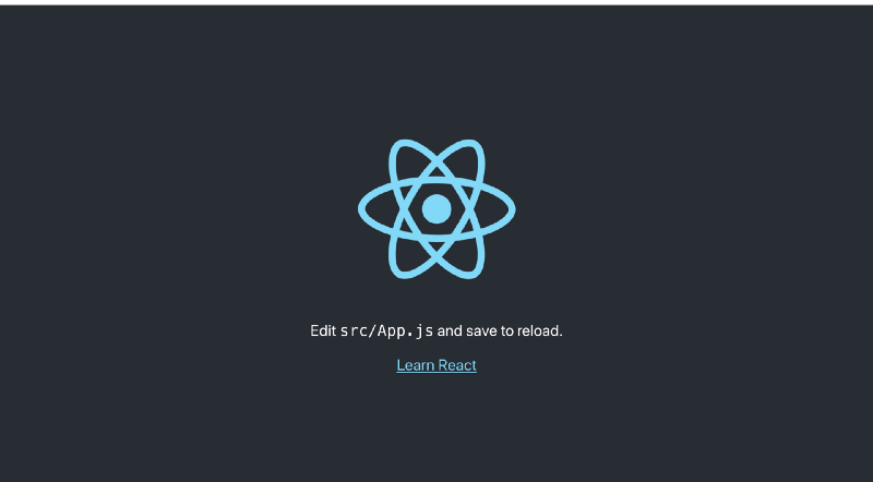
You can ensure that your app was created successfully by running yarn start . A new window should appear on your browser to localhost:3000 that looks like the picture above. Once confirmed you can stop it by pressing ⌘ + C.
Add Storybook
First, from the command line within your project, you will need to add storybook with the following command:
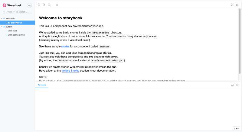
npx -p @storybook/cli sb initThen, you can run storybook by using:
yarn storybookNow you should be up and running, seeing a screen in your browser like the one below:
If you look within your project folder, you will notice that some files have been added and others updated:
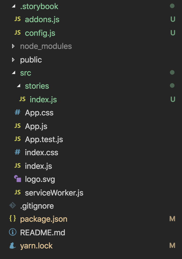
The ./storybook folder is home to where you will configure a lot of the settings for your storybook. There are all sorts of add-ons you can apply to your project to add more features. The config.js file is generally where you will apply add-ons and also tell storybook where to find your stories. The config defaults to the following:
import { configure } from '@storybook/react';
function loadStories() {
require('../src/stories');
}
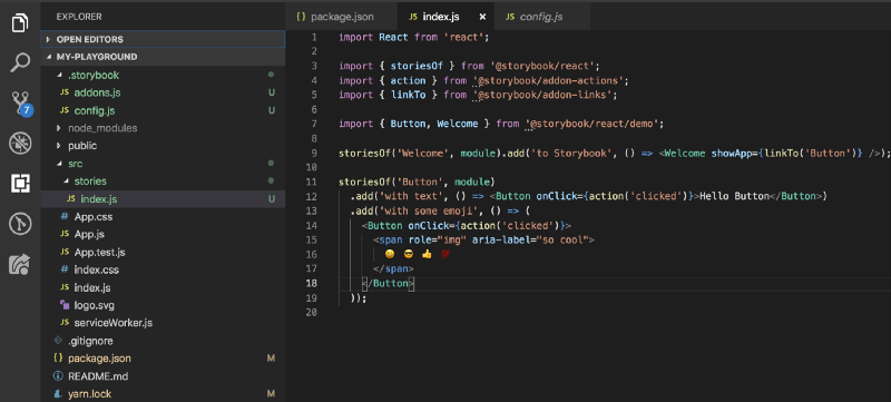
configure(loadStories, module);This is telling storybook to look in the ../src/stories folder for the stories you have written. Right now, storybook has gone ahead and added a few default stories for you. You can take a look at those to get an idea of how to write the stories. You are ultimately just rendering your components within their own functions and you can pass them whatever props you like.
As you can see in the example it gives you below, you can create multiple versions of the same component by just rendering it with different props.
You can imagine though, once you start creating more components, this file could get very large and you don’t want to have to spell out in your config every file with stories in it that you want rendered… Instead, a handy way to to do this is to name any file in your src folder with stories.js and to let storybook dynamically find all files named with stories.js at the end, within your src folder you would put the following in your config file:
import { configure } from '@storybook/react'

function loadStories() {
  const req = require.context('../src', true, /\.stories\.js$/)
  req.keys().forEach(filename => req(filename))
}

configure(loadStories, module)
This allows for a much cleaner file structure and you can organize your stories by project or even by component within your src folder.
Build Your Mini Projects
Let’s build a small component as an example to show how you could spin up a quick example project to start learning React’s Context API. Within my src folder I am going to create a ContextProject folder where I am going to add a file where I will define my component, and then another where I will define the story:
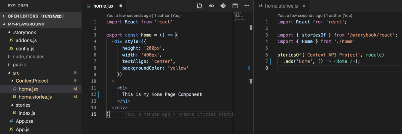
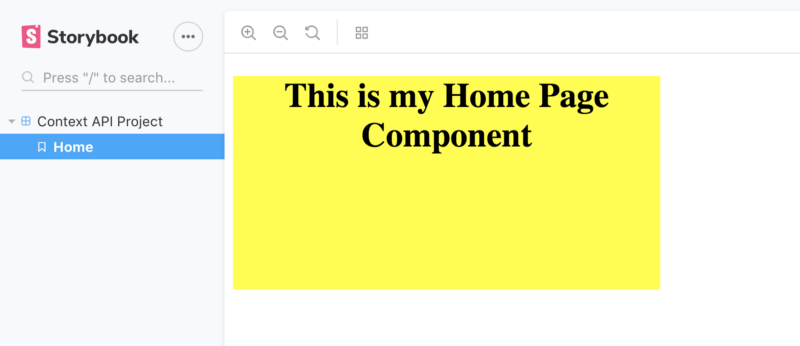
Now when I check my Storybook, I will see that I have a menu option for my Context API Project and below that, I can click to see my Home component I created:
And now I can start building out my context and other components within this folder in src. I will be able to play around and render the components I build, allowing me to quickly see my changes and not have to worry about launching a new React app every time I want to just test out a specific feature or new idea.
This also allows for a lot of flexibility when trying to quickly prototype a new idea. You already have an environment up and running and can have your favorite libraries like styled components already installed or have pre-defined themes that can just be easily imported into new projects. You can also pre-define some baseline components such as styled headings, divs, buttons etc that you can share across projects to make development go even faster.
Hope this helps and stay tuned for future posts about my favorite add-ons and details on the test projects I build in my Storybook.
Happy Coding!
References:
Storybook: UI component workshop for frontend developers
Storybook is an open source tool for developing UI components in isolation for React, Vue, and Angular. It makes…
storybook.js.org
My github Repo:
sarahsweat/my-playground
Contribute to sarahsweat/my-playground development by creating an account on GitHub.
github.com