by Daniel Miller
How to build a Reddit-inspired loading spinner with only HTML and CSS
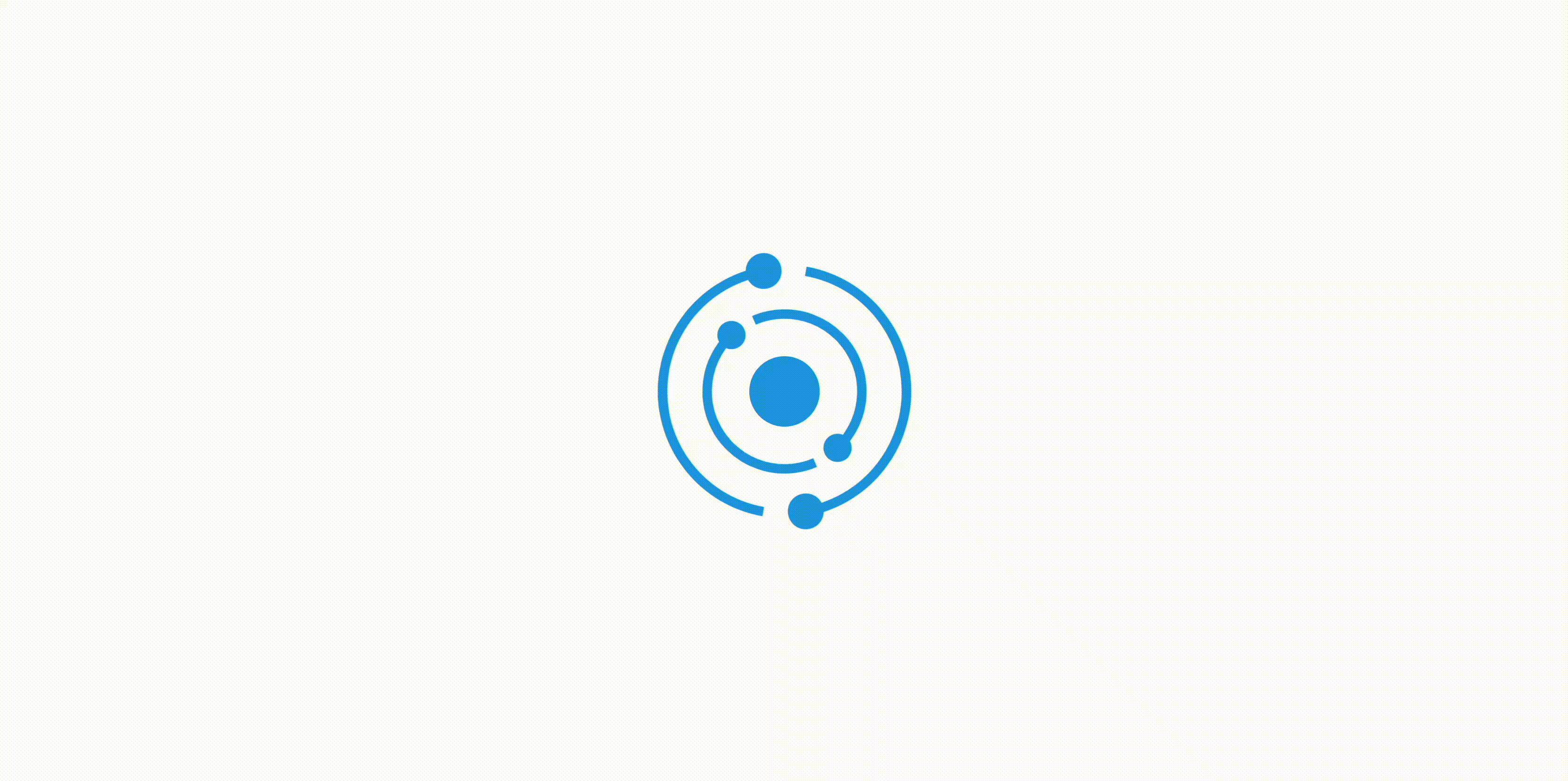
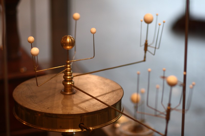
Reddit’s mobile app has a rather striking loading spinner reminiscent of orbital bodies circling a planet or star. Most developers would reach for JavaScript or SVGs for a task like this, but thanks to animation-iteration-count: infinite; and a few other hacks and tricks, that’s not even necessary. Today I’m going to show you how to code a Reddit-inspired spinner purely in HTML and CSS!
Here’s the final result:
Basic Setup
Let’s start by writing some HTML DOM elements onto which we can pin the center circle and each of the rotating orbitals.
<div class="center"></div>
<div class="inner-spin">

  ...

</div>
<div class="outer-spin">

  ...

</div>
The inner-spin and outer-spin elements will be the parents nodes of everything that needs to be animated, and eventually we’ll apply the CSS keyframes transforms to these parent nodes.
In the code example above, the ellipses (…) stand in for the arcs and orbiting “moons.” Both the inner and the outer rings each contain two arcs and two moons, but for reasons that will become clear a bit later, each arc is actually composed of two CSS shapes, so we need a total of eight arcs and four moons. The HTML in full looks like this:
<div class="center"></div>
<div class="inner-spin">

  <div class="inner-arc inner-arc_start-a"></div>
  <div class="inner-arc inner-arc_end-a"></div>
  <div class="inner-arc inner-arc_start-b"></div>
  <div class="inner-arc inner-arc_end-b"></div>

  <div class="inner-moon-a"></div>
  <div class="inner-moon-b"></div>

</div>
<div class="outer-spin">

  <div class="outer-arc outer-arc_start-a"></div>
  <div class="outer-arc outer-arc_end-a"></div>
  <div class="outer-arc outer-arc_start-b"></div>
  <div class="outer-arc outer-arc_end-b"></div>

  <div class="outer-moon-a"></div>
  <div class="outer-moon-b"></div>

</div>
CSS Shapes
It’s possible to draw circles and arcs in CSS by simply creating a square <div>and setting border-radius to 50%.
Each side of the border can take a different color or can be set to transparent. The background-color property sets the shape’s fill, if any.
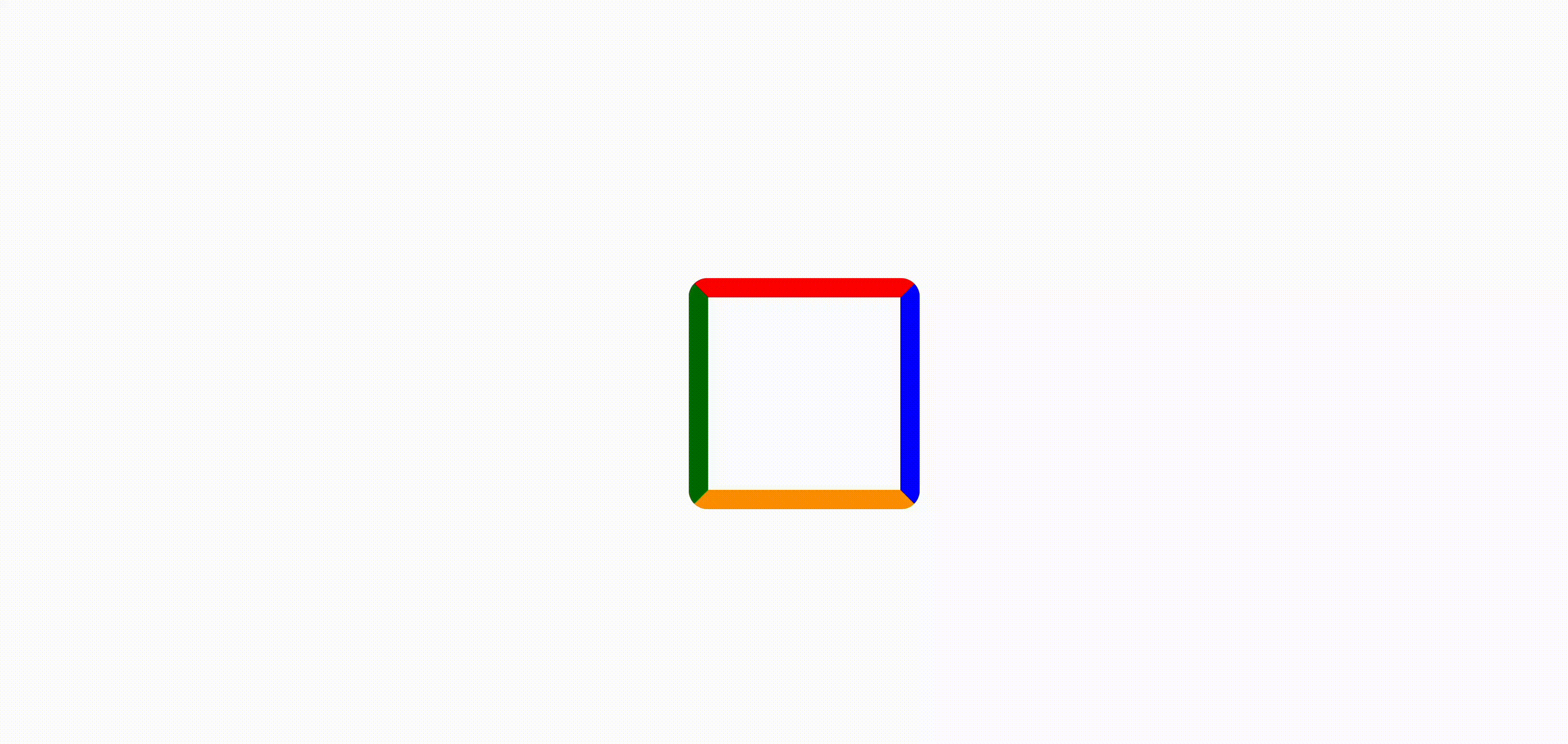
It’s easy to draw 90, 180, and 270 degree arcs by simply setting one or more sides of the border to be transparent. However, if you look closely at the spinner at the top of the page, you’ll notice that the “tail” of each orbital leaves a gap between itself and the moon behind it. That means that, although the arc lengths are close to 180 degrees, they’re a little shy of 180.
To draw circle segments of irregular lengths in CSS requires a bit of a hack. To do this we need to draw two adjacent 90-degree arc segments and rotate one slightly so that they overlap, leaving an apparent arc segment of about 160 degrees.
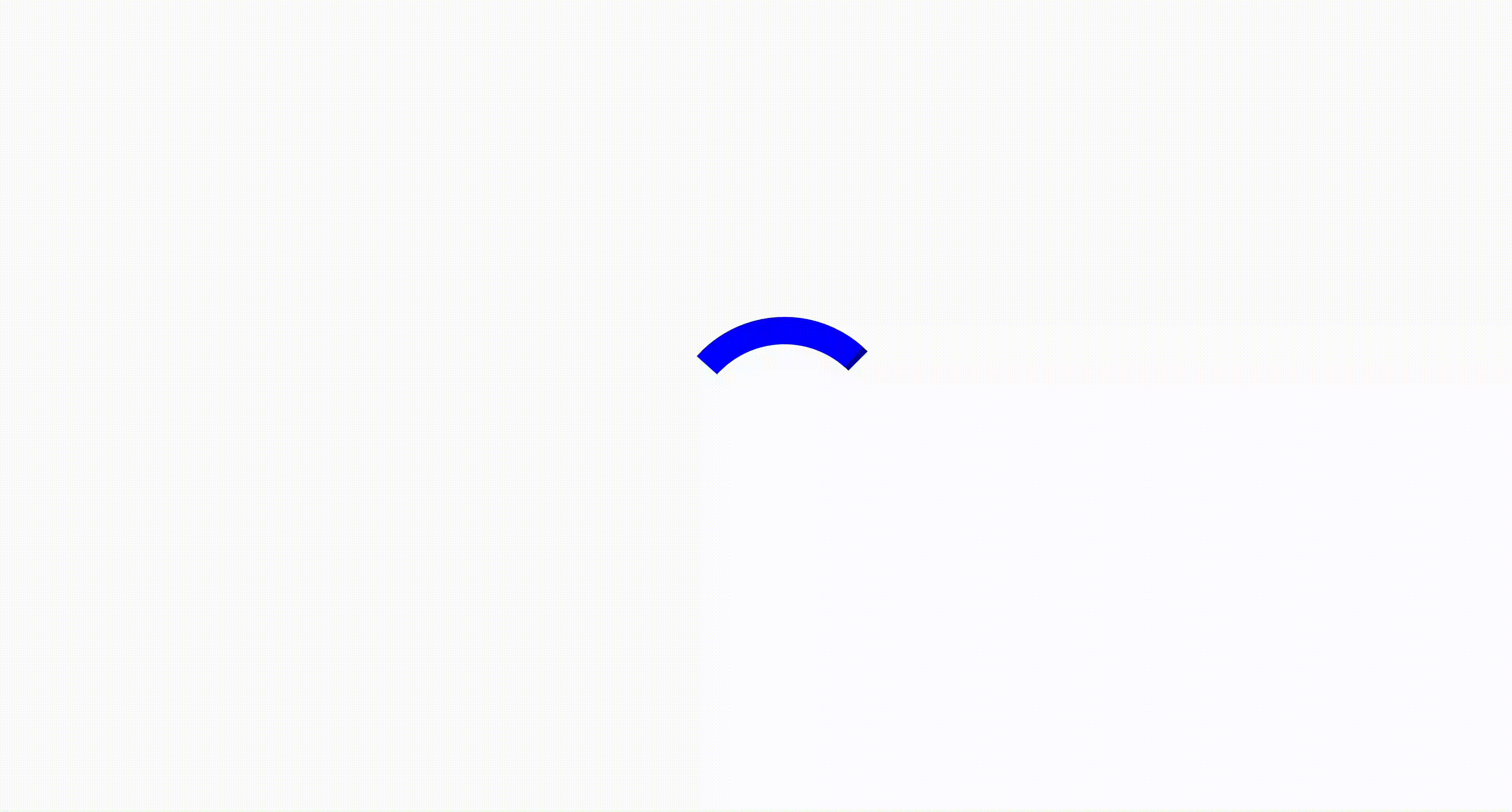
Looking back up at the HTML now, you might now be able to guess why we’ve set two nodes for each arc (an arc_start and arc_end). These will be used to represent each part of a single overlapping arc representing the tail of each orbital.
Setting Up the CSS
To start with, we’ll set a CSS variable to represent the color of the spinner and another variable to represent a -50%, -50% translate which we’ll use throughout the CSS to center shapes around their center (as apposed to their upper-left corner, which is the default).
html {
  --spinner: #1EAAF0;
  --center: translate(-50%, -50%);
}
Now we can go ahead and draw the central circle as well.
.center {
   position: absolute;
   width: 30px;
   height: 30px;
   background: var(--spinner);
   border-radius: 50%;
   top: 50%;
   left: 50%;
   transform: var(--center);
}
The child nodes for each orbital are enclosed inside parent nodes called inner-spin and outer-spin. For now we’ll just use them to center the spinner within the window.
.outer-spin, .inner-spin {
  position: absolute;
  top: 50%;
  left: 50%;
}
Drawing the Orbitals
The loading spinner is basically a series of concentric circles, so let’s first focus on drawing just one arc.
Since each arc consists of two overlapping sections, lets start be just drawing two arcs next two each other.
.inner-arc {
  width: 62px;
  height: 62px;
}
.inner-arc_start-a {
  border-color: transparent transparent transparent green;
  /* NOTE: the order here very much matters! */
  transform: var(--center) rotate(0deg);
}
.inner-arc_end-a {
  border-color: red transparent transparent transparent;
  transform: var(--center) rotate(0deg);
}
The first transform centers the <div> in the window. Rotation is set to zero degrees to show the default state of the arcs.

Notice that the arcs don’t line up with the x-crossings on the unit circle. To correct for this, and to make the arcs easier to work with, we rotate the arcs by 45 degrees. Then we slightly over rotate one of the arcs to create a total arc length of about 160 degrees.
.inner-arc_start-a {
  border-color: transparent transparent transparent green;
  transform: var(--center) rotate(65deg);
}
.inner-arc_end-a {
  border-color: red transparent transparent transparent;
  transform: var(--center) rotate(45deg);
}
Next we can position one of the orbital moons by moving it along the x-axis. Unfortunately, unlike vector graphics such as SVGs, CSS borders are not widthless vectors that accept a stroke style. That means that distances are not automatically measured to the center point of the line. We must take into account the width of the border when positioning objects.
This results in a few “magic numbers” that we could probably minimize if we wanted to set more CSS variables and use the calc() function. That seems a bit involved though, so I’ll just position the circle by pixel value for now.
.inner-moon-a {
   position: absolute;
   top:50%;
   left:50%;
   width: 12px;
   height: 12px;
   background: red;
   border-radius: 50%;
   transform: var(--center) translate(33px, 0);
}
Next we draw two more arcs, but this time we use the scale(-1, -1) transform. This flips the arcs across both the x- and y-axes, essentially mirroring the contrail.
.inner-arc_start-b {
  border-color: transparent transparent transparent var(--spinner);
  transform: var(--center) rotate(65deg) scale(-1, -1);
}
.inner-arc_end-b {
  border-color: var(--spinner) transparent transparent transparent;
  transform: var(--center) rotate(45deg) scale(-1, -1);
Finally, for the outer orbit, we simply repeat the CSS from the inner orbit but set a larger <div> height and width! (Imagine how short this CSS could be with SASS mixins!)
.outer-arc {
  width: 100px;
  height: 100px;
}
Adding the Animation
The last step is to add animation. First we need to add a single keyframes element that sets the type of animation behavior and the CSS element(s) effected by animation, in this case rotation through a transform property.
@keyframes spin { 100% {transform: rotate(360deg); } }The identifier “spin” connects the keyframes back to animation attributes that we will add within each parent <div> elements. The animation property sets the temporal information for the animation, meaning that each orbital will orbit at a different speed.
.outer-spin {
  animation: spin 4s linear infinite;
}
.inner-spin {
  animation: spin 3s linear infinite;
}
That’s it!
The code for this tutorial can be found on CodePen.io. Please comment — or Tweet at me @PleathrStarfish — if you have a suggestion, observation, or a cool fork of my code!