by Zell Liew
The act of choosing two typefaces is probably the first (and often most difficult) task you do when creating a new design. Many people get stuck here, myself included.
Recently, I discovered a simple method to pair typefaces effectively and I’d love to share them with you. (Hint: it’s a 3×3 grid).
There’s one prerequisite to use this 3×3 grid (which I will reveal shortly) — knowing how to categorize typefaces. So, let’s start there.
Categorizing typefaces
On a broad level, typefaces can be broken down into the six categories. They are:
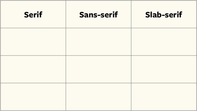
- Sans-serif
- Serif
- Slab-serifs (or Egyptians)
- Monospace
- Script (or Cursive)
- Display (or Decorative)
You can split typefaces into the first three categories by looking at the style of the serif.
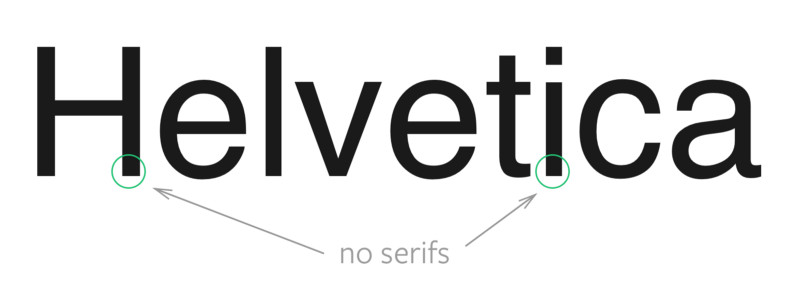
If the typeface contains no serifs, they fall into the sans-serif category. (sans means without). Examples of sans-serif typefaces include Helvetica and Gill sans.
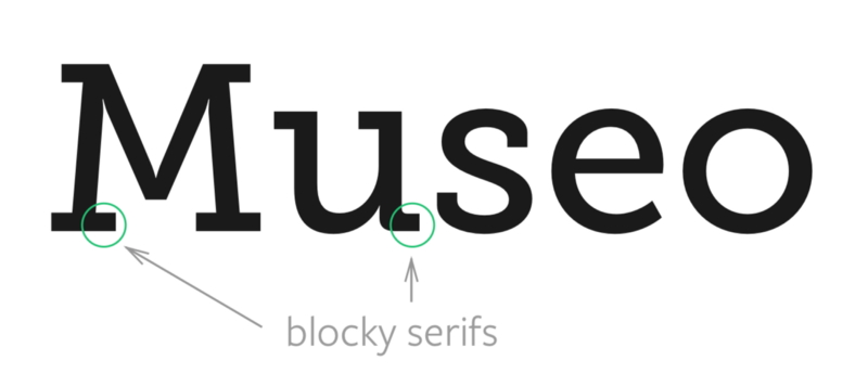
If the typeface contains serifs that look blocky, they fall under the slab-serif category. (slab means a large thick block). Slab-serifs are also called Egyptians even though there’s no relationship between the serifs and Egyptian writing. Examples of slab-serifs include Archer and Museo Slab.
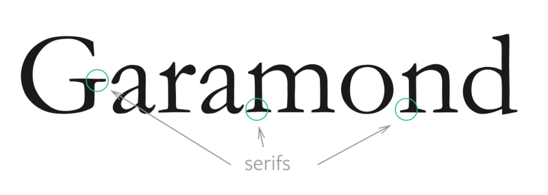
Any other typeface that contains serifs fall under the serifs category. Examples include Garamond and Georgia.
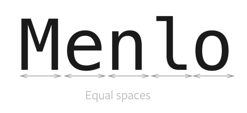
Monospace typefaces are no strangers to us developers. They’re typefaces whose characters occupy the same amount of horizontal space. They’re often used in tabular data and code. Examples include Menlo and Monaco.
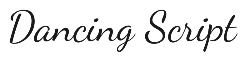
Script (or cursive) typefaces are often calligraphic in nature. They’re often used for short headlines, invitations and expressive text. Examples include Dancing Script and Lobster.
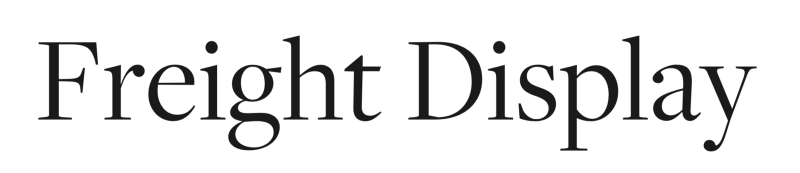
Finally, display typefaces are typefaces that are only used for large headlines. Many display typefaces are serif and sans-serif versions that are specially tweaked to look good at large sizes. Display typefaces also include ornamentals and decoratives, which can come in all sorts of form and styles. Examples include Freight Display and Abril Fatface.
Now you know how to classify typefaces into six major categories, which is great! Unfortunately, these major categories are too broad.
To pair typefaces effectively, we often have to drill in deeper into the subcategories. We’re only going to look at sans-serifs, serifs and slab-serifs as we drill deeper since most typeface choices are made there.
Things begin to get confusing when you begin to subcategorize. There’s a lot of subcategories, including but not limited to humanist, neo-humanist, old style, grotesque, neo-grotesque, transitional, geometric and modern.
Remembering the names of these subcategories, differentiating between them and correctly placing typefaces in them are three major challenges people face, myself included. After much research, I noticed you can group these subcategories into a simple 3×3 grid.
To fill up the 3×3; grid, we can look at three properties of the typeface. They are:
- The letterforms
- The stroke
- The tilt
For the first two properties, it’s often enough to look at letters e and o. The third one is a layman term I came up with ?.
Let’s look at each of them.
The letterforms
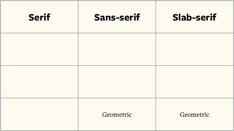
Pay careful attention to the shape of the letters, especially of the letters e and o. Do they look like circles or squares? If they do, we can immediately classify the typeface as a geometric typeface.
Geometric typefaces contain letterforms that are based off shapes. They look constructed as opposed to handwritten. Because of they seem constructed, they also give off a modern, cool and impersonal vibe.
The geometric subcategory is only applicable to sans-serif and slab-serif typefaces. So, we can fill up the 3×3 grid as follows:
Next, we look at the stroke.
The contrast in strokes
The stroke of a typeface is lines that make it up. Pay attention to these lines. Do they vary in size between different parts of the letters?
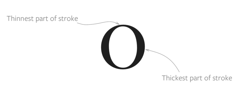
When we look at the stroke of a typeface, we’re only interested in using it to categorize serifs. This is because it’s rare for sans-serif and slab-serifs to exhibit any difference in the stroke.
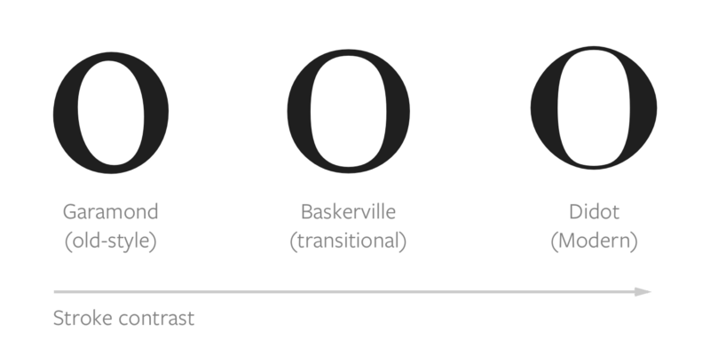
If there’s little stroke contrast (little difference between thinnest and thickest part), we can categorize the typeface as an old-style serif.
Old-style serifs are serifs that the oldest readable typefaces (according to our current standards. Blackletter comes before it, which is hardly readable now). They mimic handwriting and are thus calligraphic in nature, which causes their letters to tilt more (more on tilt later). Since they mimic handwriting, they’re often seen as real, empathetic and traditional. They are also known as humanist serifs.
On the other hand, if there’s huge stroke contrast, we can categorize the typeface as a Modern serif.
Modern serifs are deliberately constructed to stand out. Their letterforms often stand upright with zero tilt, which makes them cool and impersonal, like Geometric typefaces. They are also known as rational serifs and didones.
Finally, what lies between modern serifs and old-style serifs are transitional serifs. Their stroke contrast is distinguishably larger than old-style serifs, but not as much as modern ones.
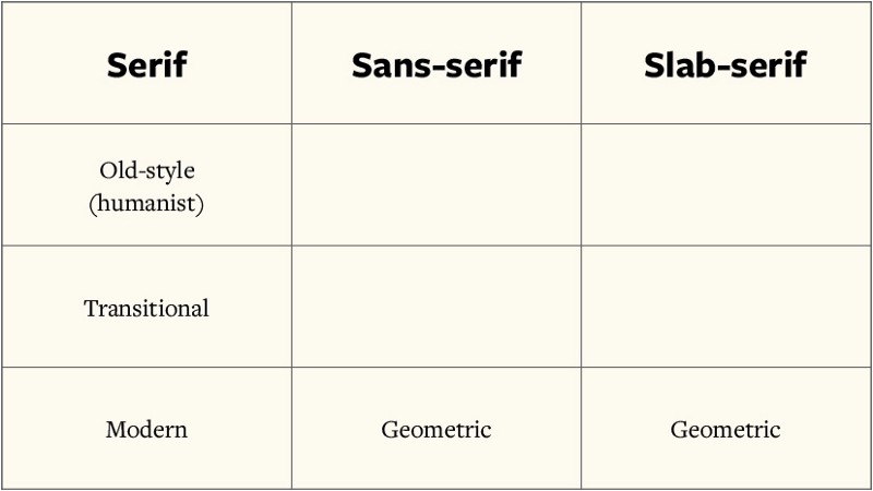
After going through the stroke, our 3×3 grid becomes:
Lets move on to the tilt.
The tilt
If you draw a line through the thinnest points of the stroke, you’ll see the stress of the letters.
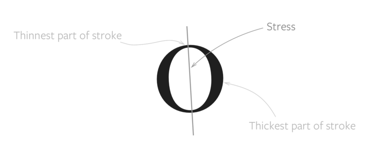
If you paid attention so far, you’ll notice that stress can only be used to distinguish serif subcategories because you need to draw a line through the thinnest parts of the letterforms.
Although it may seem pointless to look at stress since we already have sorted serifs into their respective categories, I found it helpful to distinguish between sans-serif humanist and grotesque typefaces.
Let me explain.
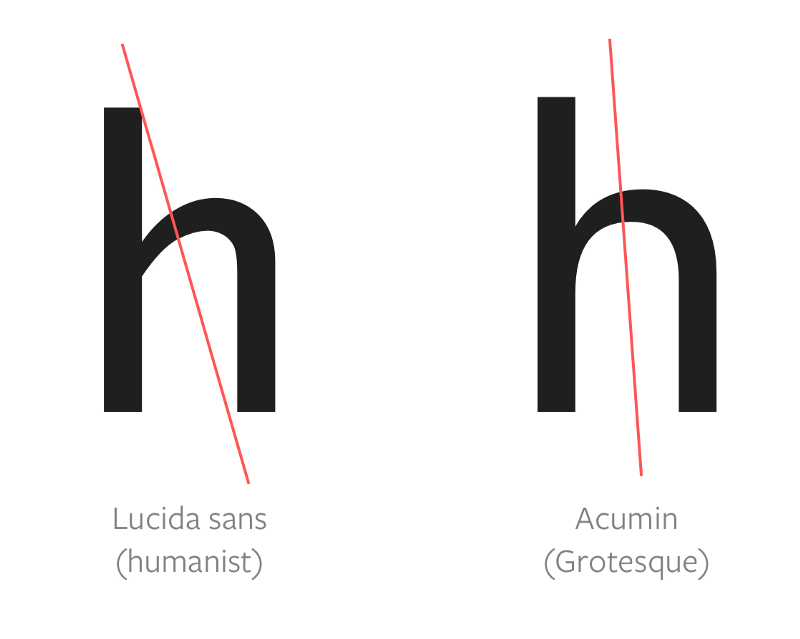
Letterforms with a diagonal stress (like old-style serifs) look like they’re tilted at an angle. Since they’re tilted, they mimic letters that are created by hand. (We don’t hold the pen perfectly upright, do we?).
Although the letters o and e can’t tell us if there’s any stress, we can look at other letters, especially those with shoulders, like h, m and n. If any of these shoulders looks as if they’re tilted (or if there’s any stress), we can categorize the typeface as a humanist typeface.
An example of a humanist sans-serif typeface that exhibits this behavior is Lucida Sans.
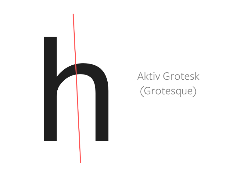
On the other hand, if the letters look like they’re upright, we can categorize them as grotesque typefaces. As you may imagine, grotesque typefaces fall between humanist and geometric typefaces.
Just to add to your typography vocabulary, grotesque typefaces are also called grotesk or gothic, depending on the language. So, if you see these names on a typeface, you’ll know immediately which category these fall under.
Want an example? How about Aktiv Grotesk? :)
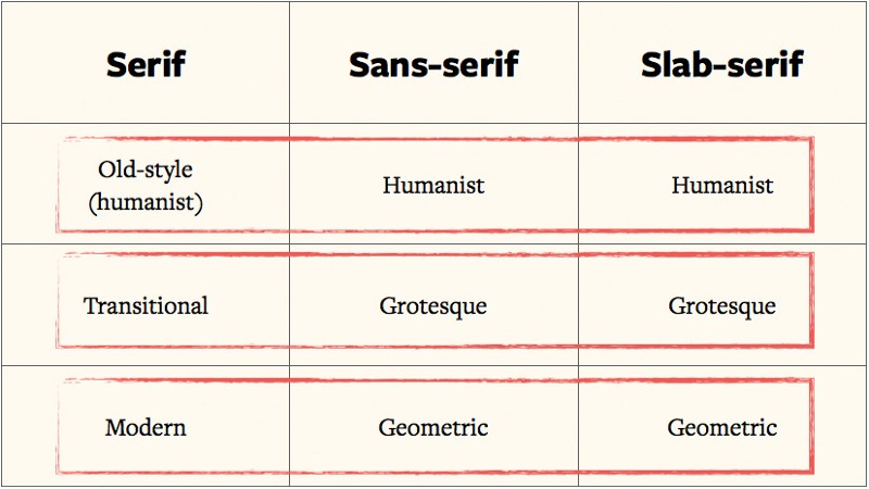
After looking at the tilt, we can finally complete the 3×3 grid:
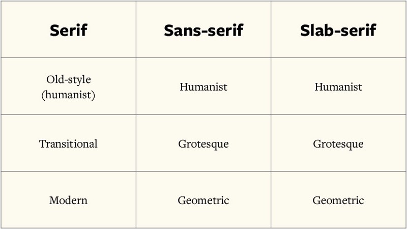
And with that, we’re done with categorizing typefaces into their respective categories and subcategories.
Before we move onto the next section, I want to highlight that typeface classification is highly subjective. Everyone classifies typefaces differently, so you just have to decide for yourself. Some typefaces can fall into multiple subcategories too. One example is Proxima Nova, which can fall into all three sans-serif subcategories at the same time.
Using the 3×3 grid
If you search around for typeface pairing rules, you’ll often come across the following two rules, among others:
- Pair sans-serif typefaces with serif (or slab-serif) typefaces
- Pair typefaces from the same era
If you follow the first rule, you automatically create contrast with your two typefaces, which is a good thing. I explain why contrast is so important in my typography course, Mastering Responsive Typography.
The reason why experts recommend you to pair typefaces from the same era (or even from the same designer) is because these typefaces contain similar letterforms. Similar letterforms create a sense of familiarity through repetition, which is why different typefaces can blend well with each other. (Read this article an explanation of why repetition creates familiarity.)
Coincidentally (maybe not!), our 3×3 grid helps you identify typefaces created in the same era without remembering the subcategories. It’s used this way:
(This is mind blowing, isn’t it? ?)
Wrapping up
Today, you learned how to categorize typefaces into six major subcategories, and their respective subcategories. You also learned a technique to pair them (using the 3×3 grid).
Now go play around with the technique and let me know your thoughts in the comments!
This article as a sample of my responsive typography course, Mastering Responsive Typography. You can check it out, and also learn more about typography on my blog.