by ZAYDEK
TIL…
Free Course: Build A Blog From Scratch ??
It might be easier than imagined
Before I get to the article, I just want to share that I’m building a product, and I would love to collect some data about how to better serve web developers. I created a short questionnaire to check out before or after reading this article. Please check it out — thanks! And now, back to our regular scheduled programming.
If you’re like me, you’re interested in the web and its overwhelming reach, but you’re also inundated with the mess of information that is learning HTML and CSS. The thing is, these languages are unlike other domains, like Word Processors and Programming Languages. The web is another world, and it’s not the prettiest thing around.
Having learned me some web, I’m here to give a gentle push of encouragement, because, with a little guidance, these domains can be a lot easier than you imagine. Continue reading, and we’ll build a beautiful blog from scratch. We’ll also learn some CSS Grid, Flexbox, and Responsive Design.
The goal is to do for you that which I have done for myself; learn HTML and CSS from first-principles.
I also taught a free HTML/CSS course on Scrimba where I teach how to build a beautiful blog from *scratch*. Click here to enroll! ?
Scrimba.com is an interactive front-end platform where websites are recorded as events — not videos — and can be edited! ?
So where does HTML come from?
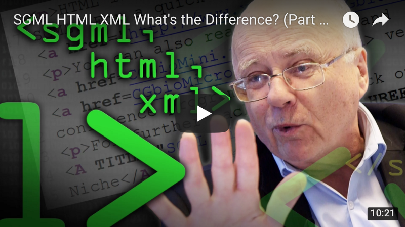
HTML is a descendent of the first meta or markup language: GML. Millennial readers are now working out that GML stands for Generalized Markup Language, but that’s not all it stands for. It was Charles Goldfarb, Edward Mosher, and Raymond Lorie who created what we now know as a meta or markup language at IBM. And in 1996, Charles Goldfarb wrote:
“I gave GML its present name so that our initials would always prove where it had originated. One of the ugly truths of technology transfer is that developers tend to be grateful for research work when first received, and virtually oblivious to it by the end of a lengthy development cycle…”
— Charles Goldfarb, in 1996
GML later became Standardized, thus becoming SGML. Then, Tim Berners-Lee who worked at CERN borrowed the ML from SGML (no, not machine learning, or whatever the hipsters call it) to create HTML, where HT stands for HyperText.
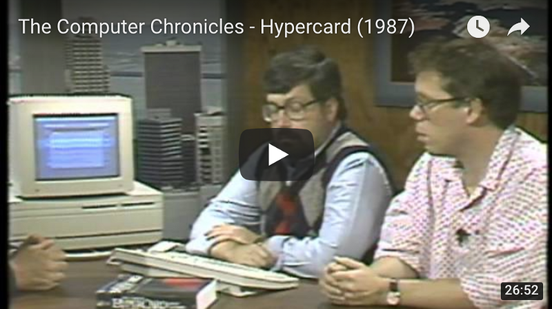
Whoa, cool word. And as I understand, it has roots from an interactive authoring environment called HyperCard, from Bill Atkinson who worked at Apple. For a deeper exploration, I submit the following videos:
So—let’s recap. HTML didn’t just take over the world. In fact, there was a whole world before HTML. WUT? I know, I’m trembling in shock—but I hadn’t been born—so, there kind of wasn’t a world.
And, HTML owes a lot to its predecessors. As do we all to our parents. Nonetheless, it’s how we make code from text. Now, in four one-minute lessons, I’ll teach the basics of HTML, CSS, and Responsive Design.
HTML and CSS in 4 minutes
First minute: A website can be better understood as a webtree
<html> <head></head> <body></body></html>All websites begin their lives as such. However—and this is terrible—there’s no content. Nevertheless, we start here because we need to first understand what is a website. Think of it as a tree—an upside-down tree*—a webtree. The html element is the root, whereas head and body are the first branches of our webtree:
html <- root / \head body <- branchesThe head element (or tag—same thing) is for metadata, or information about our website. The body element, on the other hand, is for our website’s content. And because CSS is our website’s style, it goes in the head element, whereas content, like paragraphs, cat videos (≧∇≦), and so on, go in the body element.
Second minute: elements, or tags, have multiple appearances
<element><element>value</element><element attribute="value">value</element>- The first element is a self-closing element, where we communicate something to the browser, but it doesn’t also have a value. An example of this is the
<br> element, which inserts a line-break. - The second element is a common element, where we communicate a value as belonging to some element. For example
<p>hello, world!</p> is the value “hello, world!” as belonging to the paragraph element. - Last, we have an element with an attribute. And an attribute is what is sounds like—dammit, it’s an attribute! It gives an element more context or meaning. Attributes can have multiple values, and elements can have multiple attributes. Attribute-ception.
<element attribute="value" attribute="value value">value</element>Now—I need to mention—we don’t create the names of our HTML elements. We borrow them from a list of some 100+ elements that are predefined. Of course, this makes some things easier, and some things much, much harder, such as memorization!
Third minute: How HTML and CSS communicate
<!DOCTYPE html><html> <head> <meta charset="UTF-8"> <style>selector { property: value; } </style> </head> <body> <element>value</element> </body></html>The !DOCTYPE html specifies we are writing HTML5—as supposed to all the other versions of HTML we want to avoid. And given the self-closing element meta with the attribute charset and value UTF-8, our text is encoded in Unicode. UTF-8 stands for Unicode Transformation Format… 8. Now we can write in ????! Once, dad decided to text in just emoji.
¯\_(ツ)_/¯
We also added a style element which is one of the available entry points for CSS. Where the selector selects an element and applies a property to it with a corresponding value. We will explore this and more in the next minute.
Again—I need to mention—we don’t create the names of our CSS properties. We borrow them from a list of some hundreds of properties that are predefined. Of course, this makes some things easier, and some things much, much harder, such as ____________!
Fourth minute: hello, world!
<!DOCTYPE html><html> <head> <meta charset="UTF-8"> <style>p { color: green; }@media (max-width: 8.5in) { p { color: blue; } }@media (max-width: 5.0in) { p { color: red ; } } </style> </head> <body> <p>hello, world!</p> </body></html>No longer is our website terrible! What we have is “hello, world!” in green text, and if our website’s width were resized to 8.5 inches or less, it would read in blue, and at 5 inches or less, red. Here, we used media queries to override CSS in some circumstance, like our website’s width.
What is a CSS Reset and Debugger?
We use a reset to ensure our design is consistent, and a debugger to expose inconsistencies.
We need our reset, because browsers are opinionated and set some CSS properties for us that we want to unset. Popular CSS Resets exist, but we’ll make our own. And we need our debugger for maintaining our website’s design with ease.
We can make a folder named styles to house our reset and debugger:
styles/ reset.css debug.cssAnd to link our new CSS files to our index.html, we add link elements:
… <meta charset="UTF-8"> <link rel=”stylesheet” href=”styles/reset.css”> <link rel=”stylesheet” href=”styles/debug.css”> <style> …Our CSS Reset
Of the properties we want to unset, here’s a shortlist:
:root { font: 20px/1.2 sans-serif; }body, body * { margin: unset; box-sizing: unset; padding: unset; font-size: unset; color: unset; text-decoration: unset;}Ignore line 1. for now—let’s start with body, body * { … } where we select the body and all of the body’s elements with an *. The asterisk means select all children. Remember our webtree?
html / \head body <- selected / \ \… … p <- selectedbody, body * { … } is selecting the body and—a , denotes and—p because it’s one of body’s children. This is known as the parent-child relationship, where body is the parent and p is the child. And we tell those elements to unset common properties. The properties I’ve chosen are just a shortlist. Here’s an example of one of the most famous CSS Resets:
/* http://meyerweb.com/eric/tools/css/reset/ v2.0 | 20110126 License: none (public domain)*/html, body, div, span, applet, object, iframe,h1, h2, h3, h4, h5, h6, p, blockquote, pre,a, abbr, acronym, address, big, cite, code,del, dfn, em, img, ins, kbd, q, s, samp,small, strike, strong, sub, sup, tt, var,b, u, i, center,dl, dt, dd, ol, ul, li,fieldset, form, label, legend,table, caption, tbody, tfoot, thead, tr, th, td,article, aside, canvas, details, embed,figure, figcaption, footer, header, hgroup,menu, nav, output, ruby, section, summary,time, mark, audio, video { margin: 0; padding: 0; border: 0; font-size: 100%; font: inherit; vertical-align: baseline;}/* HTML5 display-role reset for older browsers */article, aside, details, figcaption, figure,footer, header, hgroup, menu, nav, section { display: block;}body { line-height: 1;}ol, ul { list-style: none;}blockquote, q { quotes: none;}blockquote:before, blockquote:after,q:before, q:after { content: ''; content: none;}table { border-collapse: collapse; border-spacing: 0;}Yikes! Back to our reset. At the top we have :root { font: 20px/1.2 sans-serif; }. What’s :root? Remember our webtree? It’s the root, in other words, the html element. This pseudo-element belongs to a special class of elements known as psuedo-classes, which can be used to better organize and understand our CSS.
WAAAIT! Don’t we need an * to select all children elements, so their font properties are set? Well—great question—some properties, such as text properties inherit from their parents, and font does. So instead we can set font once in :root, which propagates to all its children. Property-ception.
Our CSS Debugger
A debugger emphasizes the content and border of elements:
body * { color: hsla(000, 100%, 100%, 0.88) !important; background: hsla(210, 100%, 50%, 0.33) !important; outline: 0.25rem solid hsla(000, 100%, 100%, 0.50) !important;}Behold! In just three lines, our debugger. This clever technique overrides three common properties: color, background, and outline. Our colors are made up of hsla() values, which is short for hue, saturation, luminance, and alpha. To enable our debugger, we link the file.
Should we want to disable our debugger, we can mistype the filename so as to hide it from our computer’s filesystem, e.g.:
<link rel=”stylesheet” href=”styles/-debug.css”>Or just delete the line. ٩(^ᴗ^)۶
Our debugger uses hilarious !important values so as to state that under no conditions can these properties be overridden. Remember media queries?
p { color: green !important; }@media (max-width: 8.5in) { p { color: blue; } }@media (max-width: 5.0in) { p { color: red ; } }Had we specified that our p color is !important, our media queries would be inert, due to their lesser importance.
Meet CSS Grid and Flexbox
I would argue that before CSS Grid and Flexbox, designing for the web was a hero’s journey.
The thing is, web design used to be a juggling-act of hacks where we trick the browser into rendering our designs. This is becoming less true with time. I’m not religious, but thank God!—or, thank browser engineers!—wherefore now we can lean on CSS Grid and Flexbox to kickstart our design.
If you’re not aware, CSS Grid and Flexbox are newer technologies baked into modern browsers that take the hero’s journey out of web design. And CSS Grid and Flexbox are friends — we’ll use them together to both create a grid and flex elements in our grid.
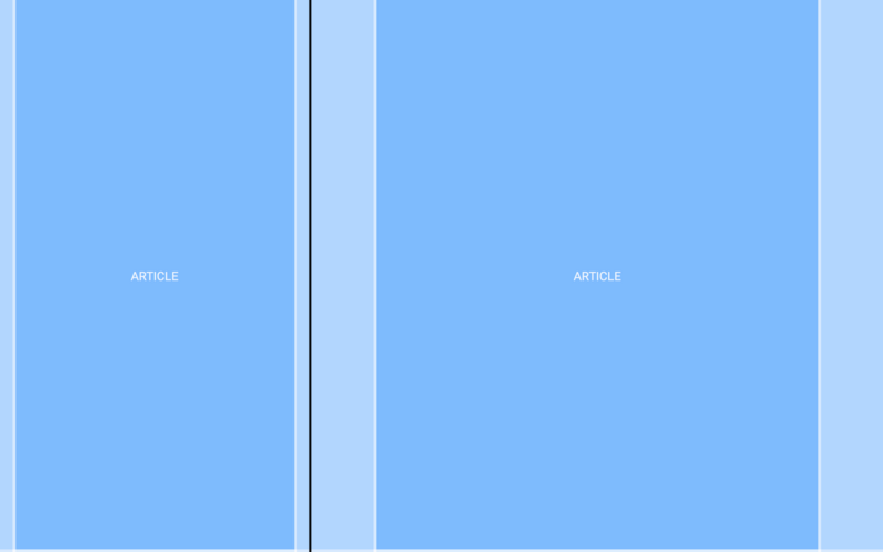
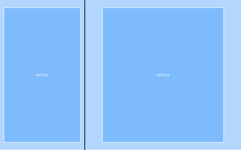
Our first grid: HTML
… <body> <article> <p>ARTICLE</p> </article> <article> <p>ARTICLE</p> </article> </body> …Remember our webtree?
body / \article article / \ p pWe’re making a blog, so each post can be thought of as an article. And our articles contain a p of ARTICLE which is another clever trick we can use. Using the name of the element as the value of the element to help us understand where and what things are. Value-ception.
Our first grid: CSS
… <style>article { display: grid; grid-template-columns: 1fr minmax(0, 8.5in) 1fr; height: 11in; /* temp fix */}article * { grid-column: 2 / 3; } </style> …Enter CSS Grid. First, we selected the article, and applied three properties: display defines the element as a grid, grid-template-columns templates columns, and height simulates each article as having one page’s height. However, height is glue-code and will be deleted.
Let’s focus on the two most important lines:
article { grid-template-columns: 1fr minmax(0, 8.5in) 1fr; }article * { grid-column: 2 / 3; }Or, in other times:
Thou Shalt Have Three Columns,
Whose Center Column Shall Shelter Thy Children.
First, had we set grid-template-columns to 1fr 1fr 1fr, where fr is short for fraction-unit, our three columns would be divided in thirds. Yet our center column has a minmax width, meaning it’s responsive. At or less than 8.5in, our center column renders at 100% width, and our left and rightmost columns disappear, as there’s no remainder.
Sidebar: note that responsive design is not limited to media queries. This is an example of where our design is implicitly responsive, as opposed to explicitly responsive. This is the best kind of responsive design, because it’s not hard-coded. And this is one of the reasons CSS Grid and Flexbox are so powerful.
Second, to communicate that article’s children belong to the center column, or start at the second column and end at the third, we set grid-column to 2 / 3. Note the subtle difference between grid-template-column and grid-column, to either template columns or span columns.
CSS Grid is great—and it is—but now we’ll lean on Flexbox to center our ARTICLE text. What we’re about to do is create a Utility Class, and it’s another paradigm for writing CSS. Here, we use the fact that elements can have attributes to inline style to the p element:
<p class=”debug-center”>ARTICLE</p>CSS in HTML?!
(╯°□°)╯︵ ┻━┻
Here’s what’s going on: elements have a class attribute. And we can use this attribute to not just write CSS to elements, but to a kind of element or class of element. This means we can reuse classes across multiple elements, regardless of their likeness. Alas—nothing’s changed—we need to also create a .debug-center class somewhere in our CSS. How about our debugger:
….debug-center { display: flex; justify-content: center; align-items: center;}Note we use a . prefix to differentiate classes from elements.
Now, wherever an element is attributed with our debug-center class, its text will center. First, we set display to flex making whichever element a Flexbox-element as opposed to a CSS Grid-element. Then we set justify-content to center to center horizontally and align-items to center to center vertically. Aaagh!
Imagine this: we use Grid to layout our website’s design, and Flexbox to flex the elements in our grid to some desired position.
Iterating our grid
We have a problem: without .debug-center ARTICLE hugs the left and right walls. What we need are vertical and horizontal gutters so that our content can breathe. Aaah. Otherwise reading would become frustrating and would lead to a poor user experience. ヾ( •́д•̀ ;)ノ
For vertical padding:
article { padding: 0.5in 0; …}And for horizontal padding, we could use padding, and either would work:
padding: 0.5in 0.5in;padding: 0.5in;However, we want our gutters to be responsive, so we’ll use CSS Grid:
article { … grid-template-columns: 1fr 0.5in [start] 7.5in [end] 0.5in 1fr}Here, we did three things: 1. we defined our horizontal gutters to be 0.5in (these will become responsive—I promise!). 2. our content-column went from 8.5in to 7.5in, the sum still being 8.5in , and 3. made up identifiers start and end to name the start and end of our content-column.
When we added new columns, we needed to also update article *:
article * { grid-column: 3 / 4; }But counting columns isn’t ideal. Instead—let’s use our made-up identifiers:
article * { grid-column: start / end; }We updated our grid without breaking the flow of content, so long as we continue to use the start and end identifiers we made up. ⊂◉‿◉つ
Last—as promised—we need our gutters to be responsive. minmax() for one reason or another doesn’t work here, so we’ll use media queries:
@media (max-width: 8.5in) { article { grid-template-columns: 1fr 5% [start] 90% [end] 5% 1fr; }}Now at or less than 8.5in, article will use % instead of in to divide our columns, and the left and rightmost columns will disappear because—again—there’s no remainder. Despite all this, we could’ve set padding to 0.5in 5% to achieve the same effect, so what gives? Read on!
Iterating our grid, again
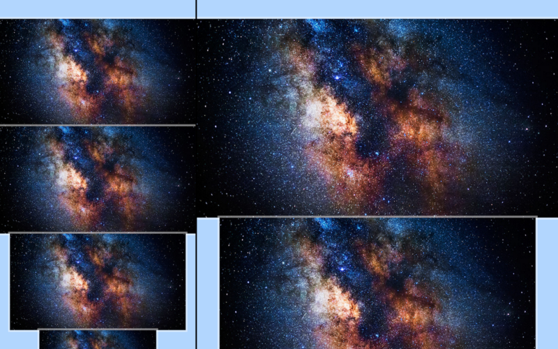
To understand our grid, let’s use images to span columns, from 100% to 8.5in to 7.5in on desktop, and from 100% to 90% on mobile. However, for the last image, the one on the left at the bottom, we need to add even few more columns to our grid. AF)UBQWF*VBQPWIFB, am I right?
Don’t be intimidated—CSS grid is awesome. Let’s add two more columns:
article { … grid-template-columns: 1fr 0.5in [start] 1.25in 5in 1.25in [end] 0.5in 1fr;}@media (max-width: 8.5in) { article { grid-template-columns: 1fr 5% [start] 15% 60% 15%[end] 5% 1fr; }}We broke up our content-column into three columns: 1.25in 5in 1.25in . We also added proportional percents for our media query: 15% 60% 15%. The plan is for text to span our original 7.5in content-column, and for small images to span our new 5in column.
To add images, we use the img element and its src—source—attribute:
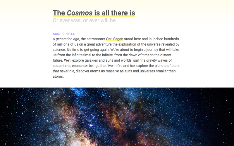
… <article> <img class="size-4" src="images/cosmos.jpg"> <img class="size-3" src="images/cosmos.jpg"> <img class="size-2" src="images/cosmos.jpg"> <img class="size-1" src="images/cosmos.jpg"> </article> …These are local, that is, they’re on our computer. And were they remote, that is, on a server:
<img src="https://website.com/images/cosmos.jpg">
Note that each img has one of four classes: size-*. And because we’ll want more than images, like videos, to span our website’s grid, it’s preferred we use classes so we can reuse the CSS. These size-* classes are also Utility Classes, so changing which size we want is simple.
Let’s make our size-* classes span different sets of columns:
.size-1 { grid-column: 4 / 5; }.size-2 { grid-column: 3 / 6; }.size-3 { grid-column: 2 / 7; }.size-4 { grid-column: 1 / 8; }What’s missing is that our imgs aren’t responsive. We need:
img.size-1, img.size-2, img.size-3, img.size-4 { width: 100%; }Because imgs render at their actual size, for example, a 400 × 400 image rendering at 400px, we needed to override that behavior with our own: width: 100%. Thus when an image is attributed with a size-* class, it can resize to whatever columns it’s spanning. Note we need not set height.
Adding text elements
Website and content links
Now that we’re getting serious with our article, let’s make things formal:
… <article id="the-cosmos"></article> …Now each article is linkable. Linkable? Well—websites are links:
https://website.com/index.htmlAnd our website’s content, for example articles, can be linked to, too:
https://website.com/index.html#articleHere article is the value of an id attribute, analogous to linking a timestamp in a YouTube video (for example, this one). Better than suggesting “start at 4 minutes and 7 seconds” or “read from the second article,” we can link content in our website, like a timestamp in a video.
To link a website or content, we use the a element and href attribute:
… <article id="the-cosmos"> <a href="#the-cosmos">The Cosmos</a> </article> …The text “The Cosmos” now links the start of the article: #the-cosmos.
This idea of linking (linking websites and content in websites) is one of the points of HTML. HyperCard mastered this, but instead of linking websites and content, was interested in ideas and associations. At the time, it was 1987 and HTML was first proposed in 1989. Watch a few seconds from the video I posted earlier—here I’ve linked a timestamp:
Text elements
Let’s add headings, a publication-date, strong and emphasized text, and links:
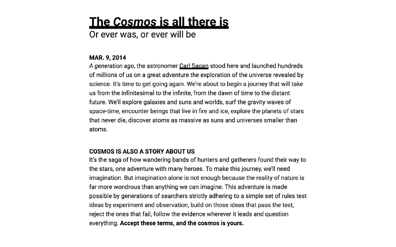
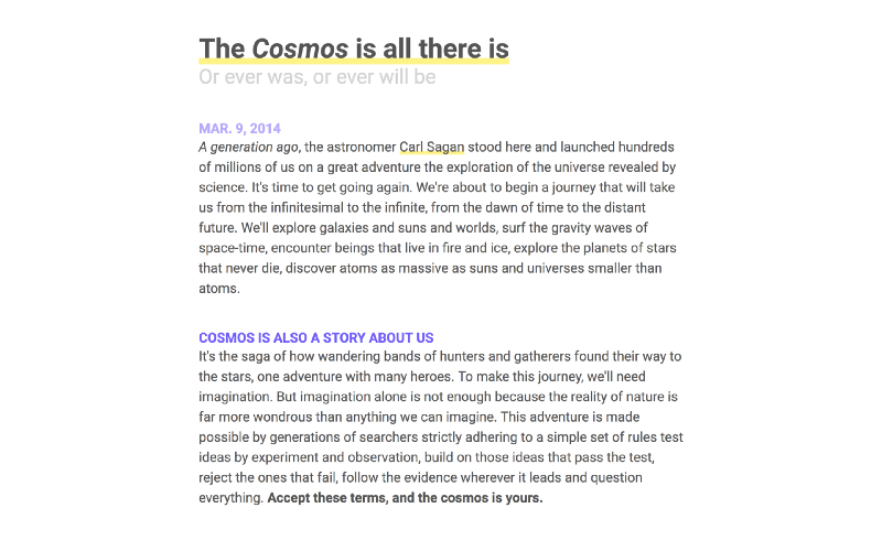
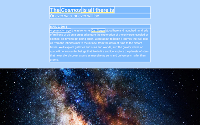
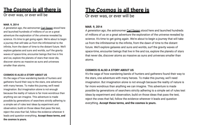
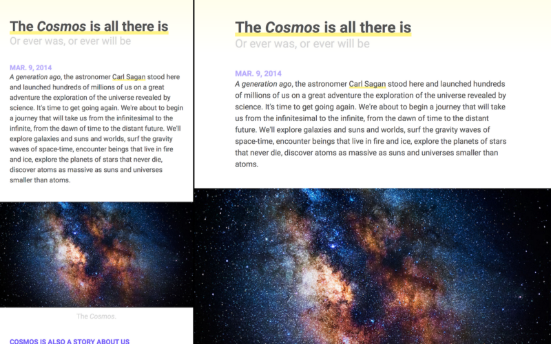
<article id="the-cosmos"> <h1><a href="#the-cosmos">The Cosmos is all there is</a></h1> <h2>Or ever was, or ever will be</h2> <time datetime="03-09-2014">MAR. 9, 2014</time> <p><em>A generation ago</em>, the astronomer <a href="https://en.wikipedia.org/wiki/carl_sagan">Carl Sagan</a> stood here and launched hundreds of millions of us on a great adventure the exploration of the universe revealed by science. It's time to get going again. We're about to begin a journey that will take us from the infinitesimal to the infinite, from the dawn of time to the distant future. We'll explore galaxies and suns and worlds, surf the gravity waves of space-time, encounter beings that live in fire and ice, explore the planets of stars that never die, discover atoms as massive as suns and universes smaller than atoms. </p> <img class="size-4" src="images/cosmos.jpg"> <h3>COSMOS IS ALSO A STORY ABOUT US</h3> <p>It's the saga of how wandering bands of hunters and gatherers found their way to the stars, one adventure with many heroes. To make this journey, we'll need imagination. But imagination alone is not enough because the reality of nature is far more wondrous than anything we can imagine. This adventure is made possible by generations of searchers strictly adhering to a simple set of rules test ideas by experiment and observation, build on those ideas that pass the test, reject the ones that fail, follow the evidence wherever it leads and question everything. <strong>Accept these terms, and the cosmos is yours.</strong> </p></article>These are the opening lines to our personal astrophysicist’s — Neil deGrasse Tyson’s — 2014 Cosmos: A Spacetime Odyssey, a reimagining of Carl Sagan’s original 1980 Cosmos: A Personal Voyage. It’s sci-fi without the -fi. And it’s getting renewed in 2019!
Above we introduced a few elements: h1, h2, h3, time, strong, and em.
h1–h6elements are headlines.- The
timeelement timestamps our article. We can put whatever we want for the element value, because computers read thedatetimeattribute’s value, which should be machine-readable. - The
strongelement is for strong text and theemelement is for emphasized text. Also,h*elements are strong.
Note that h* and p elements break from one line to the next, or block, whereas time, strong, and em elements don’t. This is because browsers set the h* and p element’s display to block, and the time, strong, and em element’s display to inline.
Rems and ems
When it’s not enough to block elements from one line to the next, we use line-breaks so it’s easier to differentiate elements from one another, not unlike padding or gutters. We could use br elements here, but it’s preferred we use extraneous CSS over extraneous HTML.
Here’s how to push content two line-breaks, following h2 and p elements:
h2, p { margin-bottom: 2.4rem; }2.4rem?
Remember our reset? We set font to 20px/1.2 sans-serif. I didn’t explain it at the time—and shame on me—but 2.4 is two-line breaks at 1.2 line-height, for example, single-spaced text. More readable text could be 1.5, and double-spaced text could be 2.
*Ahem* What are rems?
*Ahem ahem* And what are ems?
rem is root em and both are multipliers. 1rem is 20px and 1em is the parent’s font-size. Had we defined our line-breaks in ems, not rems, and set h2 and p to different font-sizes, their line-breaks would differ! Therefore, consistent line-breaks use rems and inconsistent ones use ems.
And this is a powerful idea—writing CSS such that the design is connected. Given this enlightenment, I feel it’s far more wise to think about CSS not in rules but relationships. Thus, if we make a change somewhere, we can make a change everywhere.
…make a change somewhere…
…make a change everywhere…


Responsive responsive design
What if we write CSS in rems and ems, and use media queries to change :root’s font-size? Then everything—and I mean everything—will resize proportionally. We can go even a step further and have multiple media queries for multiple widths:
@media (max-width: 8.5in) { :root { font-size: 18px; } }@media (max-width: 5.0in) { :root { font-size: 16px; } }What’s amazing about this is that we are not just overriding a property, we are overriding the property for rems and ems. We can now write CSS that is not just responsive but responsive to our responsive design. This is perhaps the most important sentence in this entire post:
We can write CSS that is not just responsive but responsive to our responsive design.
This isn’t just cool, it’s how we ought to write CSS. Websites tend to be terrible, and I think it can be boiled down to this: when we write CSS, we should write in design systems and not silo code. When we use rems and ems in tandem to media queries, that is a design system and code is not siloed.
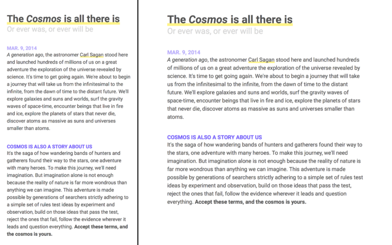
Styling text
For the love of style, let’s add some:
h1 { font: 700 2.0rem/1.2 …; color: hsl(000, 000%, 33%); }h2 { font: 400 1.5rem/1.2 …; color: hsl(000, 000%, 33%); }time { font: 700 1.0rem/1.2 …; color: hsl(250, 100%, 83%); }h3 { font: 700 1.0rem/1.2 …; color: hsl(250, 100%, 67%); }p { font: 400 1.0rem/1.5 …; color: hsl(000, 000%, 33%); }Properties can have shorthands as we’ve seen before; padding: 0.5in, equivalent to padding: 0.5in 0.5in. And here, we use font to combine font-weight, font-size, and line-height. After font, we have color with hsl values, like hsla values in our debugger.
An unaddressed problem is our a element. In our reset, we unset color and text-decoration making links indiscriminate from text. We unset these properties because text-decoration: underline is too subtle. So here’s how we can give them a strong underline:
a { box-shadow: inset 0 -0.25em hsl(55, 100%, 75%); }We invert box-shadow to create an underline that is inside the element. Had we set inset without a negative value, our underline would be an overline. We also use em so the underline scales with its font-size. This is an example of when we want inconsistent scaling, as supposed to our line-breaks.
There’s much more to box-shadow than this: click to learn more.
Last step: gradients
Wohoo! All we need is a cue for our readers as to where an article starts and ends. Without that, the ends of each article will feel like an endless continuation, which leads to a poor user-experience. So we need to give our readers a hint… (◔̯◔)
What I propose is simple: a gradient that extends from the top of each article to the bottom of its h2 element. And we can write our gradient in ems so that as our website resizes, so does our gradient:
article { … background: linear-gradient(hsl(55, 100%, 96%), white 6.83em);}Here we’ve defined a color-to-white gradient, and used 6.83em so our gradient doesn’t extend the entire article but ends at the equivalent of the bottom of our h2 element. However, the exact value depends.
You can either do math to determine the size, for example 6.83em, but another technique is to set a size on the top-color, for example hsl(55, 100%, 96%) 6.83em. Once it’s equal to or greater than the bottom color’s size, it will appear as a line and not a gradient, making it intuitive what to change it to.
Congratulations ?
Congratulations! ٩(˘.˘)۶ You’ve stepped into a world in desperate need of better designers and engineers. And with CSS Grid, Flexbox, Responsive Design and browser-level debuggers, developing for the web has never been more accessible.
Don’t forget there’s a free course on Scrimba where I teach how to make the same website from *scratch*. Click here to enroll!