by Spencer Carli
How to make your React Native app respond gracefully when the keyboard pops up
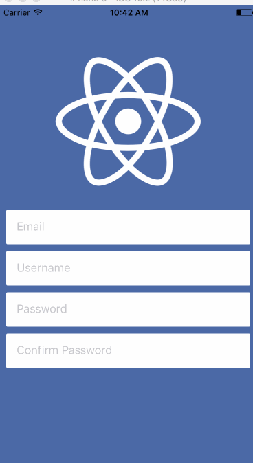
When you’re working with React Native apps, a common problem is that the keyboard will pop up and hide text inputs when you focus on them. Something like this:

There are a few ways you can avoid this. Some are simple, some less so. Some can be customized, others can’t. Today I’ll show you 3 different ways you can avoid the keyboard in React Native.
I’ve put all the source code for this tutorial on Github.
KeyboardAvoidingView
The most simple solution, and the easiest to install, is KeyboardAvoidingView. It’s a core component but it’s also pretty simple in what it does.
You can take the base code, which has the keyboard covering the inputs, and update that so that the inputs are no longer covered. The first thing you have to do is replace the container View with the KeyboardAvoidingView and then add a behavior prop to it. If you look at the documentation you’ll see that it accepts 3 different values — height, padding, position. I’ve found that padding works in the most predictable manner. So that is what I’ll use.
import React from 'react';
import { View, TextInput, Image, KeyboardAvoidingView } from 'react-native';
import styles from './styles';
import logo from './logo.png';

const Demo = () => {
  return (
    <KeyboardAvoidingView
      style={styles.container}
      behavior="padding"
    >
      <Image source={logo} style={styles.logo} />
      <TextInput
        placeholder="Email"
        style={styles.input}
      />
      <TextInput
        placeholder="Username"
        style={styles.input}
      />
      <TextInput
        placeholder="Password"
        style={styles.input}
      />
      <TextInput
        placeholder="Confirm Password"
        style={styles.input}
      />
      <View style={{ height: 60 }} />
    </KeyboardAvoidingView>
  );
};
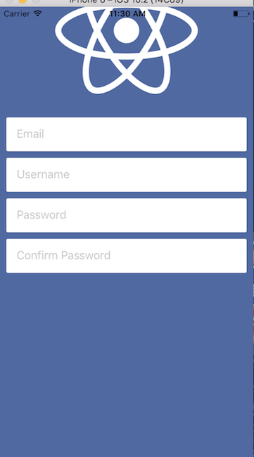
export default Demo;This gives us the following result. It’s not perfect but for barely any work, it’s quite good.
One thing to note is that on line 30 you’ll see a View that has a height set to 60px. I found that the keyboard avoiding view doesn’t quite work with the last element, and setting padding/margin didn’t work. So I added a new element to “bump” everything up a few pixels.
The image at the top gets pushed out of the view when using this simple implementation. I’ll show you how you can fix that at the end.
Android users: I’ve found this to be the best/only option. By adding android:windowSoftInputMode="adjustResize" to your AndroidManifest.xml the operating system will take care of most of the work for you and the KeyboardAvoidingView will take care of the rest. Example AndroidManifest.xml. The remainder of this article likely won’t apply to you.Keyboard Aware ScrollView
The next option is the react-native-keyboard-aware-scroll-view which gives you a lot of bang for your buck. Behind the scenes it’s using a ScrollView or ListView to handle everything (depending on the component you choose), which makes the scrolling interaction pretty seamless. The other major benefit to this package is that it will scroll to the input that is in focus, which gives the user a nice experience.
Usage is also very easy — you just need to swap out the container View, again starting with the base code, and set a few options. Here’s the code, then I’ll describe it.
import React from 'react';
import { View, TextInput, Image } from 'react-native';
import { KeyboardAwareScrollView } from 'react-native-keyboard-aware-scroll-view'
import styles from './styles';
import logo from './logo.png';

const Demo = () => {
  return (
    <KeyboardAwareScrollView
      style={{ backgroundColor: '#4c69a5' }}
      resetScrollToCoords={{ x: 0, y: 0 }}
      contentContainerStyle={styles.container}
      scrollEnabled={false}
    >
        <Image source={logo} style={styles.logo} />
        <TextInput
          placeholder="Email"
          style={styles.input}
        />
        <TextInput
          placeholder="Username"
          style={styles.input}
        />
        <TextInput
          placeholder="Password"
          style={styles.input}
        />
        <TextInput
          placeholder="Confirm Password"
          style={styles.input}
        />
    </KeyboardAwareScrollView>
  );
};
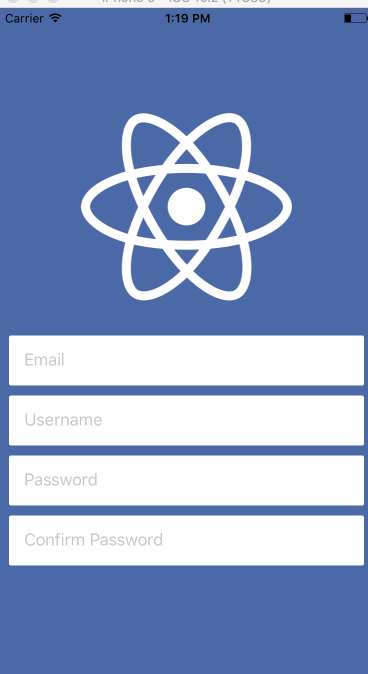
export default Demo;First off you want to set the backgroundColor of the ScrollView that way (if you were to re-enable scrolling) the backgroundColor is always the same. Next you want to tell the component where the default position is so that, once the keyboard is closed, it goes back to that spot — by omitting this prop the view could get stuck at the top after closing the keyboard, like this.
After the resetScrollToCoords prop you set the contentContainerStyle — this essentially replaces the containing View styles you had before. The final thing I’m doing is disabling the scrollview from user interaction. This may not always make sense for your UI (such as an interface where a user is editing many profile fields) but for this one it does, it doesn’t make much sense to allow the user to manually scroll because there is nothing to scroll to.
Combining these props together you get the following result, which works quite well.

Keyboard Module
This is by far the most manual option but also gives you the most control. You’ll be using the Animated library to help give smooth interactions like you saw before.
The Keyboard module, which isn’t documented on the React Native site, allows you to listen keyboard events emitted from the device. The events you’ll use are keyboardWillShow and keyboardWillHide, which return the length of time the animation will take and the ending position of the keyboard (among other information).
If you’re on Android you’ll want to use keyboardDidShow and keyboardDidHide instead.
When the keyboardWillShow event is emitted you’ll set an animated variable to the final height of the keyboard and have it animate for the same duration as the keyboard sliding animation. You then use this animated value to set padding on the bottom of the container to bump all of the content up.
I’ll show code in a moment, but doing what I described above leaves us with this experience.
I want to fix that image this time. To do so you’ll use an animated value to manage the height of the image, which you’ll adjust when the keyboard is opened. Here’s the code.
import React, { Component } from 'react';
import { View, TextInput, Image, Animated, Keyboard } from 'react-native';
import styles, { IMAGE_HEIGHT, IMAGE_HEIGHT_SMALL} from './styles';
import logo from './logo.png';

class Demo extends Component {
  constructor(props) {
    super(props);

    this.keyboardHeight = new Animated.Value(0);
    this.imageHeight = new Animated.Value(IMAGE_HEIGHT);
  }

  componentWillMount () {
    this.keyboardWillShowSub = Keyboard.addListener('keyboardWillShow', this.keyboardWillShow);
    this.keyboardWillHideSub = Keyboard.addListener('keyboardWillHide', this.keyboardWillHide);
  }

  componentWillUnmount() {
    this.keyboardWillShowSub.remove();
    this.keyboardWillHideSub.remove();
  }

  keyboardWillShow = (event) => {
    Animated.parallel([
      Animated.timing(this.keyboardHeight, {
        duration: event.duration,
        toValue: event.endCoordinates.height,
      }),
      Animated.timing(this.imageHeight, {
        duration: event.duration,
        toValue: IMAGE_HEIGHT_SMALL,
      }),
    ]).start();
  };

  keyboardWillHide = (event) => {
    Animated.parallel([
      Animated.timing(this.keyboardHeight, {
        duration: event.duration,
        toValue: 0,
      }),
      Animated.timing(this.imageHeight, {
        duration: event.duration,
        toValue: IMAGE_HEIGHT,
      }),
    ]).start();
  };

  render() {
    return (
      <Animated.View style={[styles.container, { paddingBottom: this.keyboardHeight }]}>
        <Animated.Image source={logo} style={[styles.logo, { height: this.imageHeight }]} />
        <TextInput
          placeholder="Email"
          style={styles.input}
        />
        <TextInput
          placeholder="Username"
          style={styles.input}
        />
        <TextInput
          placeholder="Password"
          style={styles.input}
        />
        <TextInput
          placeholder="Confirm Password"
          style={styles.input}
        />
      </Animated.View>
    );
  }
};

export default Demo;There’s certainly a lot more to it than any of the other solutions. Rather than a normal View or Image you’re using an Animated.View and Animated.Image so that the animated values can be leveraged. The fun part is really in the keyboardWillShow and keyboardWillHide functions where the animated values are changing.
What’s happening there is that two animated values are changing in parallel which are then being used to drive the UI. That leaves you with this.

It’s a fair amount more code but it’s pretty slick. You have a lot of options for what you can do and can really customize the interaction to your hearts content.
Combining Options
If you want to save some code you can combine a few options, which is what I tend to do. For example by combining option 1 and 3 you only have to worry about managing and animating the height of the image.
The code isn’t much less than the source of option 3 but as a UI grows in complexity it can help you out a bit.
import React, { Component } from 'react';
import { View, TextInput, Image, Animated, Keyboard, KeyboardAvoidingView } from 'react-native';
import styles, { IMAGE_HEIGHT, IMAGE_HEIGHT_SMALL } from './styles';
import logo from './logo.png';

class Demo extends Component {
  constructor(props) {
    super(props);

    this.imageHeight = new Animated.Value(IMAGE_HEIGHT);
  }

  componentWillMount () {
    this.keyboardWillShowSub = Keyboard.addListener('keyboardWillShow', this.keyboardWillShow);
    this.keyboardWillHideSub = Keyboard.addListener('keyboardWillHide', this.keyboardWillHide);
  }

  componentWillUnmount() {
    this.keyboardWillShowSub.remove();
    this.keyboardWillHideSub.remove();
  }

  keyboardWillShow = (event) => {
    Animated.timing(this.imageHeight, {
      duration: event.duration,
      toValue: IMAGE_HEIGHT_SMALL,
    }).start();
  };

  keyboardWillHide = (event) => {
    Animated.timing(this.imageHeight, {
      duration: event.duration,
      toValue: IMAGE_HEIGHT,
    }).start();
  };

  render() {
    return (
      <KeyboardAvoidingView
        style={styles.container}
        behavior="padding"
      >
          <Animated.Image source={logo} style={[styles.logo, { height: this.imageHeight }]} />
          <TextInput
            placeholder="Email"
            style={styles.input}
          />
          <TextInput
            placeholder="Username"
            style={styles.input}
          />
          <TextInput
            placeholder="Password"
            style={styles.input}
          />
          <TextInput
            placeholder="Confirm Password"
            style={styles.input}
          />
      </KeyboardAvoidingView>
    );
  }
};

export default Demo;
Each implementation has its pros and cons — you’ll have to choose the most appropriate one given the user experience you’re aiming for.
Are you interested in learning more about using React Native to build high quality mobile apps? Sign up for my free React Native course!