Using CSS position to layout elements on your website can be hard to figure out. What’s the difference between absolute, relative, fixed, and sticky? It can get confusing pretty quickly.
To help, this tutorial will guide you through all the CSS position properties. And you’ll be able to get your website layouts pixel perfect!
What does CSS position do?
Using CSS, you can layout all your elements on your webpage visually. For example, you can position an element at the very top of your page, or 50px below the element before it.
To control just how an element will appear in the layout, you need to use the CSS position property. In addition, you can utilize some other position-related properties: top, right, bottom, left, and z-index. (We’ll get more into those later on.)
The position property can take five different values: static, relative, absolute, fixed, and sticky.
It sounds like a lot, but don’t worry!
Here’s how each value for CSS position works:
1. Static
Position: static is the default value that an element will have. This means if you don’t declare position for an element in CSS, it will automatically be set to static.
It’s important to note that having a static position is the same as not setting the position property at all. (This will come into play a bit later on with absolute positioning.)Elements that are statically positioned will appear on the page in what we call the normal flow. For example, if you have multiple <div> elements one after the other, they will appear on the page directly below one another.
Here’s a quick demo to illustrate static position. We are using the following HTML markup:
<div class="parent purple"></div><div class="another green"></div>And here’s the CSS we’re using:
.first {
   // No position set, so it's static
}
.another {
   // No position set, so it's static
   top: 50px;
}
The second element has a top property set to 50px. You would think that this would move it down 50px, right?
However, here is how it will look on a webpage:
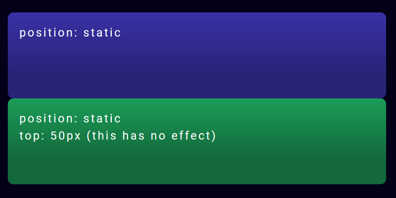
Since both elements have a static position, none of the layout CSS properties will do anything. This makes that top property have no effect on how the second element is displayed.
So that second element ends up being directly below the first element, with no space between.
How can we fix this? Let’s move on to the next position:
2. Relative
Position: relative is similar to static in that relatively positioned elements will follow the normal flow of the webpage. But the main difference is that using relative will now unlock the other CSS layout properties.
Think about it this way: you are setting the element to be positioned relative to other elements on the page.
Let’s see what this looks like, and adjust our CSS like this:
.first {
   position: static;
}
.another {
   position: relative;
   top: 50px;
}
All the CSS is exactly the same, except that we changed the second element to use position: relative. Doing this makes that top: 50px work!
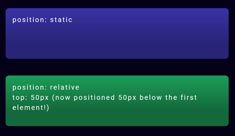
You can see that the second element is now 50px below the first one, adding that space between them.
Relatively positioned parent and child elements
Let’s try another example, using a parent element with a child element nested inside it. Both have position: relative set.
Here’s the HTML for that:
<div class="parent purple">
   <div class="child magenta"></div>
</div>
And our CSS styles:
.parent {
   position: relative;
}
.child {
   position: relative;
   top: 0px;
   left: 0px;
}
And here’s what that code will look like in real life:
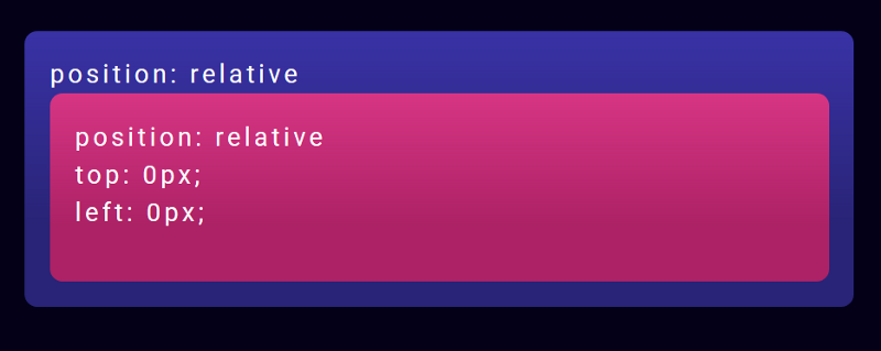
You can see that the pink child element is nicely nested inside the purple parent element. The child is also positioned as close to the top and left inside the parent as is possible. (It will go as far up as the parent text)
Position relative is relatively straight-forward, right? Well, hold on to your hats, because things are about to get crazy with position absolute.
3. Absolute
Position: absolute will cause an element to be taken out of that normal flow of the webpage.
Wait, what does that mean?
So before, using static or relative positioning, elements would be nicely displayed one below the other, depending on their order in the HTML markup. But with absolute positioning, the element is completely taken out of that entire flow.
To help explain, let’s do a comparison to illustrate the difference between relative and absolute positioning.
In the previous example, we had a parent element with a child element, both positioned relatively. And the child was nested inside the parent element.
Let’s change that child to be positioned absolutely in the parent!
Our CSS will now look like this:
.parent {
   position: relative;
}
.child {
   position: absolute;
   top: 0px;
   left: 0px;
}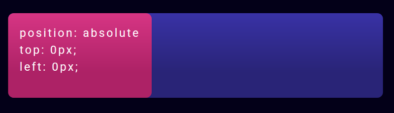
The pink child element now looks very different from our last example.
While it is still within the confines of the parent element, it is positioned at the very top and very left of the parent. It’s even covering up the parent text content!
This is due to the top: 0px and left: 0px styles of the child, combined with the child being absolutely positioned. In the normal flow of things, elements wouldn’t be on top of (and covering up) other elements.
But since the child is absolute, it’s essentially on a different layer than the normal elements. So it can be positioned on top of what else is on the webpage.
But it will stay within the boundaries of the parent element– as long as the parent has its position set. Which leads us to our next point.
There is one other tricky aspect to child elements with absolute positioning…
An absolutely positioned element needs to position itself in relation to a positioned ancestor.
When you take an element out of the normal flow by using position: absolute, it will look for an ancestor element that has its own position set. This is so the child knows what element it should position itself in relation to.
So what happens if a child element is absolutely positioned, but the parent element doesn’t have a position set?
Here’s our CSS for this illustration:
.parent {
   // No position set, so it's static
}
.child {
   position: absolute;
   top: 0px;
   left: 0px;
}
And here’s what the resulting webpage would look like:
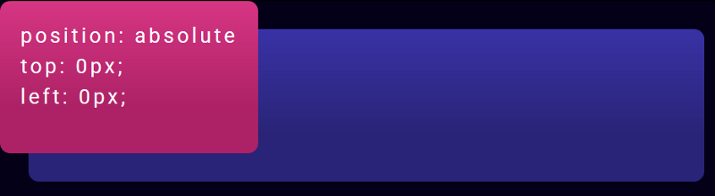
The child has now escaped the confines of the parent element, since the parent has no position set. And the child has gone up to the next (grand)parent element, in this case the <body> element, which is as far as it can go.
(A somewhat sad metaphor would be that this “orphaned” child is looking up the ancestry tree for someone that will be its “parent.”)
This is a huge cause of unexpected behavior in CSS for many developers.
If you can remember to always set the parent element of a child element to have position set to relative or absolute (in most cases), you will avoid having your child elements flying up the page to who knows where ?
So, to summarize relative and absolute positioning:
The main difference between relative and absolute positioning is that position: absolute will take a child element completely out of the normal flow of the document. And that child will be positioned in relation to the first parent element that has its own position set.The last two position values, fixed and sticky, are similar in some ways to position: absolute. But they also are related to your scroll position on the page.
Let’s take a look:
4. Fixed
Position: fixed will take the element out of the normal flow, and also position it in the same place in the viewport (what’s visible on screen). This means that scrolling will not affect its position at all.
Let’s see what this looks like in the code. Here’s our HTML:
<div class="first purple">
   Lorem ipsum dolor sit amet, consectetur adipiscing elit....
</div>
<div class="another green"></div>
And in our CSS, we’ve set the second element to be position: fixed:
.first {
   position: relative;
}
.another {
   position: fixed;
   top: 0px;
   left: 0px;
}
And this is what that will look like:
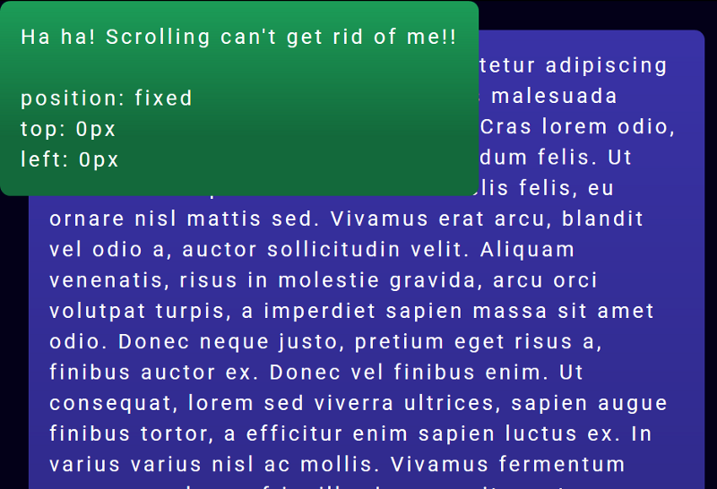
The green fixed element will stay positioned to the top and left corner of the viewport. And if you scroll, the purple element will scroll up normally, but the green element will remain stuck to where we positioned it.
Tip: A fixed element must have atoporbottomposition set. If it doesn’t, it will simply not exist on the page at all.
Position: fixed is commonly used to make navigation bars that are always affixed to the top. It’s a super helpful property!
Next, we’ll take a look at sticky positioning, which is like fixed positioning but with a little extra.
5. Sticky
Position: sticky elements will initially behave like position: relative elements, but if you keep scrolling, they will get taken out of the normal flow and behave like position: fixed wherever you have positioned them.
This can be really useful if you want to stick an element that’s initially farther down the page to the top of the screen.
In this code example, we have our green sticky element between two purple elements containing a lot of text. (All the better for scrolling!)
<div class="first purple">
   Lorem ipsum dolor sit amet, consectetur adipiscing elit....
</div>
<div class="another green"></div>
<div class="purple">
   Lorem ipsum dolor sit amet, consectetur adipiscing elit....
</div>
And the CSS for our sticky element:
.first {
   position: relative;
}
.another {
   position: sticky;
   top: 0px;
}
And here’s what it looks like on the webpage!
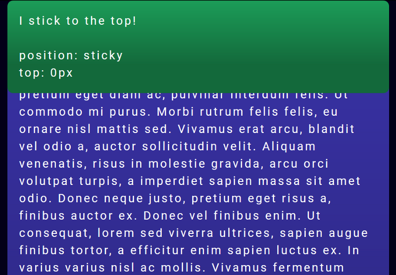
As you scroll down the page, when you see the green element come into the viewport, it seems like a normal, relatively positioned element. But as you keep scrolling, instead of scrolling off the page, it will become fixed and stick to the top of the viewport.
Just like fixed elements, a sticky element must have top or bottom set in the CSS. If it doesn’t have it, the element will continue to behave as if it was relatively positioned, and will never become sticky.
A note on browser support:
Currently, position: sticky doesn’t have complete support across the board. Newer browser versions do support it, but no versions of IE do. This may be important if you’re working on a client project where IE 11 support is necessary. You can check out the current support on CanIUse.comIn closing
I hope that you’ve found this tutorial and code examples on CSS positioning helpful! If you have any questions or feedback, feel free to leave a comment below ?
Other resources:
Want more?
I'm creating a course in responsive design! Sign up here to get emailed when it's published.
I write web development tutorials on my blog coder-coder.com, post mini-tips on Instagram and coding tutorials on YouTube.