by Patrick Ferris
How to visualise the Global Exporting Network using NetworkX and D3
Data-Driven Documents (D3) is a JavaScript library for building powerful graphics to communicate information in datasets. It is also fair to say that for many, myself included, it has a non-standard approach to building the graphics. Often the learning curve can feel steep.
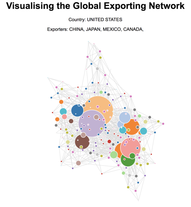
In this post we’ll look at using NetworkX — a Python library for exploring graph structures — to do some of the initial data processing for us. Then we’ll add the artistic finishing touches in JavaScript with D3. The full code can be found on my GitHub and an interactive version can be found here.
The data
I remember when I was first introduced to the CIA World Factbook, and I loved it. It holds a treasure trove of information about all of the countries in the world. It is just screaming for visualisations of the data to be made. On top of this, it has been converted to different formats on GitHub and — most importantly for us — to JSON.
The data is given per country using their two character ISO encoding. We’ll need the continent each country is in to access the data. First we’ll create that dictionary:
The dictionary makes things a lot simpler when we want to access the URL for each country’s data.
The next step is to define a simple Country class to hold the data. While we’re at it, it would improve the visualisation if we could use actual country names — not their two character code — so we can find that information and store it for later use.
And now we’re finally ready to add the exporter information — this method isn’t perfect but it gets a majority of the information.
Don’t worry too much about the split() functions on the exporting partners. That’s just cleaning up some of the data so we only get the names and the percentages we want. Check out the GitHub page to see the extra names I had to add for the graph construction to work.
NetworkX
NetworkX is a fairly sophisticated Python library for constructing, analysing, and — to a certain extent — exporting graph data structures. It is also really simple to use.
Now that we have the data we want stored in our Country objects, the code for creating our directed graph is very simple.
We can also add attributes to our nodes like the degree of the node and the name (not the ISO code). Once we have our data structure we can export it to a JSON format and dump it in a file ready to be used with D3.
What’s different about D3?
From the outset, Mike Bostock (the founder of D3) wanted to create a “reusable chart.” In his post on the subject, he highlights the key goals and missions for the D3 project. These can help us understand the syntactic structure it has.
The first, and most important, take-away is that charts should be implementable “as closures with getter-setter methods.” If you’re new to programming you may be confused as to what a closure is. Don’t worry! The big concept associated with closures is lexical scoping, which sounds a lot scarier than it really is. The basic idea behind it all is nested functions and how the inner function has access to the outer function’s variables.
Take a look at EXAMPLE 1 in the code below. Here we simply return the inner function, which has access to the arguments passed to the outer function. The variable we declare, closureOne , is a function and when we execute it with closureOne() we console.log(config.name) .
In EXAMPLE 2, we declare variables within the scope of the outer function allowing the inner my function to have access to it. In the fullName function associated with the my function — a method — we can either set or get the nameOfPerson depending on it any arguments are passed. Notice how the developer does not have access to the variable nameOfPerson . The developer is forced to use our defined methods to update and access it, providing a level of security to our function.
This method of using closures is how D3 is coded. Take a look at the line function to see this in action. This video may also shed some light on the topic.
Programming in D3
Thankfully you don’t need to be a master of closures and D3 to create a visualisation. In fact, so long as you can copy and paste, you can usually get something running in no time at all thanks to Mike Bostock’s Blocks. This site has many open-source examples of building data visualisations in D3. You can use the code to create your own with your data.
To create the network for this tutorial, I used this example. To get it running on screen, all I had to change was the name of the .csv file.
Let’s look at some of the key lines of code making this visualisation work, and also the parts I’ve added to hopefully improve it further.
Just before we dive in, Andrew Dunkman wrote a great article helping explain D3 selection which I recommend reading.
To see the functions we’re calling like dragstarted , scaledSize , or mouseOut , be sure to look at the full code here. As an example, let’s see what’s happening when we click on a node.
Conclusion
The code is messy, the visualisation isn’t perfect, and there is so much left to discuss and learn.
But that’s beside the point. Hopefully this post has been able to let you get your feet wet with NetworkX and D3 without throwing too much at you. We all have to start somewhere, and this can be your beginning to create insightful and powerful data visualisations.
If you’re stuck wondering what to tackle next, here are a few of suggestions:
- Mike Bostock’s Towards Reusable Charts — this is a great example of someone explaining their thought process and then their implementation. This shows how his goals for the project affected his implementation.
- D3 and React — two libraries fighting over the DOM, this is currently what I’m reading about, and seeing what are the best ways to utilise both on a project.
- Elijah Meeks, Senior Data Visualization Engineer at Netflix —any of Elijah Meeks’ posts are a great resource and often shed light on the world of data visualisation.
Thanks for sticking with me to the end. Happy visualising!