by Rohan Joseph
How to visualize the Central Limit Theorem in Python
The Central Limit Theorem states that the sampling distribution of the sample means approaches a normal distribution as the sample size gets larger.

The sample means will converge to a normal distribution regardless of the shape of the population. That is, the population can be positively or negatively skewed, normal or non-normal.
The Central Limit theorem is closely related to the Law of Large Numbers, which states that:
as a sample size grows, the sample mean gets closer to the population mean.
So, how are these two related?
CLT states that — as the sample size tends to infinity, the shape of the distribution resembles a bell shape (normal distribution). The center of this distribution of the sample means becomes very close to the population mean — which is essentially the law of large numbers.
Let’s illustrate this in Python with the classic die roll. Before we simulate, let’s calculate the expected value from a die roll.
An expected value is the average result of an experiment after a large number of trials.
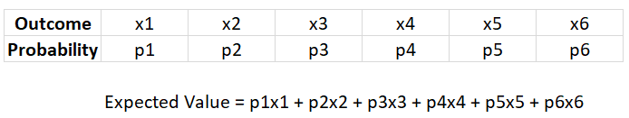
This is the general formula to calculate an expected value of an experiment (which has 6 outcomes and 6 probabilities associated with it).
So, now let’s calculate the expected value from a die roll.
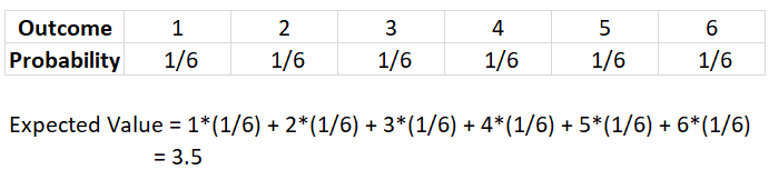
Even though it is impossible to get a 3.5 on a single roll of a die, with an increase in the number of die rolls, the average of the die rolls would be close to 3.5.
- For visualizing this in Python, first import the necessary libraries: numpy, matplotlib, and wand. Make sure you install ImageMagick for saving the plots as a gif.
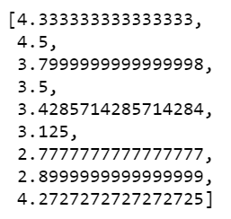
2. Now, create 1000 simulations of 10 die rolls, and in each simulation, find the average of the die outcome.
This is what the first 10 expected values of the die roll would look like:
3. Write a function to plot a histogram of the above generated values. Also, using the animation function we can visualize how the histogram slowly resembles a normal distribution.
Output:

4. You can save the animation as a gif using the following piece of code.
From this experiment, we can observe:
- With a smaller number of samples, the histogram is scattered all over and does not have a definite pattern.
- However, by increasing the sample size, the sampling distribution starts to resemble a normal distribution. This is the Central Limit Theorem.
- Also, with an increase in the sample size, the frequency for “average from die roll = 3.5” is the highest — which is the expected value of a die roll. This demonstrates the Law of Large Numbers.
So, how is the Central Limit Theorem used?
It enables us to test the hypothesis of whether our sample represents a population distinct from the known population. We can take a mean from a sample and compare it with the sampling distribution to estimate the probability whether the sample comes from the known population.
Connect on LinkedIn and, check out Github (below) for the complete notebook.
rohanjoseph93/Central-Limit-Theorem
Visualize CLT in Python. Contribute to rohanjoseph93/Central-Limit-Theorem development by creating an account on…github.com