
A network visualization tutorial with Gephi and Sigma.js
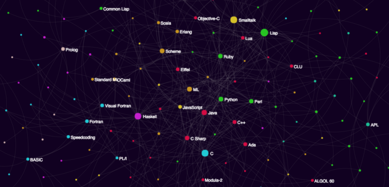
Here’s a preview of what we’ll be making today: the programming languages influence graph. Check out the link to explore the “design influence” relationships between over 250 programming languages past and present!
Your turn!
In today’s hyper-connected world, networks are an ubiquitous aspect of modern life.
Take the start of my day so far — I used London’s transport network to travel into town. Then I went into a branch of my favourite coffee shop and used my Chromebook to connect to their Wi-Fi network. Next, I logged in to the various social networking sites I frequent.
It’s no secret that some of the most influential companies of the last few decades owe their success to the power of networks.
Facebook, Twitter, Instagram, LinkedIn and other social media platforms rely on the small-world properties of social networks. This lets them connect their users with each other (and advertisers) effectively.
Google owes much of its current success to their early dominance of the search engine market — enabled in part through their ability to return relevant results with the help of their Page Rank network algorithm.
Amazon’s efficient distribution network allows them to offer same-day delivery in some major cities.
Networks are also super-important in fields such as Artificial Intelligence and Machine Learning. Neural networks are a very active field of research. Many feature detection algorithms, essential in Computer Vision, rely heavily on using networks to model different parts of images.
A wide range of scientific phenomena can also be understood in terms of network models. This includes quantum mechanics, biochemical pathways, and ecological and socio-economic systems.
Given their undeniable importance, then, how can we better understand networks and their properties?
The mathematical study of networks is known as “graph theory”, and is one of the more accessible branches of mathematics. This article aims to provide an introduction, assuming little prior knowledge or experience.
We’ll be using Python 3.x and some awesome open-source software called Gephi to put together a network visualization of how a range of programming languages past and present are linked by influence.
But first…
What exactly is a network?
The examples described above give us some clues. Transport networks are made up of destinations connected by routes. Social networks are made up of individuals, connected through their relationships to one another. Google’s search engine algorithms evaluate the “rank” of different webpages by looking at which pages link out to others.
More generally, a network is any system that can be described in terms of nodes and edges, or in colloquial terms, “dots and lines”.
Some systems are readily abstracted in this manner. Social networks are perhaps the most obvious example. Computer filesystems are another — folders and files are linked by their “parent” and “child” relationships.
But the real power of networks comes from the fact that many, many systems can be abstracted and modelled in network terms, even if at first it isn’t obvious how.
Representing networks
We need to go a little beyond pen-and-paper sketches to analyze and describe networks mathematically. How can we turn pictures of dots and lines into numbers we can crunch?
One solution is to draw up an adjacency matrix to represent our network.
Matrices are one of those concepts that might sound a little intimidating if you’re not familiar with them, but fear not. Think of them as grids of numbers which can be used to perform many calculations all at once. Here’s an example below:
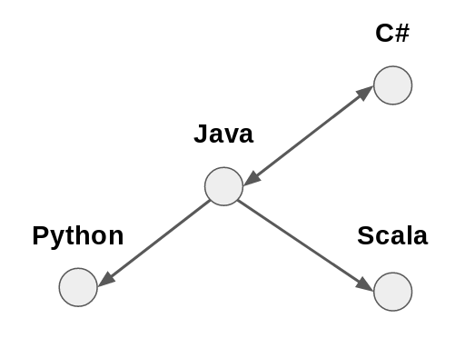
      Python Java Scala C#
Python     0    1     0  0
Java       0    0     0  1
Scala      0    1     0  0
C#         0    1     0  0
In this matrix, the intersection of each row and column is either 0 or 1, depending on whether or not the respective languages are linked. You can check this against the illustration above!
For most purposes, the adjacency matrix is a good way of representing a network mathematically. From a computational perspective, however, it can sometimes be a bit cumbersome.
For instance, with even a relatively modest number of nodes (say 1000), there will be a much larger number of elements in the matrix (e.g., 1000² = 1,000,000).
Many real-world systems yield sparse networks. In these networks, most nodes only connect to a small proportion of all the others.
If we represented a 1000-node sparse network in computer memory as an adjacency matrix, we’d have 1,000,000 bytes of data stored in RAM. Most will be zeros. There’s got to be a more efficient way of going about this.
An alternative approach is to work with edge lists instead. These are exactly what they say they are. They are simply a list of which node pairs link to each other.
For example, the programming languages network above can be represented as follows:
Java, Python
Java, Scala
Java, C#
C#, Java
For larger networks, this is a much more computationally efficient means of representing them. It is of course possible to generate an adjacency matrix from an edge list (and vice versa). It’s not like we have to pick one or the other.
Another means of representing networks are adjacency lists. This lists every node followed by the nodes it links to. For example:
Java: Python, Scala, C#
C#: Java
Collecting data, making connections
Any network model and visualisation will only be as good as the data used to construct it. This means, as well as ensuring the data is both accurate and complete, we also need to justify a means of inferring edges between nodes.
In many respects, this is the critical step. Any subsequent analysis and inferences made about the network depend on being able to justify the “linkage criterion”.
For example, in social network analysis, you might link people based upon whether they follow one another on social media. In molecular biology, you might link genes based upon their co-expression.
Often, the method used to link nodes will allow for weights to be assigned to the edges, giving a measure of “strength”.
For instance, in the context of online retail, you could link products based upon how often they are purchased together. Products that are frequently bought together would be linked by a higher weighted edge than products which are only sometimes bought together. Products that are bought together no more often than would be expected by chance wouldn’t be linked at all.
As you might imagine, the methods for linking nodes to one another can be as sophisticated as you like.
However, for this tutorial we’ll be using a simpler means of connecting programming languages. We’re gonna rely on the accuracy of Wikipedia.
For our purposes, this should be fine. Wikipedia’s success is testament that it must be doing something right. The open-source, collaborative method by which articles are written should ensure some degree of objectivity.
Also, its relatively consistent page structure makes it a convenient playground for trying out web-scraping techniques.
Another bonus is the extensive, well-documented Wikipedia API, which makes information retrieval easier still. Let’s get started.
Step 1 — Installing Gephi
Gephi is available on Linux, Mac and Windows. You can download it here.
For this project, I was using Lubuntu. If you’re on Ubuntu/Debian, then you can follow the steps below to get Gephi up and running. Otherwise, the installation process will likely be much the same as whatever you’re familiar with.
Download the latest version (at the time of writing this was v.0.9.1) of Gephi for your system. When it’s ready, you’ll need to extract the files.
cd Downloads
tar -xvzf gephi-0.9.1-linux.tar.gz
cd gephi-0.9.1/bin./gephi
You may need to check your version of the Java JRE. Gephi requires a recent version. On my relatively fresh install of Lubuntu, I simply installed the default-jre, and everything worked from there.
apt install default-jre
./gephi
There’s one more step before you’re ready to get underway. In order to export the graph to the Web, you can use the Sigma.js plugin for Gephi.
From Gephi’s menu bar, choose the “Tools” option, and select “Plugins”.
Click on the “Available Plugins” tab and select “SigmaExporter” (I also installed JSON Exporter, because it’s another useful plugin to have around).
Hit the “Install” button and you’ll be walked through the process. You’ll need to restart Gephi once you’re done.
Step 2 — Writing the Python script
This tutorial will use Python 3.x, plus a few modules to make life easier. Using the pip module installer, run the following command:
pip3 install wikipediaNow, in a new directory, create a file called something like script.py, and open it up in your favourite code editor/IDE. Below is an outline of the main logic:
- First, you’ll need a list of programming languages to include.
- Next, go through that list and retrieve the HTML of the relevant Wikipedia article.
- From this, extract a list of programming languages that each language has influenced. This will be a rough-and-ready linkage criterion.
- While you’re at it, it’d be nice to grab some metadata about each language.
- Finally, you’ll want to write all the data you’ve collected to a .csv file
The full script can be found in this gist.
Import some modules
In script.py, start by importing a few modules which will make things easier:
import csv
import wikipedia
import urllib.request
from bs4 import BeautifulSoup as BS
import re
OK — begin by making a list of nodes to include. This is where the Wikipedia module comes in handy. It makes accessing the Wikipedia API super-easy.
Add the following code:
pageTitle = "List of programming languages"
nodes = list(wikipedia.page(pageTitle).links)
print(nodes)
If you save and run this script, you’ll see it prints out all the links from the “List of programming languages” Wikipedia article. Nice!
However, it’s always sensible to manually inspect any automatically collected data. A quick glance will reveal that, as well as many actual programming languages, the script has also picked up a few extra links.
For example, you might see “List of markup languages”, “Comparison of programming languages” and others in there.
Although Gephi lets you remove nodes you’d rather not include, it wouldn’t hurt to “clean” the data before proceeding. If anything, this will save time later on.
removeList = [
    "List of",
    "Lists of",
    "Timeline",
    "Comparison of",
    "History of",
    "Esoteric programming language"
    ]

nodes = [i for i in nodes if not any(r in i for r in removeList)]
These lines define a list of substrings to be removed from the data. The script then goes through the data, removing any elements that contain any of the unwanted substrings.
In Python, this requires just one line of code!
Some helper functions
Now you can start scraping Wikipedia to build up an edge list (and collect any metadata). To make this easier, first define a few functions.
Grabbing HTML
The first function uses the BeautifulSoup module to get hold of the HTML for each language’s Wikipedia page.
base = "https://en.wikipedia.org/wiki/"

def getSoup(n):
    try:
        with urllib.request.urlopen(base+n) as response:
            soup = BS(response.read(),'html.parser')
            table = soup.find_all("table",class_="infobox vevent")[0]                return table
     except:
         pass
This function uses the urllib.request module to get hold of the HTML for the page at “https://en.wikipedia.org/wiki/” + “programming language”.
This is then passed to BeautifulSoup, which reads and parses the HTML into an object we can use to search for information.
Next, use the find_all() method to extract the HTML element you’re interested in.
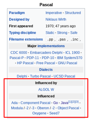
Here, this will be the summary table at the top of each programming language article. How can these be identified?
The easiest way is to visit one of the programming language pages. Here, you can simply use the browser’s Developer Tools to inspect the elements of interest.
The summary table has the HTML tag <table> and the CSS classes "infobox" and "vevent", so you can use these to identify the table in the HTML.
Specify this with the arguments:
"table"andclass_="infobox vevent"
find_all() returns a list of all elements that match the criteria. In order to actually specify the element you’re interested in, add the index [0]. If the function is successful, it returns the table object. Otherwise, it returns None.
With any automated data collection procedure, it’s always important to handle exceptions thoroughly. If not, then in the best case scenario the script crashes and you’ll need to start over.
In the worst case, you’ll end up with a data set riddled with inconsistencies and errors. This will make it a nightmare to work with down the line.
Retrieve metadata
The next function uses the table object to look for some metadata. Here, it searches the table for the year the language first appeared.
def getYear(t):
    try:
        t = t.get_text()
        year = t[t.find("appear"):t.find("appear")+30]
        year = re.match(r'.*([1-3][0-9]{3})',year).group(1)
        return int(year)
    except:
        return "Could not determine"
This short function takes the table object as its argument, and uses BeautifulSoup’s get_text() function to produce a string.
The next step is to create a substring called year. This takes the 30 characters after the first appearance of the word "appear". This string should contain the year the language first appeared.
In order to extract just the year, use a regular expression (courtesy of the re module) to match any characters that begin with a digit between 1 and 3, and are followed by three digits.
re.match(r'.*([1-3][0-9]{3})',year)If this is successful, the function returns year as an integer. Otherwise, it returns a sad-looking “Could not determine”. You might wish to scrape further metadata — such as paradigm, designer or typing discipline.
Collecting links
One more function for you — this time, you’ll feed in the table object for a given language, and hopefully receive out a list of other programming languages.
def getLinks(t):
    try:
        table_rows = t.find_all("tr")
        for i in range(0,len(table_rows)-1):
            try:
                if table_rows[i].get_text() == "\nInfluenced\n":
                    out = []
                    for j in table_rows[i+1].find_all("a"):
                        try:
                            out.append(j['title'])
                        except:
                            continue
                    return out
            except:
                continue
        return
    except:
        return
Woah, look at all that nesting… What is actually going on here then?
This function makes use of the fact that the table objects have a consistent structure. The information in the table is stored in rows (the relevant HTML tag is <tr> ). One of these rows will contain the` text "\nInfluenced\n". The first part of the function finds which row this is.
Once this row has been found, you can then be pretty sure the next row contains links to each of the programming languages influenced by the current one. Find these links using find_all("a") — where the argument "a" corresponds to the HTML tag <a>.
For each link j, append its ["title"] attribute to a list called out. The reason to be interested in the ["title"] attribute is because this will match exactly the language’s name as stored in nodes.
For example, Java is stored in nodes as "Java (programming language)", so you need to use this exact name throughout the data set.
If successful, getLinks() returns a list of programming languages. The rest of the function deals with exception handling, in case something should go wrong at any stage.
Collecting the data
At last, you’re almost ready to sit back and let the script do its thing. It will collect the data and store it in two list objects.
edgeList = [["Source,Target"]]
meta = [["Id","Year"]]
Now write a loop that will apply the functions defined earlier to every item in nodes, and store the outputs in edgeList and meta.
for n in nodes:
    try:
        temp = getSoup(n)
    except:
        continue
    try:
        influenced = getLinks(temp)
        for link in influenced:
            if link in nodes:
                edgeList.append([n+","+link])
                print([n+","+link])
    except:
        continue
    year = getYear(temp)
    meta.append([n,year])
This function takes each language in nodes and attempts to retrieve the summary table from its Wikipedia page.
Then, it retrieves all the languages the table lists as having been influenced by the language in question.
For each language that also appears in the nodes list, append an element to edgeList in the form of ["source,target"]. In this way, you’ll build up an edge list to feed into Gephi.
For debugging purposes, print each element added to edgeList — just to be sure everything’s working as it should. If you were being extra thorough, you could add print statements to the except clauses, too.
Next, get the language’s name and year, and append these to the meta list.
Writing to CSV
Once the loop has run, the final step is to write the contents of edgeList and meta to comma separated value (CSV) files. This is easily done with the csv module imported earlier.
with open("edge_list.csv","w") as f:
    wr = csv.writer(f)
    for e in edgeList:
        wr.writerow(e)

with open("metadata.csv","w") as f2:
    wr = csv.writer(f2)
    for m in meta:
        wr.writerow(m)
Done! Save the script, and from the terminal run:
$ python3 script.py
You should see the script printing out each source-target pair as it builds up the edge list. Make sure your internet connection is steady, and sit back while the script does its magic.
Step 3 — Graph building with Gephi
Hopefully you got Gephi installed and running earlier. Now you can create a new project and use the data you gathered to build a directed graph. This will show how different programming languages have influenced one another!
Start by creating a new project in Gephi, and switch to the “Data Laboratory” view. This provides a spreadsheet-like interface for handling data in Gephi. The first thing to do is import the edge list.
- Click “Import spreadsheet”.
- Choose the
edge_list.csvfile generated by the Python script. Ensure that Gephi knows to use the commas as the separator. - Choose “Edge List” from the List type.
- Click “Next” and check that you are importing both Source and Target columns as strings.
This should update the Data Lab with a list of nodes. Now, import the metadata.csv file. This time, make sure to choose “Nodes list” from the List type.
Switch over to the “Preview” tab, and see how the network looks.
Ah… It’s just a little bit… monochrome. And messy. Like a plate of spaghetti. Let’s fix this.
Making it pretty
There are all sorts of ways you can work on the presentation, and here’s where a little bit of creative freedom comes in. With network visualisations, there are essentially three things to take into consideration:
- Positioning There are several algorithms which can generate layout patterns for a network. A popular choice is the Fruchterman-Reingold algorithm, which is available in Gephi.
- Sizing The size of nodes in a graph can be used to represent some interesting property. Often, this is a centrality measure. There are many ways of measuring centrality, but they all reflect the “importance” of a given node, in terms of how well-connected it is to the rest of the network.
- Coloring It is also possible to use color to show some property of a node. Often, color is used to indicate community structure. This is broadly defined as a “group of nodes which are more connected with each other than with the rest of the graph”. In a social network, this can reveal friendship, family or professional groups. There are several algorithms which can detect community structure. Gephi comes with the Louvain method built-in.
To make these changes, you will need to calculate some statistics. Switch to the “Overview” window. Here you will see a panel on the right. It should contain a “Statistics” tab. Open this, and you will see a range of options.
Gephi comes with many inbuilt statistical capabilities. For each of them, clicking “Run” will generate a report that will reveal insights about the network.
Some useful ones to know include:
- Average degree The average language is connected to about four others. The report also shows a degree distribution graph. This reveals that most languages have very few connections, while a small proportion have many. This suggests that this is a scale-free network. Much research has been done on scale-free networks, and the processes that generate them.
- Diameter This network has a diameter of 12 — meaning this is the “widest” number of connections between any two languages. The average path length is just under four. This means that, on average, any two languages are separated by four edges. These figures give a measure of the “size” of the network.
- Modularity This is a score that shows how “compartmentalized” the network is. Here, the modularity score is about 0.53. This is relatively high, suggesting there are distinct modules within this network. Again, this indicates something interesting about the underlying system. Languages tend to fall into distinct “influence groups”.
Anyhow, to modify the appearance of the network, head over to the left panel.
In the “Layout” tab, you can select which layout algorithm to use. Hit “Run” and watch the graph shift about in real-time! See which layout algorithm you think works best.
Above the Layout tab is the “Appearance” tab. Here, you can play with different settings for the node and edge colors, sizes and labels. These can be configured based upon attributes (including the stats you get Gephi to calculate).
As a suggestion, you could:
- Color the nodes by their Modularity attribute. This colors them according to their community membership.
- Size the nodes by their Degree. Better connected nodes will appear larger than less connected ones.
However, you should experiment and come up with a layout you like best.
Once you’re happy with the appearance of your graph, it is time to move on to the final step — exporting to Web!
Step 4 — Sigma.js
Already you have built a network visualisation that can be explored in Gephi. You could choose to take a screenshot, or save the graph in SVG, PDF or PNG format.
However, if you installed the Sigma.js plugin earlier, then why not export the graph to HTML? This will create an interactive visualisation that you can host online, or upload to GitHub and share with others.
To do this, select “Export > Sigma.js template…” from Gephi’s menu bar.
Fill in the details as required. Make sure to choose which directory you export the project to. You can change the title, legend, description, hover behavior and many other details. When you’re ready, click “OK”.
Now, if you navigate to the directory you exported the project to, you will see a folder containing all the files generated by Sigma.js.
Open up index.html in your favorite browser. Ta-da! There’s your network! If you know a little CSS and JavaScript, you can dive into the various generated files to tweak the output as you wish.
And that concludes this tutorial!
Summary
- Many systems can be modelled and visualised as networks. Graph theory is a branch of math that provides tools to help understand network structures and properties.
- You used Python to scrape data from Wikipedia to build a programming languages influence graph. The linkage criterion was whether a given language was listed as an influence on another’s design.
- Gephi and Sigma.js are open-source tools that allow you to analyze and visualize networks. They allow you to export the network in image, PDF or Web formats.
Thanks for reading — I look forward to any comments or questions you might have! For a fantastic resource to learn more about graph theory, see Albert-László Barabási’s interactive online book.
The full code for this tutorial can be found here.