
by Nirmalya Ghosh
In this article, we’re going to write a simple search plugin in React. Through this article, I hope to help fellow developers understand how to write plugins using React, publish them to npm and deploy a demo to Github pages.
The source code of the plugin is available on Github.
Getting started
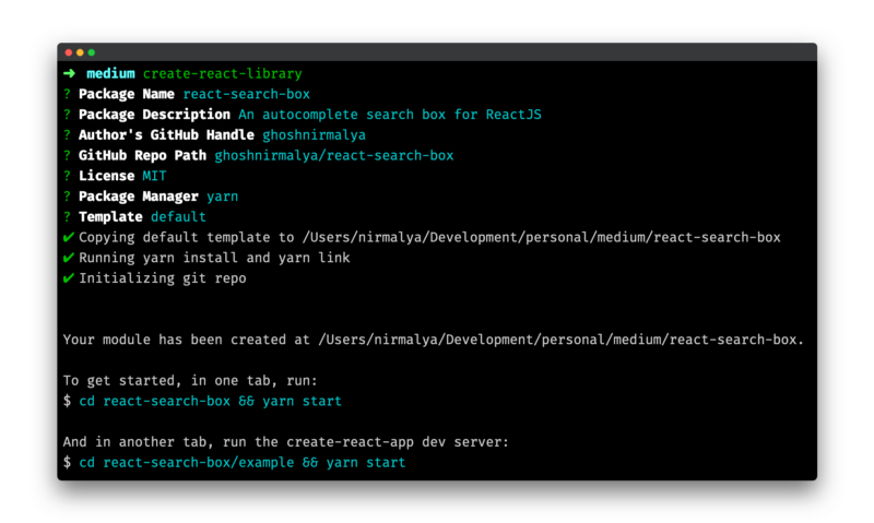
We’re going to bootstrap our plugin using create-react-library which is a CLI for easily creating reusable react libraries. This CLI has a bunch of features and will help us in generating a boilerplate for our plugin.
To use create-react-library, we’ll need to install it globally:
npm install -g create-react-libraryThe above command will install create-react-library globally and we can generate a new module from any directory. To generate a new directory, type the following command in the directory where you want to bootstrap the plugin:
create-react-libraryThe above command will ask some basic prompts about your module and once you answer them, a boilerplate for the plugin will be generated.
Now, you need to run the plugin (for watching any changes that you make to it) and the example. In one tab, you can run:
cd react-search-box && yarn startAnd, in another tab, you need to run the example app:
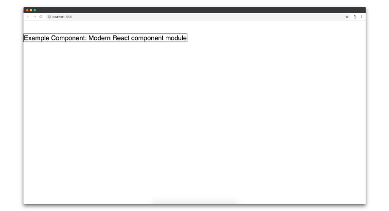
cd react-search-box/example && yarn startThe last command will run a create-react-app project which imports your plugin. If you make any changes to your plugin, it will get reflected in the example app. You can view the current status of your plugin by visiting http://localhost:3000.
Designing the input box
Let’s add the first basic functionality: an input box which would let the users type in it.
import React, { Component } from 'react'import PropTypes from 'prop-types'import styles from './styles.css'export default class ReactSearchBox extends Component { static propTypes = { /** * value: The default value for the input box. * placeholder: The placeholder text for the input box. */ value: PropTypes.string, placeholder: PropTypes.string } state = { value: '' } componentDidMount() { const { value } = this.props this.setState({ value: value }) } handleInputChange = e => { const { value } = e.target this.setState({ value: value }) } inputNode = () => { /** * This function is responsible for rendering the input box. * The input box acts as a source of entry for the data from the user. */ const { placeholder } = this.props const { value } = this.state return ( <input className={styles.input} type='text' placeholder={placeholder} value={value} onChange={this.handleInputChange} /> ) } render() { return <div className={styles.container}>{this.inputNode()}</div> }}In the above code, we’re creating an input element which has a className attribute, a type attribute, a placeholder attribute, a value attribute and an onChange handler. Most of these are very basic props. The only interesting prop is the onChange prop which is triggered whenever the user types in the input box.
Whenever there is a change in the input box, we’re calling the handleInputChange function. handleInputChange function gets the event as an argument to it. We’re using an ES6 arrow function here. So, we don’t need to explicitly bind this with the handleInputChange function. You can read When should I use arrow functions with React by James K Nelson.
Since we have a value state which we’re passing to the input box as an attribute, we are updating that value state whenever there is a change in the input box through the handleInputChange function.
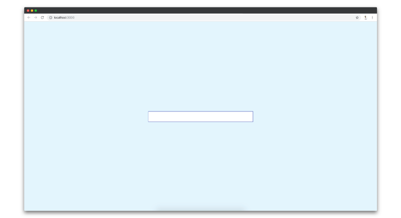
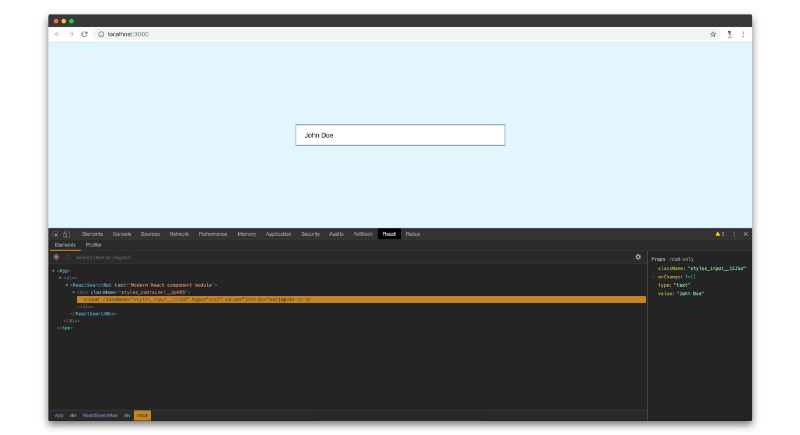
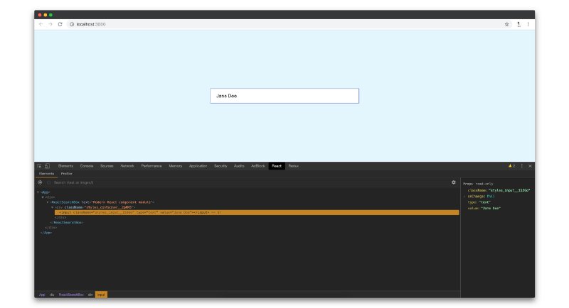
handleInputChange = e => { const { value } = e.target this.setState({ value })}If you visit http://localhost:3000, you’ll see an input box on the screen. You can type in the input box and the value will get updated.
If you check in React Developer Tools, you’ll see that the value of the input box is getting updated.
That’s all the functionality we need for the input box. Next, we’ll design a dropdown which will appear once the string that the user types in the input box, matches with any record that’ll be supplied to our plugin through the data prop.
Designing the dropdown
In this section, we’re going to implement a dropdown, which will appear with an array of records which matches with the string that the user types in the input box. The initial array of records will be supplied using the data prop which we will implement first.
import React, { Component } from "react";import ReactSearchBox from "react-search-box";export default class App extends Component { data = [ { key: "john", value: "John Doe" }, { key: "jane", value: "Jane Doe" }, { key: "mary", value: "Mary Phillips" }, { key: "robert", value: "Robert" }, { key: "karius", value: "Karius" } ]; render() { return ( <div className="container"> <ReactSearchBox placeholder="Placeholder" value="Doe" data={this.data} /> </div> ); }}Our plugin should be imported and defined like the above block of code. You import ReactSearchBox and then you pass an array of objects (the data array in this case) to ReactSearchBox.
For now, we will render the dropdown if a value prop is passed to our plugin. Later, we will refactor our component to show the dropdown if any record from the data prop matches with the supplied value prop.
Our plugin would now look something like the following:
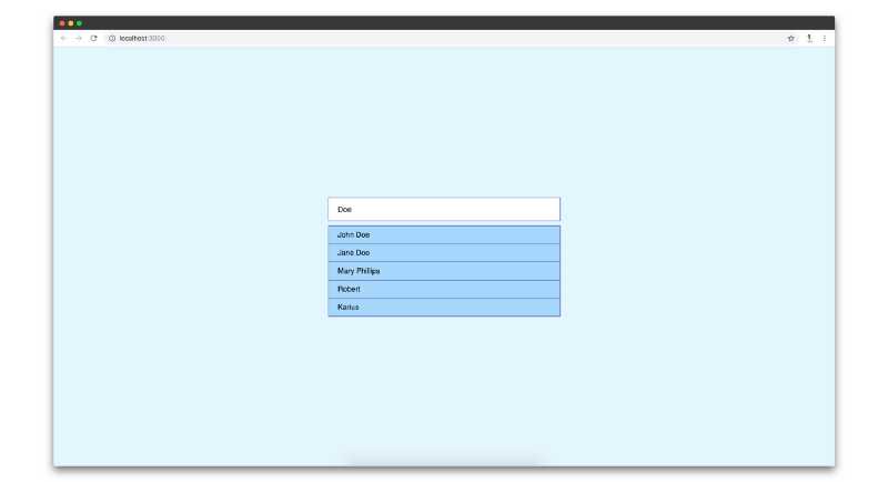
import React, { Component } from 'react'import PropTypes from 'prop-types'import styles from './styles.css'export default class ReactSearchBox extends Component { static propTypes = { /** * value: The default value for the input box. * placeholder: The placeholder text for the input box. * data: An array of objects which acts as the source of data for the dropdown. */ value: PropTypes.string, placeholder: PropTypes.string, data: PropTypes.array.isRequired } static defaultProps = { /** * Set data prop as an empty array in case it's not passed. */ data: [] } state = { value: '' } componentDidMount() { /** * This function is the same as before */ } handleInputChange = e => { /** * This function is the same as before */ } inputNode = () => { /** * This function is the same as before */ } dropdownNode = () => { /** * This function is responsible for rendering the dropdown. */ const { data } = this.props return ( <div className={`react-search-box-dropdown ${styles.dropdown}`}> <ul className={styles.dropdownList}> {data.map(record => { return ( <li key={record.key} className={`react-search-box-dropdown-list-item ${ styles.dropdownListItem }`} > {record.value} </li> ) })} </ul> </div> ) }render() { return ( <div className={styles.container}> {this.inputNode()} {this.dropdownNode()} </div> ) }}The code for the dropdown is present in the dropdownNode function. Based on the data prop which is supplied to our plugin, we are creating a list of li items and rendering inside the dropdown.
If we visit http://localhost:3000/, we will see a dropdown along with an input box.
That’s all the functionality we need for the dropdown. Next, we’ll refactor our plugin to render dropdown only when any record matches with the query that the user will type in the input box.
Refactoring our plugin to render dropdown only when any record matches with the query
This is the last step of our development process.
First, we need to add a package named fuse.js which is a lightweight fuzzy-search library. It’ll help us to check if the query that the user types in the input box matches with any records from the data prop which is supplied to our plugin.
Let’s add it to our list of dependencies using the command below:
yarn add fuse.jsNow, we would refactor our plugin to check if the query matches with any of the records.
import React, { Component } from 'react'import PropTypes from 'prop-types'import Fuse from 'fuse.js'import styles from './styles.css'export default class ReactSearchBox extends Component { static propTypes = { /** * This is same as before */ } static defaultProps = { /** * This is same as before */ } state = { /** * 'matchedRecords' stores the items when the input box's value * matches with any item from the 'data' prop. */ value: '', matchedRecords: [] } constructor(props) { super(props) const { data } = props /** * These options are from Fuse plugin. Check out http://fusejs.io/ * for more details. */ const options = { /** * At what point does the match algorithm give up. A threshold of 0.0 * requires a perfect match (of both letters and location), a threshold * of 1.0 would match anything. */ threshold: 0.05, /** * Determines approximately where in the text is the pattern expected to be found. */ location: 0, /** * Determines how close the match must be to the fuzzy location * (specified by location). An exact letter match which is distance * characters away from the fuzzy location would score as a complete * mismatch. A distance of 0 requires the match be at the exact * location specified, a distance of 1000 would require a perfect * match to be within 800 characters of the location to be found * using a threshold of 0.8. */ distance: 100, /** * When set to include matches, only the matches whose length exceeds this * value will be returned. (For instance, if you want to ignore single * character index returns, set to 2). */ minMatchCharLength: 1, /** * List of properties that will be searched. This supports nested properties, * weighted search, searching in arrays of strings and objects. */ keys: ['value'] } this.fuse = new Fuse(data, options) } componentDidMount() { const { value } = this.props /** * If any 'value' is passed as prop, find if it matches with any item * from teh 'data' prop. If there is any record, which matches with * the query, update 'matchedRecord' state with the matched object(s). * * Also, update the 'value' state with the 'value' prop. */ const matchedRecords = this.fuse.search(value) this.setState({ value: value.trim(), matchedRecords, /** * Control the showing and hiding of the dropdown when there is any value * in the input box. But, close the dropdown once any dropdown item is * clicked. */ showDropdown: !!value.trim() }) } handleInputChange = e => { /** * This function is responsible for checking if any items from the input * box's value matches with any item form the 'data' prop. If any item matches, * then that matched object is pushed into the 'matchedRecords' state. That * state is responsible for populating the dropdown. */ const { value } = e.target/** * Check all the values from 'data' array whose 'value' matches with * 'value' using Fuse plugin. */ const matchedRecords = this.fuse.search(value)/** * Update 'value' state with the value from the input box * Update 'matchedRecords' state with the matched records from the data array. */ this.setState({ value: value.trim(), matchedRecords, /** * Show the dropdown onChange of the input */ showDropdown: true }) } inputNode = () => { /** * This function is the same as before */ } handleDropdownItemClick = record => { /** * This function is responsible for updating the value inside the * input box when any dropdown item is clicked. * * The 'value' state is updated with the clicked record's value. */ const { value } = record this.setState({ value, /** * Hide the dropdown once any dropdown item is clicked */ showDropdown: false }) } dropdownNode = () => { /** * This function is responsible for rendering the dropdown. * When any value from the input box matches with any value from the * 'data' prop, that matched object from the 'data' array shows up * in the dropdown's li. The matched values are stored in the * 'matchedRecords' state. */ const { matchedRecords, showDropdown } = this.state/** * If there is no value present in the input box, then the dropdown * shouldn't appear. */ if (!showDropdown) return false return ( <div className={`react-search-box-dropdown ${styles.dropdown}`}> <ul className={styles.dropdownList}> {matchedRecords.map(record => { return ( <li key={record.key} className={`react-search-box-dropdown-list-item ${ styles.dropdownListItem }`} onClick={() => this.handleDropdownItemClick(record)} > {record.value} </li> ) })} </ul> </div> ) } render() { /** * This function is the same as before */ }}I’ve added comments inside every function which state what that particular function does. The basic functionality that we get out of the above code is the following:
- The user types in the input box (We would call the text that user types in as
query). onChangeof the input box, the plugin would check if the current value of the input box matches with any record supplied to our plugin through thedataprop.- If any record matches with the query, we will render a dropdown with a list of the matched records.
- If no records match with the query, we won’t render the dropdown.
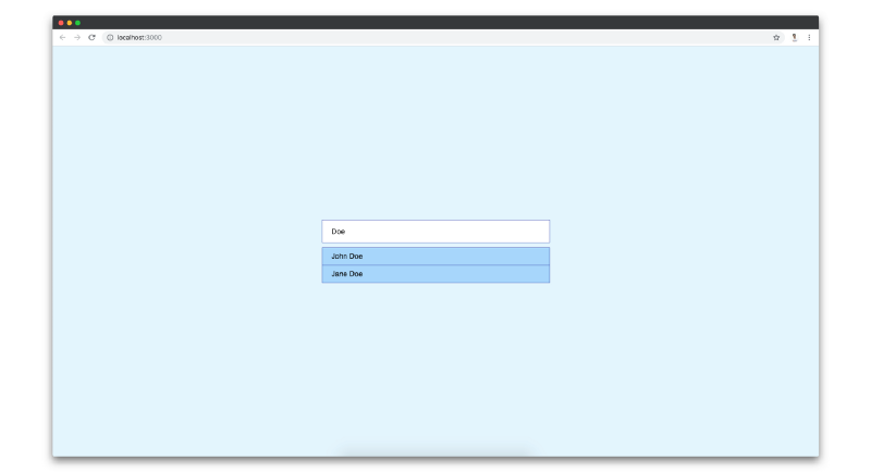
If you visit http://localhost:3000, you can see that dropdown appears with a list of matched records. The dropdown will hide if the input box is empty.
That’s all the code that we need. Next, we will push our changes to a Github repository.
Pushing our code to Github
In this section, we would create a Github repository and push our code to Github.
If you’re new to Github, you can follow this article to know how to create a repository. Once you’re done creating a new repository, you need to add remote to your plugin.
git remote add origin https://github.com/ghoshnirmalya/react-search-boxIn my case, I’m adding https://github.com/ghoshnirmalya/react-search-box because I want my code changes to be available on that repository. For your case, it’ll be a different url.
Once that’s done, you can push your changes to the Github repository:
git push origin master
You code is now available on your Github repository.
Publishing our plugin to npm
In this section, we will publish our code to npm. npm is the package manager for JavaScript.
create-react-library already has a feature through which we can publish our plugin to the npm registry. You just need to run the following command:
yarn publish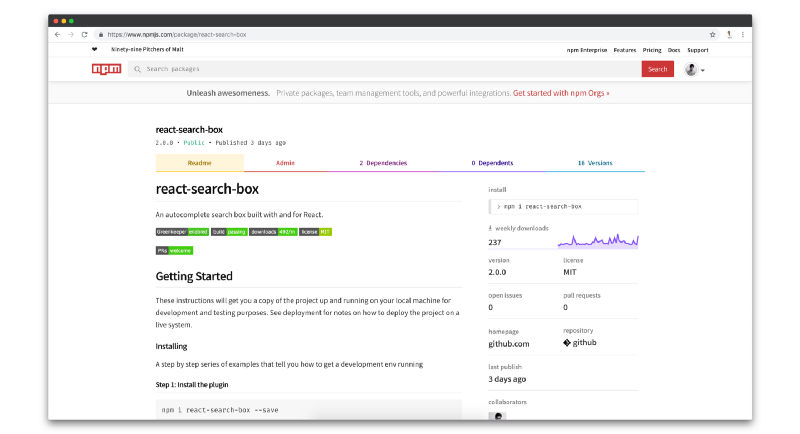
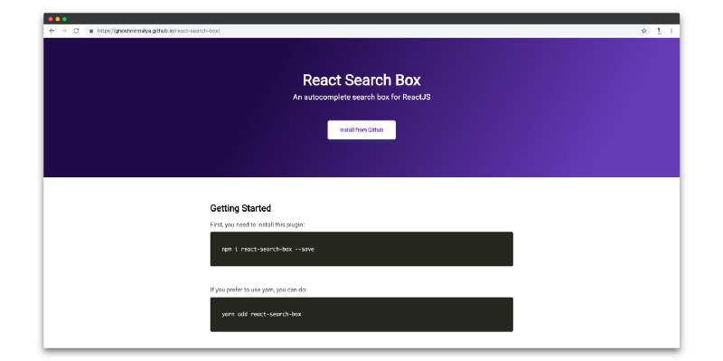
Deploying an example application to Github pages
In this section, we will deploy a sample application which will use our plugin to Github pages.
create-react-library already has a feature through which we can deploy the example folder to Github pages. You just need to run the following command:
yarn deployNow, you can view your application available at https://your-username.github.io/your-repository-name/. For me, it’s https://ghoshnirmalya.github.io/react-search-box since the url to my repository is https://github.com/ghoshnirmalya/react-search-box.
Closing notes
One last thing that you should remember is that I’ve made a bunch of changes to React Search Box on top of the changes that I mentioned here. I just wanted to create a simple autocomplete React plugin and thought that my learnings would help others who want to contribute to React but are not sure how to start.
I hope that this article will help others. I’m curious to know what great plugins you guys build with the help of this articles. Please let me know in the comments below.