by Harshita Arora

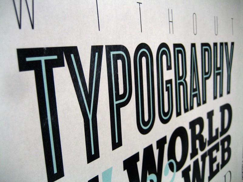
For digital design, it’s important to know and understand how to use and how to combine different fonts. There’s a font for every mood!
This post is going to give you a quick introduction to the biggest families in Typography: Serif and Sans Serif. And how, as a designer, you can choose the right fonts and combine them.
Let’s start!
Serif Type Family
The typeface Serif is differentiated from Sans Serif by the tiny little feet-like thingy called Serifs.

A lot of Serif typefaces that you’ll see will look a lot more traditional or conservative.
Origins: The reason they have these tiny feet is actually because of stone carving. Back in the days when people needed to carve out Latin letters in stone, the designer would usually paint the letters they wanted with a paintbrush. But the stonemasons would have to carve it out from that painting. And that stone carving created these serifs on the letters.
People tend to use Serif typefaces for something quite serious. This is because of their traditional and conservative look and feel.
Serif is further divided into four typeface families.
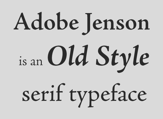
1. Old Style
This is the oldest Serif family. It includes fonts such as Adobe Jenson, Centaur, Goudy Old style, and many more. Their typeface is modeled on what text used to look like in the 1400s. Very old-looking.
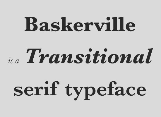
2. Transitional
This is a bit more modern-looking. This typeface family includes Times New Roman, Baskerville, Georgia, etc.
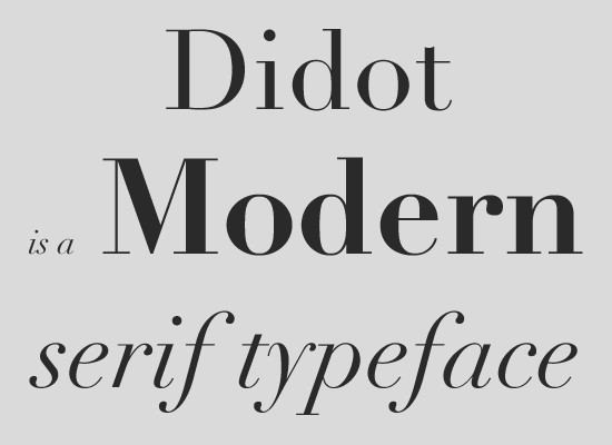
3. Modern
Even more modern-looking and classy-looking. This includes Didot, which is the typeface used for the title of Vogue magazine.
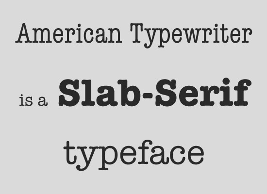
4. Slab-Serif
They’re a type family with thick serifs. Examples of slab-Serif typefaces include American Typewriter, Archer, etc.
Now, how do you differentiate between these four major classes in the Serif Family?
It’s actually quite easy. Look at the first three families: Old style, Transitional, and Modern. Put them side-by-side. If you have a look at the thinnest versus the thickest part of the letters, you’ll see that as you progress from the older to the more modern types. You’ll see an increased difference in what we call the modulation of the typefaces. Concentrate on the O’s for example. Comparing the Old Style to the modern types, the thickness and thinness difference will be lesser compared to Modern.
And a lot of this modulation comes from when people used to write with flat-nibbed pens.
What about Slab-Serif?
If you have a look at a Slab-Serif font, you’ll see there’s pretty much zero difference between the thickest and the thinnest parts of the font.
And it was designed intentionally like this. It’s one of the modern members of the Serif family. Yet, it doesn’t follow the rule of “more into the future you go, the greater the difference between the thickest and thinnest part of the font.” Slab-Serif was created for newspaper printing for clearer reading when the quality of the paper used to be poor.
Sans-Serif Type Family

Sans-Serif differs from the Serif. It does not have serifs (the tiny little feet) or any decorative elements along the central beams and the top bars. Sans-Serif is slightly more modern than the serifs.
They’re also subdivided into four families.
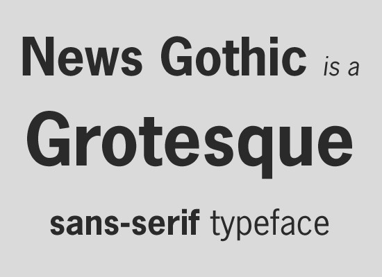
1. Grotesque
The oldest one. This includes News Gothic, Franklin Gothic, and more.
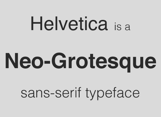
2. Neo-Grotesque:
Slightly more modern. Helvetica and Ariel are examples.
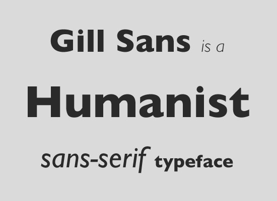
3. Humanist:
Even more in the future. Gill Sans is an example.
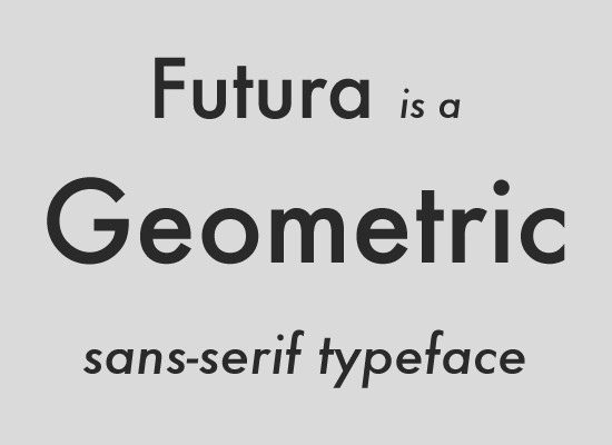
4. Geometric:
They’re based on geometric shapes. Futura is an example.
How do you differentiate between the four?
Now, similar to the serifs, you can move from the older Grotesque family to the Neo-Grotesque to the Humanist. You can see the difference in the thickest and the thinnest parts of the font get more and more exaggerated. When you look at the Grotesque, it’s almost equidistant at all points. And when you look at the Humanist typefaces, you start to see the variation of the modulation.
In a Geometric typeface, the O’s are always perfectly round. The O’s look exactly like as if you draw with a protractor. And this typeface is a bit like Slab-Serif type. Even though it’s one of the modern typefaces in the family, it bucks the trend and pretty much has no modulation and is equidistant at all points.
How Typography Determines Readability
Having a knowledge of the font families and their subfamilies helps with styling. But more importantly, it’s about readability. Design is both about function and form. What makes a typeface more readable?
Humanist Sans-Serif is considered to be more readable than Grotesque. And the reasons are:
- Humanist typeface has more open shapes.
- The inter-character spacing in the Humanist typeface is more than in Grotesque, making it slightly easier to read.
- In the Grotesque typeface, the characters are ambiguous from each other. A lowercase ‘g’ and 9 in Grotesque look pretty similar, they’re all very square, adding more confusion and making it less readable. Whereas in the Humanist typeface, you can clearly differentiate between the characters.
These are some factors that make fonts more readable. Now you can choose the typeface depending on the purpose.
How to combine fonts
When you’re combining different typefaces, usually you’ll have a different typeface for the heading and a different one for the body. And this is to create a slight contrast and interest in your designs.
Some of the common rules that designers use when they combine different fonts :
- The Serifs and Sans-Serif work really well together. It tends to create a good design. Sans-Serif have slightly increased readability compared to Serifs. Which is why Sans-Serif is a great typeface for the body of text.
Don’t combine a Serif with a Serif and a Sans-Serif with a Sans-Serif because it can look a little bland and undifferentiated. - Too many fonts in one design is not a good thing. It ends up looking too strange. Stick to 2 fonts (one from Serif family and the other from Sans-Serif).
- Appreciate the mood of the typeface just like colors. And don’t combine different moods together. Try to combine more modern fonts with modern fonts and older fonts with more traditional ones.
If you get the mood of your typefaces, you start to create some incredibly beautiful designs.
Things that you should keep similar: Mood and Time era of the font
Things that you should contrast: Serif-ness (for instance, one font should be Serif and the other Sans-Serif) and Weights.
Weight means how heavy or bold your text is. Most design software have a whole range of weights. For example, light, medium, bold, extra bold, and so on. Play around with different weights contrasting them to create interesting designs.
NEVER EVER use — Comic Sans, Papyrus, Viner, Kristen, Curlz. No matter what you’re designing, they’ll make your designs look terrible.
Tools for Typography
- WhatFont
A chrome extension that tells you the name of a font on any website. - Font Squirrel
I usually download fonts from here. They’re free for commercial use.
That was a brief overview of the vast field of typography. Hope you learned interesting things that you can use in your designs! :)