
I’ve always enjoyed critiquing applicants’ portfolios at the design studio where I work. And I also often ask for feedback on my own designs on Reddit’s webdev subreddit.
So one day, I thought it’d be fun to unofficially review the portfolios of anyone who requested a critique. I had no idea what I was getting myself into.
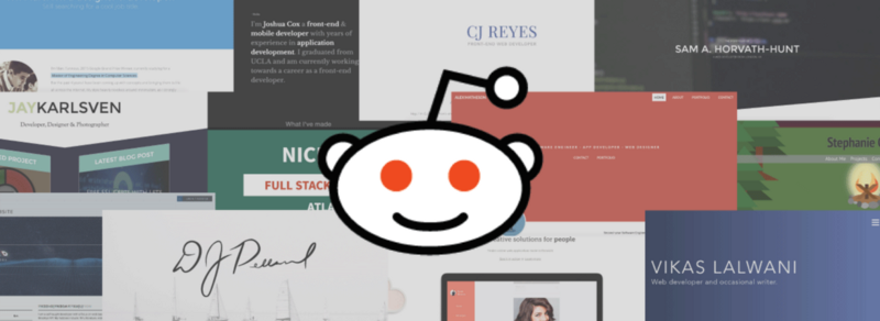
I kicked things off by extending my services for free to the 120,000 people who read the subreddit.
Things started out quiet. I would play a round of Rocket League, and then there would be one or two portfolios to review. Then I went to sleep.
When I woke up, I had twenty requests. And these kept coming for three days straight.
In the end, I was able to recognize some common patterns and high/low points across the board. Let’s highlight these.
Note that this post is specifically talking about front end developers who want to join a design studio. If you have a different goal or audience for your work, this article may not be applicable.
What were the worst things I saw?
Truth be told, the r/webdev community did a lot better than my studio’s overall applicant pool. I think that speaks to how dedicated the community members are to their craft.
This doesn’t mean everyone’s portfolio was perfect, though. There were some common mistakes that were absolute no-no’s.
Always remember keyboard and contrast accessibility.
Accessibility was the biggest mistake made throughout the review. One of the first things I physically do with a portfolio is to try to navigate it without using my mouse. If that’s not possible, I know that the applicant doesn’t have accessibility on their mind.
Color contrast for text is also a big factor. I used to love putting white text on yellow backgrounds. I thought I was being hip!
But I quickly learned in the industry that users with low vision struggle to read text with poor color choices. If your eyes are not trained to watch out for low contrast yet, refer to the Center for Persons with Disabilities’ Color Contrast Checker.
Tip# 1: Some members of your target audience will have disabilities. Before writing any styling, make sure your HTML is accessible.
Stop trying to rate your own skills.
One trend that has plagued portfolio sites for years has been skill progress bars. You say you are 85% proficient at Angular? What does that mean? How does that compare to your 80% skill at Node? Most reviewers are only going to understand three skill levels:
- You don’t know the skill at all
- You’re still learning the skill
- You feel confident in the skill
Don’t worry about the first one. Just quickly tell me what you’re learning and what you feel confident in. All of this will be proven in your projects, anyway.
Go mobile or go home.
Want to know what many reviewers’ favorite thing to do with your portfolio is? We love opening your website and then immediately adjusting the browser window width back and forth. This tells us whether you give consideration to the plethora of devices your site could be browsed on.
Want to go beyond that minimum threshold? Then have your CSS written mobile-first. Writing mobile-first styling tells us that you like writing the smallest amount of code needed. When you stop at merely having media queries with a max-width property, it tells us that mobile devices were an afterthought in your design.
What did people need to prove?
Actual projects are the real meat of a portfolio website. They prove to me that you have the relevant work experience.
A resume or list of previous jobs is a nice timeline. But as a maker, your creation is the ultimate validation.
Here are parts of peoples’ project sections that made my life easier as a reviewer.
Show me the code and the live site.
You have a project description, process write-up, and talk about the technology used. That’s great, but where’s the code?
It’s common for industry hires to get caught up in private work projects. But without any opportunity to inspect your code, you’re making the reviewer’s job tougher. We’ll struggle to know whether it’s worth our time to move you on to the next step in a recruiting process.
If the code is proprietary, where’s the live site? If I can see your code, why would you not have a live version running?
Tip #2: Work on side and personal projects related to the same tech you use at work. Not only does it help you train for your current role, it also allows a portfolio reviewer to know where your skills are.
Tell me what you’ve actually contributed to.
Group projects are great to show how well you collaborate. Most projects will require teamwork skills.
With portfolios though, you need to be clear about what work you yourself have contributed. Github repos can provide a clear history for me to review your work and understand this group dynamic.
Honesty in your project write-ups is always appreciated. Don’t exaggerate your role within a project, because the people reviewing your portfolio will dive into a project’s Git history to double check ourselves.
Prove you don’t need Bootstrap or jQuery.
It’s understandable if you started learning CSS with Bootstrap or JavaScript with jQuery. The problem comes when all of your projects contain Bootstrap and jQuery.
Even though Bootstrap is convenient, I need to know that you have a clear understanding of CSS. I also need to know whether you have a solid foundation in plain JavaScript. This ensures that I’ll be able to onboard you onto a project with any combination of front-end tools already being used.
In fact, we don’t allow Bootstrap or jQuery at all during our interviewing process. So you’ll be more prepared for the future interviews and challenges if you have the appropriate CSS and JavaScript skills.
What stood out the most?
So we’ve gone over the things your portfolio needs and the ways portfolios can go wrong. What about the stuff that gets a reviewer excited about an applicant?
The following advice might seem a less concrete than my previous suggestions, but take it to heart.
Step away from the norm.
Almost everyone had the standard Intro > Skills > Projects > Contact flow to their site. Almost everyone had the exact same hamburger menu for navigation.
Do you want to get your reviewers’ attention? Get experimental and make small changes that do not harm the design.
One of the slightest differentiators had placed their navigation on the right side instead of the left. I knew it was time to focus more because the navigation was not on the cookie-cutter left or top of the layout. Simple, but effective.
Speak towards your dream job.

Have you seen that one position that you absolutely want? Build your portfolio around that job’s requirements and responsibilities.
It’s tough for me to understand why you want a job at our studio when your portfolio is full of WordPress themes. It’s also hard to think of you as a good fit for the role if your main focus seems to be a whole different industry.
We love generalists, but it’s a great plus to show that your speciality is also what the role prescribes.
Tip #3: A lot of portfolios are used both for job applications and freelance clients. Don’t do this. The best practice is for a professional to design separate portfolios for each of those audiences.
Every little detail matters.
Here is the toughest point for a lot of people: you can’t control what your reviewer sees on your portfolio.
We’re constantly scanning the website instead of reading it top-to-bottom. So make sure you have your layout styling perfected, each sentence proofread, and no broken links.
There’s no telling what part of your site the reviewer will actually take the time to look at.
You’ve got this.
I was proud of all the great portfolios I was able to provide feedback on, and the discussions that followed.
The most encouraging part was when front end developers were not yet up-to-par for our role, and I was able to give them feedback. These aspiring professionals took the critique seriously and positively.
That is exactly the kind of attitude I look for later in the process when I interview applicants.
My hope is that these people will improve, and I’ll have a chance to review their work again in the future.
P.S. I’m still getting back to late requests for portfolio reviews. Also, all of the portfolios in my opening image asked for the review publicly, and scored highly!
For further information: Feel free to contact me by the comments, email, or @seejamescode. I work in ATX for IBM Design and always love conversation with the web design community. Also be sure to share your own or favorite portfolio in the comments!