
Today, I am thrilled to share with you a new, flexible grid framework generator: Grid Wiz!
Grid frameworks are essential for experiences that span many codebases to keep the layouts aligned. The grid keeps columns at specific dimensions as the user goes to different pages within the experience.
While at IBM, I introduced CSS Gridish. It had a simple premise: Give a config file of your grid design and get both CSS Flexbox and CSS Grid back. This helps teams transition to CSS Grid once their users’ browsers support the final spec.
There were two fundamental decisions in CSS Gridish that troubled me: the use of vw units and Node Sass. vw units created more bugs and poor development experiences than it solved. Node Sass is powerful and used by a lot of IBM, but restricted the environment flexibility of the package.
So for my next personal project, I set off to work on Grid Wiz. Let’s check out why I am much more excited about this project…
Benefits
Flexible Browser Support
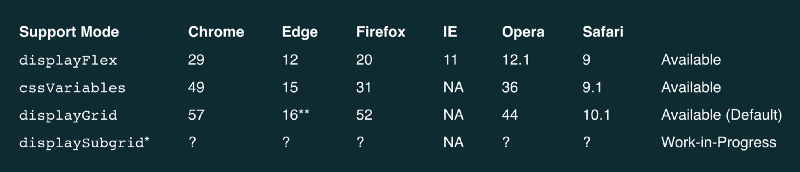
Different experiences have different browser requirements based on the users visiting. Your grid framework should also be performant with the smallest amount of code needed. With specific browser compatibility, you can support the right browsers with minimal code.
Need to support browsers all the way back to Internet Explorer? Use the Flexbox mode with the most code. No need for Internet Explorer, but do need to cover some slightly older versions of today’s browsers? The CSS Variables mode will save you a lot of code with the exact same visual output. When a user base is finally ready for CSS Grid, you will get the extra functionality with the least amount code.
Here is a breakdown of the support modes you can toggle between:
Nesting Grids
HTML isn’t written one layer deep. A great grid framework should allow you to embed divs within divs, but still remember how many columns are available.
Without “subgrids”, users of your grid framework are prone to accidentally break out of your design spec.
The next update to CSS Grid will include subgrids natively. However, Grid Wiz allows you to start using subgrids today. Once browsers update to the future feature of CSS Grid, a new support mode will be added for performance.
Environment Flexibility
Writing the source code in isomorphic JavaScript creates many possible use cases for Grid Wiz. Here are some of the ways you can use Grid Wiz:

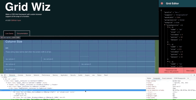
- Edit your grid directly in the live demo and then copy the CSS directly into your codebase. This is a great method for those still new to web development.
- Distribute your grid to multiple projects with a Node package. Add Grid Wiz as a dependency and compile it with Gulp, Webpack, Rollup, or anything else.
- Compile the grid directly in your app’s build process. This may sound irresponsible, but does not really affect server-side rendered apps like the Grid Wiz website itself. (Shoutout to Next.js for making SSR easy.)
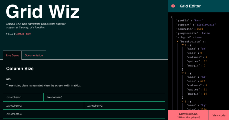
How to Use Grid Wiz
How does Grid Wiz work? As simply as possible.
Just provide your grid’s design spec as an object and get a string of CSS back:
// Check out https://grid-wiz.now.sh for more info
const gridWiz = require("grid-wiz");

var yourGridCSS = gridWiz({
  prefix: "bx--", // Prefix for all CSS class names. Can be empty.
  support: "displayGrid", // `displayFlex`, `cssVariables`, or `displayGrid`
  maxWidth: 1584, // Max-width of entire grid in pixels. Optional.
  progressive: false, // Include all browser support fallbacks older than selected support
  subgrid: true, // Embedded grids and rows know the remaining amount of columns available.
  breakpoints: [
    {
      name: "sm", // Class name prefix fot the breakpoint.
      size: 0, // Starting screen width in pixels of the breakpoint.
      columns: 4, // Amount of columns available.
      gutter: 32, // Space between content of adjacent columns in pixels.
      margin: 0 // Space on outside of entire grid in pixels.
    },
    {
      name: "md",
      size: 672,
      columns: 8,
      gutter: 32,
      margin: 16
    },
    {
      name: "lg",
      size: 1056,
      columns: 16,
      gutter: 32,
      margin: 16
    }
  ]
});
Conclusion
Grid Wiz smoothly transitions teams from older browser specs, to CSS Grid, and then to features yet to be released.
I am excited to support this open-source project in the future and hope you will contribute also. If you run into any problems, please don’t hesitate to create a new issue on the GitHub repo for Grid Wiz!
If Grid Wiz helps you out, please leave the GitHub repo a star! You can also follow me on Twitter.

Special thanks to Diego Hernandez, Jen Downs, and Josh Black for feedback that shaped this project. Also thanks to the maintainers of Babel, Next.js, and Rollup for making the project easy to make.
As always, thanks to freeCodeCamp and the community for being a great platform to share these tools on.