by George Stepanek
It’s all about the “-ilities”

We were “feature complete.”
Four weeks into a 10-week Free Code Camp project to build an environmental pledge web application, we had gotten all of the use cases working correctly.
Which meant that we were finished, right?
Not even close!
It took another four weeks just to bring the app up to a professional level of quality. It wasn’t just about finding and fixing a few remaining bugs. Most of the work we still had to do was about sorting out the “–ilities”: non-functional requirements, such as usability and compatibility.
The app was working OK. But now we needed to make it work better.
“Two seconds is the threshold for ecommerce website acceptability. At Google, we aim for under a half second.” — Maile Ohye
Performance
The application needed a multi-page look and feel, so people could share the URLs of individual pledges or of their own pledge achievements, but we couldn’t achieve the sub-second response times we wanted using a multi-page design. It was simply taking too long to download and render the pages.
Our solution was to refactor it into a React-based single-page application that catches the click events of the hyperlinks to control which ‘page’ to display:
var self = this;$('a').click(function (event) { var href = $(this).attr("href"); self.setState({ url: href }); window.history.pushState('', '', href); event.preventDefault();});This means that the application gets fully loaded only once (which may take a few seconds over a slow connection) and then each click within the site is much, much faster.
We also aggressively optimized the images with Adobe Photoshop to reduce download times, and made sure that the pages are readable even while their images are still being downloaded.
Compatibility
When you put a web application up on the public internet, you don’t know who is going to access it, which browser they’re going to use, or how old their browser version will be. It has to work for everyone.
One advantage of our single-page app design was that it was easy to get it to turn itself off for older browser versions that don’t support the APIs we needed, and fall back to using the hyperlinks as-is. Using the application this way is slower, of course, but it still works just fine.
These days most modern browsers are reasonably compatible with each other, but you should still test as widely as possible. We found that we needed to put in special rules for older versions of Internet Explorer (which wasn’t unexpected) and iOS (which was).
“Don’t make me think” —Steve Krug
Usability
We thought that our application — with five categories that each contained a dozen or so pledges — was pretty simple.
But when we asked our friends and family to do user testing, some of them said they got confused as to where they were in the application, and didn’t really understand how to get to where they wanted to go.
It needed to be more intuitive.
So we added icon breadcrumbs to the header to help people get an immediate sense of where they are in the hierarchy of pages, with hyperlinks to help them go back up.
We also added next pledge and previous pledge arrows so people could easily click through from one pledge to the next without having to go back to the category page each time.
Design
The 1to1 Movement describes itself as a “branding organization” whose aim is to make environmentalism more appealing. Their main website has a modern and stylish design, and we wanted to carry that forward into our web application.
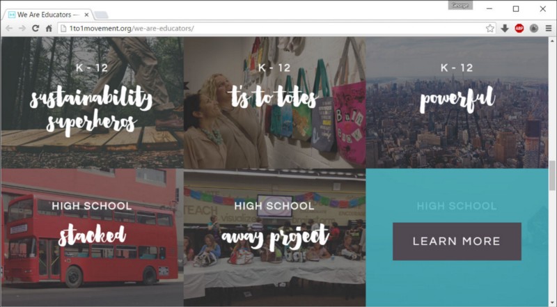
So we copied some of the main design aspects — full bleed images, low contrast thumbnails, specific fonts, turquoise highlight color — and then we asked a knowledgeable friend to give us design review to make sure we were using them correctly and consistently.
We wanted everyone to come away with a good impression, and part of that was checking that the website looks good on all screen sizes, all the way from mobile phones right up to high-resolution displays. Using a responsive UI framework like Bootstrap got us most of the way there, but we still needed check for glitches at various viewport widths. For example, we had to add { white-space: nowrap; } to the breadcrumbs section to prevent it from breaking up when the header line gets wrapped.
“Any fool can write code that a computer can understand. Good programmers write code that humans can understand.” —Martin Fowler
Maintainability
Many of these fixes and improvements were for unusual browsers or versions, or for rarely encountered use cases. So one key thing we did was add meaningful comments to explain why each component was coded the way it was. We wanted future developers understand how everything worked, and make it easier for them to avoid breaking existing functionality when they add new features.
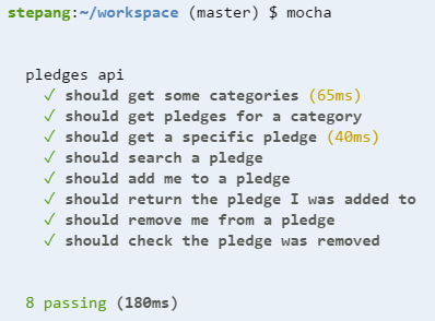
A good set of unit tests would also help future developers, because they make it quick and easy to check for broken code. We used mocha and supertest to create automated tests for the back-end business logic in our API calls.
What’s Next?
With all of this done, could we now walk away in good conscience? Not quite!
Even though we’d made the application production-ready, we still needed to actually deploy it into production and properly hand it over to the client.
But that’s a tale for another time…
Thanks for reading. I hope this article has helped you better understand all the “–ilities” involved in making an app production-ready.