
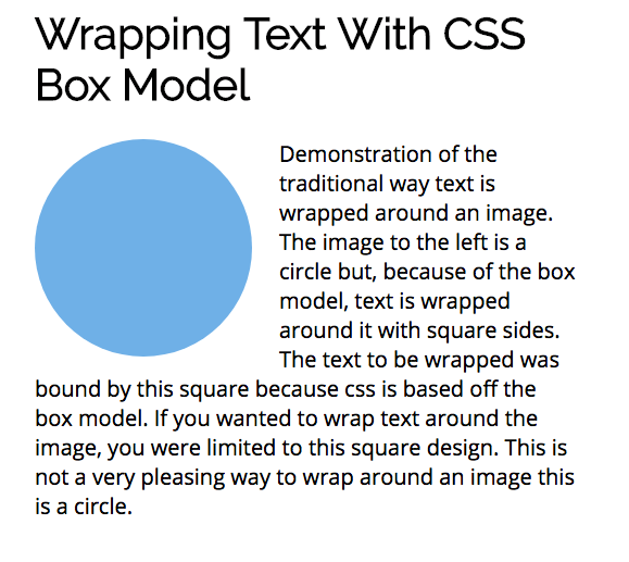
CSS is based off a box model. If you have an image that is a circle that you want to wrap text around, it will wrap around the images’ bounding box.
Shape-outside
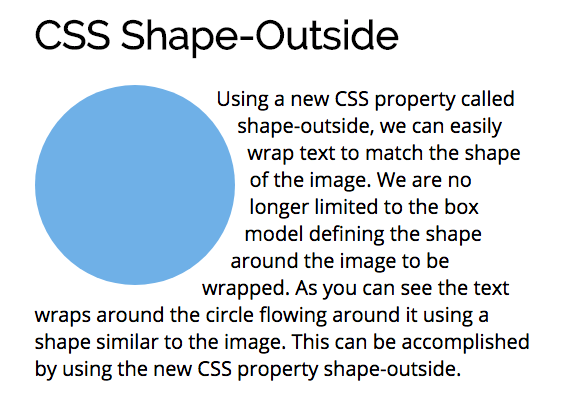
A new CSS property called shape-outside lets you wrap text that conforms to the shape of your image.

What is shape-outside
Shape-outside is a new CSS property that changes the shape of items that are wrapped. Instead of being limited to a rectangular bounding box around the image, shape-outside allows us to shape content to fit the image.
Here is how MDN describes shape-outside:
The shape-outside CSS property uses shape values to define the float area for a float and will cause inline content to wrap around the shape instead of the float’s bounding box.
The most important take away from that description is this new property applies to images that uses a float. The CSS shape-outside property controls how text wraps around any floated image. The text that is wrapped can take the shape of a circle, ellipse, rectangle or polygon.
Using shape-outside
The shape-outside property takes a “basic shape” and applies a shape function to it. The shape function is used to change the shape of the float area of the shape. The CSS shape-outside property provides functionality to create these shape functions:
- circle
- ellipse
- polygon
- rectangle
- url
The image can be positioned with these values. The values are appended to the end:
- margin-box
- padding-box
- border-box
The image must have intrinsic dimensions. You must set the height and width of the element. This will be used by the shape function to create a coordinate system that is used when wrapping text around the image.
Circle
Circle() is one of the functional values provided with shape-outside. The full notation for circle() is circle(r at cx cy) where r is the radius of the circle and cx and cy are the coordinates for the center of the circle. If you omit them, the center of the image will be used as the default values.
Here is an example of using shape-outside on a circle:
.circle { height: 200px; width: 200px; border-radius: 50%; background-color: #7db9e8; margin: 0 25px 5px 0; float: left; -webkit-shape-outside: circle(); shape-outside: circle();}Ellipse
Ellipse is a variation of the circle where the item is elongated on either the horizontal or vertical axis. The full notation for ellipse() is ellipse(rx ry at cx cy) where rx and ry are the radii for the ellipse and cx and cy are the coordinates for the center of the ellipse.
Here is an example of using shape-outside on the ellipse:
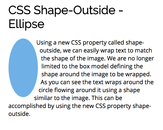
.ellipse { width: 100px; height: 200px; border-radius: 50%; background-color: #7db9e8; margin: 0 25px 5px 0; float: left; -webkit-shape-outside: ellipse(50px 100px at 50% 50%); shape-outside: ellipse(50px 100px at 50% 50%);}Polygon
The polygon function provides an unlimited range of shapes. The full notation for polygon() is polygon(x1 y1, x2 y2, …) where each pair specifies the x y coordinates for a vertex of the polygon. To use the polygon() function you must specify a minimum of 3 pairs of vertex.
Polygon is used with a clip-path. The clip-path CSS property creates a clipping region that defines what part of an element should be displayed. Anything inside the region is displayed, while those outside are hidden.
Here is an example of using shape-outside to create two triangle shapes and the text flows between them:
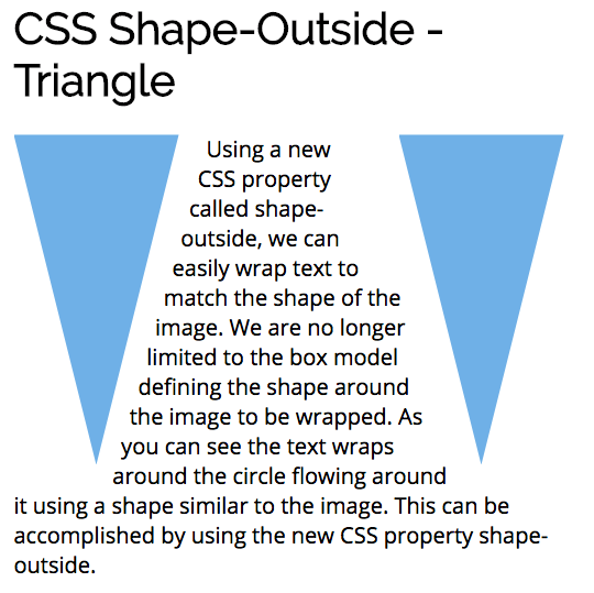
.leftTriangle { width: 150px; height: 300px; background-color: #7db9e8; margin: 0 25px 5px 0; float: left; -webkit-clip-path: polygon(0% 0%, 100% 0%, 50% 100%); clip-path: polygon(0% 0%, 100% 0%, 50% 100%); -webkit-shape-outside: polygon(0% 0%, 100% 0%, 50% 100%); shape-outside: polygon(0% 0%, 100% 0%, 50% 100%);}.rightTriangle { width: 150px; height: 300px; background-color: #7db9e8; margin: 0 0 5px 25px; float: right; -webkit-clip-path: polygon(0% 0%, 100% 0%, 50% 100%); clip-path: polygon(0% 0%, 100% 0%, 50% 100%); -webkit-shape-outside: polygon(0% 0%, 100% 0%, 50% 100%); shape-outside: polygon(0% 0%, 100% 0%, 50% 100%);}Browser Support
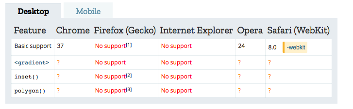
The CSS shape-outside is supported primarily by Chrome, Opera and Safari.
Get the Code
The code for all of the examples can be found in my github repo here.
More Articles
Thanks for reading my article. If you like it, please click on clap icon below so that others will find the article. Here are some more of my articles that you might be interested in:
Here are 5 Layouts That You Can Make With FlexBox
Breadth First Search in JavaScript
Instantiation Patterns in JavaScript