by Vinny
No budget? No excuse. UX on the cheap Part 2: let’s get building.
This is a continuation of my series on ‘UX on a Budget’. If you haven’t read part one, I’d strongly recommend giving it a read before getting into this article. You can find it below.
No budget? No excuse. Here’s a practical guide to UX on the cheap.
Here’s a problem I’ve encountered over and over again during my 5 years as a UX designer at Melbourne agencies: no…medium.freecodecamp.com
In part one, I discussed the first stage of IDEO’s circular design methodology, ‘Understand’. In this article, I’m going to walk through the next two stages, ‘Define’ and ‘Make’.
In part one, I discussed the first stage of IDEO’s circular design methodology, ‘Understand’. In this article, I’m going to walk through the next two stages, ‘Define’ and ‘Make’.
In keeping with theme of this series, the idea of this article is give you some practical tips into how you can implement this methodology. We are sticking to the core of Lean UX (that is, ‘do as little as you can to validate your ideas’) and keeping down budget. Let’s get to it, after a quick reminder to sign up for the full eBook :)
Define
Now you’ll need to define the problem that you are trying to solve. What you’ll want to do here is establish some achievable goals, that are clear, easy to measure and at their core benefit the business.
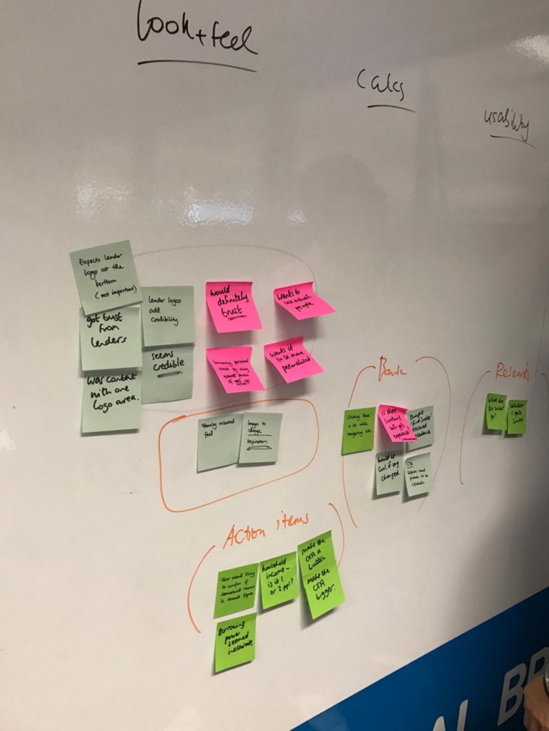
Workshopping
UX’ers love post it notes. There’s a reason for this. Humans are programmed to be good at certain things. One of these, is seeing patterns and the desire to group like things together (see Susan Weinschenk’s book, ‘100 Things Every Designer Needs To Know About People’ for one, plenty more about this topic out there).
Getting post it notes onto a board allows us to get ideas out of our head and onto a wall and view everything from a different perspective. Things can be easily moved, ideas grouped together (more about affinity mapping here) and we can form discussion points.
I’d strongly advise trying to workshop the insights that you collect from any kind of user research, or even insights you’ve drawn from analytics. Ideally you can draw on at least one/two from the client’s team and one other person from your own team. Having 4 people in a room means that you’ll see the data from other perspectives, not just your own. This is vital.
I fully understand this is not always possible and therefore having at least one other (you can still workshop with two people!) is still a worthwhile exercise.
There are plenty of ways to synthesize your data and I’ll not go into detail here, but I’d strongly recommend the book Gamestorming if you want some workshop ideas — the book will help you choose the right activity for the situation you have.
Pro tip: Make sure and finish with a clear summary of what took place, and a clear next step. Too many times these awesome conversations get lost, or people not in the room don’t get the context. Create a Trello board with the key insights — it’s free, easily shareable and better than a photo where you have to zoom in and can’t read peoples handwriting :)
Dig past the surface
One of my favorite people to listen to speak about human behaviors is leading advertiser Rory Sutherland. If you haven’t watched him talk before, reading this article will have paid for itself by just discovering this guy. Check him out. A quote from Rory which really resonated with me:
As soon as a number becomes a metric, it loses all relevance as a metric.
It’s common at the start of projects to promise things like an increase in traffic, or a lower bounce rate, or some kind of analytics metric that sounds great. The thing is, while not always irrelevant, a lot of the time we focus on the wrong goals.
If your goal is to make more money, your focus should be on conversion rate, not traffic, not bounce rate. Focus on what’s actually important and spend all your time and effort on that goal, not wasting it on those aesthetically pleasing positive trend lines in Google Analytics. Looks great on a report, but who cares if it doesn’t mean money in the bank.
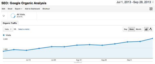
Of course this is different in every project. Sometimes more traffic is the goal, sometimes a lower bounce rate is better. The point is, if you’re promising you’re going to improve something — make sure and think about what you are choosing and why. Make sure you’re not being unrealistic.
The Lean UX Canvas
I’ve talked a lot about lean UX and here’s another handy tool from Jeff Gothelf — the lean UX canvas.
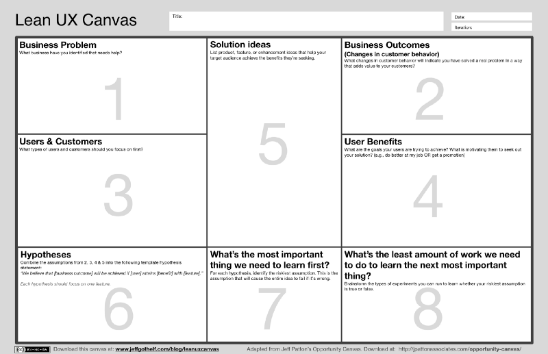
This can serve as a great reference point for your project. You may not want to use all of this canvas, but you can pick the pieces that are relevant. Customize it to suit you and suit the project you’re working on, but it’s really important to use a tool like this because it gives you something to refer back to later and help you to make decisions later on.
The main reason I’m a fan of this kind of canvas, is that it formalizes the data I’ve collected. I’ve talked a lot about gathering data and insights, and coming up with goals — this allows them all to live in one place as a reference point.
Creating your own version of this document with your own branding and customized to the project at hand, not only will help you with your work, but will look impressive to your client and gives them a great reference point.
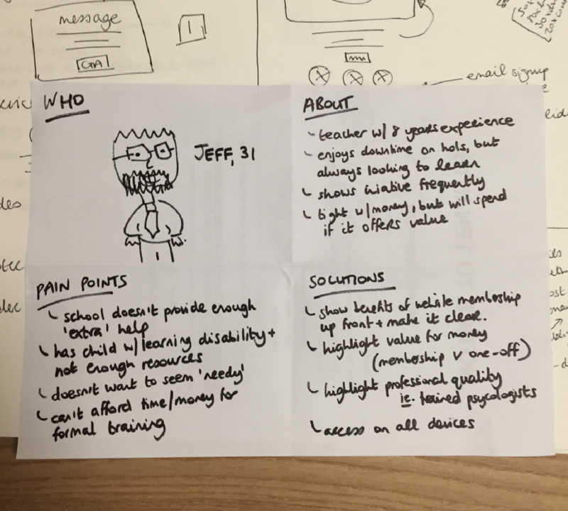
A controversial sidenote — personas
One thing I haven’t mentioned in here is personas. Some love them, some don’t love them. My personal opinion is to use personas if you find them useful. In the spirit of Lean UX, you can easily create proto-personas very quickly (another trick from Jeff’s book)— this just means creating a quick summary of a potential customer/user of your product, that you can refer to throughout your work.
People that advocate for personas say that having personas help your designs remain human centered, by the very literal fact that you are making your decision decisions based on a human (who you’ve created). This can be an excellent way to guide conversations.
On the other side of the fence, there’s an argument that by focussing on personas, we give to much emphasis into these particular users and their perspectives and therefore lose sight of the bigger picture.
I think there’s an art to personas and a way to create a good balance. I’d advise experimenting with them and seeing how you go.
Summary
You’ve got lots of beautiful stats and insights from part one. Now you’ve started to synthesize data, looking for patterns and opportunities. You’ve established some business goals. You’ve made some promises. You’ve got your canvas filled out (or at least noted down what you’re trying to achieve). You’ve got some others involved and you’re now ready for the fun part.
Making stuff!
Make
Paper
Personally, when it comes to making stuff, I have to start with paper. For me it’s an exercise in getting out of my head. Writing stuff down, so I can draw patterns. Whether it’s drawing out a mock flow or what a screen might look like, or just listing relevant thoughts. I keep notebooks and notebooks, of what looks like utter nonsense, but is actually critical to how I work.
For me personally, it’s all about being scrappy. I don’t use a ruler when I create a paper wireframe — it gets in the way. I’m not knocking this approach, I feel a tinge of jealousy when I see some of the unbelievable wireframes others come up with using a pencil and paper, that’s just not how I work.
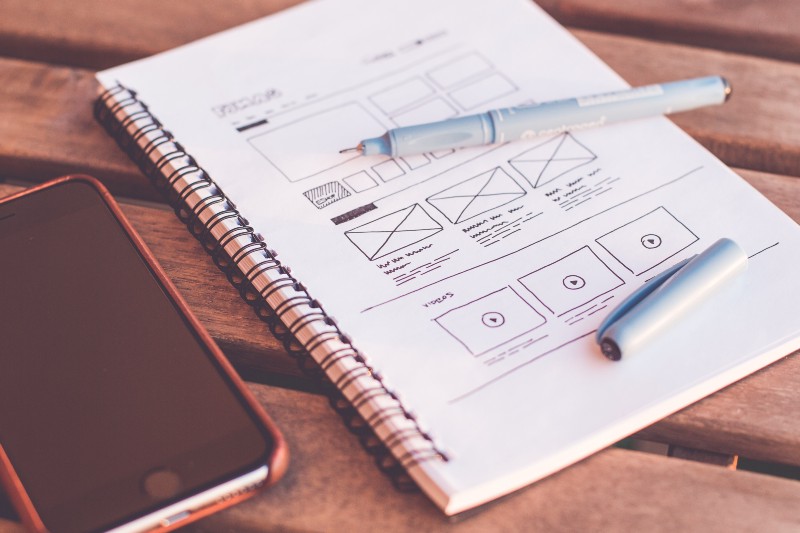
As soon as you open your design tool of choice and you’re in digital mode, your creativity is limited. You go from endless possibilities to a fixed canvas. You think about how things look instead of how things work. I try to hold off on this step until I have at least got a good idea of what I’m trying to achieve.
Prototyping
After scribbling out your thoughts on paper, it comes time to wireframe your designs, and get people actually using them.
There’s apps out there like POP where you can prototype with your paper designs. This can be good to get a feel for how your flows might work and can be enough to show to people — but personally I prefer going digital at this stage and getting my thoughts into order.
Some tips for digital prototyping:
- Use real content not lorem ipsum
- Start with nothing, don’t start with a template and work backwards
- Find a good UI kit to help speed things along
Why you ask? Lorem ipsum sucks. It was great for what it was invented for (print), but not for what we do. It takes us away from the real design into the land of make believe.
Even if you don’t have the final content/copy, pick something similar. I cannot stress this point enough. Some people are so detail focussed that they just can’t look past that placeholder text in the way you can. Also, there’s no point in designing a great headline in a font that only works with four words, when in real life that headline’s going to be 20 words.
Another aside — Friendly tools
Personally when it comes to ‘making’ digital products, I rely on a couple of pieces of software. Thankfully they play nicely together. That’s Sketch and InVision. Crazy, right?

I spent a long time looking for great wireframing tools, and have used many in the past. I’ve been through UX Pin, Illustrator, Photoshop (seriously), Axure, Balsamiq, Mockflow and Adobe XD, some better than others, but I’ve landed on Sketch as my go-to. There’s many reasons for this, obviously it’s become a hugely popular piece of software in our industry, leading to lots of awesome plugins, articles on how to use more effectively and lots of Medium articles about why it’s so much better than anything that’s come before it.
My thinking is that when it comes to tools we still have a long way to go (read this article), but out of all the UI tools I’ve used, Sketch is the one that gets least in my way. It’s quick for me to do what I want, I can crank out a wireframe in no time at all, and when I’m ready to go hi-fi and turn it into visual design, I can use the same software.
Being able to directly sync with InVision means that I can produce prototypes seamlessly from Sketch, and with the new ‘Inspect’ functionality I can also pass along to developers easily.
Sketch is a bargain at $99 (with a free 30 day trial) and InVision allows one free project so it definitely sticks within the ‘budget’ theme of this article. Having used InVision for so long, it’s hard to look past it for prototyping, but I have experimented with Marvel and it’s got a lot to like, so if for whatever reason you’re not into InVision, I’d strongly recommend looking at it.
With tools like Wordpress and Squarespace out there, it’s easy to create a website in very little time, and jump straight to code without design. For me personally, I can code, but my skill-set relies on empathizing with customers and crafting solutions.
If I spend time coding, I start to get away from the problem I’m really trying to solve (for the customer) and start fixating on my own coding limitations, therefore I try to avoid code prototypes at the early stage — this is of course different for everyone dependent on their skill-set.
Testing Prototypes
Once you’ve got a prototype together, you can get testing right away. What do you need to prototype? Basically as little as you possibly can to test your hypothesis.
Let’s say you are testing demand for an app and you ask people to sign up to be notified by email. It could be as simple as adding an e-mail address box to your webpage — do people sign up? If they do, then there’s demand for the product, you can go ahead and create it knowing there’s a demand for it.
You could add a button with the name of a new feature on it — if people click, you can lead them to a screen saying ‘coming soon’, meanwhile you can track the clicks on the button and see what the demand looks like.
With a project you’ve setup in InVision or Marvel, at this stage your best gathering as many thoughts as you can on what your working on, at as early a stage as possible. If you’ve got other people on your team that you can get in front of the product that’s great. Even friends will help with some basic usability issues, the more people you have checking out what your doing, the better.
This is also a great time to use the guerrilla testing techniques I discussed in part one, where you can sit in a local café and get new users looking and using the prototype with fresh eyes.
Validating with data
There’s also a great tool called Usability Hub, which allows you to easily recruit users to run through some quick tests with data. It’s not a free tool, but it’s very reasonably priced and affordable for a small agency or UX team of one (yay!).
I particularly love running my prototypes through their preference and five second tests. It’s always nice to have data to mean you’re having informed conversations about what can often be quite subjective matters.
Iterating
With all of this, I haven’t even talked about getting to a development stage yet. The assumption would be that once you’ve went through this process, you’re going to get some feedback to act upon. This means iterations. You’ll need to employee these techniques multiple times, before you get a definitive idea of what you’re going to build as your final product and release.
We are dealing with UX ‘on a budget’ here, so that doesn’t always mean that you’re going to have the kind of time that this process requires. My advice is to try and get some testing done as early as possible, regardless of the project you’re working on — but living in the real world, this isn’t always possible to the extent we want. And that’s OK.
Wrapping Up and Moving On
Ok, so to summarize what we’ve covered in this article:
- We’ve defined our problem through workshops
- Maybe we made some personas, maybe we didn’t — but we’ve focussed on the user throughout this ‘defining’ stage
- We’ve got some plans written down on our version of the Lean UX Canvas
- We’ve done some paper prototyping to rapidly produce some ideas
- We’ve went digital into Sketch (or whatever tool you might prefer) and created a digital prototype
- People have started interacting with the prototype and we are learning
- We’ve iterated through a few versions and are ready to go!
That’s it. A lot. But, due to the focus on the user, you should be much closer to a solution that’s elegant and user-centered. You mightn’t get it 100% right the first time, but you’ve invested as little time as you can on each idea, meaning there’s a chance to move on quickly when needed, to the next idea.
Now — it’s time to get it released and learn even more.
Further Reading
All of what I’ve talked about in the past couple of articles, as well as the last part of the IDEO circular design process I’ve yet to cover (‘release’), will be available in my eBook, please signup below to be notified of release :)
In the meantime, make sure and check out these books if you’re looking for some further reading into validating ideas quickly — they’ve definitely served as a great foundation for my own knowledge on the subject!
Download the book now:
UX on a Budget: The Practical Guide
Over the past couple of months, I’ve been writing a couple of Medium articles and putting together some content for a…medium.com
If you’ve found this useful, please ❤️, share and make sure and follow me for more :)