
CSS Grid (Grid) has been out for some time now, with full support in major modern browsers. I’ll leave others to dive into why it’s so great and what new design possibilities it makes so easy to explore. If you have been looking for the best way to support responsive web designs, I’ve yet to see anyone that doesn’t love Grid. It’s simple to use, yet extremely powerful and flexible.
But, I hear you say, a lot of our users aren’t using the most up-to-date browser versions, or are in markets where Chrome/Firefox don’t hold a majority share. And, really, is re-writing all our old code really worth it?
I felt similarly, until hearing a great talk given by Natalya Shelburne. She described how she started using CSS Grid alongside Bootstrap, without losing support for older browsers, by enhancing rather than deleting old CSS.
Importantly, this is without using any JavaScript polyfills, but using pure CSS. As Rachel Andrew mentions:
As we already know, the browsers that don’t support grid are older, slower browsers or browsers most often found on lower powered devices in emerging markets. Why would you force a bunch of JavaScript onto those devices?
Natalya describes how “feature queries” can be used to implement Grid in browsers that do support it, without losing existing functionality. MDN refers to this as “progressive enhancement”, stating that:
It is worth noting that you do not have to use grid in an all or nothing way. You could start by simply enhancing elements in your design with grid, that could otherwise display using an older method.
Using Grid
So, how do we go about this?
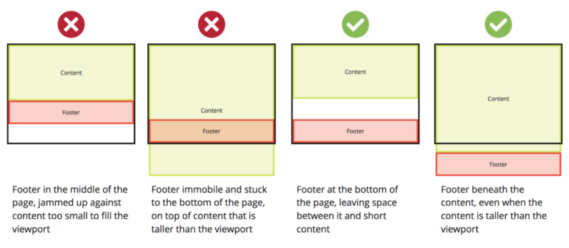
In a previous post, I described a simple approach to “keep your footer where it belongs.” This avoids the problems seen when a page’s main content is too small to push a footer to the bottom of the page.
This provides a chance to show how a feature query can be used to move to using Grid.
It’s important to note that this is an example of how you could move to using Grid in an existing codebase, not why it is a powerful tool. This example is used because it is small — so it is possible to understand the how without distractions found in a larger codebase.
Realistically, Grid provides no great improvement here. The benefits of using a new tool should be discussed, rather than just implementing it because it is cool!
The example is below. More explanation on the code is here.
<!DOCTYPE html>
<html>
 <head>
   <link rel="stylesheet" type="text/css" href="main.css" />
 </head>
<body>
 <div id="page-container">
   <div id="content-wrap">
     <!-- all other page content -->
   </div>
   <footer id="footer"></footer>
 </div>
</body>
</html>
There are two main parts to adding Grid:
- adding the needed new grid properties
- overriding any properties no longer needed.
main.css:
#page-container {
  position: relative;
  min-height: 100vh;
}
#content-wrap {
  padding-bottom: 2.5rem;    /* Footer height */
}
#footer {
  position: absolute;
  bottom: 0;
  width: 100%;
  height: 2.5rem;            /* Footer height */
}
main.css can be extended to add:
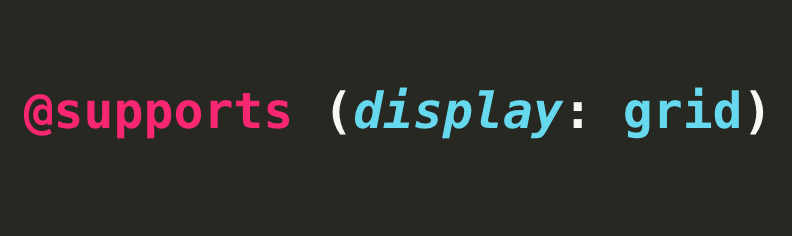
@supports (display: grid) {
    #page-container {
        position: static;               // override
        display: grid;                  // new
        grid-template-rows: 1fr auto;   // new
        grid-template-columns: 100%;    // new
    }

    #content-wrap {
        padding-bottom: 0;              // override
    }
    #footer {
        position: static;               // override
        height: auto;                   // override
    }
}
position is set back to its default of static, and the padding and height are reset to values that do not interfere with the new layout.
min-height: 100vh is not referenced. It is also used by Grid so does not need to be altered.
Three new, related,grid properties are added. The use of a single fraction unit 1fr ensures the first child element of page-container (in this case content-wrap) will fill all the remaining space that the auto height of the second child element footer does not take up.
And that’s all there is to it! Now browsers that support Grid will use the code within the feature query, while still fully supporting browsers that don’t. This even allows for single components to add Grid one at a time — a team can see how straightforward the process is without a huge time investment.
Hopefully this illustrates the incremental approach that can be taken to using Grid.
More complex uses
The power of what Grid offers is best seen in the more complex examples written by Natalya that inspired this update article. This shows the power of what Grid can offer when used at a larger scale.
Quick tips
The fallback code can be tested without access to an older browser or emulator. Temporarily change@supports (display: grid) to a non-existent value, for example gridNO, so the fallback code is used.
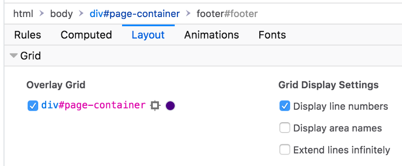
Firefox provides some great tools that Chrome currently doesn’t. These are the “Grid Display Settings” activated within the “Inspector” tab. These settings help to visually illustrate how Grid is being executed, which is great for complex layouts.
Finally, I was inspired by a statement made by Rachel Andrew:
It shouldn’t look the same in all browsers, it should be a good experience in all browsers.
The default of many companies is to strive for a duplicate experience in every browser. But is it worth considering that on older, slower browsers, a simpler approach might actually be a better experience?
Thanks for reading ? I hope that this helps inspire you to try using Grid not just in greenfield projects, but also alongside anything you might be using today!
Resources
- From Bootstrap to CSS Grid
- Keeping the Footer at the Bottom with CSS-Grid
- A Complete Guide to Grid
- CSS Grid Layout and Progressive Enhancement
- Using CSS Grid: Supporting Browsers Without Grid
Here are a couple of other things I’ve written recently: