by Daniel Lopes
I redesigned Tinder. Here’s what I learned in the process.
The challenge
I set out to see how far I could push myself creatively as a designer by rebuilding an App I frequently use.
I chose Tinder because I’ve used it a few times, and realized a few modifications to the design would be helpful. Of course I’m not suggesting that my design should be used instead of the current Tinder design. It’s just a different point of view from the current design of the App.
My Goals:
- Create a better user experience
- Facilitate the use of the application
- As a personal goal, to complete my first design project
Understanding the App
Tinder is a location-based social App that is most commonly used as a dating App with a target audience from 18 to 34. Since its debut in 2012, Tinder has undergone rapid growth thanks to its extremely simple way of use and amazing organic strategy.
The Home Page
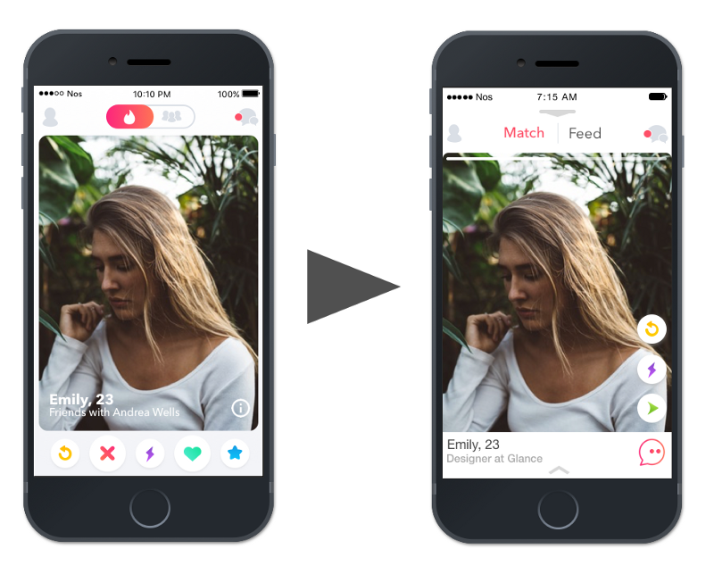
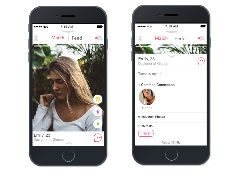
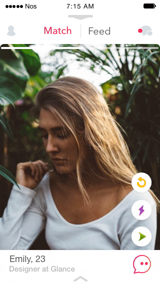
Problem 1: Bottom buttons and Card swiping
As soon as a user opens the App, Tinder users have two prime features to indicate whether they like a profile or not:
- the bottom buttons
- the card swiping
So which of these should they use?
Both options are very good, but the card swiping provides a much smoother experience. If you compare it to other Apps that are increasingly implementing the card swiping feature, Tinder is far ahead. We should take 100% advantage of it.
After analysing the existing design, the “super like”, “like” and “nope” buttons were removed, with the card swiping gestures for these actions.
The following new buttons were added.

Dismiss Profile
Let’s say you come across a profile that interests you and at the same time does not, you can dismiss it and go to the next one.

Message
Feature for Tinder gold that would allow you to send a message to any profile, even if they have not yet liked you.
New swiping card - Friends
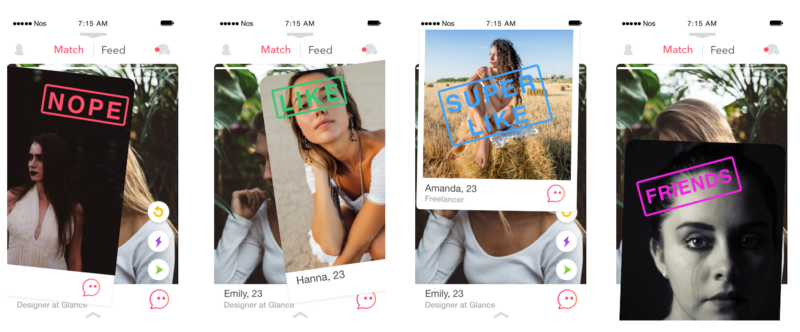
Tinder is listed under “Lifestyle” in the App store. Although Tinder isn’t marketed as a dating App, most people see it as one. Browsing through the profiles, I saw plenty of bios with something like “Just looking for friends!”.
So swiping down on the new swiping cards allows you to be friend of someone.
Problem 2: Changing pages to see a profile
This modification was something more personal. I didn’t like the way a user would navigate to a person’s profile. I did not consider the process fluid in the eyes of the user as we are constantly changing pages and it does not become very intuitive or practical if we want to go back after seeing the profile.
So I decided to implement the function of being able to see the profile of the user without leaving the main page. Swiping up would display the user’s profile and swiping down would return the user to the main page.
Redesigning the Tinder Feed
Tinder introduced the Feed feature that shows you real-time updates of your matches all in one place. Is a very good idea that will take you beyond “It’s a Match!” and help you make a real connection.
But to access this new feature you need to go to the messages. As I think we should take advantage of this I decided to remove it from the messages and put it on the main screen.
A user would just need to click on the feed button on the main screen to access all the news from their matches.
To navigate within the feed, I decided to implement two buttons:
- New - Clicking on “New” at the bottom of the screen on the right side would create a new post.
- Old - Clicking on “Old” at the bottom of the screen on the left side would navigate to the oldest post until we reach the last one.
The buttons:
- Message - Instant message to the connection without leaving the feed.
- Share - Sharing on social media.
New Feature: Tinder Experiences
Most people see Tinder as a dating App. But it’s much more, the experience can be more powerful. I implemented a new feature called “Tinder Experiences”, a way to take dates and meetings with friends to another level.
Discover places of the city where you are, meet people who share your passions, open up to new experiences.
Status
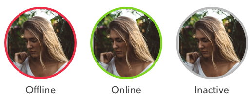
There are a few other things that can be implemented to improve the user experience a lot. One of them is to know the status of the user. So in a simple and minimalistic way I inserted the staus of users within the messages. This improvement allows us to know if a user is online, offline or inactive.
Another possible feature is to Filter users by when they were last active. This would allow a user to set a range in your “Discovery Preferences”, For example, display users that have been active within the last 30 minutes.
Conclusion
Going into this project, I knew that this would be the perfect opportunity for me to improve my design skills and push myself creatively. I’m studying computer engineering and at the same time studying design alone at home as I want to pursue a career in product design. I figured out that the best way for me to learn would be to just throw myself into a project.
So for me this is not the end of redesigning a mobile App and only the beginning.
Thanks for reading. I hope you liked it. ?
I would appreciate your feedback.