by Moin Nadeem
How we tracked and analyzed over 200,000 people’s footsteps at MIT
My freshman spring, I had the pleasure to take 6.S08 (Interconnected Embedded Systems), which teaches basic EECS concepts such as breadboarding, cryptography, and algorithmic design.
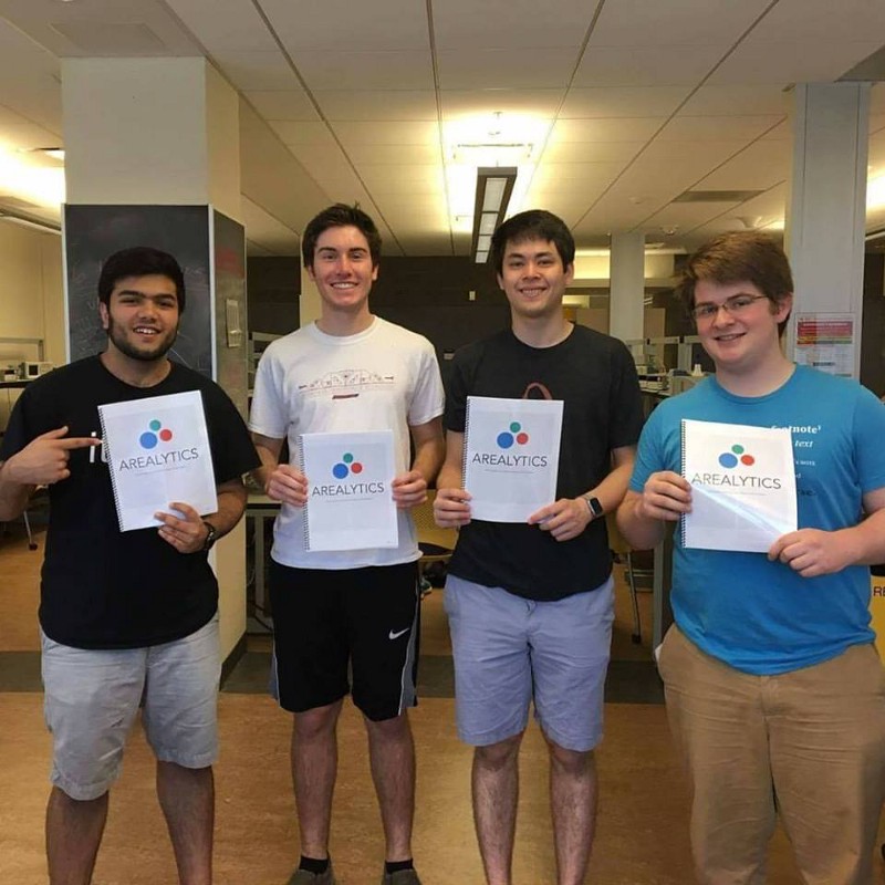
While the class was incredibly time-consuming and challenging, I have to say it was one of the most rewarding classes I have taken thus far. I’m proud to have worked with some incredible people (Shout out to Avery Lamp, Daniel Gonzalez, and Ethan Weber for the endless memories), and together, we built a final project that we wouldn’t forget.
For our final project, our team knew we wanted to be adventurous. While walking to get ice cream one day, Avery suggested a device to monitor WiFi probe requests, similar to how some malls do. After some initial research and persuasion towards our instructors, we decided to commit and began researching the idea.
What are WiFi Probe Requests?
Most people consider their phone as a receiver; it connects to cellular / WiFi networks, and for all practical uses, are only functional when connected. However, when phones are searching for WiFi networks, they commonly also send out small packets of information called probe requests.
These probe requests send snippets of information such as a unique MAC address (similar to a fingerprint), RSSI signal (logarithmic signal strength), and a list of previous SSIDs encountered. As each phone will send out one MAC address (excluding recent attempts at anonymization), we can easily leverage these to track students walking around campus.
Collecting Probe Requests
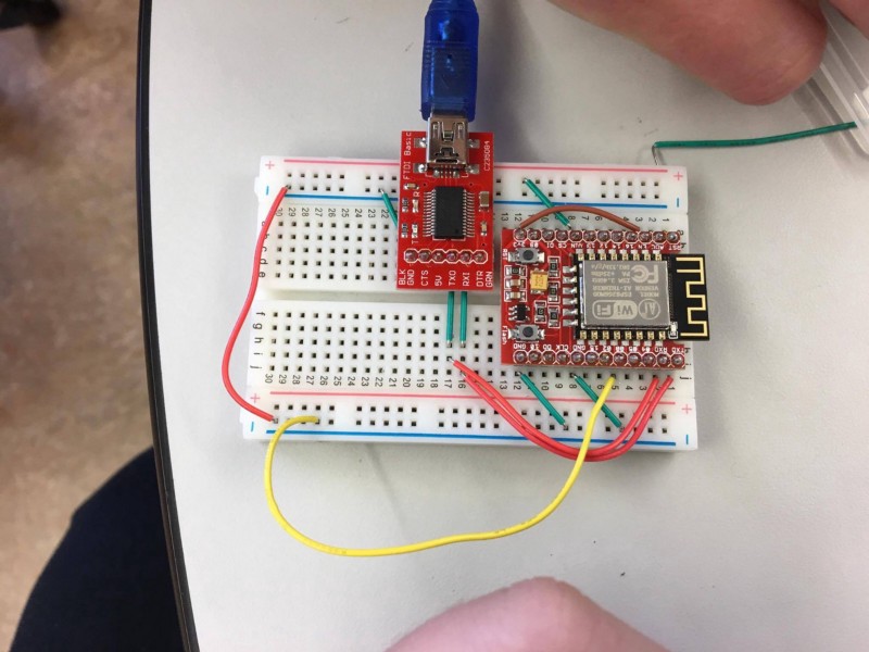
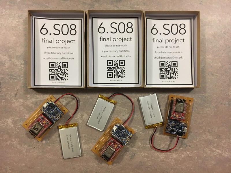
Requirements for our final project included using the standard 6.S08 components we used during the semester: a Teensy microcontroller, an ESP8266, and a GPS module. However, given the low power consumption of the ESP8266 (120 mA), and the lack of a need for a strong CPU, we decided to bypass the Teensy altogether. This design decision required to us to learn how to utilize FTDI programmers in order to flash an implementation of Arduino for our ESPs, but it enabled us to continue with an environment which provided strong familiarity and a breadth of libraries over the built-in AT-command firmware.
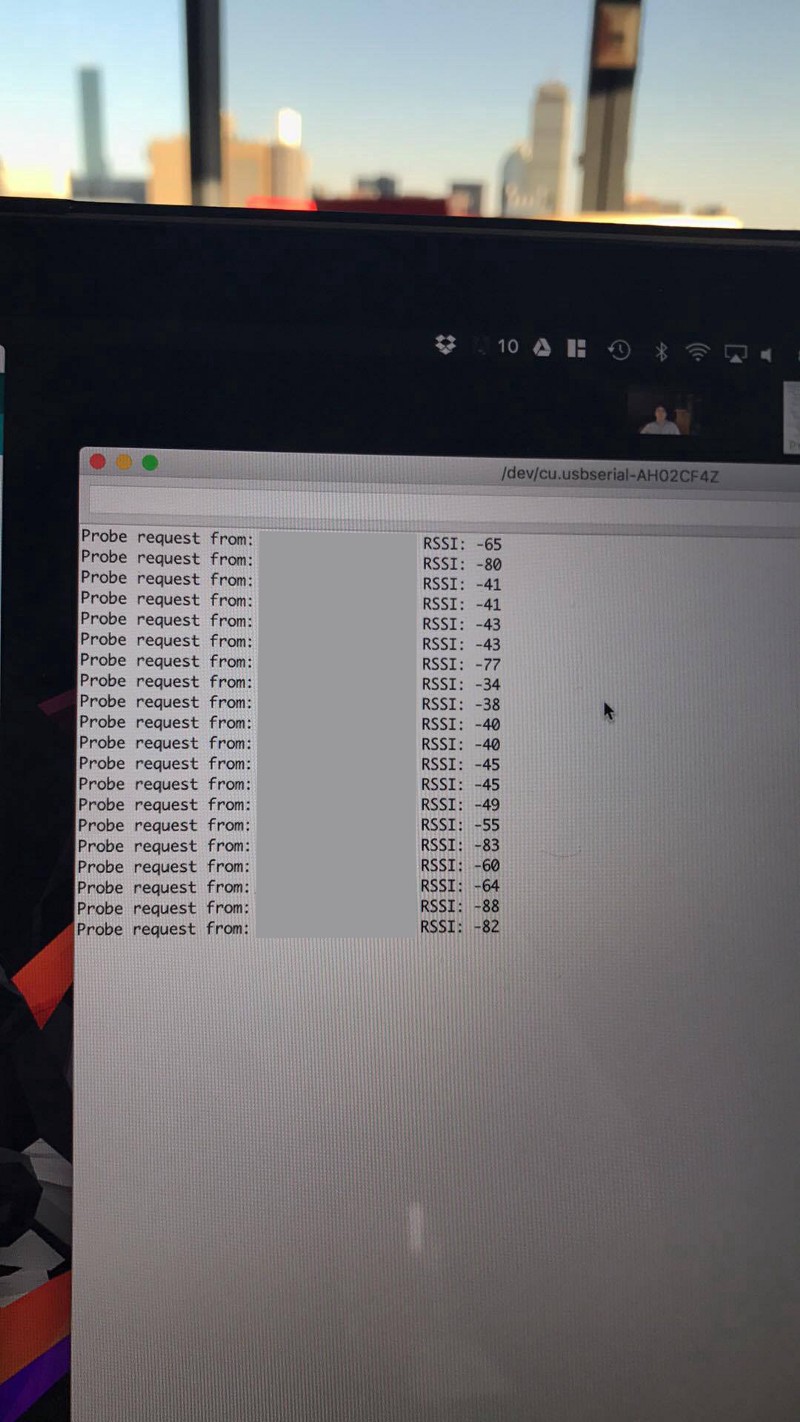
Within the next few days, we had a Proof of Concept which tracked probe requests made around campus; this was enough to mitigate any doubts from our professors, and it was game on.
Developing a POC
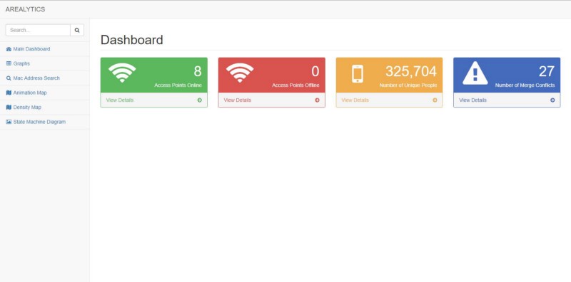
Now that we knew enough about probe requests to proceed, our team spent the next few days writing the infrastructure which would permit us to collect these requests en-masse. I wrote a Flask + MySQL backend to manage device infrastructure + information, Avery worked on an iOS application to ease deployment of devices, Daniel Gonzalez created a beautiful frontend to our website, and Ethan created an analytics platform which transformed the wealth of incoming data into intelligible data with valuable insights.
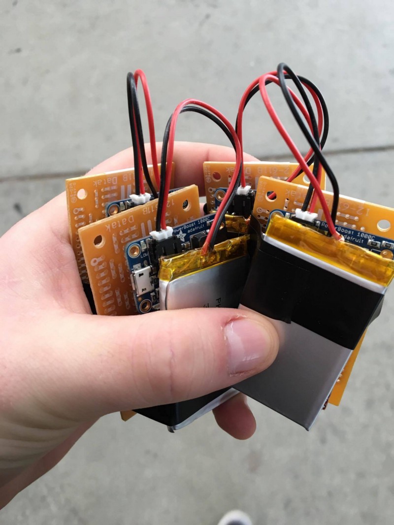
On a hardware side, Daniel and Ethan soldered our ESP8266s onto prototype boards, along with some power modules. We reused the PowerBoost 1000Cs given to us by the class to make these devices entirely portable, which had the nice side effect of permitting us to perform tracking in some tight locations.
Notably, the team dynamic was absolutely wonderful: we laughed together, learned together, and truly enjoyed each other’s company. Deploys at 4am weren’t so bad when it’s with some of your best friends.
Deploying
Given that Ethan wrote some nifty code to auto-connect the devices to the nearest unsecured WiFi hotspot on boot, and Avery wrote an app to update the location + last moved fields (useful for knowing which MAC addresses to associate with each location), deployment was as easy as plugging in the devices to a nearby outlet and ensuring that it was able to ping home. Deployment was quite enjoyable if you got creative with it.
Analyzing the Data
After letting the project run for a week, we collected about 3.5 million probe requests (!). I’d also like to note that the data is all anonymized; in no way is this data fine-grained enough to determine a mapping from MAC addresses to individuals, mitigating most privacy concerns our instructors had.
We began by applying Ethan’s work to all of the locations, which caused immediate excitement. Our data clearly showed the periodic behavior behind each location.
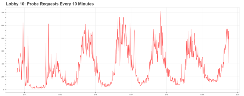
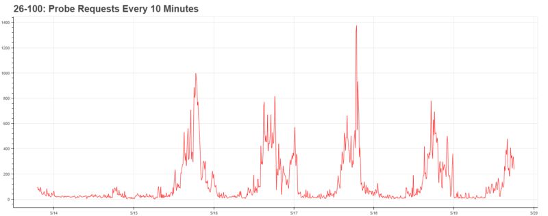
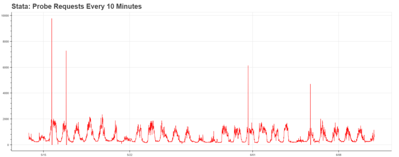
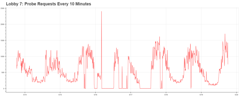
Furthermore, it was clearly indicative of some greater trends throughout campus: major arteries (Lobby 10, 26–100) achieved peak traffic around 5pm, whereas buildings on the edge of campus (such as Stata, which has a cafe) achieved peak traffic at noon. Needless to say, with the infrastructure in place, the data becomes much more exciting.
Once we figured out that the data for these trends existed, we began to ask ourselves some more interesting questions:
- What could we conclude about the make + distribution of devices at MIT?
- What if we modeled our campus as a network graph?
- Is there a most common walk?
- More interestingly, could we predict where people will go next given their location history?
We proceeded to attack these one-by-one.
Analyzing the Dataset
MAC addresses actually provide a plethora of information in 6 bytes; we can leverage this information to determine more about the people who walk around us. For example, every manufacturer purchases a vendor prefix for each device they manufacture, and we can use this to determine the most popular devices around MIT.
But there’s also a catch — recent attempts to use this technology to track individuals by the NSA has led many manufacturers into anonymizing probe requests. As a result, we won’t be able to fully determine the distribution of devices, but we can investigate how widespread probe request anonymization is.
It’s quite ironic that any device which anonymizes probe requests actually informs you that they do it — in anonymized devices, the locally addressed bit (second-least significant bit) of the address is set to 1. Therefore, running a simple SQL query lets us know that nearly 25% of devices anonymize MAC addresses (891,131 / 3,570,048 probe requests collected).
Running the list of vendor prefixes (first three bytes of a MAC address), we see that the top two out of top eight addresses are anonymized.
- Locally addressed “02:18:6a”, 162,589 occurrences
- Locally addressed “ da:a1:19”, 145,707 occurrences
- 74:da:ea from Texas Instruments, 116,133 occurrences
- 68:c4:4d from Motorola Mobility, 66,829 occurrences
- fc:f1:36 from Samsung, 66,573 occurrences
- 64:bc:0c from LG, 63,200 occurrences
- ac:37:43 from HTC, 60,420 occurrences
- ac:bc:32 from Apple, 55,643 occurrences
Interestingly enough, while Apple is by far the largest player in probe request anonymization, they seemingly randomly send out the real address every once in a while. For someone tracking at a frequency as high as ours (nearly every second), this is problematic; we checked with iPhone-owning friends and were able to track their location with a frightening accuracy.
Predicting future locations
After modeling student’s walks as a network graph, we realized that we could easily calculate the probability of going to another node given the node they were previously at. Furthermore, we realized that this graph may be easily modeled as a Markov Chain. Given an initial set of vertices, where would they go next?
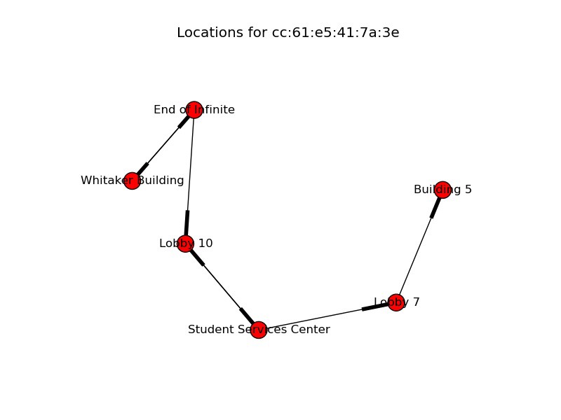
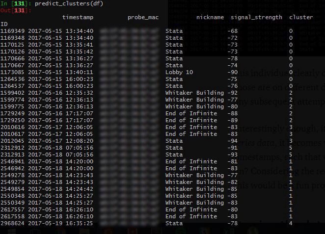
However, this posed a significant challenge: our database had little understanding of when a walk began, and when a walk ended. It was little more than a dump of coordinates with locations and timestamps. If you examined the walks manually, it was clear when some began and others ended, as the times would be quite far apart from each other.
This can be understood by examining the image above. For example, this individual clearly didn’t walk from Stata to the Whitaker building, since those are on different days. However, our database has no idea of this, and as any subsequent attempts to use this data would produce flawed results.
Interestingly enough, if we re-structured this as a problem of clustering time-series data, it becomes very intriguing. What if there was a way to cluster the timestamps, such that we could identify the various “walks” a student went on? Considering the recent buzz around clustering time-series data, I figured this would be a fun project to start my summer with.
Parsing the database into walks
In order to best understand how to potentially cluster the data, I needed to better understand the timestamps. I began by plotting the timestamps onto a histogram to better understand the distribution of the data. Gladly enough, this simple step helped me hit pay dirt: it turns out that the frequency of probe requests with respect to distance from an ESP8266 roughly follows a Gaussian distribution, permitting us to use a Gaussian Mixture Model. More simply, we could just leverage the fact that the timestamps would follow this distribution to wring out the individual clusters.
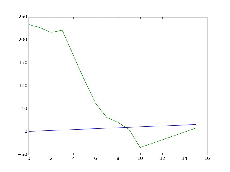
The subsequent problem was that a GMM needs to be told how many clusters to use, it won’t identify it on its own. This presented a strong issue, especially when considering that the number of walks each individual went on was highly variable. Gladly enough, I was able to utilize the Bayes Information Criterion, which quantitatively scores models with regard to their complexity. If I optimized to minimize by BIC with respect to model size, I could determine an optimal number of clusters without overfitting; this is commonly referred to as the elbow technique.
The BIC worked reasonably well at the beginning, but would overly penalize individuals whom went on many walks by under-calculating the number of possible clusters. I compared this with Silhouette Scoring, which scores a cluster by comparing the intra-cluster distance with the distance to the nearest cluster. Surprisingly enough, this provided a much more reasonable approach to clustering time-series data, and avoided many of the pitfalls that BIC encountered.
I scaled up my DO droplet to let this run for a few days, and developed a quick Facebook bot to notify me upon completion . With this out of the way, I could get back to work predicting next steps.
Developing a Markov Chain
Now that we’ve segmented an enormous string of probe requests into separate walks, we may develop a Markov Chain. This permitted us to predict the next state of events given the previous ones.
I used the Python library Markovify to generate a Markov model given a corpus from our previous step, which shortened development time comparably.
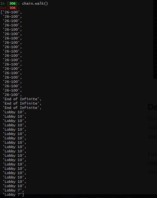
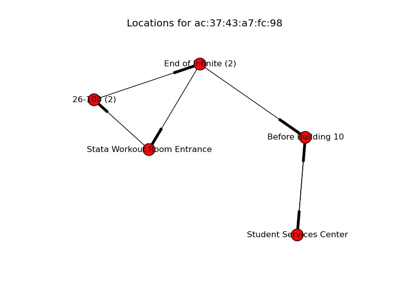
I’ve included a sample Markov Chain generated above; this actually represents the walk from a student leaving lecture (26–100 is a lecture hall) and going to his dormitory! It’s really exciting that a computer was able to pick up on this and generate a similar walk. Some locations are repeated, this is because each recorded location actually represents an observation. Therefore, if a location appears more than others, that simply means that the individual spent more time there.
While this is primitive, the possibilities are quite exciting. what if we could leverage this technology to create smarter cities, work against congestion, and provide better insights into how we may be able to reduce mean walk times? The data science possibilities in this project are endless, and I’m incredibly excited to pursue them.
Conclusion
This project was one of the most exciting highlights of my freshman year, and I’m incredibly glad we did it! I’d like to thank my incredible 6.S08 peers, our mentor Joe Steinmeyer, and all the 6.S08 staff who made this possible.
I’ve learned a lot while pursing this project, from how to cluster time-series data, to the infrastructure required for tracking probe requests around campus. I’ve attached some more goods below of our team’s adventures.