
by Harnoor Bandesh
The Web Optimization trick you might have missed

Have you ever wondered why the Google search pages or Amazon site loads really fast? Well stay with me while I take you through the concept, which drastically improves page performance. But firstly, let us go through some concepts that lead to the idea.
Analysing Critical Rendering Path (CRP)
First of all, let us define the vocabulary that we will be using:
- Critical Resource: Resource that could block initial rendering of the page
- Time To First Byte (TTFB): Measures the duration from the browser making an HTTP request to the first byte of the page being received by the browser
Optimizing web performance is all about understanding what happens in the intermediate steps between receiving the HTML, CSS, and JavaScript files and the required processing to turn them into rendered pixels — that’s the critical rendering path (CRP).
Before the pages are rendered, the browser has to go through all the following steps:
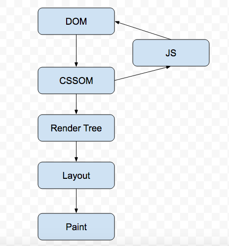
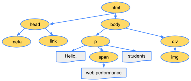
When the browser first hits the page, it downloads the HTML file. It then starts building up the DOM (Document Object Model) tree. Each tag in HTML represents a node inside the DOM tree which has all the information about it. Let us take an example to understand this.
Suppose the Browser receives the following HTML from the server:
<html>
 <head>
   <meta name="viewport" content="width=device-width,initial-      scale=1">
   <link href="style.css" rel="stylesheet">
   <title>Critical Path</title>
 </head>
 <body>
    <p>Hello <span>web performance</span> students!</p>
     <div><img src="awesome-photo.jpg"></div>
 </body>
Browser converts it into a tree object called the DOM as:
Note: The DOM Construction Process is incremental. This is the basis of the idea for which I am writing this article.
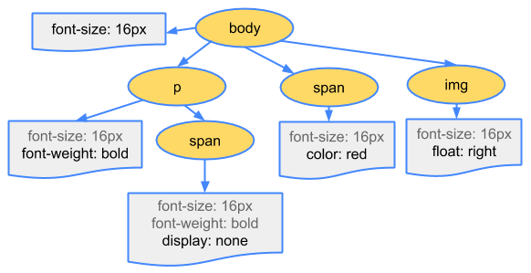
While the browser was constructing the DOM, it encountered a link tag in the head section referencing an external CSS stylesheet.
Anticipating that it needs that resource to render the page, it dispatches a request for the same, which comes back with the following content:
body { font-size: 16px }
p { font-weight: bold }
span { color: red }
p span { display: none }
img { float: right }
The browser then creates the CSSOM (CSS Object Model):
The CSSOM and DOM trees are combined to form a Render tree. The Render tree is then used to compute the layout of each visible element.
This is what a Render tree looks like:
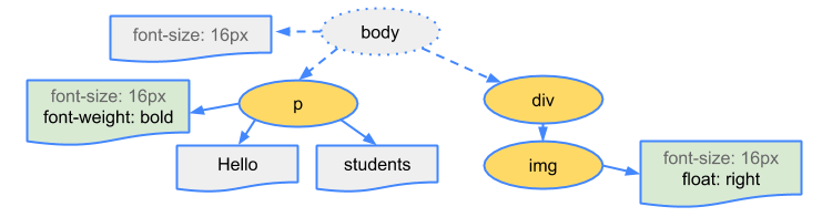
Some nodes are not visible — such as script tags and meta tags — and are omitted since they are not reflected in the rendered output. Some nodes are hidden via CSS and are also omitted from the render tree.
Now with the Render tree in place, we can head for the Layout step. The output of the layout process is a “box model” in which the exact position and size of each element is captured. All the relative measurements are converted to absolute pixels on the screen.
Finally, now that we know which nodes are visible, and their computed styles and geometry, we can pass this information to the final stage. This stage converts each node in the Render tree to actual pixels on the screen. This step is often referred to as “painting”.
Note: the CSS is render blocking. Until the CSSOM is constructed, the browser cannot proceed to the Render tree step. Hence we need to serve the CSS file to the browser as soon as possible, which is why we keep all the link tags in the head section.
Now let us add JavaScript to our example:
<html>
 <head>
   <meta name="viewport" content="width=device-width,initial-scale=1">
   <link href="style.css" rel="stylesheet">
   <title>Critical Path</title>
 </head>
 <body>
    <p>Hello <span>web performance</span> students!</p>
    <div><img src="awesome-photo.jpg"></div>
    <script src="app.js"></script>
 </body>
By default, JavaScript execution is “parser blocking”. When the browser encounters a script tag in the document, it does the following steps:
1. Pause DOM construction
2. Download the file
3. Hand over control to the JavaScript runtime
4. Let the script execute before proceeding with DOM construction
The browser does not know what the script is planning to do on the page, so it assumes the worst case scenario and blocks the parser.
Hold on!!! This is not the worst case that can happen while DOM parsing. In the last example, we can see that we have both CSS and JavaScript external files that the browser needs to download.
Now, suppose the CSS files take some time to download, and in the meanwhile the JavaScript file gets downloaded. Now, the browser will assume the worst case scenario that JavaScript might query CCSOM, which is why it does not start parsing the JavaScript file until the CSS file is downloaded and CSSOM is ready!
Let us look at a diagram which might help us to get a better understanding of what I am trying to say:
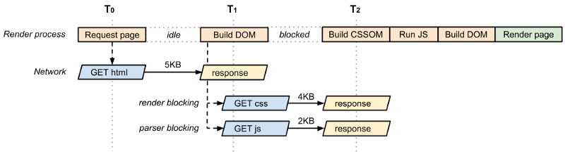
CSS is a demon for any web page! It is render blocking and parse blocking as well. We need to be very careful in handling it.
Let us look into some ways to optimize the CRP.
Optimizing the CRP
At this point we know that the CSS can be a demon. Get it to the client as soon as possible to optimize the time to first render. What if we have some CSS styles that are only used under certain conditions? For example, when the page is being printed or being projected onto a large screen?
It would be nice if we didn’t have to block rendering on these resources. CSS “media types” and “media queries” allow us to address these use cases:
<link href="style.css" rel="stylesheet">
<link href="print.css" rel="stylesheet" media="print">
<link href="other.css" rel="stylesheet" media="(min-width: 40em)">
A media query consists of a media type which checks for the conditions of particular media features. For example, our first stylesheet declaration doesn’t provide a media type or query, so it applies in all cases. That is to say, it is always render blocking.
On the other hand, the second stylesheet declaration applies only when the content is being printed. Hence this stylesheet declaration doesn’t need to block the rendering of the page when it is first loaded.
Finally, the last stylesheet will be executed by the browser if the condition matches. If the condition does not match, the browser wont block the rendering.
When declaring your style sheet assets, pay close attention to the media type and queries. They greatly impact critical rendering path performance.
By default all JavaScript is parser blocking. A signal to the browser that the script does not need to be executed at the point where it’s referenced allows the browser to continue to construct the DOM and lets the script execute when it is ready. For example, after the file is fetched from cache or a remote server.
To achieve this, we mark our script as async:<script src=”app.js” async></script>
Adding the async keyword to the script tag tells the browser not to block DOM construction while it waits for the script to become available, which can significantly improve performance.
One more plus point of the async attribute is that the script does not get blocked waiting for CSSOM to get ready.
Analytics script is great example for the async attribute as the script does not changes the DOM in any way. There is one more attribute for script tags, which is defer. You can learn about defer by visiting here.
And finally — the apex of the article arrives, where I will tell you the main secret — apart from the optimizations stated above — that big companies apply and do wonders…
Sending HTML in chunks from the server
Look at the following images and decide: in which way would you want your websites to render?
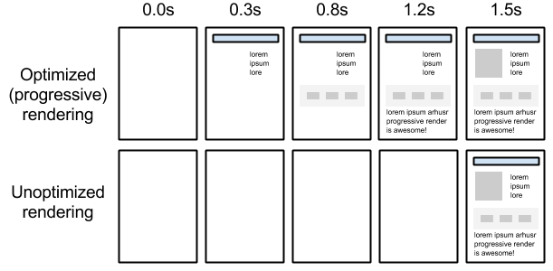
Got an answer? It’s the first one of course! No one really like to see the blank page for so long. It is much better to render the HTML in chunks on the web page which is what Google Search pages, Amazon, and other big giants do.
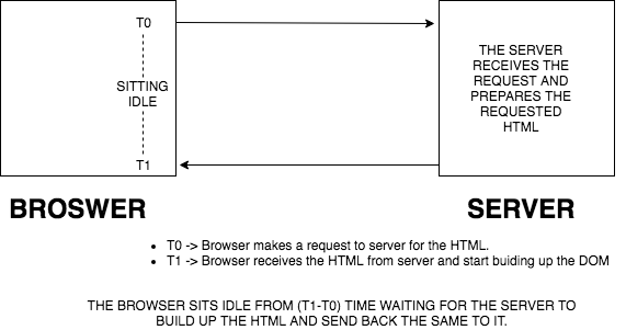
Now when you first hit the URL of any website, the complete HTML of the page gets built up on server. Until that time, the browser is sitting idle doing nothing.
After the HTML is built on the server, it is passed on to the browser. The browser then starts building up the DOM and goes through all the CRP steps as mentioned before.
The following diagram will help us get this thing clearer:
So why don’t we optimize the idle time of the browser and make it start building up the DOM by sending the HTML chunk that is ready to the server? In other words, we can flush out the HTML in chunks the moment they get ready, instead of waiting for the entire HTML to get prepared. This will make the browser start building up the DOM/CSSOM tree instead of waiting idle. Isn’t that a wonderful idea!
I hope the following diagram may clear up this idea more:
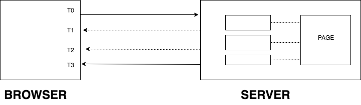
The page is divided into HTML chunks on the server. Now the server, instead of waiting for the entire HTML to get ready and then serving it to the browser, will send the HTML chunks the moment they are ready on the server. This means that the first chunks won’t wait for the other two to get ready — they will be served to the browser the moment they are ready on the server.
Let us take an example to understand this idea even better. The following is the Google Search page:
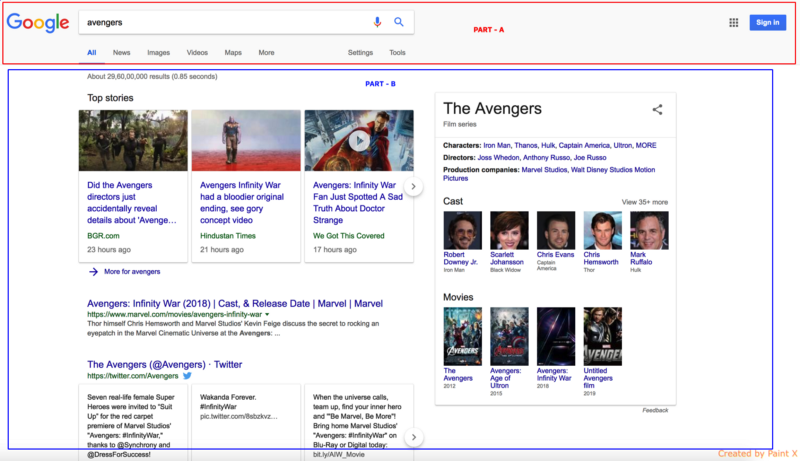
Now suppose we hit this URL, and the browser dispatches a request to the server to serve this page. The server starts building this page and has completed the HTML of Part A, but for Part B it needs to fetch the data from some source which will take some more time.
Now, instead of waiting for part B to get completed, the server flushes out the completed HTML of part A to the browser so that it starts building up the DOM.
In the meantime, the server prepares the HTML of part B with the required data. In this way, the user would be able to see the web page loading progressively on the browser. Sending HTML in chunks also reduces the Time To First Byte and improves performance and page speed index of the page.
This is what Google is actually doing in their Search pages! Even Amazon throws their header first while the rest of the page gets prepared on the server.
Sending the HTML in chunks also serves one more purpose of optimization. As your head tag reaches the client first, the browser initiates the CSS and other requests in the tag. This helps the browser download other critical resources while the rest of the HTML is prepared by the server.
Typical time to fetch a page from the server is around 500 ms. But a typical time to get the first chunk from the server is around 20–30 ms. The CSS call which was to be initiated after 500 ms will now be initiated after 20–30 ms, giving the web page a boost of around 470–480 ms. You can even preload the heavy images in head tag which will be used by the HTML that is yet to come from the server, improving page load time!
Now the question is: how to send HTML in chunks from the server side.
Well, we have different ways in different languages. We have a method called flush in Java, .NET and PHP. In Node.js we need to res.write() whenever our HTML chunk is ready.
Note: The browser does not make repetitive calls to the server to get all the chunks. All the HTML chunks are served over a single call to the server.
My POC
I have made a POC with Node.js, Express and React, where the React components are rendered on Node.js and each component is flushed to the browser as soon as its HTML gets prepared. You can find the source code here.
You can see the live demo here.
In the demo you can see links. The Move to page without chunking link will take you the page in which the chunking concept has not been applied. The Move to page with chunking link will take you to the page in which the chunking concept has been applied. Below are screenshots of the page.

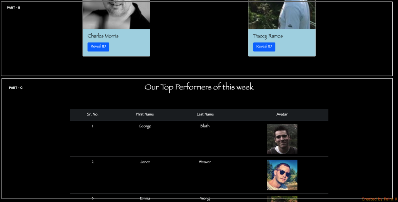
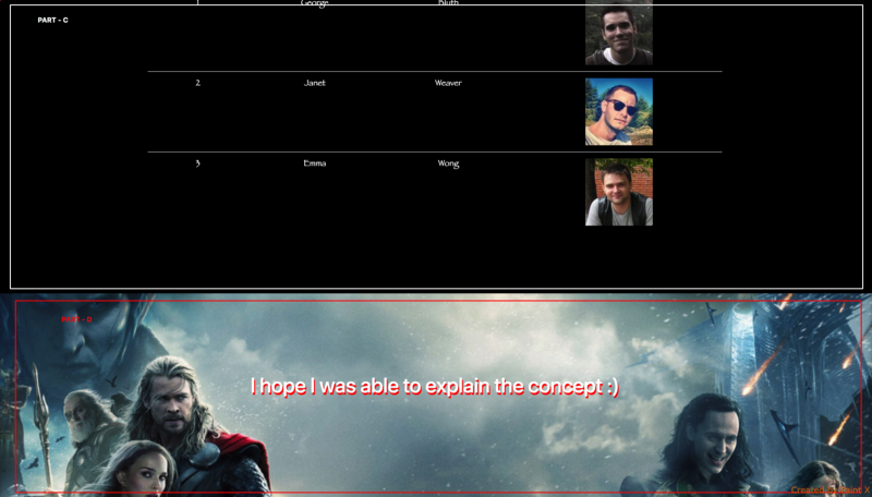
The page is divided into 4 parts. The moment Part A gets prepared on the server it is flushed to the browser so that the browser can start building up the DOM.
Part B is built up using the data from an API which will take some time. Up until then the browser creates the HTML of Part A as a DOM construction in an incremental process.
The moment the HTML of Part B gets prepared on the server, it is served to the browser. The story goes on for Part C and Part D.
But here is one catch: even before sending the Part A, I send one more chunk to the browser which is the head tag of the HTML. In the head tag I have preloaded all the heavy banner images in the header and footer, and have done pre-connect and dns-prefetch of all the remaining images. Learn more about preload, prefetch and pre-connect here.
The head tag also contains the CSS file links. Now as Part A gets prepared on the server, the browser dispatches the request of all the resources in the head section so that the page gets populated faster when the HTML arrives.
The performance test on both the pages were run with the help of the Lighthouse Extension in Chrome. And the results are really encouraging.
The test was run 10 times on both the pages and the average of all the values is displayed below:
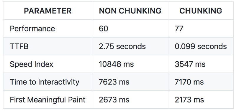
Learn more about Time to Interactivity, Speed Index, first meaningful paint.
This basic idea implementation can drastically improve the performance of a web page. I hope I was able to explain the concept.
If you want to contribute in the idea, or if you feel something better can be done in it, then please go ahead, fork the repo, create a new branch and raise a pull request to me. Please find below the steps to turn on the App on local:
- Clone from here
- Install Node on your system
- Run
npm installinside the folder where you have cloned the code - Run
npm run devto make thebundle.jsfile - Terminate the process and run
npm start - The App will start running on
8080port
Please feel free to share this article with your friends if you find it interesting. :)